A ranking board displays the distribution and ranking of metrics across dimensions. It shows the top N items in descending order. For example, it can display the top 10 cities by sales volume, from highest to lowest. This topic describes how to add data and configure styles for ranking boards.
Prerequisites
You have created a dashboard. For more information, see Create a Dashboard.
Limits
A ranking board consists of the Category/Dimension, Indicator/Measure, and Auxiliary Indicator/Measure fields:
The category is based on a dimension. Select at most one dimension, such as region or product type.
The indicator is based on a measure. Select at most one measure, such as order quantity or profit amount.
Auxiliary indicators are based on measures. Select at most three measures, such as discount point or shipping cost.
By default, 20 data rows appear in the preview. A maximum of 500 data rows are displayed.
Overview
Scenario
You can use ranking boards to compare aggregated data from different dimensions and display the rankings.
Benefits
Easy data analysis: You can obtain the data sum and period-over-period comparison results with a few clicks.
Various interactive options: You can add remarks or endnotes to metrics in ranking boards. You can also add links to ranking boards to interact with external systems.
Example Chart
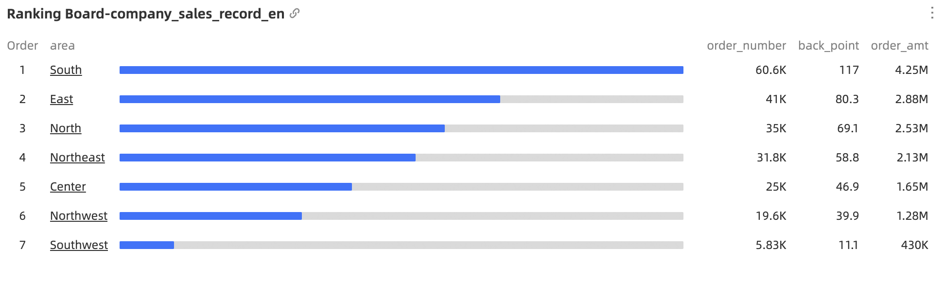
Chart Field Configuration
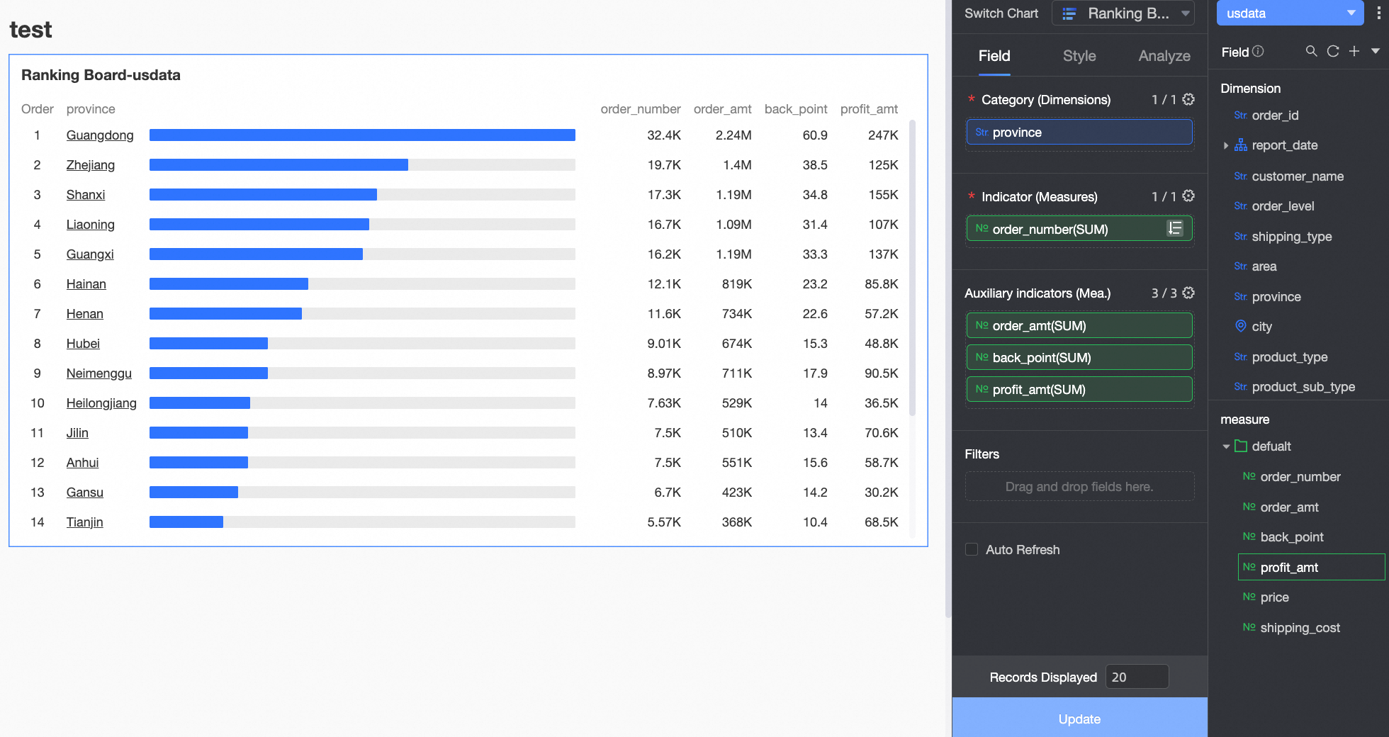
On the Data tab, select dimensions and measures as needed.
In the Dimension list, locate Province. Double-click it or drag it to the Category/Dimension area.
In the Measure list, locate Order Quantity. Double-click it or drag it to the Main Indicator/Measure area.
In the Measure list, locate Order Amount, Discount Point, and Profit Amount. Drag them sequentially to the Secondary Indicator/Measure area.
Click Update. The chart updates automatically.
auto-refresh
After you select Auto Refresh, the system refreshes the chart automatically. For example, if you set the interval to 5 minutes, the system refreshes the chart every 5 minutes.
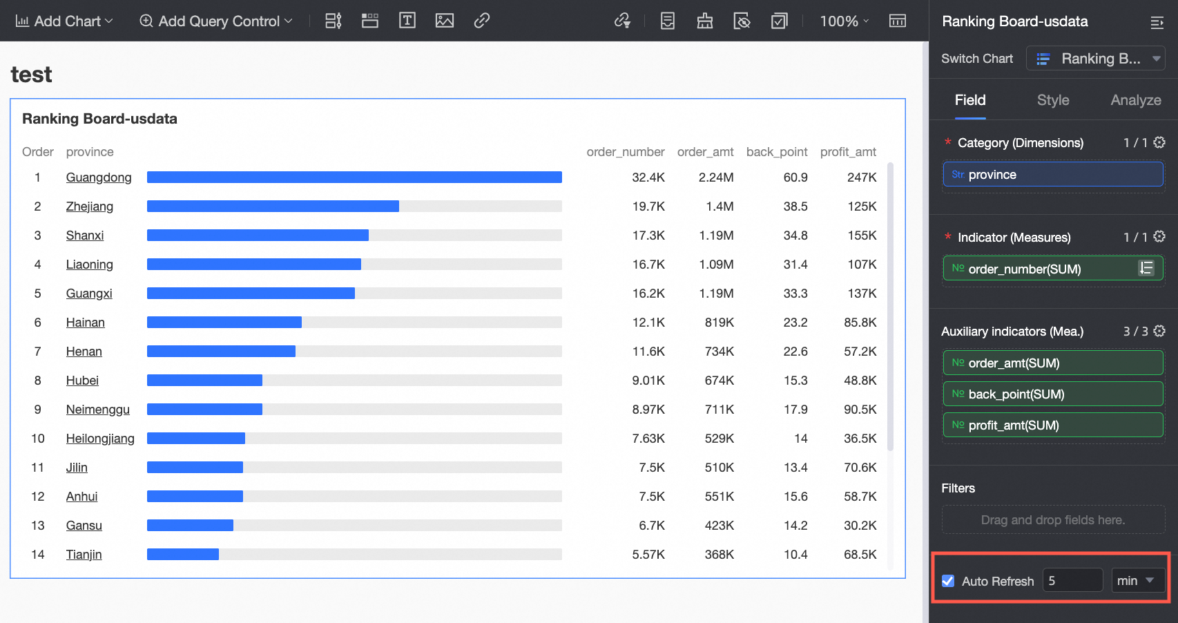
Chart Style Configuration
You can configure chart styling below. For general chart styling configurations, see Configure the Chart Title.
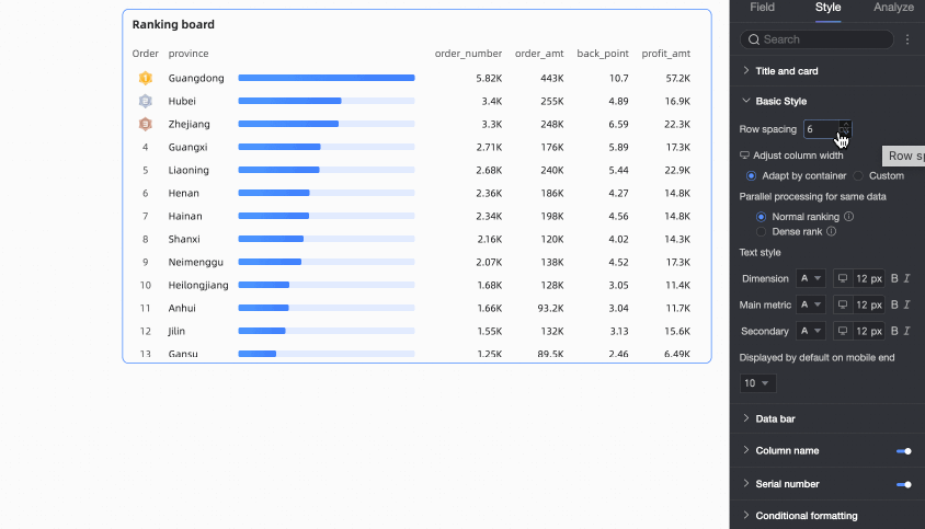
Basic Styles
In Basic Styles, customize chart styles.

Chart Configuration Item | Configuration Item Description |
Row Spacing | Adjust the spacing between ranked rows. The upper limit is 50 px. |
Column Width | Adjust the width of each element in the chart. Select Automatic Container Fit or Custom.
|
Parallel Processing for Identical Data | Set how rankings are handled when data values are the same. Select Rank or Dense Rank. You can also customize the text style of ranked data here.
|
Mobile Default Display | Set the default number of data ranking bars displayed on mobile charts. The default is 10. |

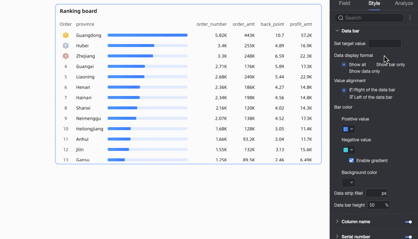
Data Bars
In Data Bars, set the display style for ranking data bars.

Chart Configuration Item | Configuration Item Description |
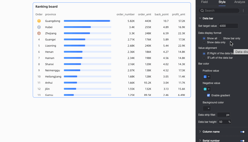
Set Target Value | Supports custom settings for Data Bars. If you do not set a target value, the data bar for the top-ranked data displays 100%. Data for other dimensions displays as a percentage relative to the top-ranked item. If you set a target value, the data bar percentage displays as indicator value / target value, as follows:
|
Data Display Method | Select from three methods: Display All, Data Bars Only, and Numbers Only.
|
Data Display Position | Only when Data Display Method is set to Display All, select from two methods: Left of Data Bar and Right of Data Bar. Note Only the position of indicator/measure data changes.
|
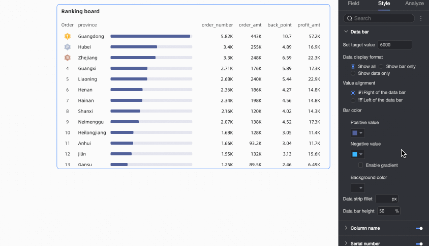
Data Bar Color | Set the positive/negative values and background color for data bars. Enable gradient color effects for data bars.
|
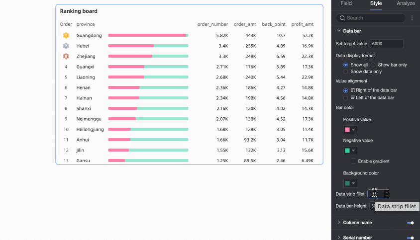
Data Bar Border Radius | Adjust data bars from sharp corners to rounded corners. |
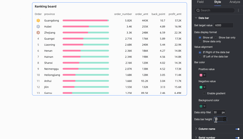
Data Bar Height | Customize data bar height. The peak value is 100%, the trough value is 10%, and the default value is 67%. |
Column Headings
In the Column Heading section, you can specify whether to display the column heading and configure its name, To3 style, and text style.

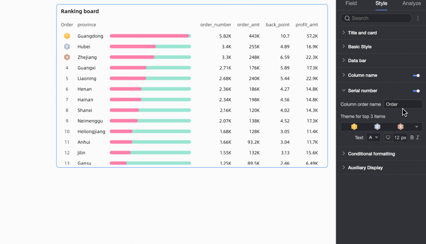
Ordinal Numbers
In Ordinal Numbers, customize the sort name and the sort label style for TOP 3.
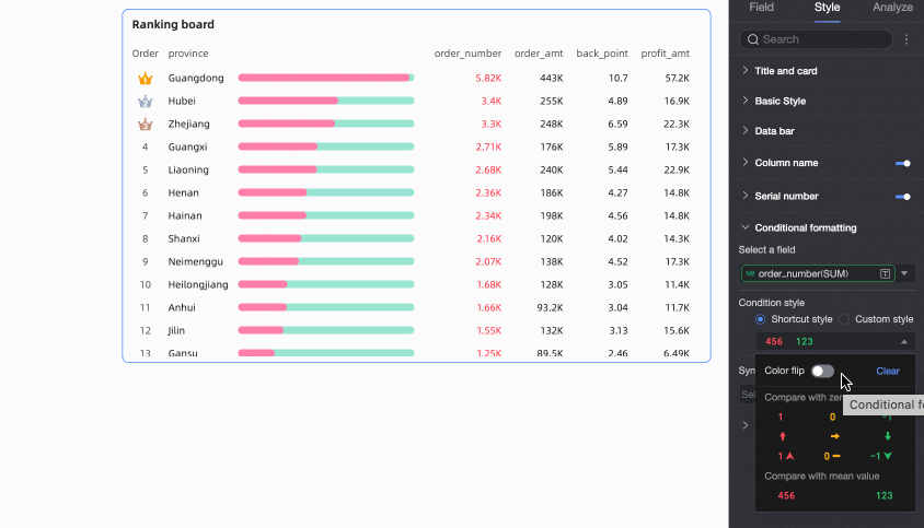
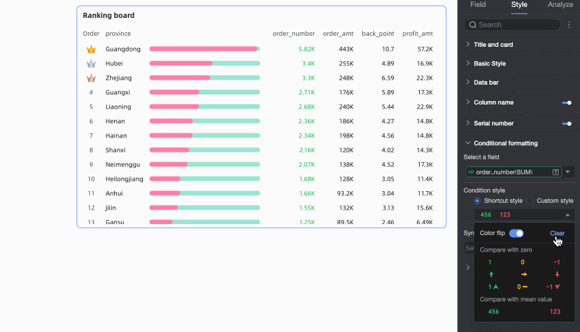
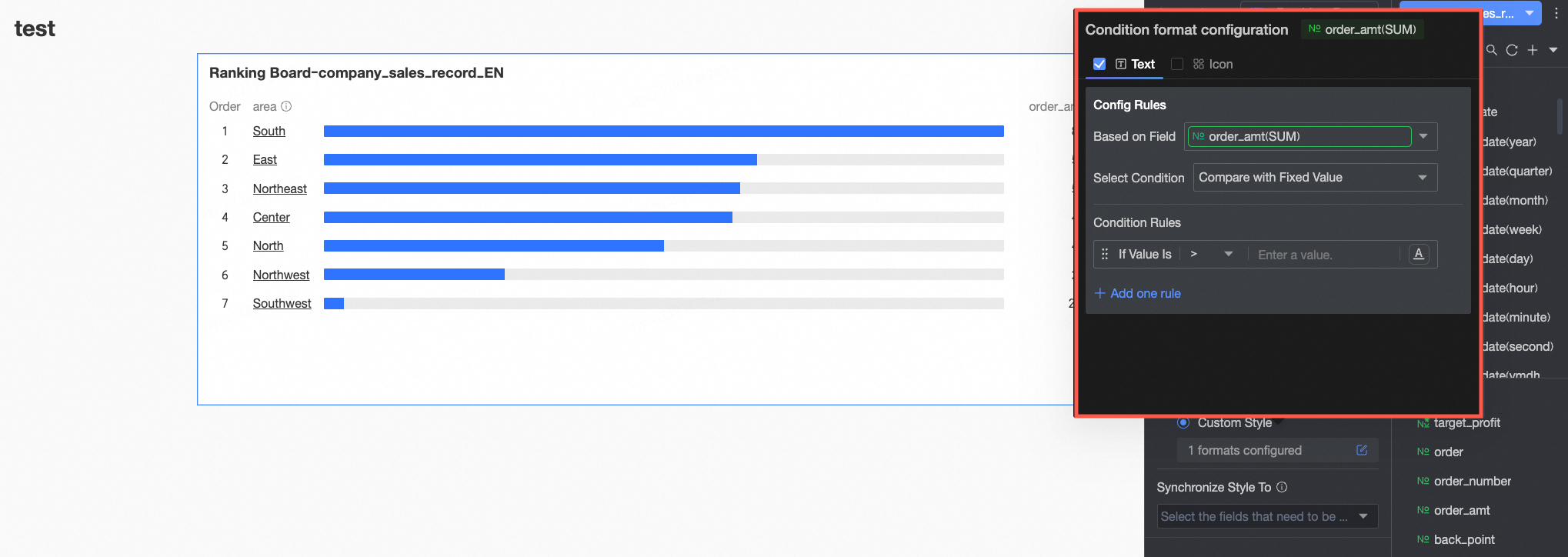
Conditional Formatting
In Conditional Formatting, set conditional formats for measure data.

Chart Configuration Item | Configuration Item Description |
Select Field | Select the measure field for which to configure conditional formatting. All measure items are selectable. |
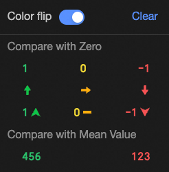
Quick Styles | From the styles provided by the system, set the marker icon or font display color for the current measure field.
|
Custom Styles | In addition to the quick styles provided by the system, you can also configure custom styles for the current measure field as needed.
|
Synchronize Styles To | Synchronize the current conditional format to other measure indicators. Note Style synchronization takes effect only once. Resynchronize after adjusting styles. |

 Configure the following information here.
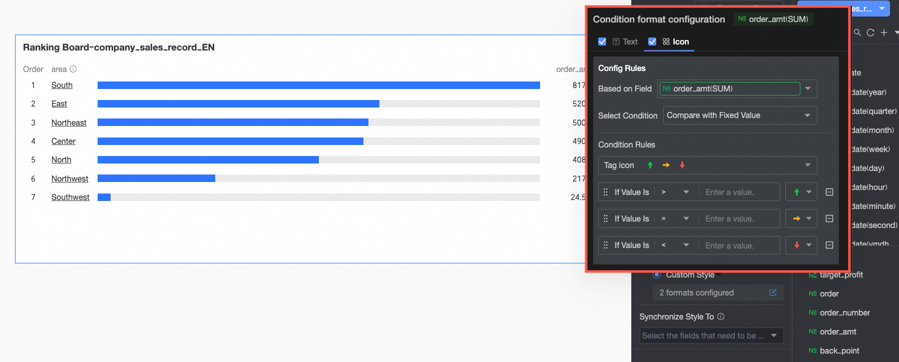 Configure the following information here.
Auxiliary Display
In Auxiliary Display, configure the scroll bar display method and thickness.
Tooltip
Hover the mouse over a data bar to view its tooltip. The tooltip displays the corresponding dimension value and measure value.
When a highlight filter interaction is applied, the tooltip of the linked chart can also display the data's original value.
For example, as shown in the following figure: Click the North China region on the map. The ranking board highlights the order amount for each product type in the North China region and displays the original order amount in the tooltip before the filter interaction.

Chart Analysis Configuration
Module | Name | Description |
Data Interaction | Drilling | After you have configured drill-down fields in the field panel, you can configure the display style for drill-down level rows here. For more information, see Drilling. |
Filter Interaction | If the data that you want to analyze exists in different charts, you can configure this feature to associate the charts, and then analyze the data. For more information, see Configure the filter interaction feature. | |
Go to | If the data that you want to analyze belongs to different dashboards, you can configure dashboard navigation to associate the dashboards for data analytics. Navigation includes Parameter Navigation and External Link. For more information, see Navigation. | |
Analysis Alert | Auxiliary Line | An auxiliary line can be used to show the difference between the value of a measure and the reference value indicated by the auxiliary line. The reference value can be a fixed value or a calculated value. You can use the following calculated values: average, maximum, minimum, and median. For more information, see Analysis and Alerting. |
Label | When data in a chart is abnormal or requires extra attention, you can use background colors, icons, remarks, or highlighted data points to label the data. This helps you identify abnormalities and take corresponding actions. For more information, see Label. | |
What to do next
When others need to view the dashboard, you can share it with specific people. For more information, see Share a Dashboard.
When you need to create complex dashboards with navigation menus for thematic analysis, you can integrate your dashboards into the BI portal. For more information, see BI portal.