A bubble chart adds a size variable to show relationships among multiple variables. You can use up to six variables in a bubble chart. This topic describes how to add data to a bubble chart and configure its style.
Prerequisites
A dashboard is created. For more information, see Create a dashboard.
Overview
Scenarios
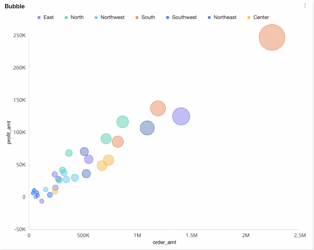
Two sets of data are used to generate multiple points in the coordinate system. You can observe the distribution of these points to determine whether a correlation exists between variables or summarize the distribution pattern.
Purpose: Provides key information.
Whether a quantitative correlation exists between variables.
Whether the correlation is linear or curved.
Whether outliers exist. An outlier indicates a point that deviates from most points. You can further analyze these outliers to determine whether they have a significant impact on the population during modeling analysis.
Benefits
Computing capability: The conversion rate is automatically computed.
Data visualization: A bubble chart can be dynamically displayed based on the timeline of data.
Example:
Limits
A bubble chart supports the following fields: Y axis/Measure, X axis/Dimension or measure, Category/Dimension, Color/Dimension or measure, Size/Measure, and Playback axis/Time dimension.
Select only one measure for the Y axis/Measure field.
The x-axis is determined by a single dimension or measure.
Select only one dimension for the Category/Dimension field.
Select only one dimension or one measure for the Color/Dimension or measure field. This field can use the same dimension or measure as the X axis/Dimension or measure, Y axis/Measure, or Category/Dimension fields.
Select only one measure for the Size/Measure field. This field can use the same measure as the Y axis/Measure field.
If the x-axis is a measure field, the size can be the same as the x-axis value.
Select only one dimension for the Playback axis/Time dimension field. This dimension must be a date field.
NoteYou can enable the playback axis only when both the X axis/Dimension or measure and Y axis/Measure fields use measures.
Configure Chart Data
On the Data tab, select dimensions and measures as needed.
In the Measure list, locate profit_amount. Double-click it or drag it to the Y axis/Measure field.
In the Measure list, locate order_amount. Double-click it or drag it to the X axis/Dimension or measure and Size/Measure fields.
In the Dimension list, locate province. Double-click it or drag it to the Category/Dimension field.
In the Dimension list, locate area. Double-click it or drag it to the Color/Dimension or measure field.
(Optional) To assign custom shapes to different dimension values, drag the relevant field to the Shape/Dimension field. Later, you can customize bubble shapes for each dimension value in the style panel. In this example, drag product_type to the Shape/Dimension field to assign a unique bubble shape to each product type.
NoteThis configuration requires fields in the Category/Dimension area.
Click Update. The system updates the chart automatically.

Chart Style Configuration
This section describes how to configure chart style. For general chart title configuration, see Configure the Chart Title.
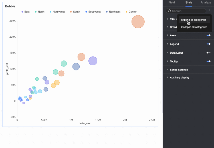
Use the search box at the top of the configuration panel to quickly find and configure configuration items by entering keywords. Click the  icon on the right to expand or collapse all categories.
Plot Area
In the Plot area, configure Color scheme, Bubble size, and Enable four-quadrant. Available options depend on which fields are configured in the Fields panel.
When a field is configured in the Shape/Dimension field, the following options are available.

Configuration item
Description
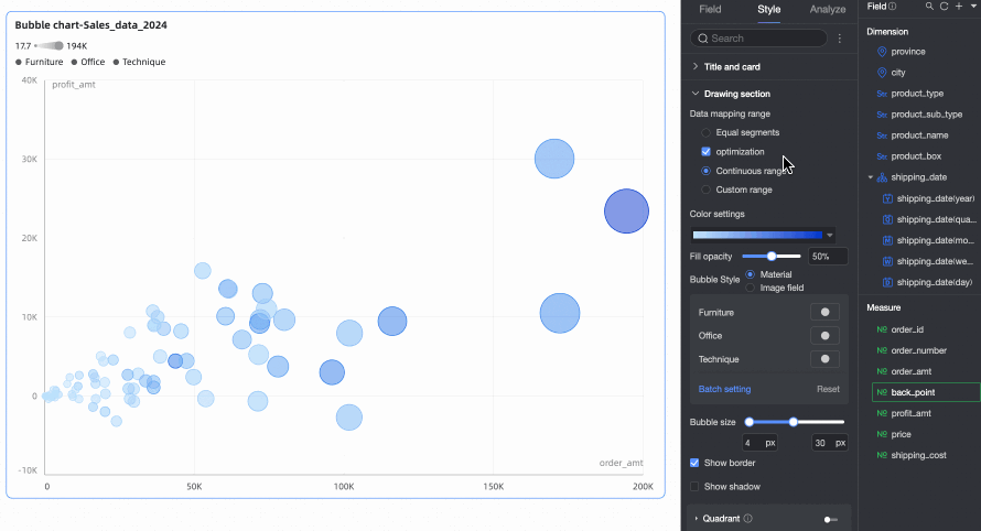
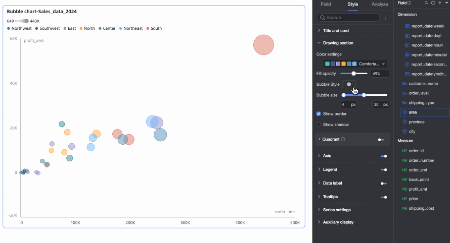
Color scheme
Set the overall color scheme for bubbles in the chart. Choose from built-in system themes or assign custom colors to individual dimension values.
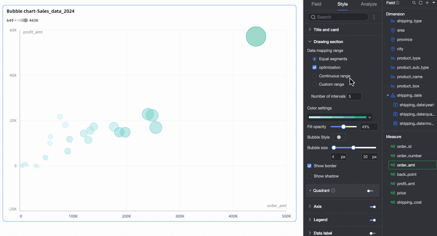
When a measure is configured in the Color/Dimension or measure field, set Data mapping segments for the measure.
Fill transparency
Set the transparency of bubbles.
Bubble style
Set the visual style of bubbles. Choose from built-in assets or image fields.
Assets: Assign different patterns to each dimension value. Choose from built-in system assets or upload custom images.

Image Field: Select images from an image field in the dataset for filling. You can use Image Field only when the dataset contains an Image Field and the field type is Image (
 ).
).
When you upload a custom image or use an image field, you can also set the image shape and display mode here.

Bubble size
Set the size of bubbles.
Show border
Specify whether to show bubble borders.
Show shadow
Specify whether to show bubble shadows.
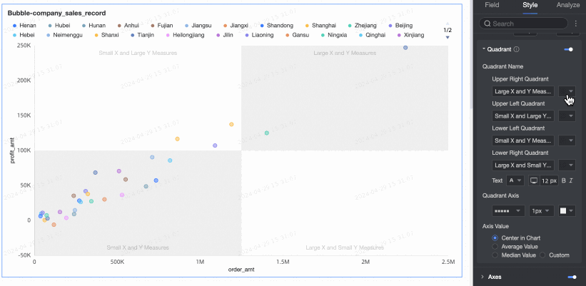
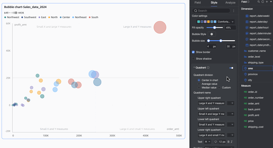
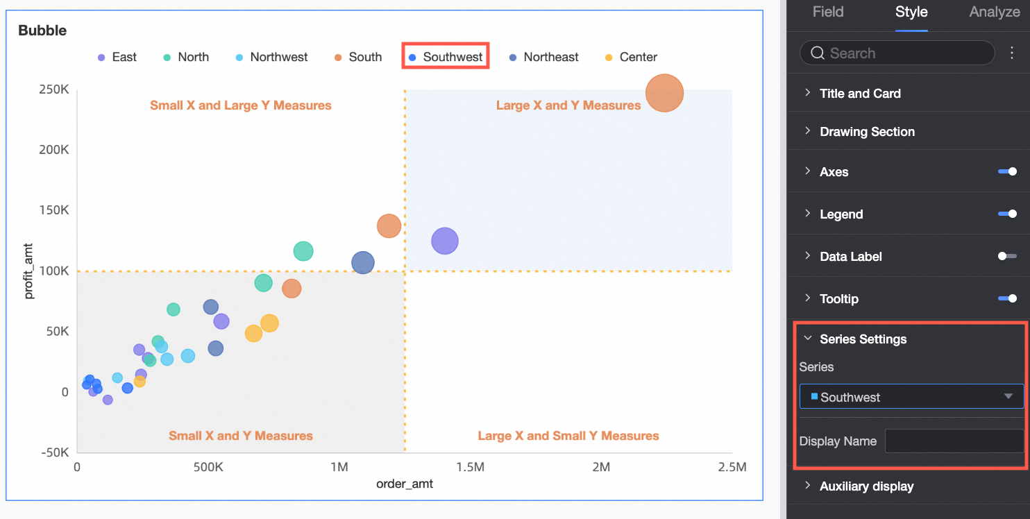
Four-quadrant
You can enable the Four-quadrant feature only when both the X axis and Y axis fields use measures.
When no field is configured in the Shape/Dimension field, the following options are available.

Configuration item
Description
Color scheme
Set the overall color scheme for bubbles in the chart. Choose from built-in system themes or assign custom colors to individual dimension values.

When a measure is configured in the Color/Dimension or measure field, set Data mapping segments for the measure.
Fill transparency
Set the transparency of bubbles.
Bubble style
Set the visual style for all bubbles in the chart. Choose from built-in system icons or upload custom images.
Bubble size
Set the size of bubbles.
Show border
Specify whether to show bubble borders.
Show shadow
Specify whether to show bubble shadows.
Four-quadrant
You can enable the Four-quadrant feature only when both the X axis and Y axis fields use measures.
Axes
In the Axes section, configure axis styles.
Name | Configuration item | Description |
X-axis | Show X-axis | Specify whether to show the X-axis. |
Show title and unit | Specify whether to show the axis title and unit on the X-axis. | |
Show axis labels | Specify whether to show labels on the X-axis. | |
Minimum and Maximum | Displays the minimum and maximum values for the horizontal axis. Note Select Auto to let the system automatically determine the axis range. Clear Auto to manually set the minimum and maximum values. | |
Axis label display format | Set the display format for axis labels. Options include AutoFit, Custom format, and Manual input. Note You can also batch-set measure display formats on the Data tab. For more information, see Configure Chart Fields. | |
Show gridlines | Specify whether to show gridlines on the X-axis. You can configure line style, line width, and color. | |
Show axis | Specify whether to show the axis. You can configure line style, line width, and color. | |
Show tick marks | Specify whether to show tick marks on the X-axis. | |
Left Y-axis | Show left Y-axis | Specify whether to show the left Y-axis. |
Show title and unit | Set the position of the axis title and unit. Options include Outside axis and Above axis. | |
Show axis labels | Specify whether to show labels on the axis. | |
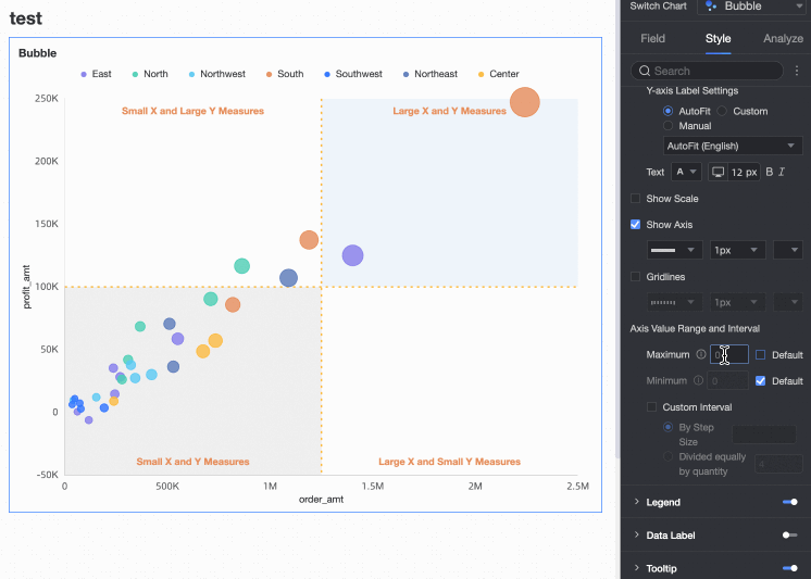
Minimum and Maximum | Display the maximum and minimum axis values:
| |
Show axis | Specify whether to show the axis. You can configure line style, line width, and color. | |
Axis label display format | Set the display format for axis labels. Options include AutoFit, Custom format, and Manual input. Note You can also batch-set measure display formats on the Data tab. For more information, see Configure Chart Fields. | |
Show gridlines | Specify whether to show gridlines on the axis. You can configure line style, line width, and color. | |
Show tick marks | Specifies whether to show scales on the left y-axis. | |
Axis value range and interval |
|
Legend
In the Legend section, click the  icon to enable the legend and configure its style.
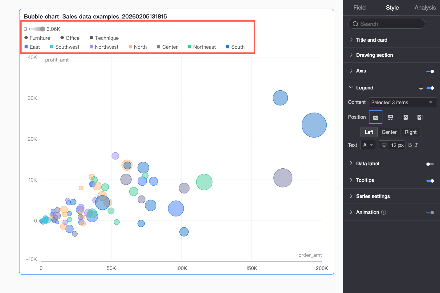
Configuration item | Description |
Content | Click the content checkbox. The drop-down list shows dimension fields currently configured in the Category, Color, and Shape fields. Select which fields to display in the legend. |
Position | Set the legend position and alignment.
Note When a playback axis field is configured, the legend position supports only Top. |
Text | Set the text style for the legend. Configure font color, size, weight, and italicization. |
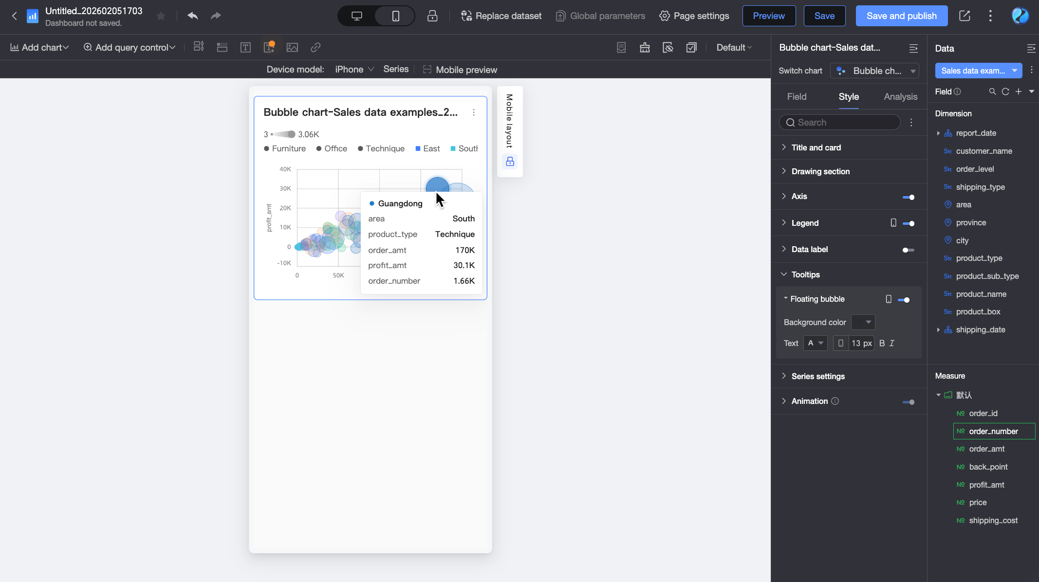
Mobile legend | PC and mobile legends are configured separately. Use the PC/Mobile toggle button ( |
 ) at the top of the dashboard editor to switch to mobile view. Then configure a mobile-optimized legend, including content, position, and text style.
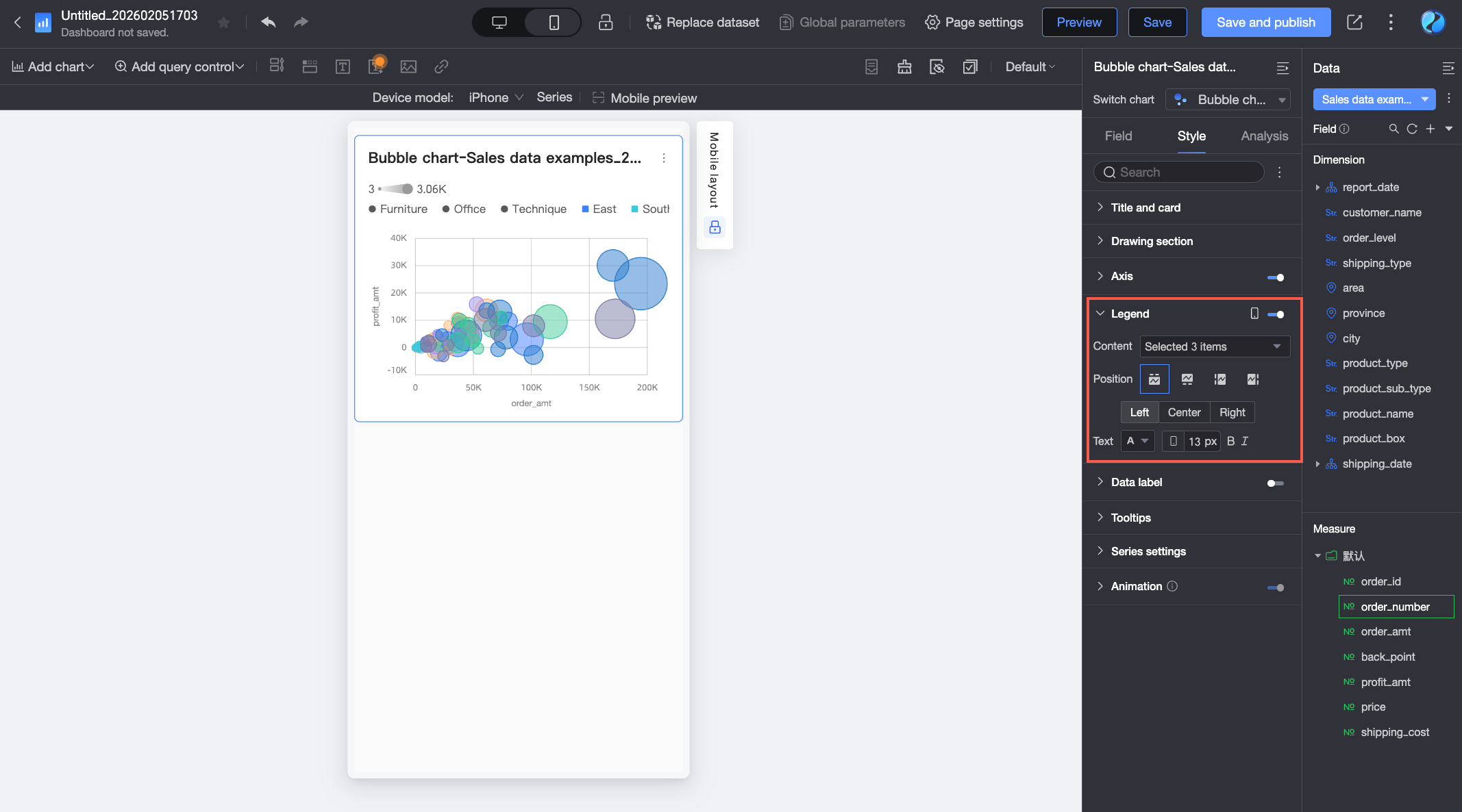
Data Labels
In the Data labels section, configure whether to show data labels, their position, and their style.
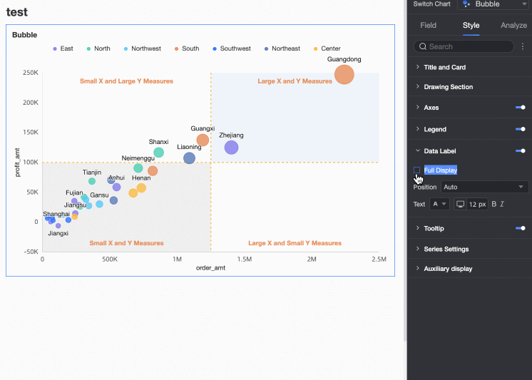
When a playback axis/time dimension field is configured, you cannot adjust the Position.
Tooltip
In the Tooltip section, configure whether to show tooltips and their style.
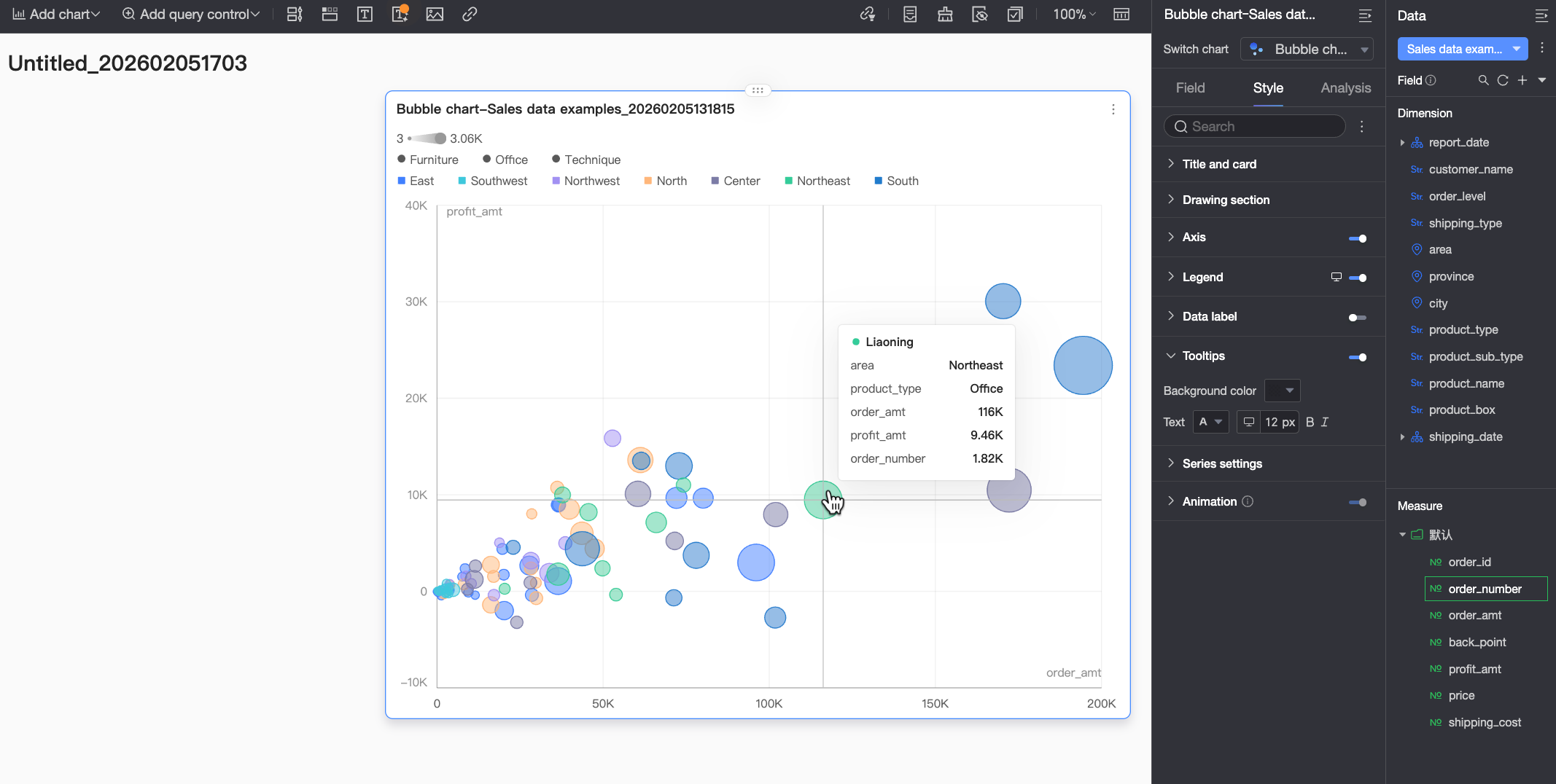
Configuration item | Description |
Background color | Set the background fill color for the tooltip. |
Text | Set the text style for the tooltip. Configure font color, size, weight, and italicization. |
Mobile tooltip | The tooltip settings for the PC and mobile views are independent. You can click the PC/Mobile switch button ( |
Series Settings
In the Series settings section, configure series styles.
Supplementary Display
In the Supplementary display section, configure the Playback axis:
Select Auto playback when page loads to play the animation once when the report loads.
Select Loop to repeat the animation continuously.
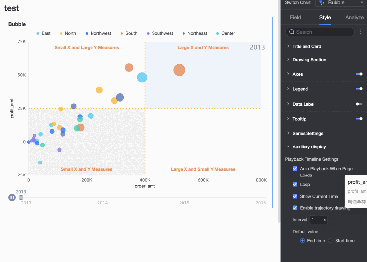
Select Show current time to display the corresponding time during playback.
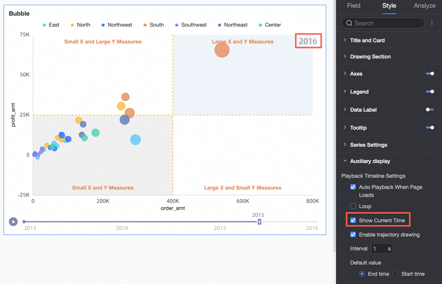
Select Enable trajectory drawing to draw the playback axis trajectory for a bubble when you click it.
Configure chart analysis
Configuration item | Name | Description |
Interactive analysis | Linkage | If your data is spread across multiple charts, use linkage to associate them for interactive analysis. For more information, see Linkage. |
Jump | If your data is spread across multiple dashboards, use jump links to associate them for interactive analysis. For more information, see Jump. | |
Analysis and alerting | Auxiliary line | A gridline is an auxiliary line that can be used to show the difference between the value of a measure and the reference value. The reference value is indicated by the auxiliary line. The reference value indicated by a gridline can be a fixed value or a calculated value. You can use the following calculated values: average, maximum, minimum, and median. For more information, see Metric analysis. |
Trend line | A trendline displays the overall trend of the data that you selected. Quick BI provides the following types of trendlines: Intelligent, Linear, Logarithmic, Exponential, Polynomial, and Power. For more information, see Metric analysis. Note Trendlines are supported only when the playback timeline is not used. | |
Annotate | - | If data in a chart is abnormal or requires extra attention, you can use background colors, icons, comments, or data points to mark the data. For more information, see Label. Note Labels are supported only when the playback timeline is not used. |
What to do next
You can share the dashboards that you created. For more information, see Share a dashboard.
To create a complex navigation menu for thematic analysis, you can integrate the created dashboard into the BI portal. For more information, see Create a PC-based BI portal. Show gridlines: Specifies whether gridlines are displayed on the axis, including line style, line width, and color.