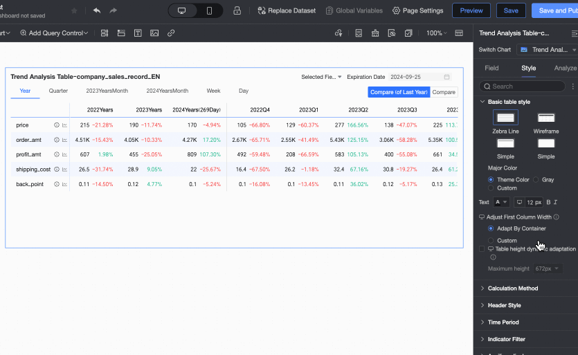
The trend analysis table is specially designed for business decision-making scenarios in Quick BI. It supports the intuitive display of metric trends across different time granularities such as yearly, quarterly, and monthly through a combination of tables and trend charts. As a time series data visualization tool, it can compare historical data and analyze target completion rates.
Overview
Scenarios
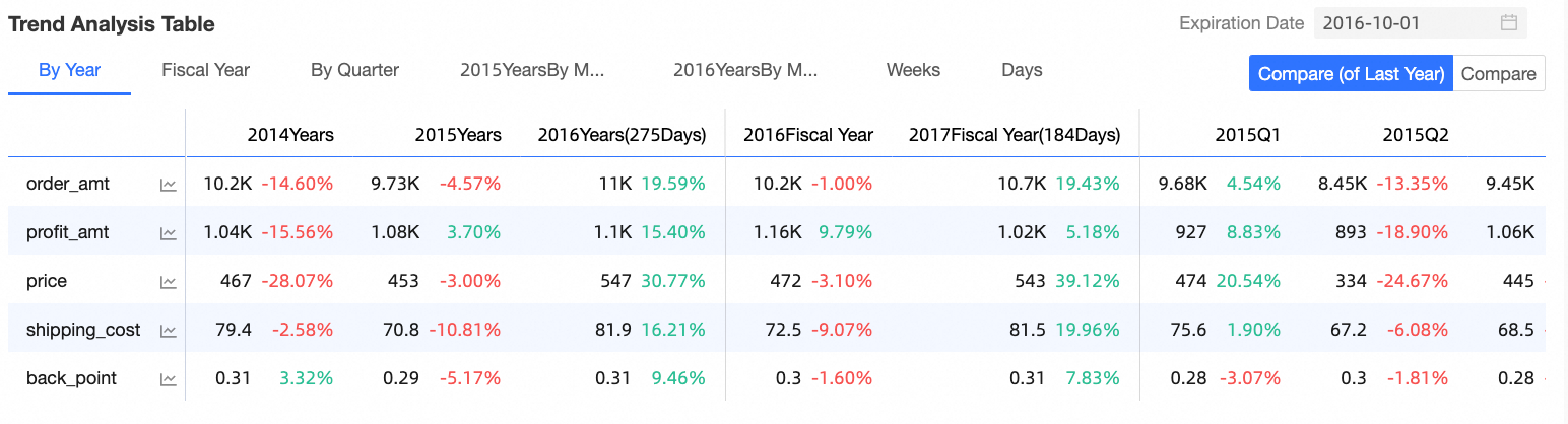
Commonly used for macro indicator analysis, this chart can analyze data for years, quarters, months, weeks, fiscal years, and the last 7 days. It also allows for further comparison, trend, average, and normalization analysis of individual indicators.
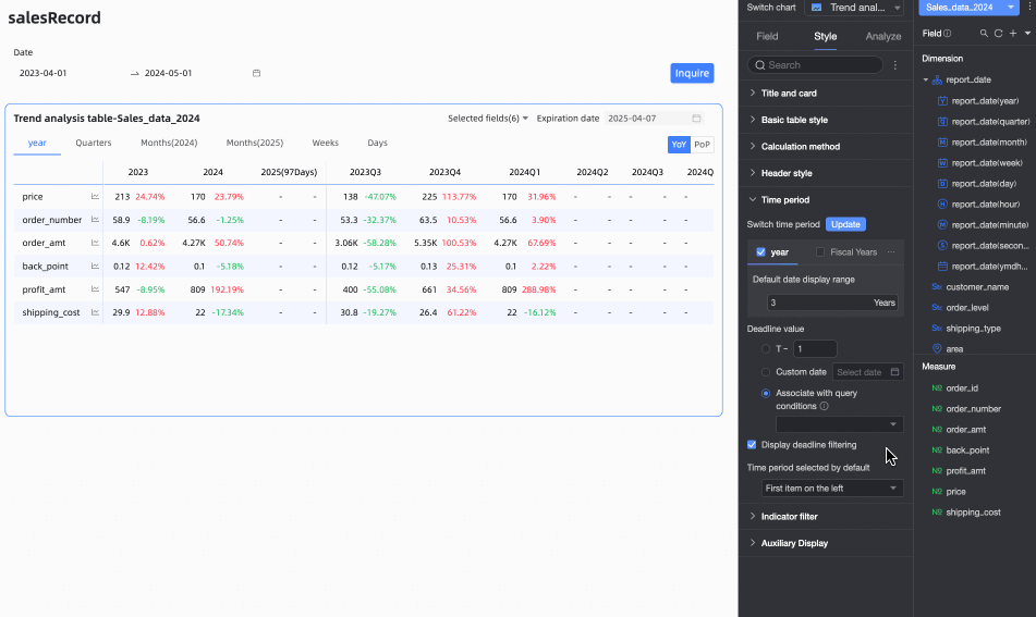
Sample Chart
Core Advantages
Multidimensional analysis: Supports comparison (year-on-year/chain ratio) across time granularities such as day, week, month, and year
Target management: Built-in target value entry and completion rate analysis functions
Enhanced interaction: Click on metrics to display pop-up trend charts for in-depth analysis
Limits
Prerequisites
You have completed data modeling. The dataset must include date fields, and the date fields must be of day granularity (such as Order Date (day)). For more information, see Create a dataset.
You have created a dashboard. For more information, see Create a dashboard.
When adding data to a trend analysis table, the dataset must include date fields of day granularity (such as Order Date (day)), with the following limitations:
The number of columns is determined by the date field and the number of time periods. You can select only one dimension field with day-level granularity, and the number of time periods cannot exceed 1,000.
The number of rows is determined by the number of measures. You must select at least one measure, and the total number of measures cannot exceed 300.
Graph Data Configuration
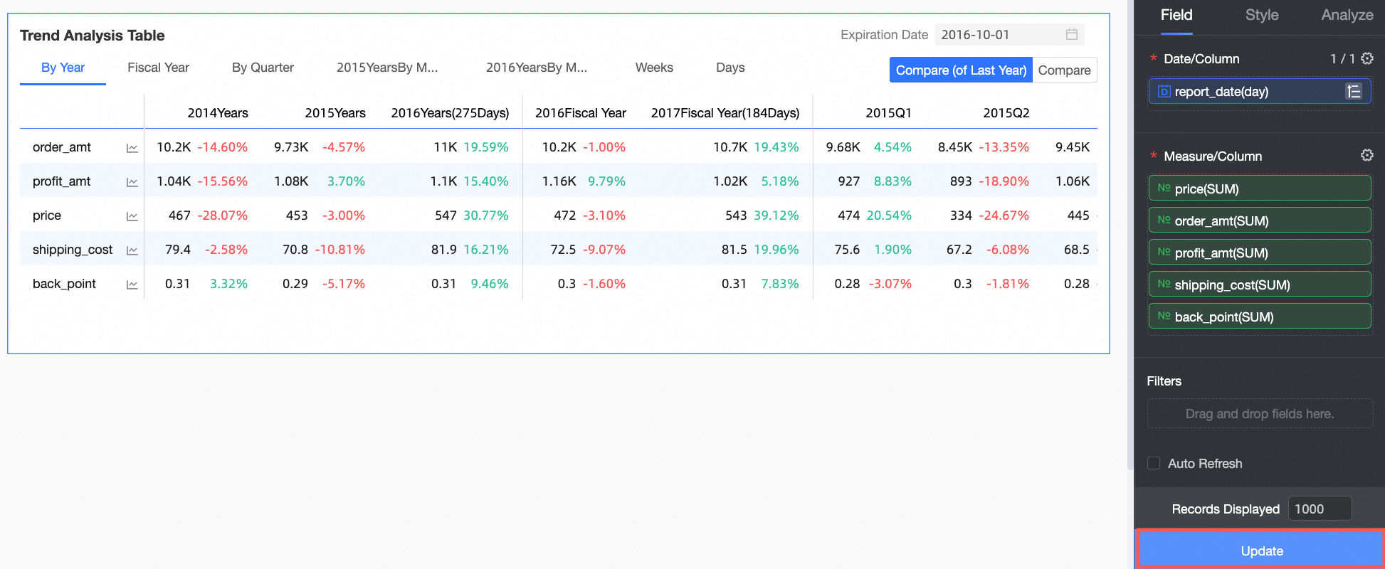
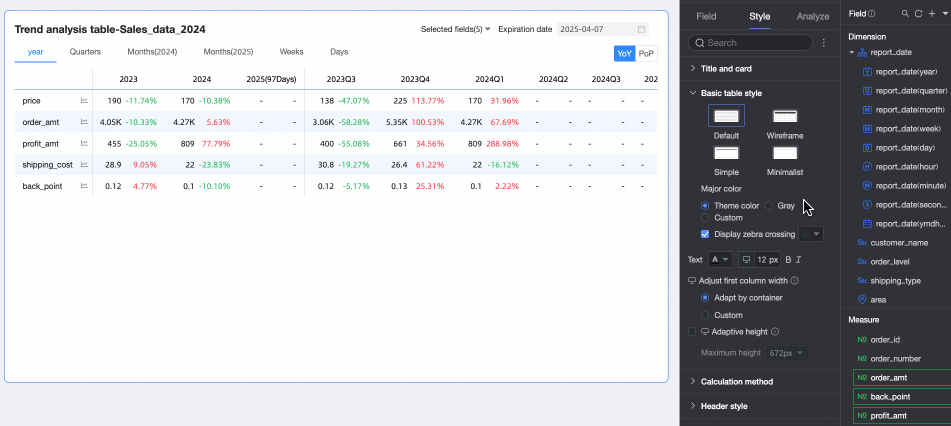
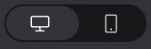
On the Chart Design tab, click the Data tab, and select the required dimension fields and measure fields.
In the Measure list, find Order Amount, Profit Amount, Shipping Cost, Unit Price And Discount, and double-click or drag them to the Measure/Row area.
In the Dimension list, find Order Date (day), and double-click or drag it to the Date/Column area.
NoteDate/Column only supports adding date fields of day granularity.
Click Update. The system automatically updates the chart.
Configure the Chart Style
On the Field tab, click the
 configuration icon next to Measure/Column, and follow the instructions in the following figure to configure the tree style of the trend analysis table.
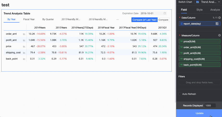
On the Style tab, configure the style of the trend analysis table. For information about common style configurations of charts, see Configure the chart title.
You can enter keywords in the search box at the top of the configuration area to quickly find configuration items. You can also click the
 icon on the right to expand/collapse all categories.
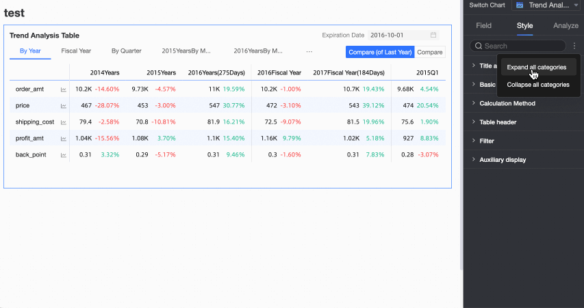
In Basic Table Style, configure the basic style of the table.

Configuration item name
Description
Custom Table Theme
Set the appearance style of the trend analysis table.
Theme Style: Supports four types: Default, Border, Simple, Minimalist.
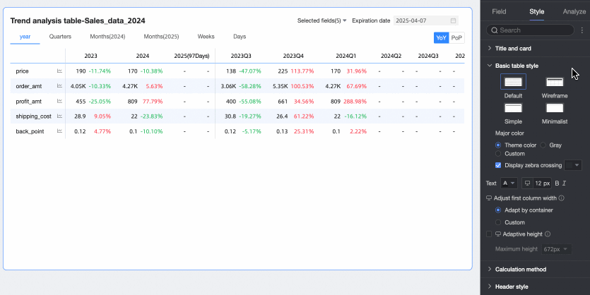
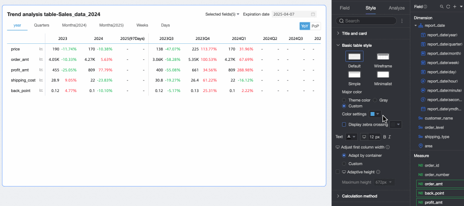
Main Color Scheme: When the table theme style is Default, Border, or Simple, you can select the main color scheme for the trend analysis table's appearance. Options include following the Theme Color, Gray, or Custom.
Display Zebra Stripes: Choose whether to display zebra stripes in the trend analysis table and the color of the zebra stripes.
First Column Width Adjustment
Sets the width of the first column in the trend analysis table. You can switch the preview mode
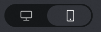 at the top of the page to set the first column width for the trend analysis table on PC and mobile devices. The supported adjustment methods include the following:
Adapt to Container: The system automatically adjusts the column width based on the field values.
Custom: Sets the display width of field values. The unit is pixels, and the default value is 160.
Dynamic Table Height Adaptation
Sets whether the table height automatically adjusts based on the table content.
You can switch between PC and mobile settings by clicking the
 icon at the top of the page. When this feature is enabled, the table container height will automatically adjust based on the data content, which may affect the overall layout of the report. Please decide whether to enable it based on your actual needs.
Maximum Height
When Dynamic Table Height Adaptation is enabled, you can set the maximum value for the adaptive height. After setting, the table will adjust its height based on the set maximum height value during dynamic adaptation. That is, when the adaptive height is greater than the maximum height, the table height will be the maximum height; when the adaptive height is less than the maximum height, the table height will be the adaptive height.
You can switch between PC and mobile settings by clicking the
icon at the top of the page. The supported heights include the following: 192px (about 5 rows), 352px (about 10 rows), 672px (about 20 rows), 1632px (about 50 rows), and Custom. 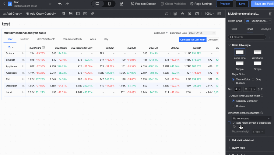
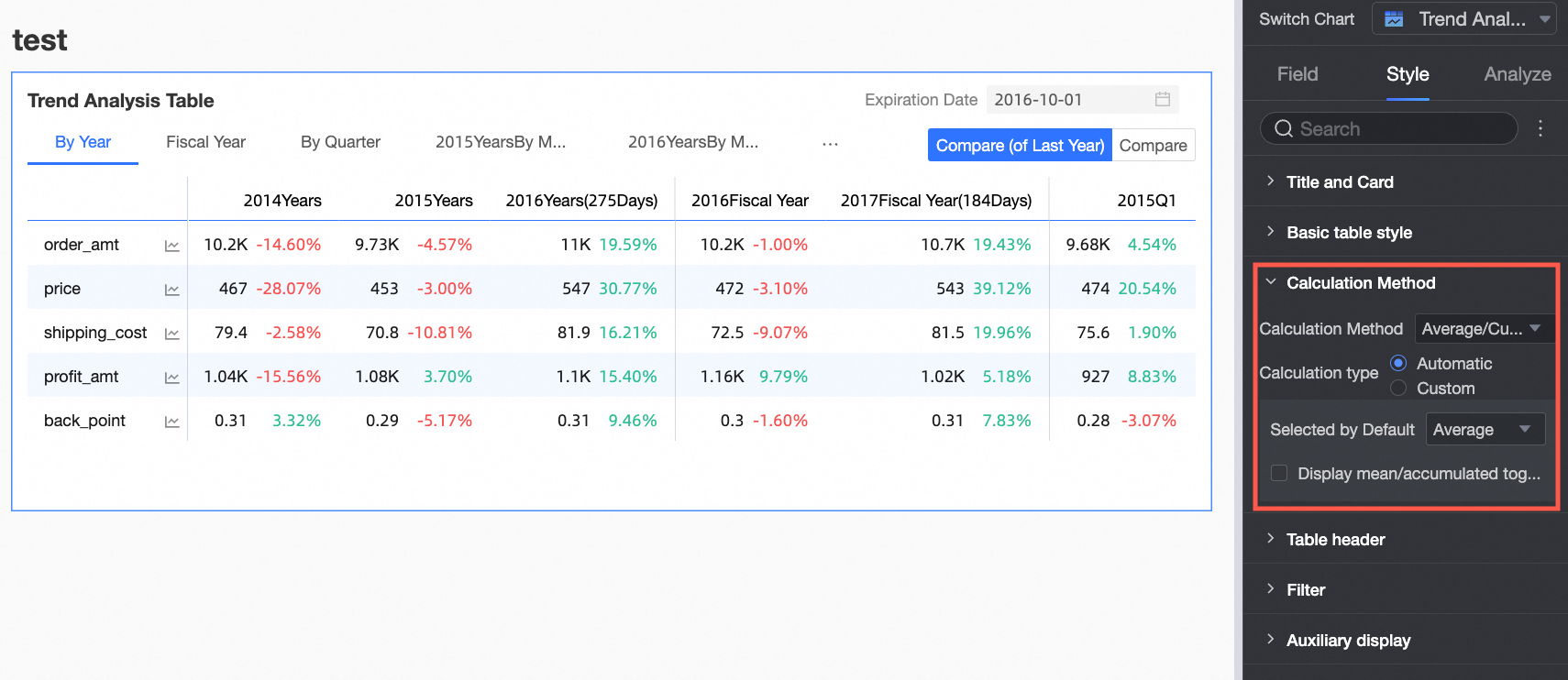
In Calculation Method, set the calculation method for the trend analysis table.
Configuration item name
Description
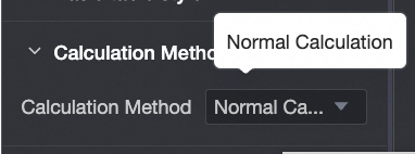
Calculation Method
Supports setting the calculation method for the trend analysis table.
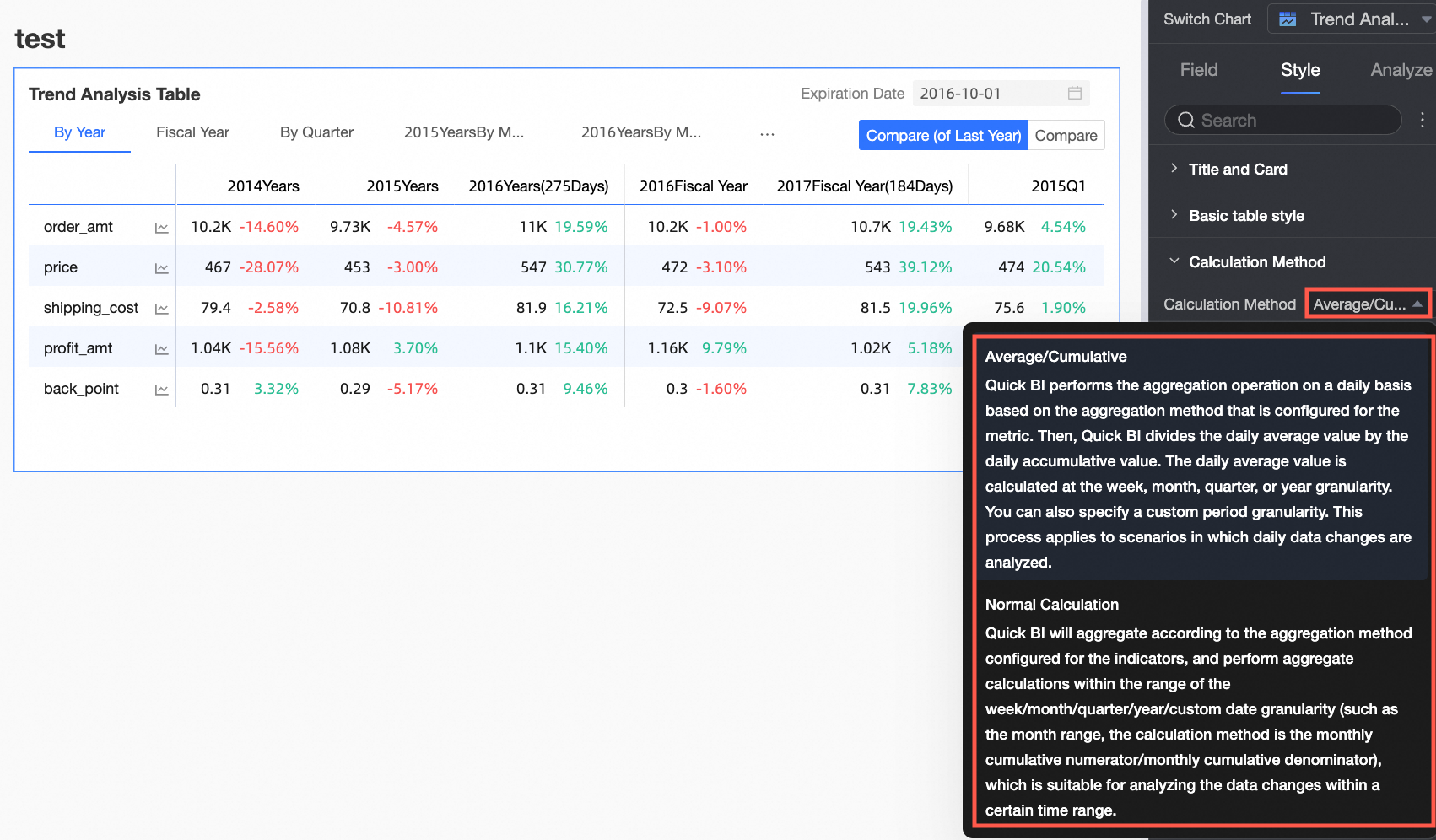
The calculation method can be Average/Cumulative or Regular Calculation. The default is Average/Cumulative.
NoteFor information about the data sources that support regular calculation and average/cumulative calculation, see Data Source Function Item List.
If you click Average/Cumulative, you need to configure related settings. If you switch to Regular Calculation, no configuration is needed.
NoteRegular Calculation: Quick BI aggregates data within the date range of week/month/quarter/year/custom date granularity according to the aggregation method configured for the metric (such as within a month, the calculation method is month cumulative numerator/month cumulative denominator). It is suitable for scenarios where you need to analyze data changes within a certain time range.
Select the Enable Average/Cumulative Switch Button check box. The Average and Cumulative switch buttons will appear in the upper right corner of the chart. The button color will follow the settings in the table's Main Color Scheme.
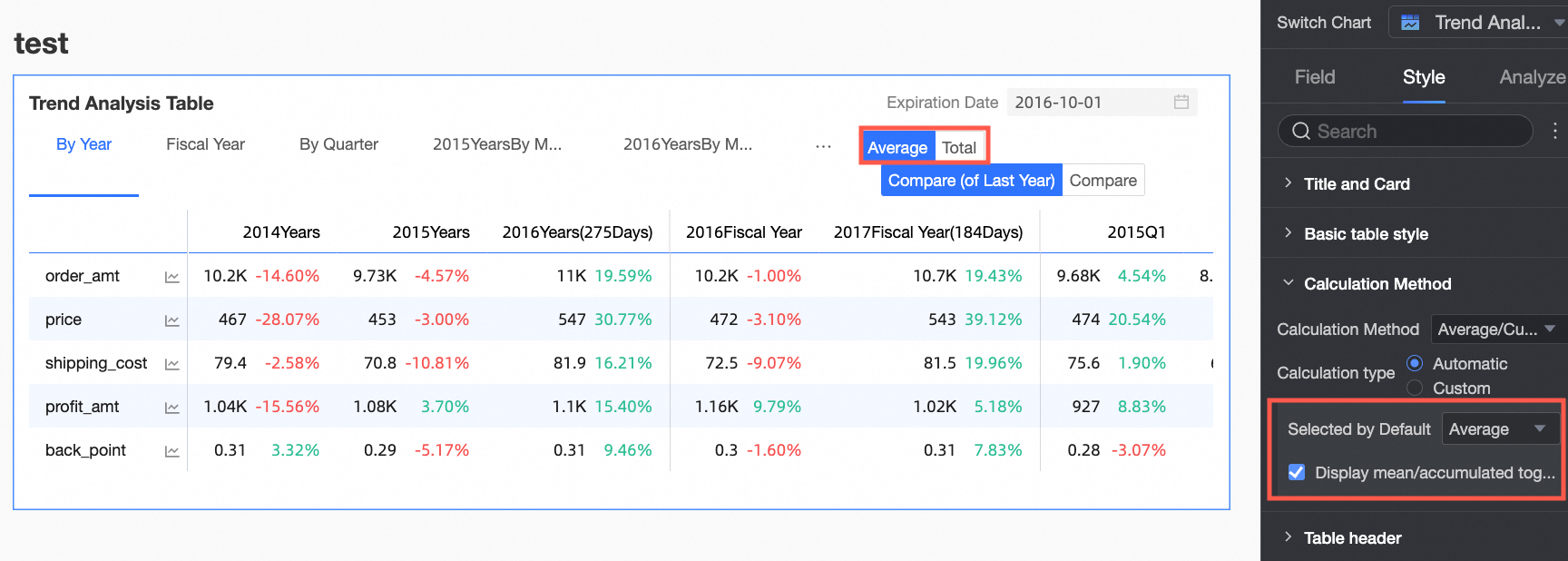
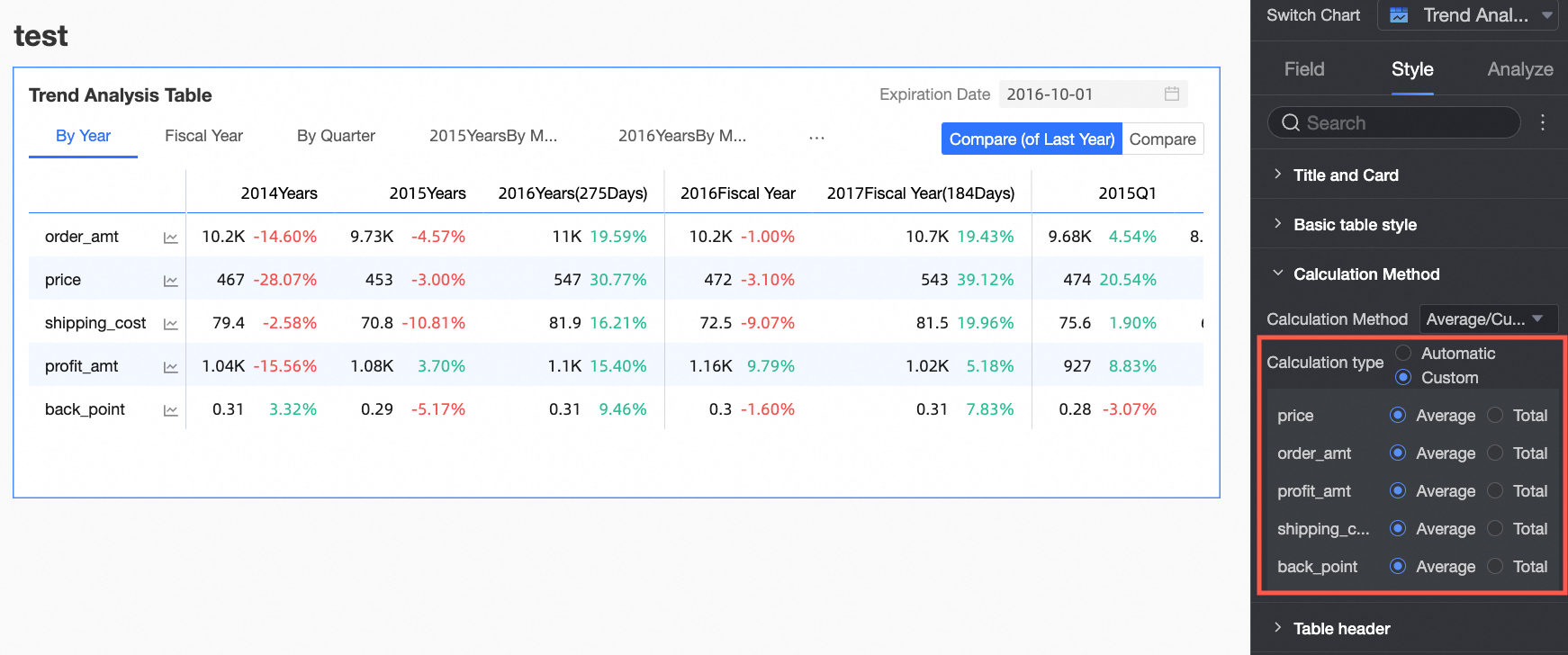
Select the Customize Average/Cumulative Switch check box to manually set the Average/Cumulative calculation method for each measure.
In Header Style, set the style of the row and column headers of the trend analysis table.

Configuration item
Content
Description
Column Header
Background Fill
Sets the background fill color of the column header.
Text
Sets the text style of the column header.
Row Header
Background Fill
Sets the background fill color of the row header.
Text
Sets the text style of the row header.
In Time Period, set the time period switch and the default end date value.

Configuration item name
Description
Time Period Switch
Supports switching by Year, Fiscal Year, Quarter, Fiscal Quarter, Month, Week, Day, and also supports Custom Time Granularity periods.
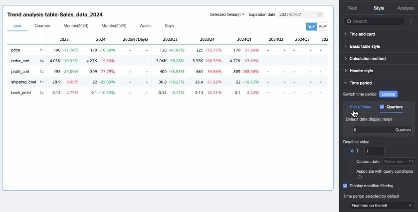
Except for custom time granularity periods, other time periods support setting Default Date Display Range.
Fiscal Year supports configuring the Fiscal Year Cycle Start Month, which can be selected from January to December, with April as the default.
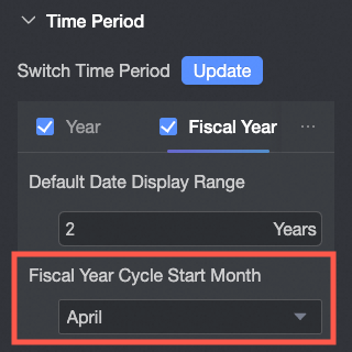 Note
NoteThe fiscal year cycle start month of the trend analysis table is independent of the fiscal year configuration in the date attribute of the dataset. That is, the fiscal year cycle start month configuration here is not related to the fiscal year configuration of the dataset.
Week range definition: When the calculation method is "Regular Calculation", you need to download the function script and run it on the corresponding data source to customize the week range.
After running, you can select the week range.
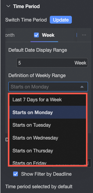 Note
NoteFor information about the data sources that support custom weeks (week start time), see Data Source Function Item List.
Fiscal Quarter's Fiscal Year Cycle Start Month follows the fiscal year cycle configuration.
Default End Date Value
Sets Display Date Filter and sets the default value. When you select the Display Date Filter check box, the word End Date will appear in the upper right corner of the chart.
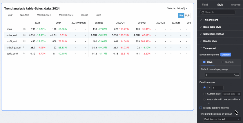
The End Date Value can be set to T-X, Custom Date, or Associated with Query Condition.
T-1: The end date value is the Xth day counting backward from the current time (Today). The value of X can only be a positive integer. For example, when X is 1 and the current time is 2024-1-16, the end date displays 2024-1-15.
Custom Date: The end date value is customized as needed.
Associated with Query Condition: The end date value is associated with the time-type query condition of the current table. When previewing, the corresponding value of the selected query condition will be written into the table end date to improve data viewing efficiency. This is suitable for scenarios such as using query controls to control the data display range of multiple trend/multidimensional analysis tables. The specific rules are:
When adding a regular query control to the dashboard, you need to select the associated chart and its date field in Associated Charts and Fields, and the Display Type of the query control needs to be Date Selection.

When the Filter Method of the query condition is Range, the Range Type does not support selecting Start From, but other options are available (i.e., it should include a time that can be parsed as an end date). After selection, the end date will take the end date of the range. For example: If the range is set to 2023.10.19-2023.11.30, the end date will be 2023.11.30.
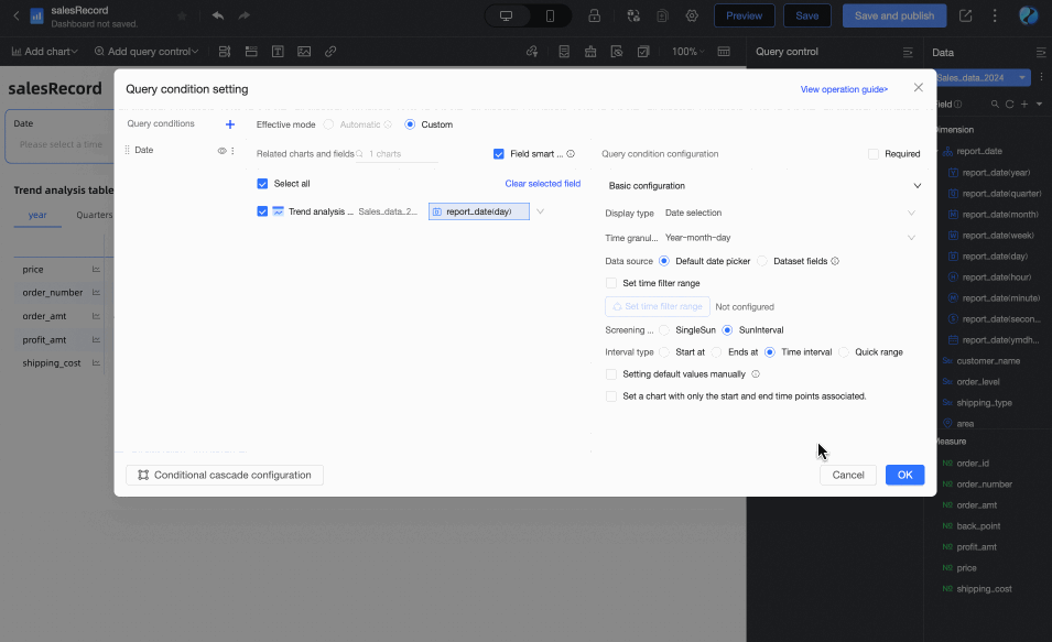
When the Filter Method of the query condition is Single Day, the end date will take the selected day. For example: If you filter January 1, 2024, the end date will also be January 1, 2024.
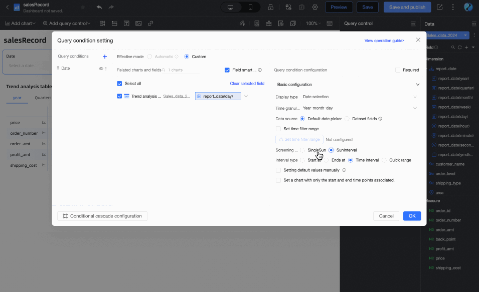
When you select Associated with Query Condition but do not set which specific query condition to associate with in the drop-down list, the end date is considered to be T-1. That is, if the current date is 2024.12.17, the end date will be 2024.12.16.
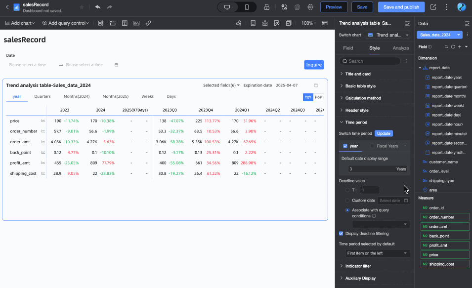
Default Selected Time Period
You can customize the Default Time Period option. The default is the first item on the left.
In Auxiliary Display, you can set the Scrollbar Display Method and the Thickness of the Scrollbar.
When you set the display method to Show on Mouse Hover, the scrollbar is only displayed when you place your mouse on the table.
When you need the scrollbar to be always visible, you can select Always Show.
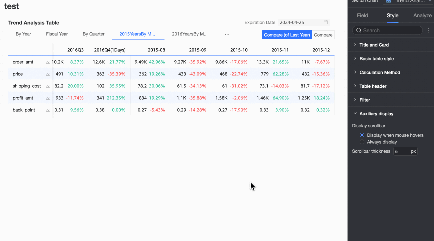
When you need to make the scrollbar more noticeable, you can adjust the thickness of the scrollbar.
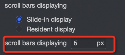
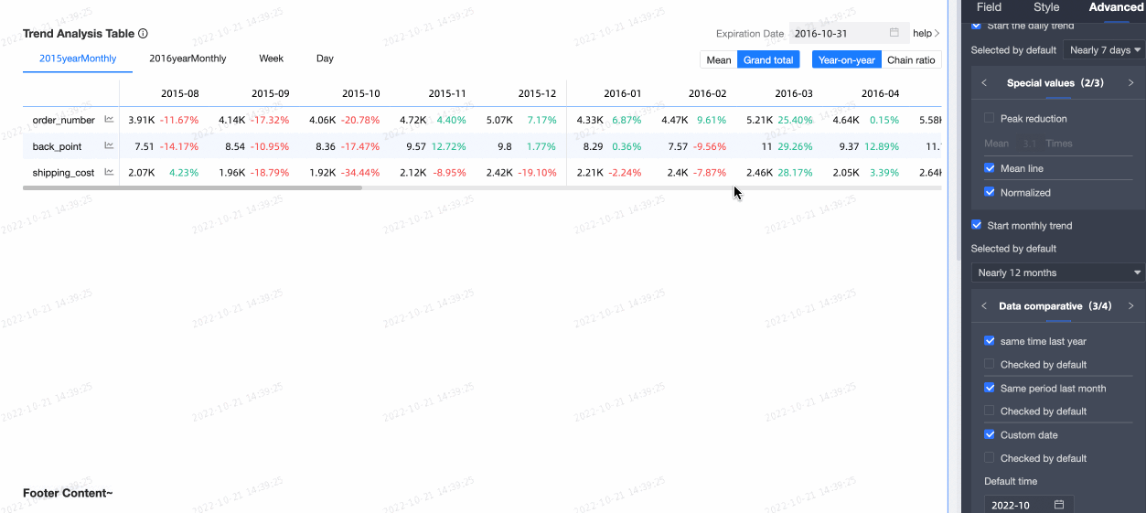
Chart Design On the Chart Design tab, click the Analysis tab, and configure the data comparison for trend analysis in the section.
Select the Enable Table Data Comparison check box. The words Year-on-year and Chain Ratio will appear in the upper right corner of the chart.
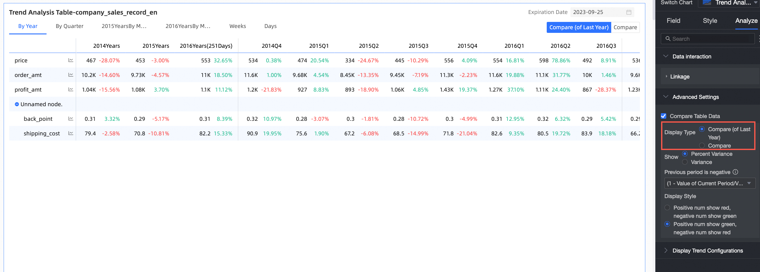
Display Type: Supports two types of comparison content: Year-on-year and Chain Ratio.
NoteThe date fields are of day granularity. Therefore, you can configure the Year-on-year and Chain ratio parameters for data of day, week, month, quarter, and year granularities, and custom periods. You can compare data as needed.
Display Content: Supports Difference Percentage and Difference Value.
Difference Value = Current period data - Previous period data.
Difference Percentage = [(Current period data - Previous period data) / Previous period data] × 100%
Taking the previous period data (week range 2015-9) and current period data (week range 2015-10) as an example, let's examine the difference value and difference percentage of orders in this range.
From the figure below, you can see that the current period data is 6113, the previous period data is 6577, so the difference value is -464 (
-464=6113-6577).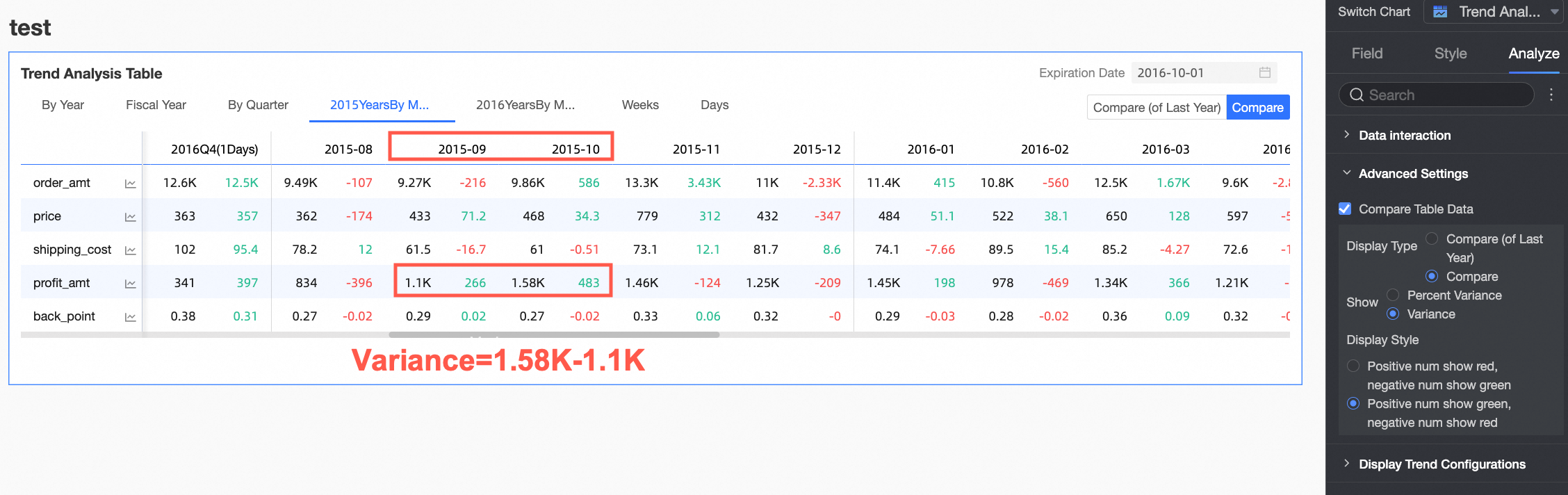
From the figure below, you can see that the current period data is 6231, the previous period data is 8118, so the difference percentage is
-7.06%(-7.06%=[(6113-6577)/6577]*100%).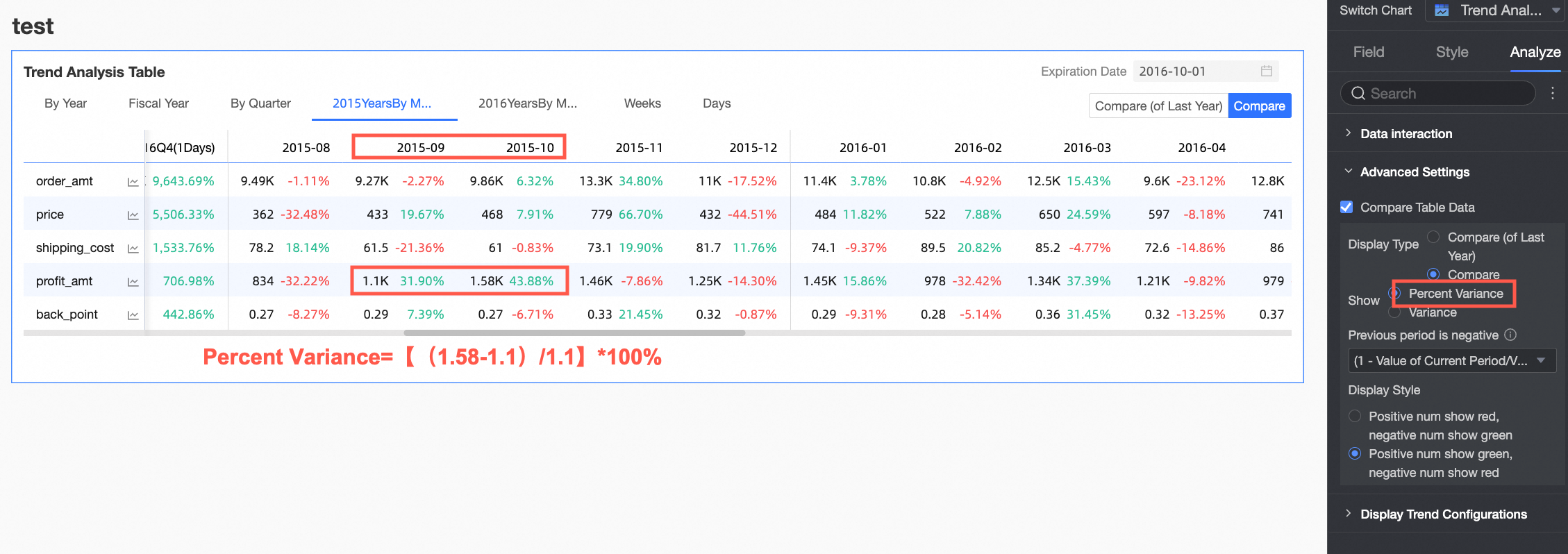
Display Style: Configure the display colors for positive and negative numbers. You can choose to follow the Global Semantic Color Settings (i.e., follow the settings in Page Settings > Global Style > Semantic Color).

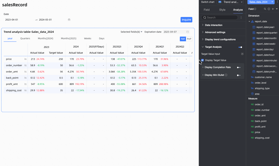
Chart Target Analysis Configuration
In actual business scenarios, business teams often set target values for key performance indicators within specific time periods, such as quarterly sales targets or annual profit targets. Through the target analysis function, actual values and target values can be presented in the same chart, intuitively showing the differences between them, helping business teams better analyze target completion rates and adjust business strategies in a timely manner.
After completing the field panel configuration for the trend analysis table, you can enable the Target Analysis feature in the Analysis panel and configure related settings.

Configuration item | Content | Description |
Target value entry Click the | Fill in the target value | Based on your actual business requirements, enter the target values for each indicator in specific time periods in the Target Value Entry Form, then click OK. Note
|
Export the form | Click the Export Form button to download the current form as an Excel file to your local device. You can send this Excel file to the corresponding business personnel for completion, thereby collecting target value data. | |
Import target value | Click the Import Target Value button to upload the offline collected target value data file to the system. The system will automatically detect the file content and fill it into the form. Note
| |
Update | To preserve the target values that have been filled in, the input form will no longer automatically update its structure with the trend table after it is first generated. If you change the field configuration or time period configuration of the table after filling in target values, you can click Update, and the system will update the row and column structure of the target value input form based on the current trend table structure. | |
Clear | When you need to clear all the target value data that has been filled in with one click, you can click Clear to empty all existing data in the table. | |
Display Target Value | Choose whether to display target values in the trend analysis table. When the target analysis feature is enabled, it is selected by default. | |
Display Completion Rate Turn on the | Configure completion rate calculation method | Click the
|
Custom Header Name | Select this option to customize the header name of the completion rate column in the input box. | |
Custom Completion Rate Font Color | When you select this option, you can set corresponding font colors for completion rates at different stages to visually represent the development status of the data. | |
Display Mini Bullet Chart Turn on the | Custom Header Name | Select this option to customize the column header name of the bullet chart in the input box. |
Bar Color | Customize the color of the bullet chart bar. | |
Target Line Color | Sets the color of the target line in the bullet chart. | |
Background Color | Sets the color of the bullet chart column background.
| |
 icon to open the entry window

 switch to display the completion rate
 icon to configure the completion rate calculation method for each measure indicator in the Configure Completion Rate Calculation Method dialog box. You can select from the following three calculation methods:


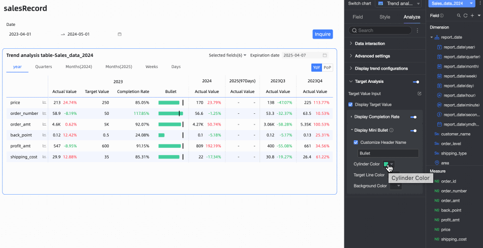
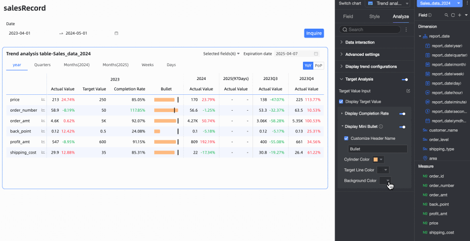
Chart Preview Configuration
On the preview page of the trend analysis table, you can adjust the display effect of the table to improve data viewing efficiency and experience.
Configure a Trend Analysis Chart
Click the trend icon on the chart (as shown below) to see the trend analysis chart of the indicator. 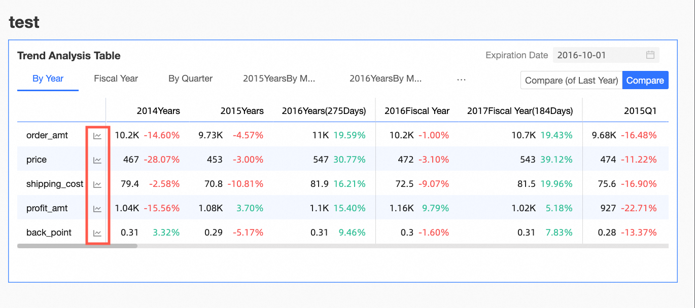
You can configure the trend analysis chart in the Chart Design's Analysis tab under Pop-up Trend Settings.
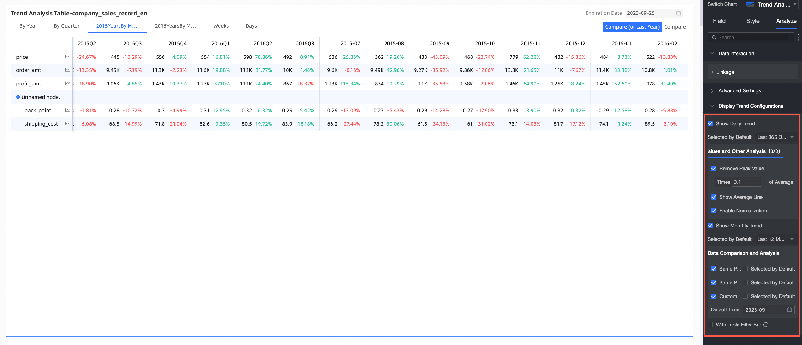
Configuration item | Description |
Enable Daily Trend and Enable Monthly Trend | After you turn on this feature, you can view the daily trend and monthly trend of the metric on the trend analysis chart. |
Data Comparison Analysis | Includes Same Period Last Year, Same Period Last Month, Same Period Last Week, Previous Day, and Custom Date.
|
Special Value And Other Analysis | Includes Remove Peak, Average Line and Normalization. You can analyze special values for data analysis and decision-making. |
Comparison Metrics | You can compare multiple metrics at the same time for data analysis. |
Hide Empty Value Columns
When previewing the trend analysis table, if you perform time filtering or other operations, many empty columns may appear (because they do not display data as they are not within the filtered time range). In this case, you can use the hide all empty value columns feature to quickly hide interfering columns. You can choose to Hide Single Column or Hide All Empty Value Columns. 
Hide All Empty Value Columns: Click any column header, and select Hide All Empty Value Columns from the drop-down list. This will batch hide columns that contain only empty values (displayed as '-') based on the cell data already displayed in the table.
You can click the
 icon to unhide certain columns, or click the column header again and select Show All Hidden Columns from the drop-down list to unhide all empty value columns.
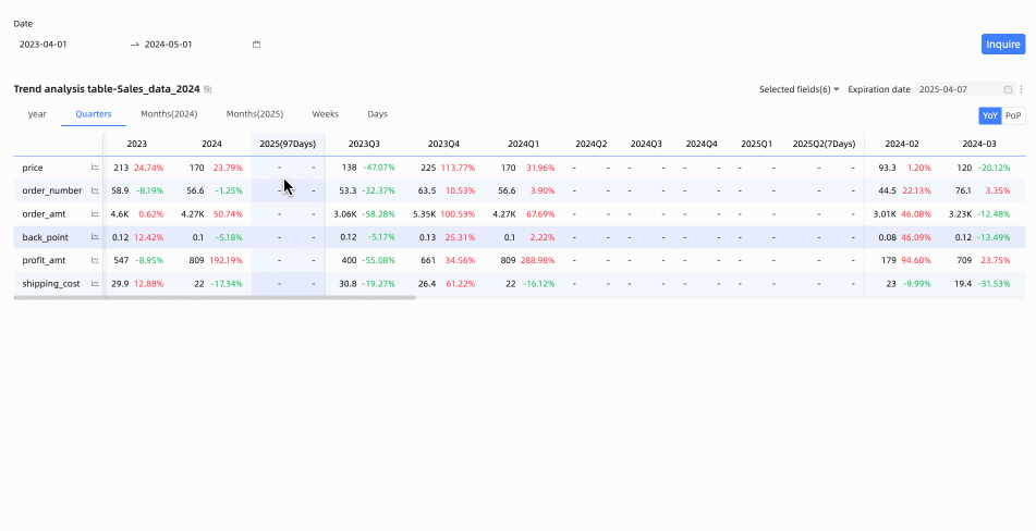
Hide Single Column: When editing or previewing a trend analysis table, if you temporarily do not want a specific time column to be displayed, you can hide specific columns using the hide column feature. Click the header of the target column you want to hide, and select Hide Column from the drop-down list.
You can click the
icon to unhide.
Restore Default Filter Fields
Through the field filter panel, you can select the measure indicators that need to be displayed in the trend analysis table as needed. After reselecting fields, to restore the default selected fields, you can click the  icon in the upper right corner of the table, or click Restore Default in the upper right corner of the field filter panel to reset the filter fields to the default state.
FAQ
1. What are the main differences between trend analysis tables and multidimensional analysis tables?
Answer: The main difference is in column configuration. Trend analysis tables can only place one time dimension of day granularity in the columns, focusing on how indicators change over time. Multidimensional analysis tables, however, can place not only time dimensions but also multiple business dimensions (such as region, product category) in rows or columns (depending on configuration) for more complex multidimensional cross analysis.
2. How do I set up year-on-year and month-on-month growth rates in a trend analysis table?
Answer: In chart editing mode, go to the Analysis tab, find Advanced Settings, and select Enable Table Data Comparison. Then select Difference Percentage in Display Content, and choose Year-on-year or Chain Ratio for Display Type based on your needs. After setting, a year-on-year/chain ratio toggle button will appear in the upper right corner of the chart during preview, and the table will display the corresponding percentage data.
3. Why do I get an error message when I select a date field for the "Date/Column" area?
Answer: The trend analysis table has strict requirements for fields in the Date/Column area: it must be a date type field of day granularity. Please check if your selected date field meets the day granularity requirement (for example, the field name might need to be similar to Order Date(day)). Date fields of other granularities such as year, month, or week cannot be directly used in this area.
4. How can I quickly remove empty columns (showing '-') when previewing the table?
Answer: In preview mode, hover your mouse over any column header, click the dropdown arrow that appears, and select Hide All Empty Value Columns from the menu. The system will automatically hide columns where all visible cell data are empty values, making the table more compact.