An indicator trend chart is a metric visualization component in Quick BI, primarily used to display the latest data or aggregated data of one or multiple key metrics (measures), combined with their change trends over a selected time period. This chart format combines key values with trend lines (or area charts, bar charts), enabling users to quickly assess metric performance, especially by observing trend changes to identify potential business anomalies or highlights.
The visualization configuration and content display for indicator trend charts were upgraded in version 5.5.2. This upgrade may change the style of some components on PC and mobile clients. If necessary, you can adjust the styles manually or contact Quick BI service personnel for assistance.
Prerequisites
The dashboard is now created. For more information, see Create a Dashboard.
Overview
Advantages
Calculation capability: You can configure advanced calculation features with a few clicks to compare values with historical data.
Data visualization: You can add logos to the chart and configure settings such as background, font size, and color.
Other capabilities: You can add remarks including text and metrics. You can also add hyperlinks to connect metrics to other platforms.
Scenarios
In specific scenarios, you need to monitor metric changes to detect potential business exceptions. An indicator trend chart displays metric values and their change trends over a period.
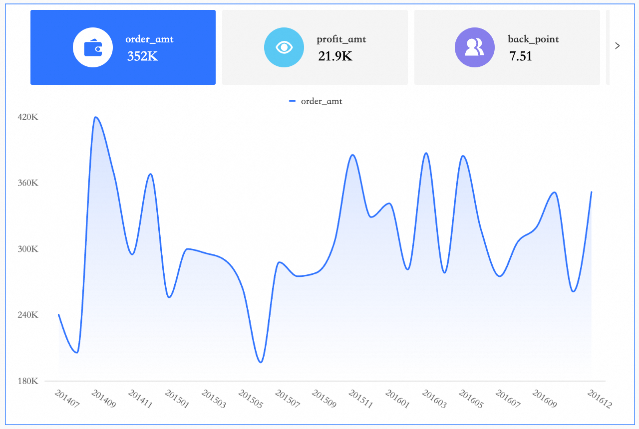
Sample Chart
Limits
To ensure the proper use of indicator trend charts, note the following prerequisites and configuration limitations.
Prerequisites: You need to create a dashboard. For more information, see Create a Dashboard.
Field Configuration Limitations:
An indicator trend chart consists of Indicator (Measures) and Date (Dimensions):
You can specify only one dimension in the Date (Dimensions) section, such as shipping_date(day).
You must specify at least one measure in the Indicator (Measures) section, such as order_number or order_amt.
Graph Data Configuration
On the Fields tab, select the required dimensions and measures:
In the Dimensions list, find order date (day), double-click or drag it to the Date/Dimensions area.
In the Measures list, find order_number, order_amount, shipping_cost, and profit_amount, and double-click or drag them to the Indicator (Measures) section.
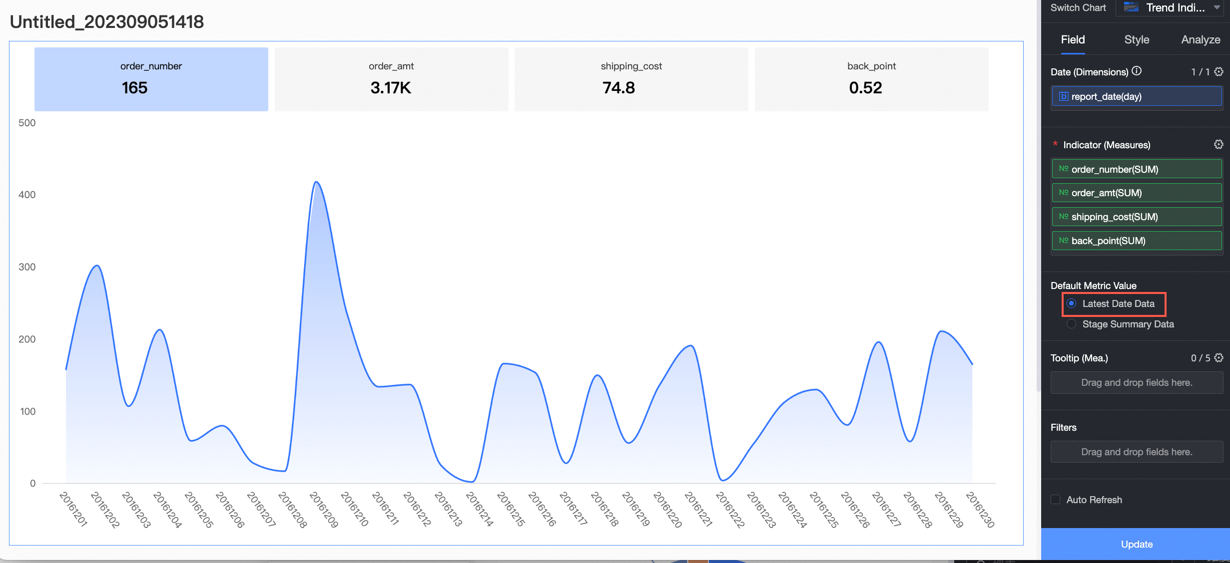
Select Default Value Of Indicator and click Update. The system automatically updates the chart.
Latest Date Data: Indicates that the value displayed on the indicator card is the data from the latest time point within the currently selected time range.
If you select Latest Date Data, the indicator card displays the data of the last day (December 30, 2016).
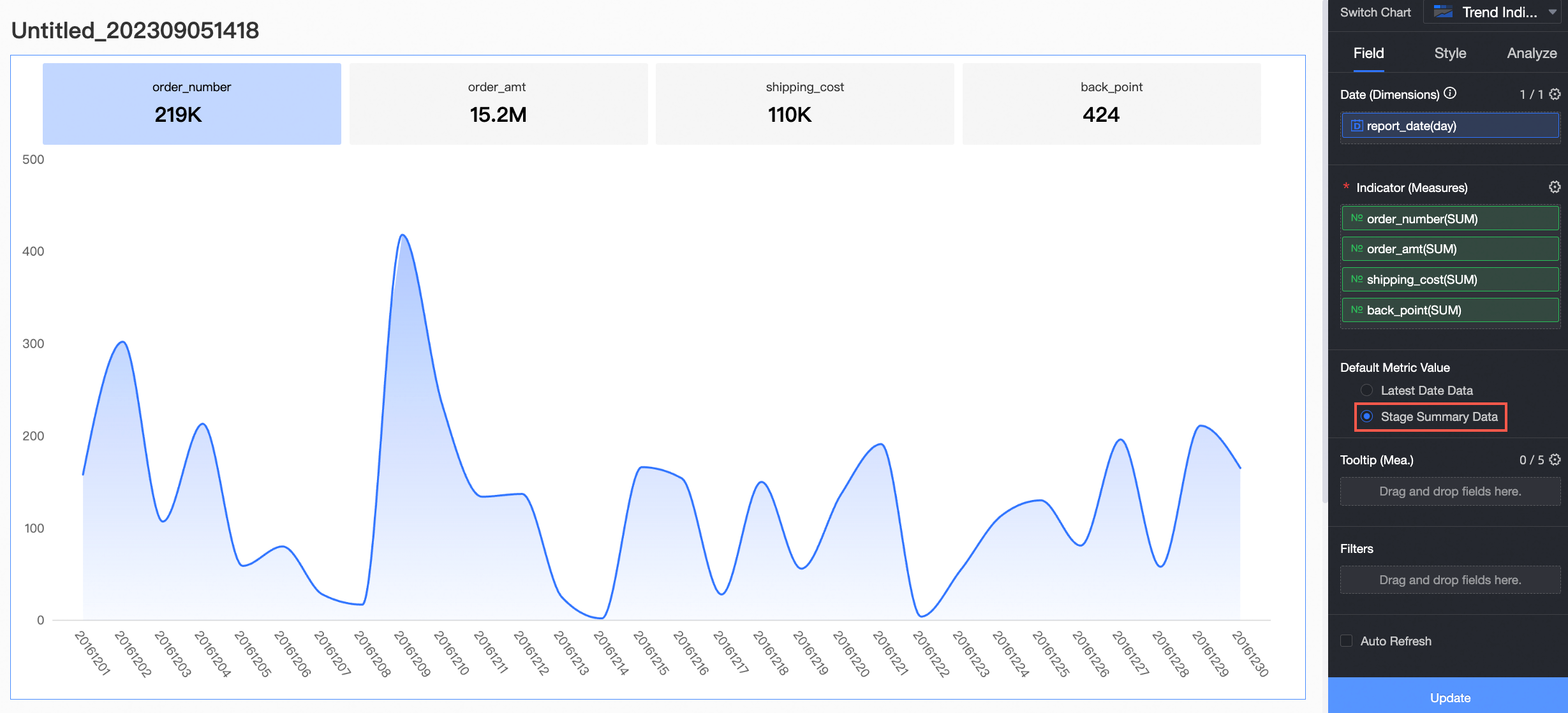
Aggregated Data: The indicator card displays the aggregated data of the time range.
If you select Aggregated Data, the indicator card displays the aggregated data of the time range (December 1, 2016 to December 30, 2016).
Configure the chart style
This section describes how to configure the style of an indicator trend chart.
Chart type
You can select the layout type for the chart. The chart type determines how indicator blocks and trend charts are arranged. The following three types are supported.
Chart type | Description |
Indicator tab trend chart | Displays each indicator value and its corresponding trend chart in separate tabs. Users can click different indicator tabs to view their specific trend charts. This chart type helps keep the report interface clean, avoids overwhelming users with too much information at once, and allows them to focus on the current content.
|
Small trend chart (top and bottom) | Displays each indicator value and its corresponding trend chart side by side, with the indicator value arranged above or below the trend chart. This chart type is suitable for situations where you need to view both the indicator value and its trend simultaneously. This helps users quickly understand the indicator's changes.
|
Small trend chart (left and right) | Displays each indicator value and its corresponding trend chart side by side, with the indicator value arranged to the left or right of the trend chart. This chart type helps users compare indicator values and their trends within the same view. Compared with the Small trend chart (top and bottom) type, it is more suitable for wider screens to clearly display information on both sides.
|


Indicators
On the Indicators tab, you can configure the indicator settings for the chart.
Quick layout
You can set the arrangement of primary and secondary indicators in the chart. For example, if the secondary indicator is the year-on-year comparison for each indicator, you must set the layout style for each indicator and its year-on-year comparison in the tab. If secondary indicators are not enabled, this setting controls the arrangement of the indicator name and its value.
Layout type
Sample image
Layout 1

Layout 2

Layout 3

Layout 4

Layout 5

Layout 6

Layout 7

Indicator layout
In the Indicator layout section, you can set the layout style of indicator blocks. The available configuration items vary depending on the chart layout type.
If you select Indicator tab trend chart for Chart type, you can configure the following items.

Configuration item
Description
Indicator and trend chart interaction
Supports Single Selection and Multiple Selection.
Single Selection: Displays the trend chart for only one measure.
Multiple Selection: Displays the trend charts for multiple measures simultaneously.
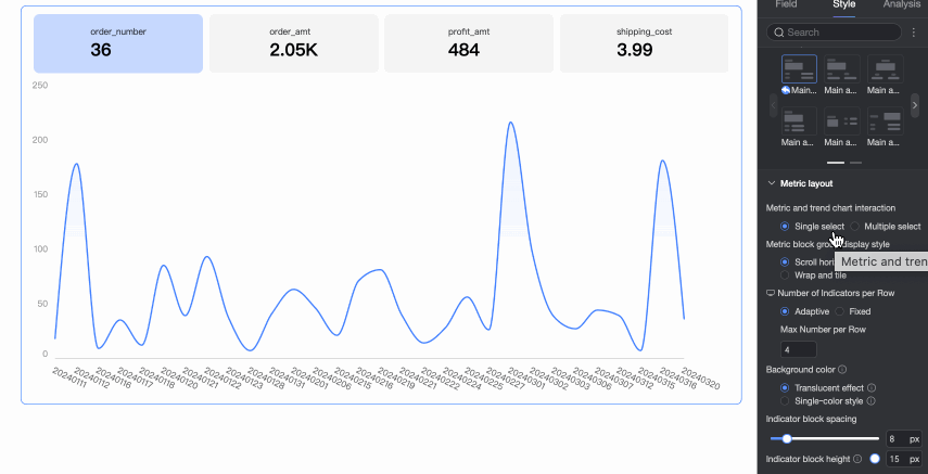
Display mode of indicator block group
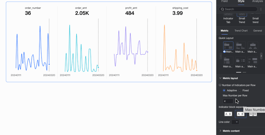
When there are multiple measures in the chart and not all indicator blocks can be fully displayed, you can set the display mode. Use Slide Left And Right to scroll through other indicators, or use Wrap And Tile to display all indicators directly. You can also set the number of indicator blocks per row.

Background color
Set the background color mode for the indicator blocks. The color of the blocks will follow the trend chart's color scheme. Supports Transparent effect and Solid color style.
Transparent effect: Adds transparency to the trend chart's color scheme.
Solid color style: Matches the trend chart's color scheme.
Indicator block spacing
Set the distance between indicator blocks.
Indicator block height
Adjust the indicator block height by defining the distance between the indicator content and the indicator block.
If you select Small trend chart (top and bottom)/Small trend chart (left and right) for Chart type, you can configure the following items.

Configuration item
Description
Display mode of indicator block group
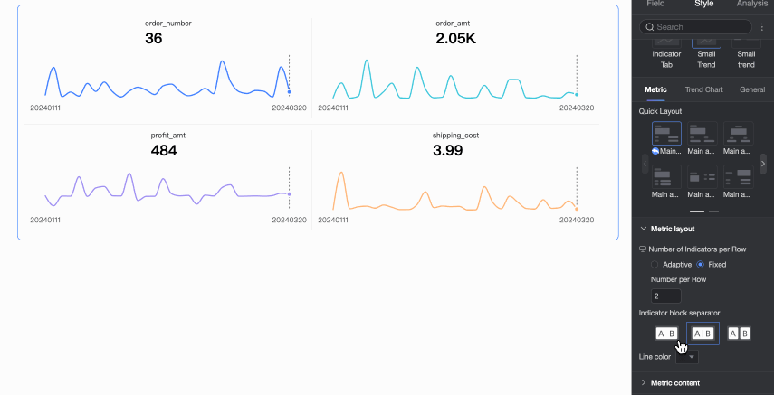
Set the number of indicator blocks per row on the indicator trend chart.
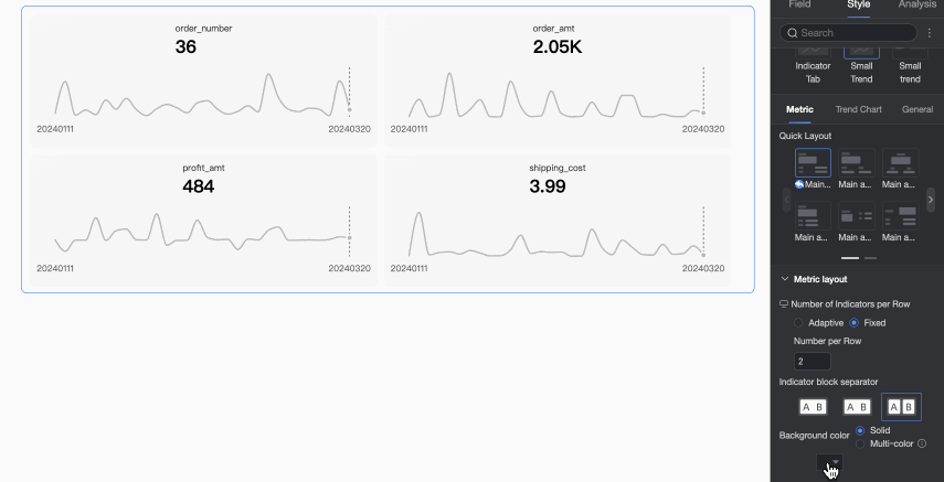
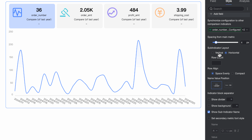
Indicator block separator
Set the separator mode between indicator blocks. Supports No separator, Line separator, or Background fill.
Separator color
When Line separator is selected for the indicator block separator, you can set the color of the separator line.
Background color
When Background fill is selected for the indicator block separator, you can set the background color. You can set a uniform Monochrome color for all indicator blocks, or use the Multicolor mode to have the background color follow the trend chart's color configuration.
Indicator block spacing
Set the distance between indicator blocks.
Indicator content
In the Indicator content section, you can configure the position, display mode, font style, and decoration style for the content within the indicator blocks.

Configuration item
Description
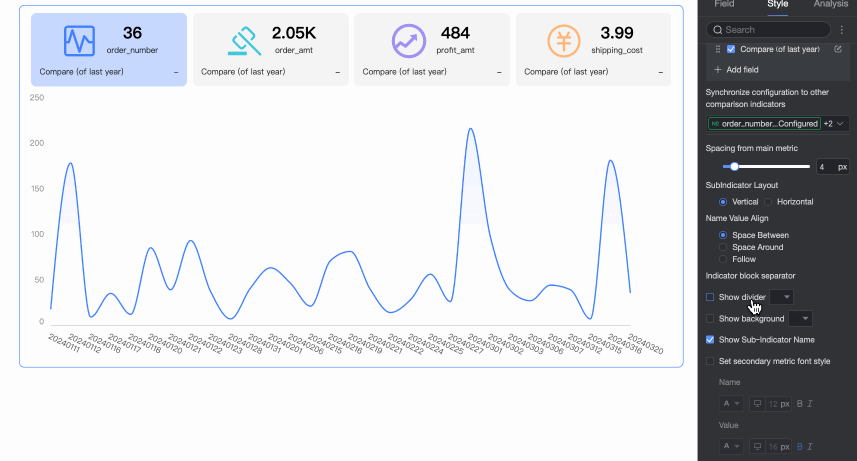
Primary and secondary indicator layout
Set the arrangement between primary and secondary indicators. Supports Top and bottom and Left and right arrangements.
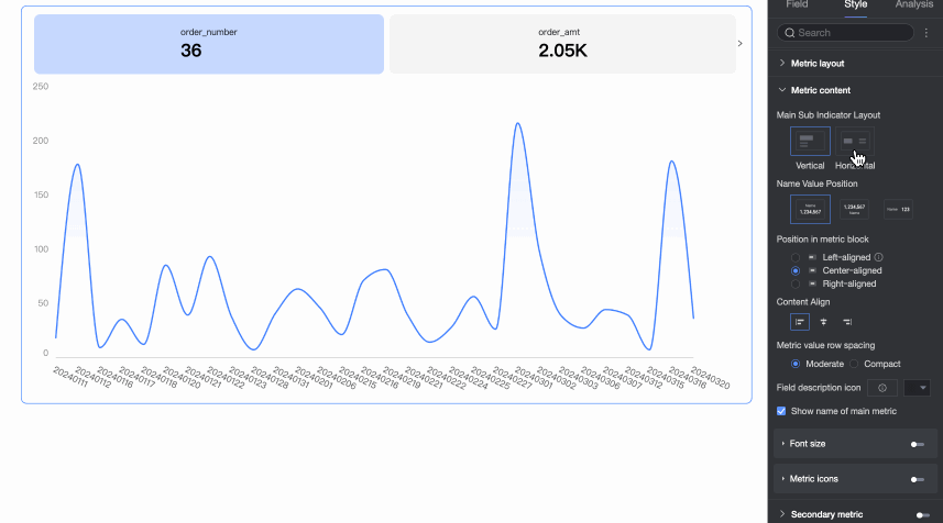
Name and value position
When the Primary and secondary indicator layout is set to Top and bottom, you can configure the position arrangement of the indicator name and value.
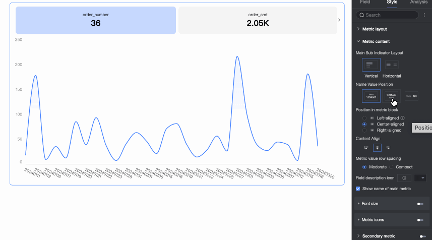
Content position in indicator block
Set the position of the content within the indicator block.
When Indicator layout is Top and bottom, supports Align left, Align center, and Align right.
When Indicator layout is Left and right, supports Space between and Align left.
Content alignment
Set the text alignment within the indicator block. Supports Align left, Align center, and Align right.
Indicator value line spacing
Supports Medium and Compact.
Field description icon
Supports Use material and lets you set the color of the field description.
Null value handling
When selected, if a query for a single time granularity returns no data, the indicator card displays "-".
Show primary indicator name
Set whether to display the primary indicator's name in the indicator block.

Font size settings
Select whether to Enable font size settings. When enabled, you can set the font size, color, bold, and italic for the primary indicator name and primary indicator value.
Metric Modifier Graph
Select whether to Show primary indicator decoration. After selecting, you can set the decoration style. The following settings are supported.
Decoration position: For horizontal layouts, supports Left, Top, Right, and Left of name. For vertical layouts, supports Top, Center, or Bottom.

Circle style: Supports Transparent, Solid color, and No background.
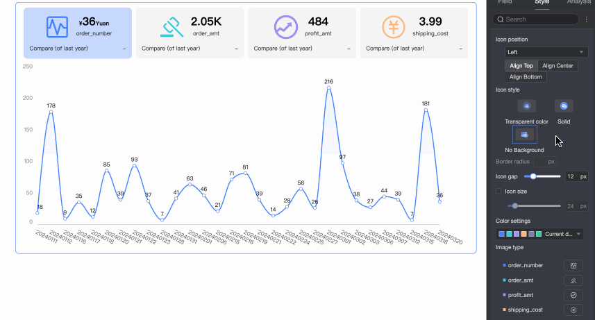
Border radius: Set the border radius value for the decoration icon.
Distance from indicator: Set the distance between the decoration and the indicator.
Icon size: When selected, you can customize the size of the decoration.
Decoration type: Supports Material and Image field.
You can use the Image Field only when the dataset contains an image field, and the field type is image (
 ).
).When you select Material, you can use material icons or upload a local image. You can specify a separate material style for each measure.
NoteOnly PNG, JPG, and GIF images up to 1 MB are supported.

Secondary indicators
In the Secondary indicators section, you can enable secondary indicators and configure their content, layout style, and other settings.
Configuration content
Description
Comparison indicator selection
Enable secondary indicator display and select the measure field for which you want to configure a secondary indicator comparison from the drop-down list.

Secondary indicator content
Configure the specific content for the secondary indicator comparison. The system automatically generates corresponding period-over-period and sequential comparison options based on the date field granularity you configured in the Date/Dimensions area. For example, if the date field type is 'day', you can select day-over-day, week-over-week, and month-over-month comparisons.
You can perform the following operations:
Click the checkbox before an option to select the secondary indicator content to display. You can configure a maximum of two indicators.

Click Add field. In the Add field dialog box, customize the secondary indicator content to compare and display, and configure its aggregation method, display format, conditional formatting, and auxiliary trend chart.

Click the
 icon to drag and sort the indicators to adjust their display order in the chart.
Click the
 icon. In the Secondary indicator content settings dialog box, adjust the display format, conditional formatting, and auxiliary trend chart for the current indicator.
Sync configuration to other comparison indicators
Select the measure fields to which you want to sync the current secondary indicator configuration.
Secondary indicator position
Set the position of the secondary indicator. You can place it Below the primary indicator or in an Independent block. When set to an independent block, you can also set the spacing between the secondary and primary indicators.
Arrangement between indicators
When there are multiple secondary indicators, you can set their arrangement. Supports vertical or horizontal arrangement.
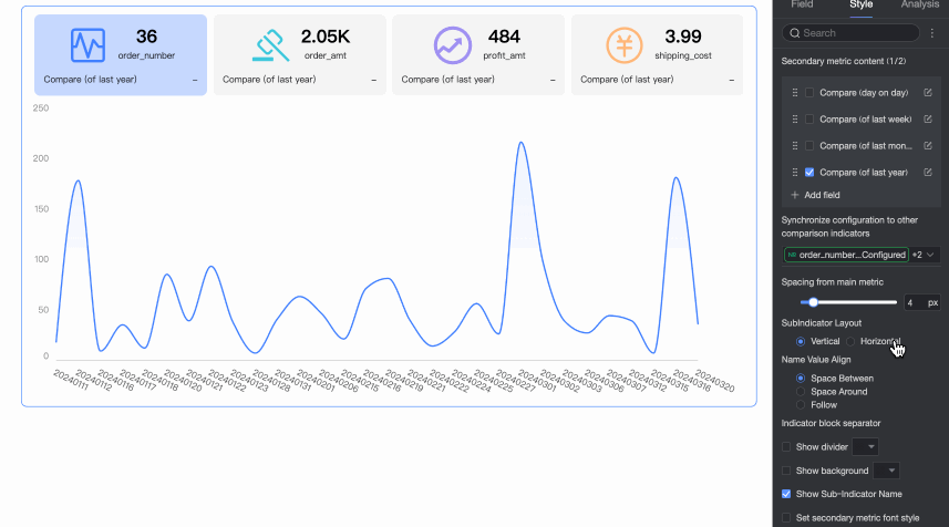
When you select Vertical arrangement, you can configure the alignment of the secondary indicator name and value.
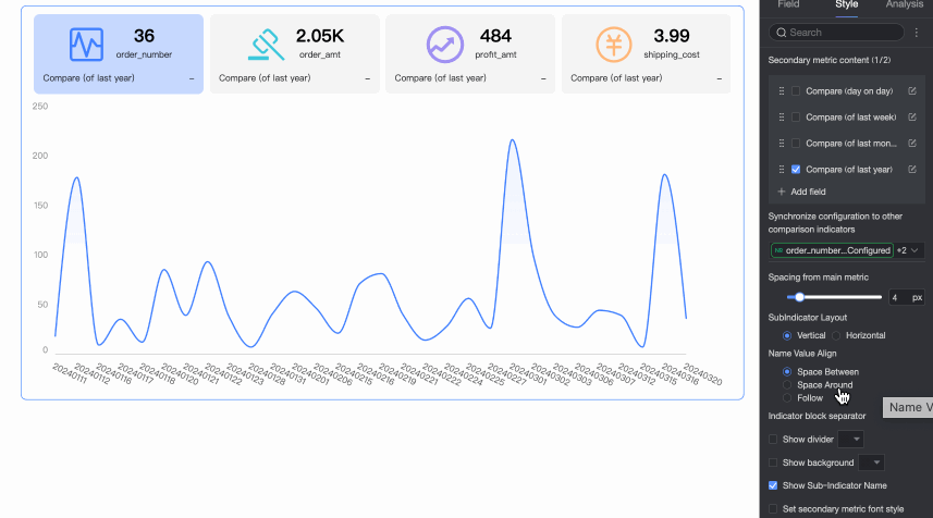
When you select Horizontal arrangement, you can configure the number of secondary indicators to display per row, and the layout style, position, and alignment of the secondary indicator name and value.
Indicator block separator
Set whether to display separators and a background between secondary indicators. You can also customize the color of the separator and background.
Show secondary indicator name
Set whether to display the names of the secondary indicators.
Set secondary indicator font style
Set the font format and color for the secondary indicators.
Series settings
In the Series settings section, you can select an indicator series to configure markers, data labels, maximum/minimum values, and prefixes/suffixes for indicator data.

Configuration item
Description
Select field
Select the field you want to configure. The selectable fields are the measures added to the Indicators/Measures area.
Show markers
Set whether to show markers in the trend chart. You can select the marker style.

Line style
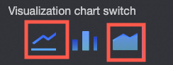
Set the style and thickness of the lines in the trend chart.
NoteThis is configurable only when the visualization chart type for the trend chart is a line chart or an area chart.
Show data labels
Select whether to show data labels, and set the label color and position.

Show max/min values
Set whether to show labels for the maximum and minimum values on the chart.

Prefix and suffix for indicator data value
Set the prefix and suffix for the indicator data values on the chart, and the style of the prefix and suffix text.

Conditional formatting
In the Conditional Formatting section, you can set the conditional formatting for measure data.

Configuration item
Description
Select Field
Select the measure field for which you want to configure conditional formatting. You can select any measure that is added to the Indicators/Measures area.
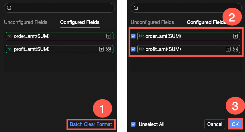
After you configure the style, if you no longer need some of the configured conditional formats, you can click Batch clear formats in the lower-right corner of the field panel. In the list that appears, select the conditional formats to clear, and then click OK.
Quick Style
Select a style from the system to set the icon or font color for the current measure field.
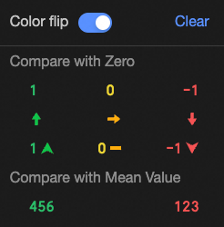
Comparison: You can select Compare with 0 or Compare with average.
Flip colors: For example, if you select Compare with 0, values less than 0 are red, and values greater than 0 are green. After you flip the colors, values less than 0 are green, and values greater than 0 are red.
Clear: If you no longer need a quick style, click Clear to remove it.
Custom Style
In addition to the quick styles provided by the system, you can configure custom styles for the current measure field as needed.
Text
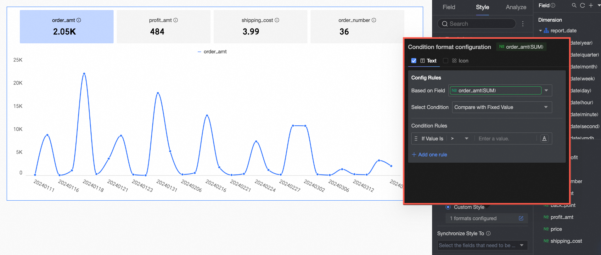 On the Text tab, set rules to highlight the text of the current measure field. You can configure rules for the current field based on the values of other fields.
Icon
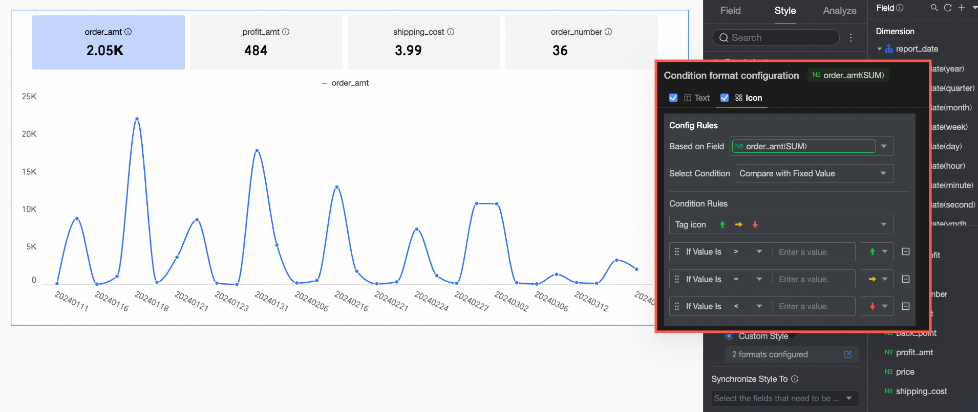 On the Icon tab, set the icon marking rules for the current measure field. You can configure marking rules for the current field based on the values of other fields.
Replicate Style To
Sync the current conditional formatting to other measures.
Icon position and size
Set the position and size of the conditional formatting icon within the indicator block.
Configure Chart Analysis
Configuration item | Name | Description |
Data Interaction | Filter Interaction | If the data that you want to analyze belongs to different charts or tables, you can configure this feature to associate the charts and tables, and then analyze the data. For more information, see Filter Interaction. |
Hyperlink | When the data that you want to analyze exists in multiple dashboards, you can use dashboard hyperlinks to associate multiple dashboards for data analysis. Hyperlinks include two types: Parameter Hyperlink and External Link. For more information, see Hyperlink. | |
Secondary Metrics | Secondary Metric Content | You can configure the content of secondary metric comparison. The system automatically generates the corresponding period-over-period comparison options based on the granularity of the date field that you configure in the Date (Dimensions) section. For example, if the date field type is day, the system supports day-to-day comparison, week-on-week comparison, and month-on-month comparison. You can perform the following operations:
|
Replicate Configuration to Other Comparison Metrics | You can select the measure fields to which you want to replicate the current secondary metric configuration. | |
Secondary Metric Position | Set the position of the secondary metric. You can set the Secondary metric position to Below the primary metric or Independent block. | |
Secondary Metric Font Style | You can set the font format and color of secondary metrics. | |
Analysis And Alerts | Auxiliary Line | An auxiliary line can be used to show the difference between the value of a measure and the reference value indicated by the auxiliary line. The reference value can be a fixed value or a calculated value. You can use the following calculated values: average, maximum, minimum, and median. For more information, see Auxiliary Line. |
Annotation | - | You can use highlighted measures, icons, comments, or data points as labels to mark the data that is abnormal or you focus on in a chart. This helps you identify data exceptions and fix the issue. For more information, see Annotation. |


What to do next
If other users need to view the dashboard, you can share the dashboard with specific users. For more information, see Share a Dashboard.
To create a complex dashboard with navigation menus for topic-specific analysis, you can integrate the created dashboard into a BI portal. For more information, see Create a PC BI portal.
FAQ
1. What is the difference between an indicator trend chart and an indicator card?
Answer: An indicator card is mainly used for static display of the current value or aggregated value of key metrics, emphasizing the value itself. An indicator trend chart not only displays the metric value (latest value or period aggregated value) but must also combine it with a time dimension to show how the metric changes over time, focusing more on dynamic changes and trend analysis.
2. How can I see both the sales amount and its change rate compared to the previous month on the indicator card?
Answer: You can achieve this by configuring "Secondary Metrics." In the Analysis tab, find the Secondary Metrics settings, first enable secondary metric display, and select Sales in the Comparison Metric Selection. Then in Secondary Metric Content, check the automatically generated Month-on-Month option (if your date dimension supports month granularity comparison), or click Add Field to customize the calculation of the change rate. You can also set the display position and font style of the secondary metric.
3. What is the difference between "Latest Date Data" and "Aggregated Data" in the chart data configuration?
Answer: "Latest Date Data" means the value displayed on the indicator card is the value of the last data point in your selected time range. For example, if the time range is December 1 to December 30, it will show the data for December 30. "Aggregated Data" means the value displayed on the indicator card is the aggregated result of data within the entire time range (December 1 to December 30), such as sum, average, etc. (depending on the default aggregation method of your measure field).
4. How can I change the trend chart from the default line chart to a bar chart?
Answer: In the Style configuration tab, find the Trend Chart settings area. If your trend chart type is set to Show Trend Chart, there will be a Chart Type option in this area where you can select Bar Chart to change the main trend chart display type. If you have selected Indicator with Small Trend Chart, the small trend is usually a line chart or area chart and does not support direct conversion to a bar chart.