A radar chart visualizes numerical data or ratios from data analysis. It lets you view data metrics and change trends at a glance. This topic describes how to add data to a radar chart and configure its style.
Prerequisites
The dashboard has been created. For more information, see Create a Dashboard.
Chart Overview
Scenarios
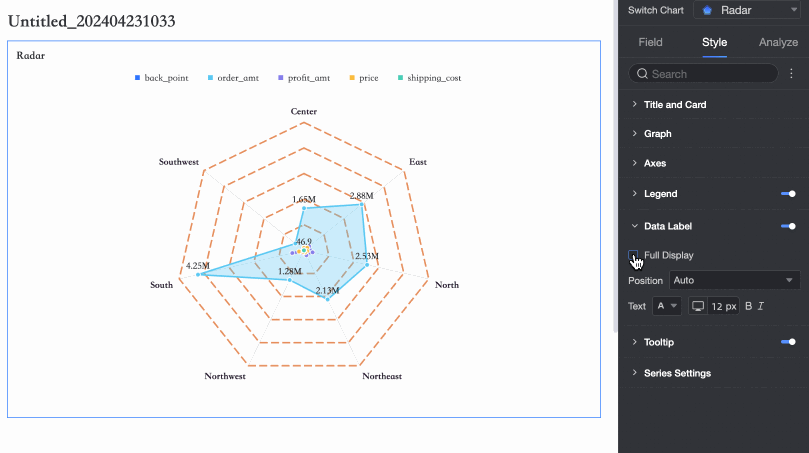
A radar chart, also known as a spider chart, maps the data volume for multiple dimensions onto axes that originate from a central point and extend to the edge of a circle. Points belonging to the same group are connected by lines. It is often used to visualize the distribution of dimension values.
Benefits
Interactive operations: Switch metrics and configure in-chart filters.
Visualization effects: Use circle and polygon styles, and customize the label display.
Annotation capabilities: Add custom text or metric annotations. Configure external links to enable interaction between data and other systems.
Example Preview
Configure Chart Fields
When adding data to a radar chart, you can use two configuration modes: Dimension as branch label and Measure as branch label:
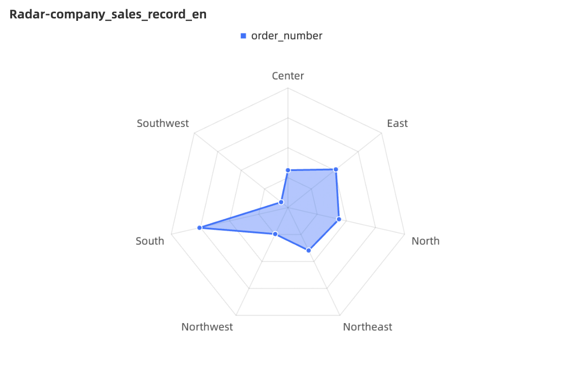
Dimension as branch label: Dimension values serve as the branch nodes in the radar chart. This mode compares the area distribution among measures.
Select the required dimension and measure fields, and then click Update.
In the Measures list, find Discount, and then double-click it or drag it to the Branch Length/Measure area.
In the Dimensions list, find Region, and then double-click it or drag it to the Branch Label/Dimension area.
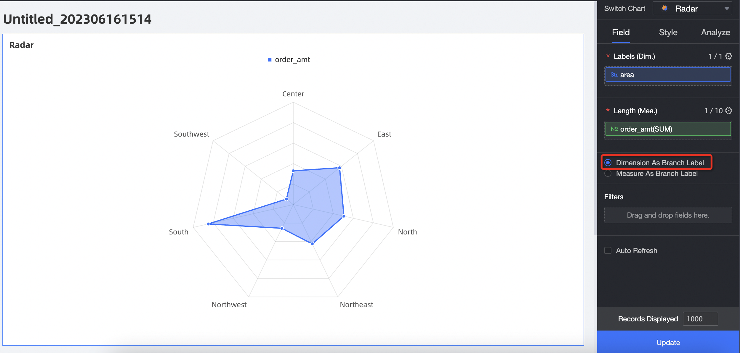
Measure as branch label: Measure values serve as the branch nodes in the radar chart. This mode compares the area distribution among dimension values.
Select the required dimension and measure fields, and then click Update.
In the Measures list, find Order amount, Profit amount, and Discount, and then double-click them or drag them to the Branch Length/Measure area.
In the Dimensions list, find Region, and then double-click it or drag it to the Branch Label/Dimension area.
Configure Chart Styles
The following sections describe the chart's style settings. For information about common style settings for charts, see Configure the chart title.
You can enter a keyword in the search box at the top of the configuration section to quickly find a configuration item. You can also click the  icon on the right to Expand/Collapse All Categories.
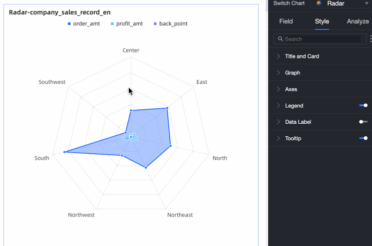
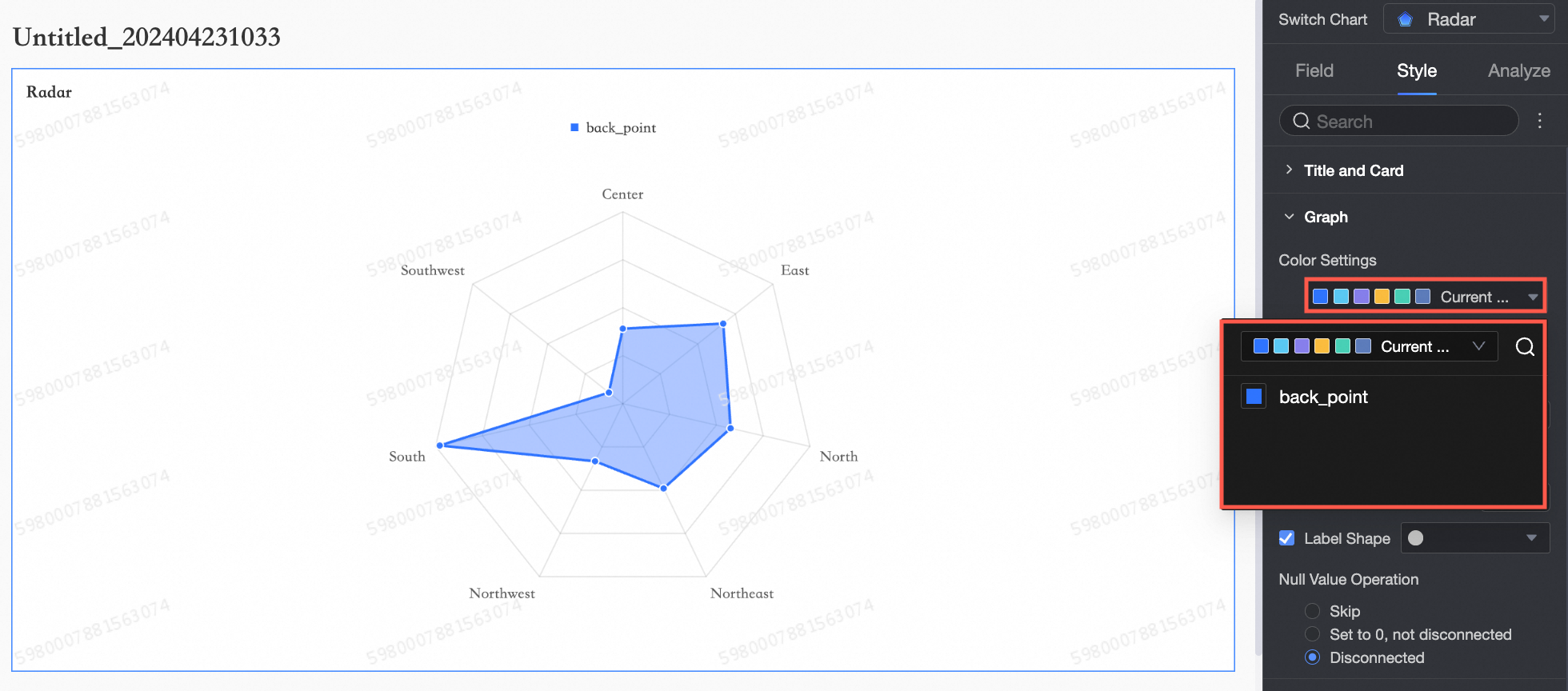
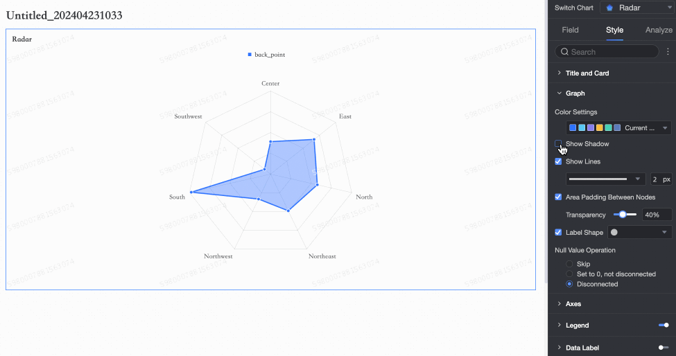
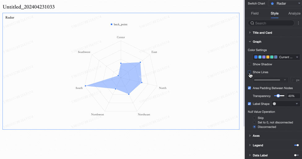
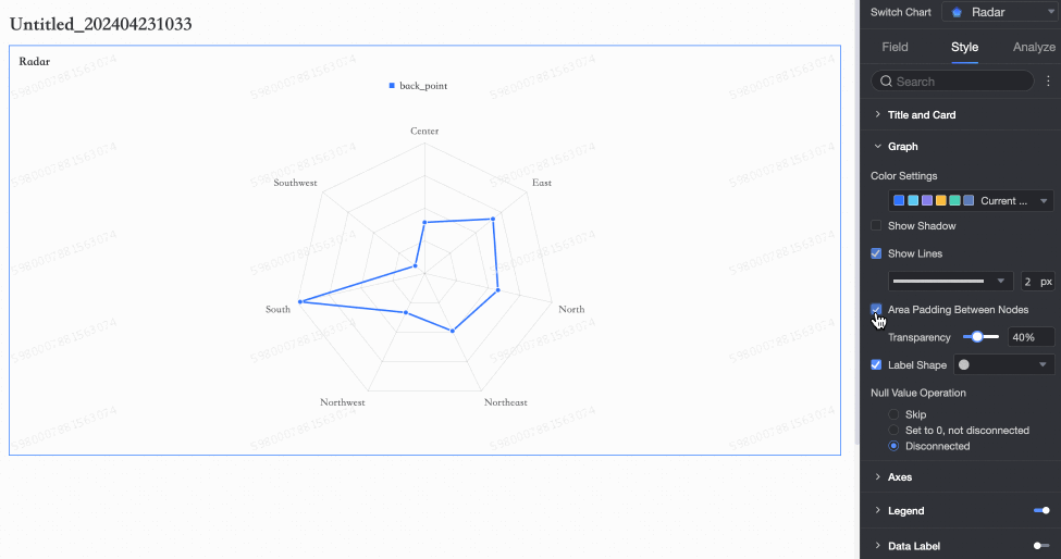
Graphics
In the Graphics section, configure the following parameters.
Configuration item | Description |
Color Settings | Set a custom color for the radar chart.
|
Shading | Specify whether to show a shade.
|
Show Lines | Specify whether to show lines and set the shape and thickness of the lines.
|
Fill Area Between Nodes | Specify whether to fill the area between nodes and set the transparency of the fill.
|
Show Markers | Specify whether to show markers and set the shape of the markers.
|
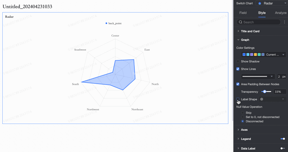
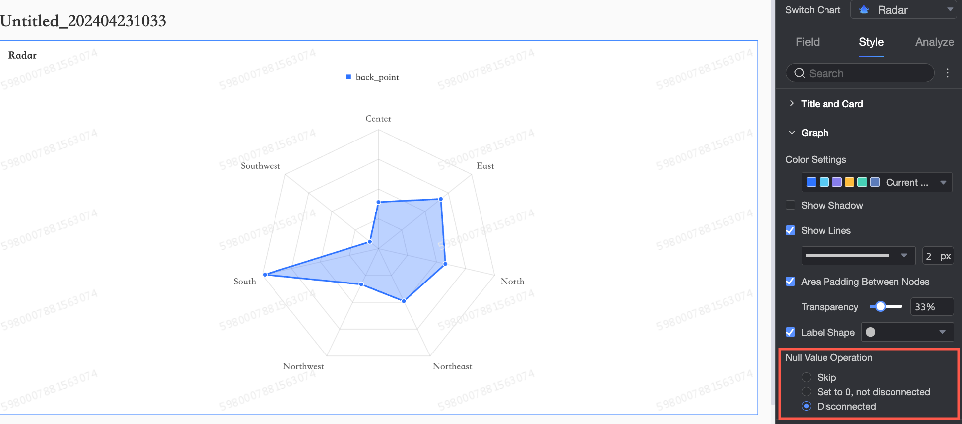
Handle Null Values | If a dimension in the chart has a null value, you can set how the null value is displayed. You can select Skip, Set to 0, do not break, or Break line.
|
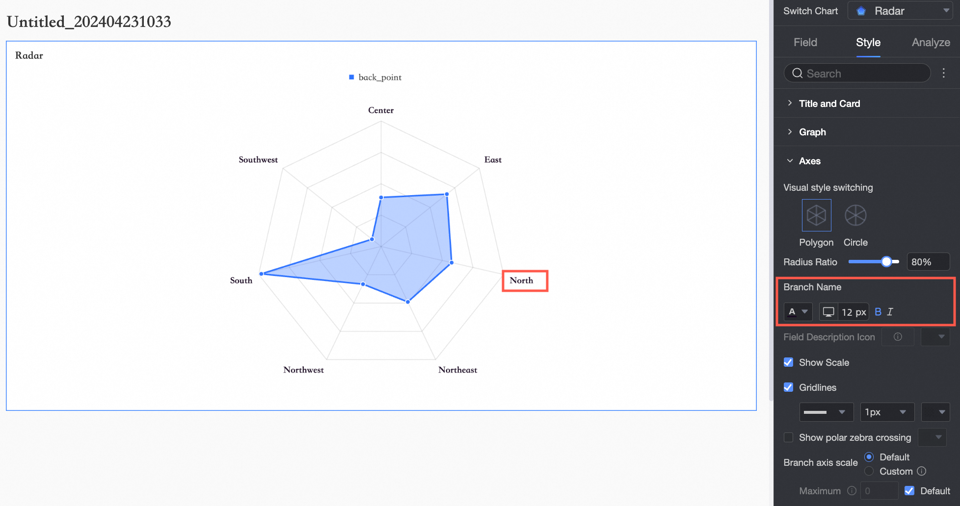
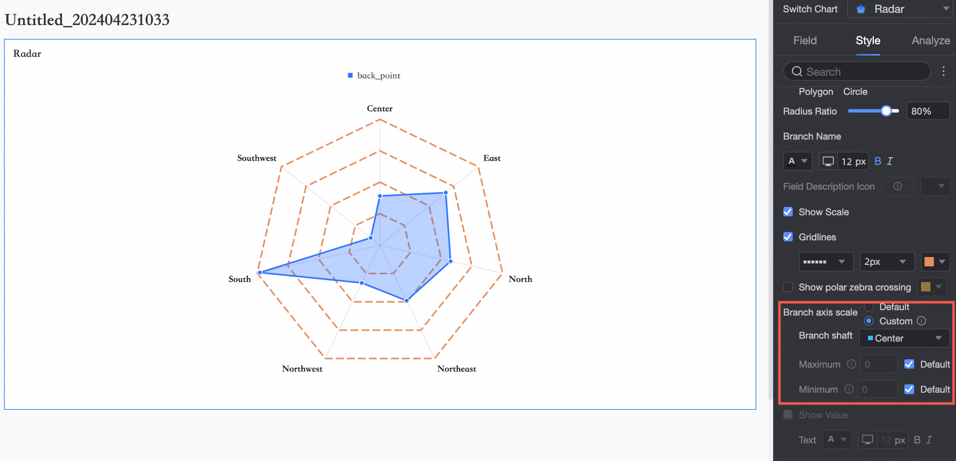
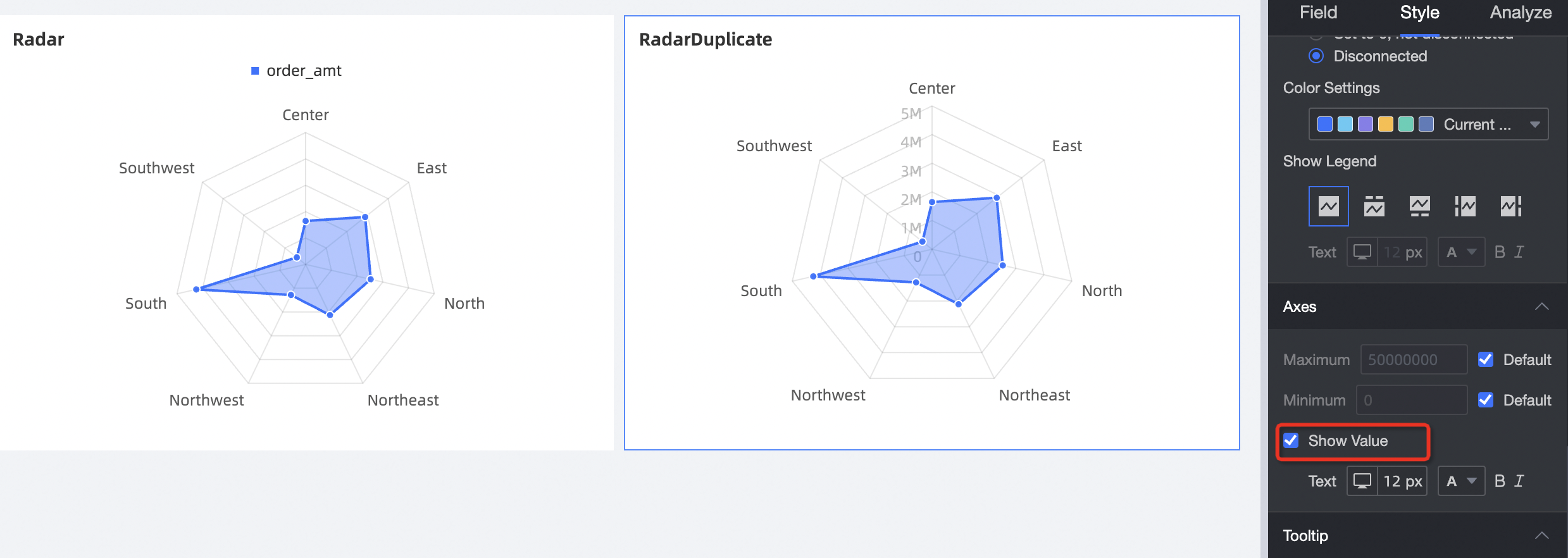
Axes
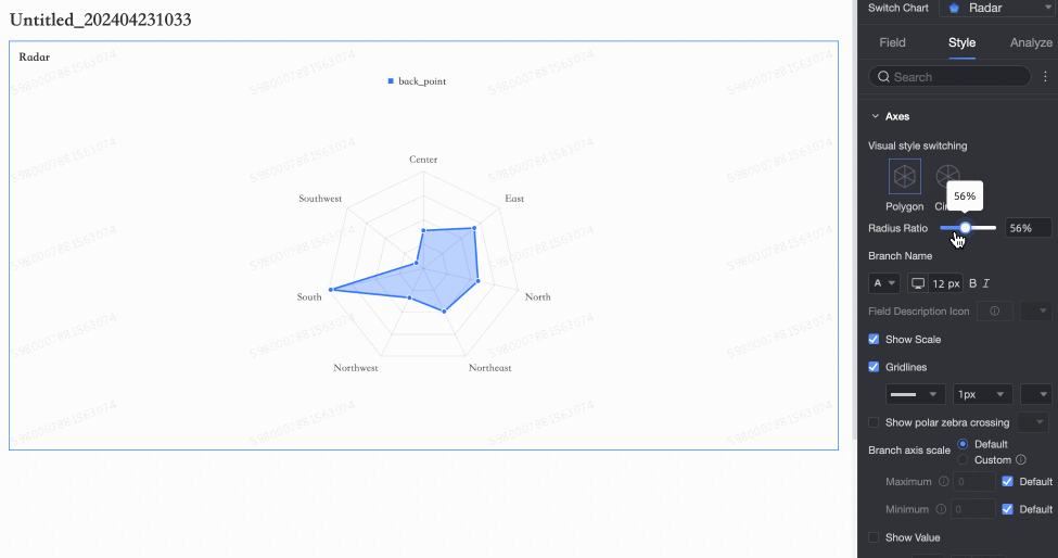
In the Axes section, set Visualization Style, Maximum, and Show Axis Labels.
Chart configuration item | Configuration Item Description |
Visualization Style Switch | You can select Polygon or Circle.
|
Radius Ratio | Set the radius ratio.
|
Branch Name | Set the branch name and style.
|
Field Description Icon | Set the icon and color for the field description. |
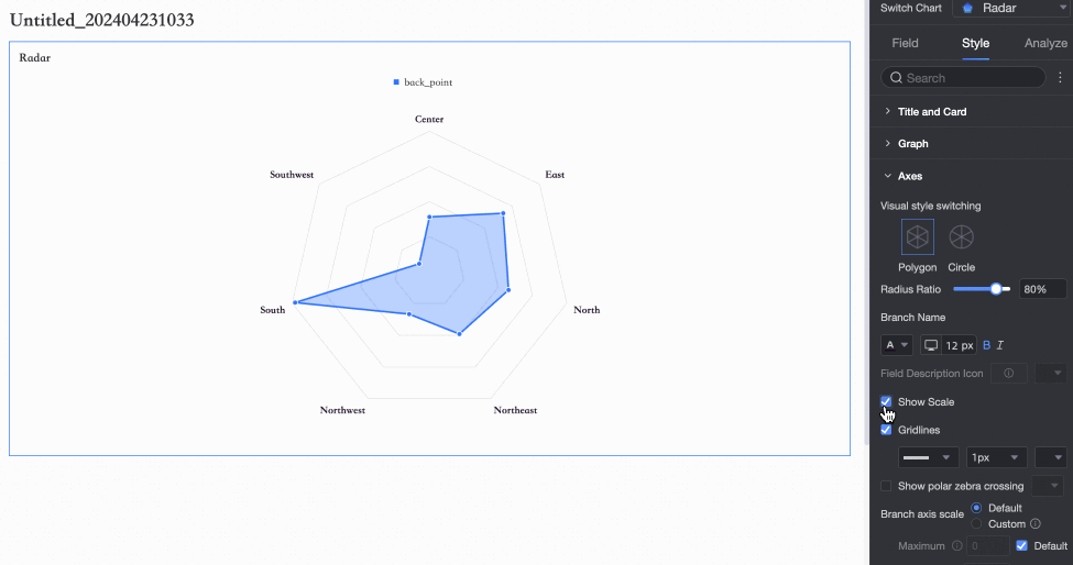
Show Tick Marks | Specify whether to show tick marks.
|
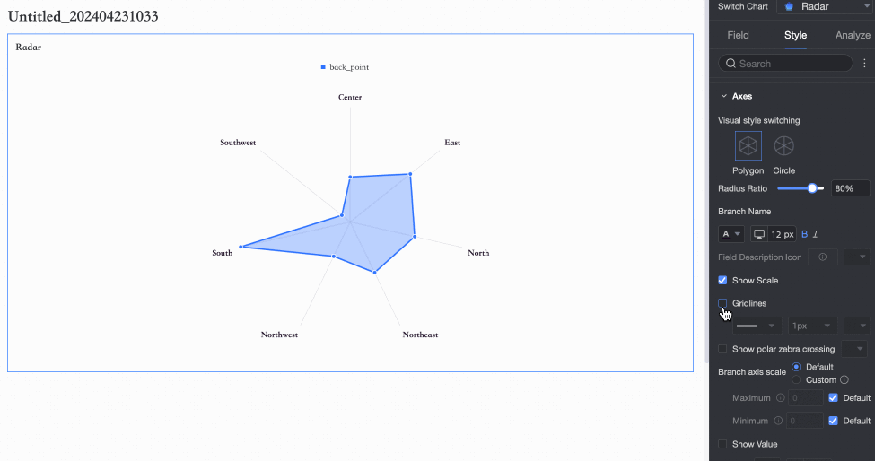
Show Gridlines | Specify whether to show gridlines and set the shape, size, and color of the gridlines.
|
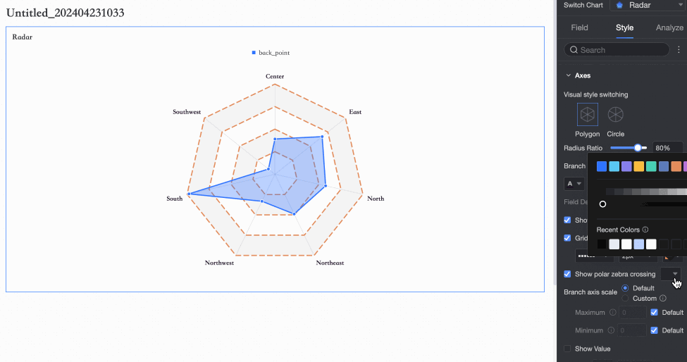
Show Polar Zebra Stripes | Specify whether to show polar zebra stripes and set the color of the stripes.
|
Axis Branch | Set the axis branch to Auto or Custom. If you select Custom, you can set the maximum and minimum values for the axis dimension.
Note
|
Show Axis Labels | The vertical axis supports showing axis labels to help display the size of each ring axis.
|
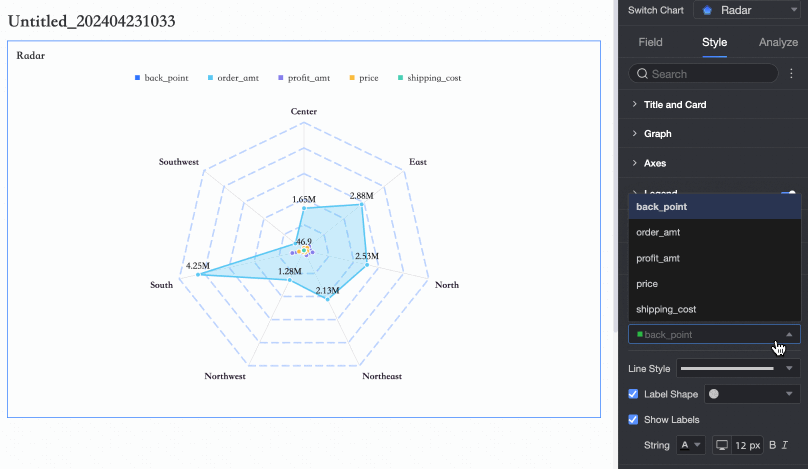
Legend
In the Legend section, click the  icon to enable the chart legend and configure its style.
PC configuration
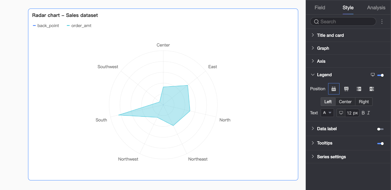
Chart configuration item
Description of Configuration Items
Position
Set the display position and alignment of the legend on a PC.
If you set the display position to Top or Bottom, you can select left, center, or right alignment.
If you set the display position to Left or Right, you can select top, center, or bottom alignment. You can also set the distance between the legend and the chart data.
Text
Set the text style of the legend on a PC. You can set the font color, size, weight, and whether it is italic.
Mobile configuration
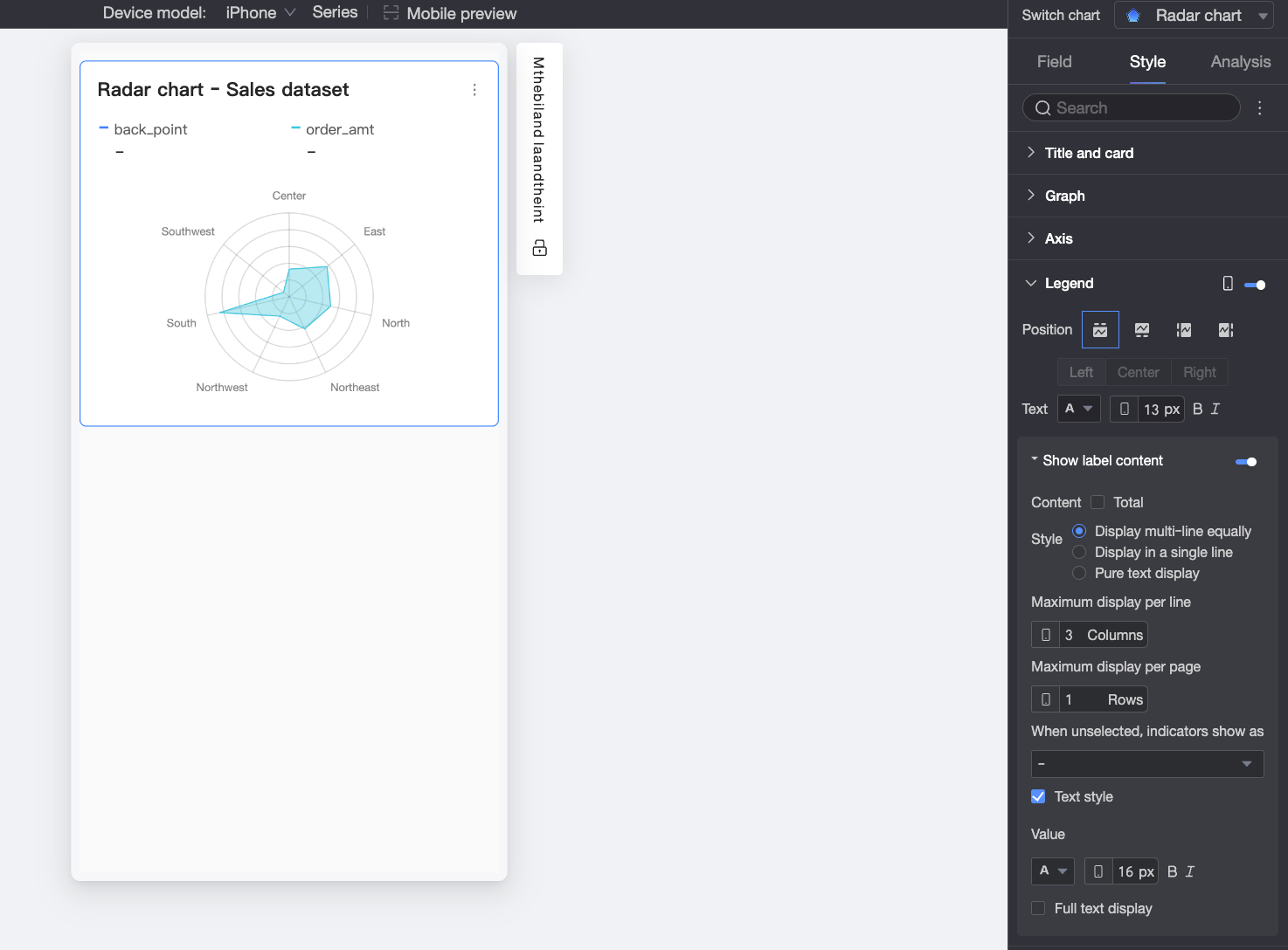
Chart configuration item
Description
Position
Set the display position and alignment of the legend on a mobile device.
If you set the display position to Top or Bottom, you can select left, center, or right alignment.
If you set the display position to Left or Right, you can select top, center, or bottom alignment. You can also set the distance between the legend and the chart content.
NoteIf you set the position to Top, you can enable labels under the legend. After you enable this feature, you cannot customize the alignment.
Text
Set the text style of the measure names in the legend on a mobile device. You can set the font color, size, weight, and whether it is italic.
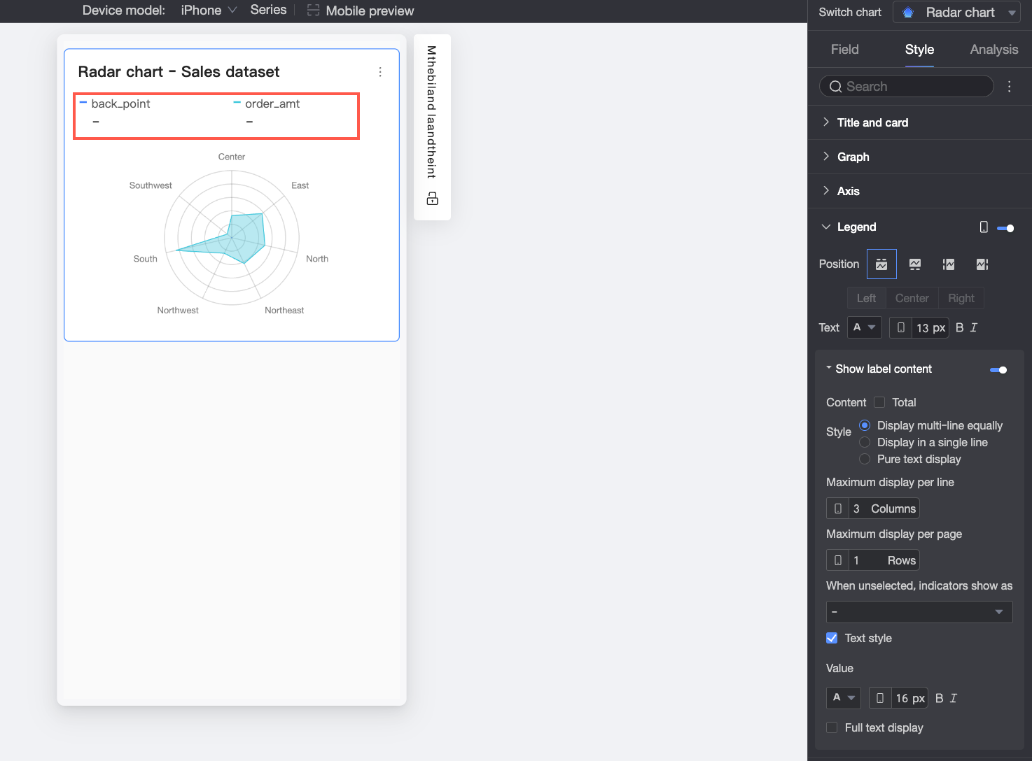
Show Label Content
If Position is set to Top, click the
 icon to enable labels under the legend.
Content
Specify whether to display the total value in the labels under the legend.
Style
Set the layout of the text in the labels under the legend. You can select one of the following options.
Multi-line equal division: Automatically arranges labels in equal divisions based on the number of columns entered in Maximum columns per row and the number of rows entered in Maximum rows per page.
Single-line tile: All label content is displayed in a single line.
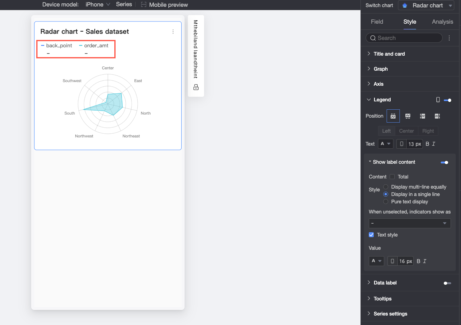
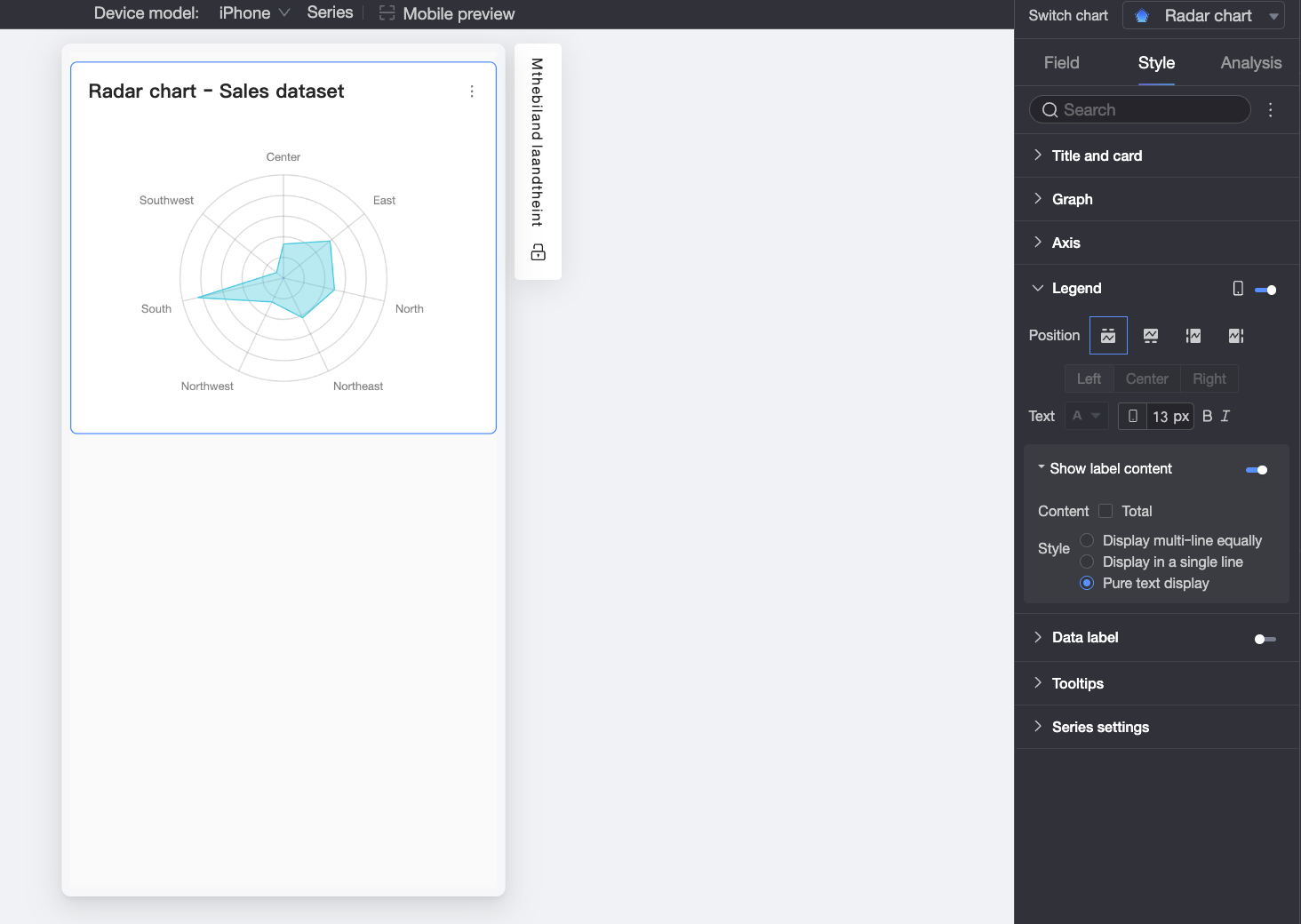
Plain text: Displays only text without icons. The text color follows the line color of the corresponding measure in the chart.
When not selected, display metric as
If you set Style to Multi-line equal division or Single-line tile, you can specify how to display the metric when a report viewer does not select the legend. You can select to display it as "-" or empty.
Text Style
If you set Style to Multi-line equal division or Single-line tile, you can set the style of the Value text.
Data labels
In the Data labels section, set Show Labels, Label Position, and Label Style.
Tooltip
In the Tooltip section, click the icon to enable tooltips and set the tooltip method.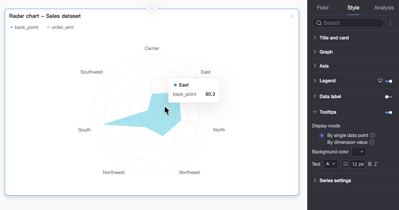
Chart configuration item | Description |
Display Mode | Set the display mode for the tooltip information. You can select By single data point or By dimension value. |
Background Color | Set the background fill color of the tooltip box. |
Text | Set the style of the text in the tooltip box. You can set the font color, size, weight, and whether it is italic. |
Mobile Tooltip | The tooltip switches for PC and mobile are independent. You can switch between the PC and mobile editing views using the PC/mobile switch button ( |
 ) at the top of the dashboard editing page to edit the mobile tooltip. The font size can be set separately for PC and mobile, while other styles are configured uniformly.
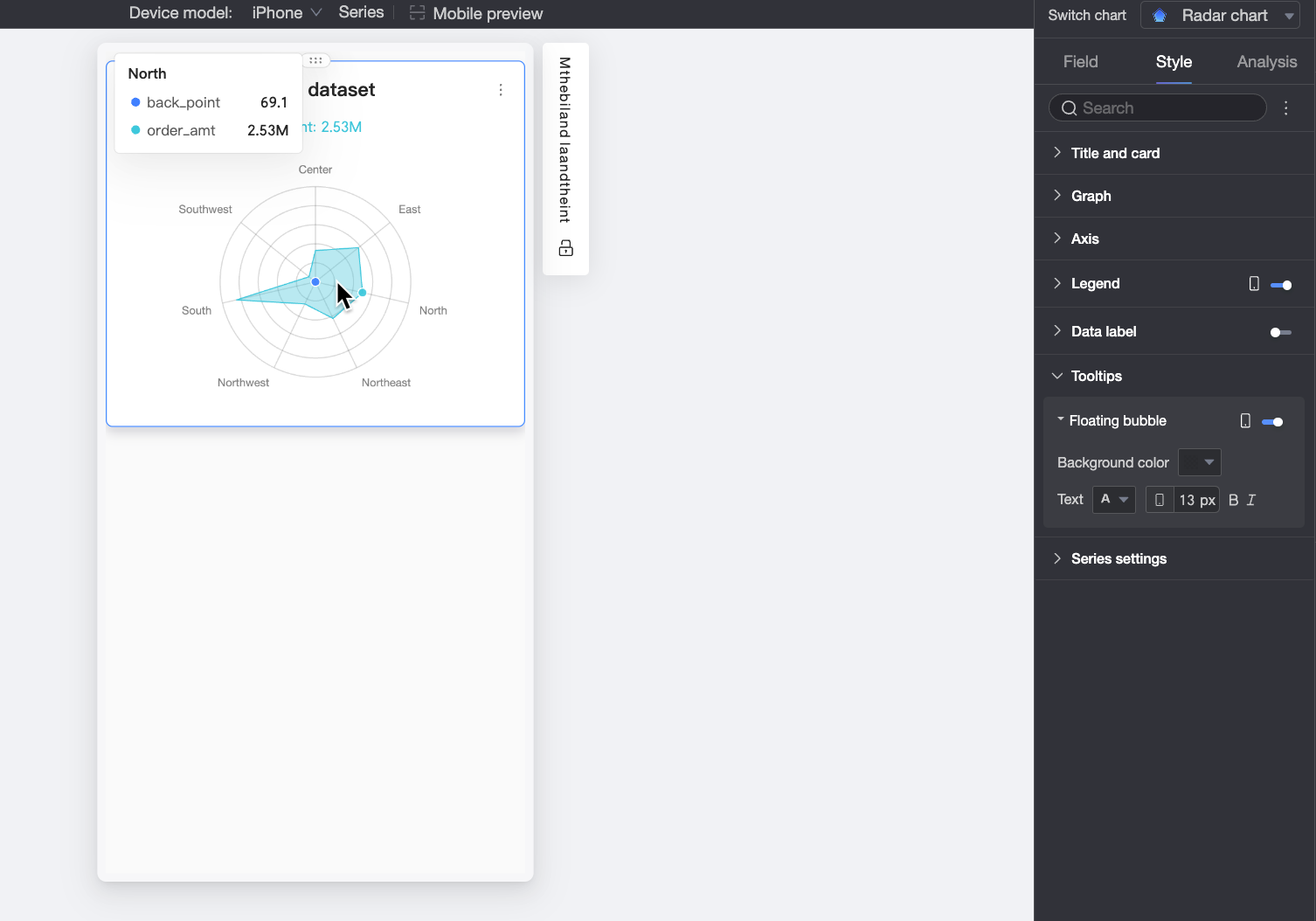
Series settings
In the Series settings section, set the Line Style and Show Markers.
Configure Chart Analytics
Configuration item | Name | Description |
Data Interaction | Drill-down | If you have set the drill-down fields in the fields panel, you can set the display style for the drill-down level rows here. |
Filter Interaction | If the data you need to analyze exists in different charts, you can use chart filter interactions to associate multiple charts for data analysis. For more information, see Configure and view filter interactions. | |
Jump | If the data you need to analyze exists in multiple dashboards, you can use dashboard jumps to associate multiple dashboards for data analysis. Jumps include Parameter Jump and External Link. For more information, see Configure and view jumps. | |
Analysis and Alerts | Auxiliary Line | Use an auxiliary line to view the difference between the current measure value and the value set for the auxiliary line. The auxiliary line value can be a static field or a calculated value. Calculated values include average value, maximum, minimum, and median. For more information, see Auxiliary line. |
Annotate | - | If the data in the chart is abnormal or requires special attention, you can use color highlights, icons, comments, or data points to annotate it. This helps you detect anomalies and take appropriate action. For more information, see Annotate. |
Limits
A radar chart consists of Branch Length/Measure and Branch Label/Dimension. Two data configuration modes are supported.
Dimension as branch label: Dimension values serve as the branch nodes in the radar chart. This mode compares the area distribution among measures.
Branch Label/Dimension: You can select a maximum of one dimension. The dimension values serve as the branch nodes of the radar chart.
Branch Length/Measure: You can select at least 1 and up to 10 measures. Each measure forms a radar plane.
Measure as branch label: Measure values serve as the branch nodes in the radar chart. This mode compares the area distribution among dimension values.
Branch Label/Dimension: You can select a maximum of one dimension. The dimension values serve as the radar planes of the radar chart.
Branch Length/Measure: You can select at least 1 and up to 10 measures. Each measure forms a branch node.
What to do next
If others need to view the dashboard, you can share it with specific people. For more information, see Share a dashboard.
To create a complex dashboard with a navigation menu for thematic analysis, you can integrate the dashboard into a BI portal. For more information, see Create a BI portal.