Heatmaps visualize correlations across dimensions and are commonly used in models such as market basket analysis. This topic explains how to add data to a heatmap and configure its style.
Prerequisites
The dashboard has been created. For more information, see Create a Dashboard.
Chart overview
Scenarios
Commonly used in models such as market basket analysis.
Benefits
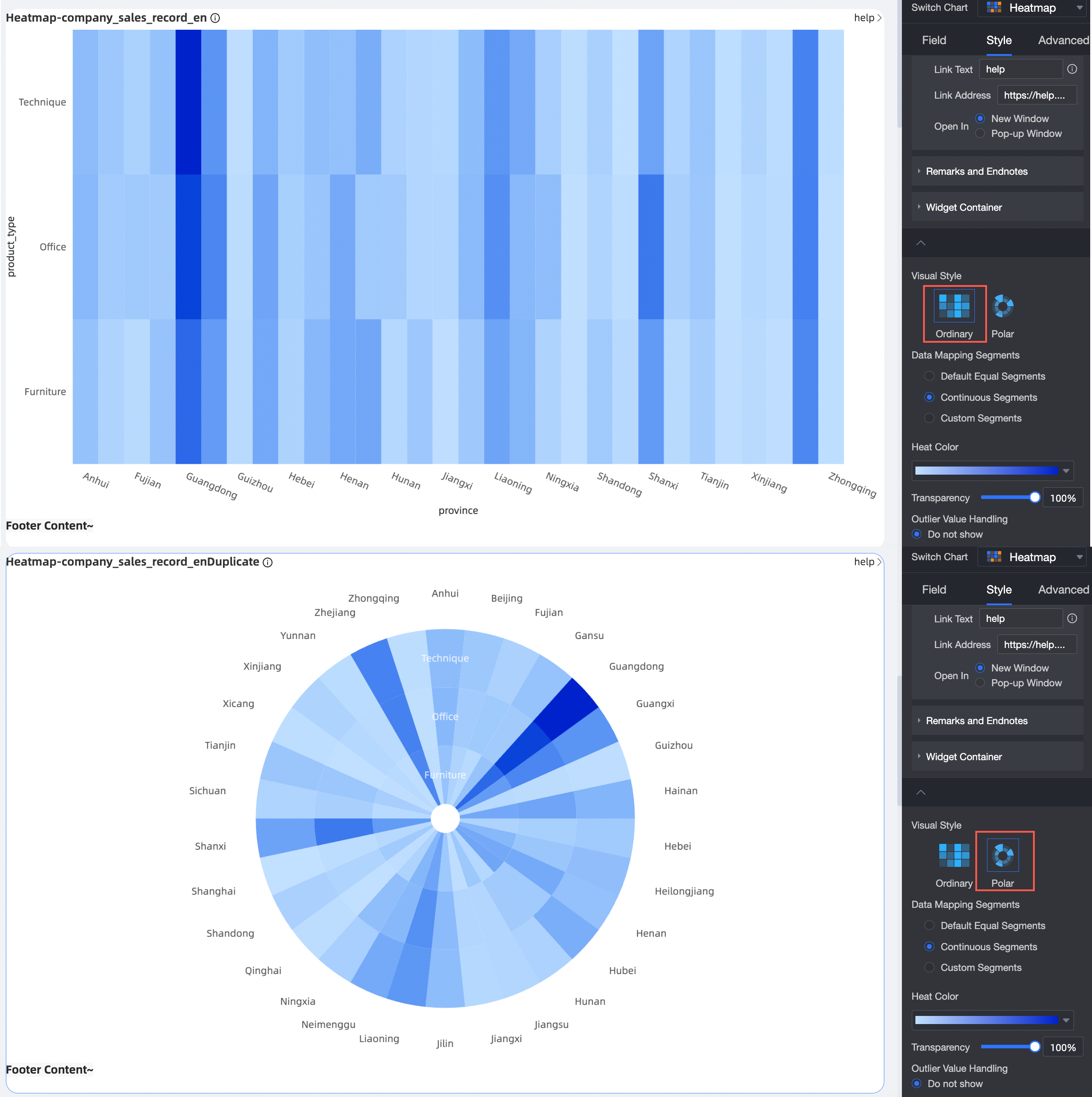
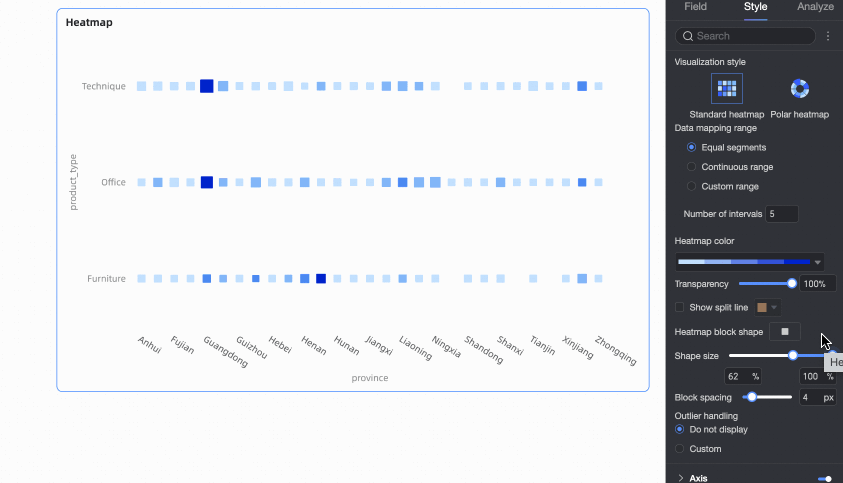
Visualization: Supports two styles—standard heatmap and polar heatmap.
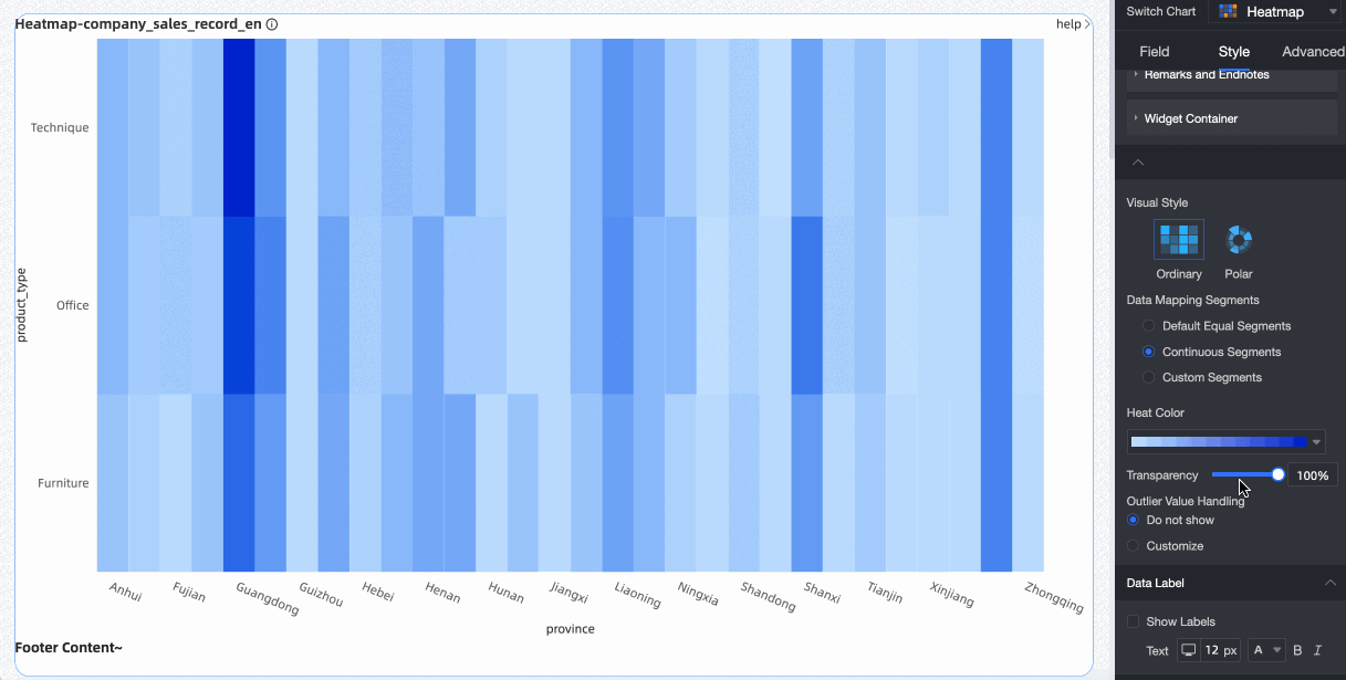
Example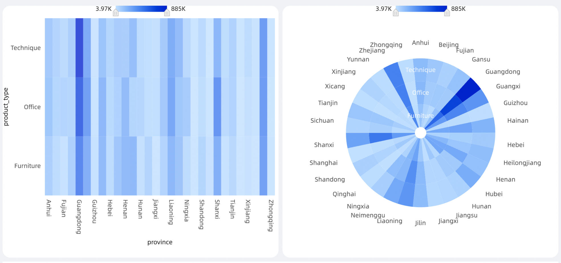
Chart Field Configuration
In the Fields tab on the right side of the chart, select the required dimension fields and measure fields.
In the Dimensions list, locate the Province field. Double-click it or drag it to the X-axis/Dimension area to use it as the X-axis.
In the Dimensions list, locate the Product Type field. Double-click it or drag it to the Y-axis/Dimension area to use it as the Y-axis.
In the Measures list, locate the Order amount field. Double-click it or drag it to the Heat Intensity area to define color intensity.
(Optional) To reflect data values through the shape size of heatmap cells, drag a relevant measure field into the Shape Size/Measure area.
Click Update. The system updates the chart automatically. The updated chart appears as follows.

(Optional) To view data for only selected provinces, set a filter to show the required data.

For more information about field filtering, see Field filtering.
Auto-refresh
Enable this option to refresh chart data automatically. For example, if you enable this option and set the interval to 5 minutes, the system refreshes the chart every 5 minutes.
Chart Style Configuration
For style configuration of Title and Card, see Configure the Chart Title.
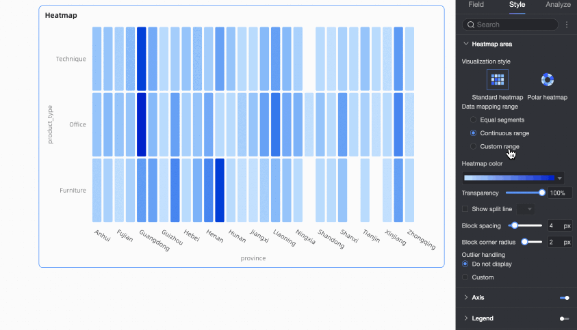
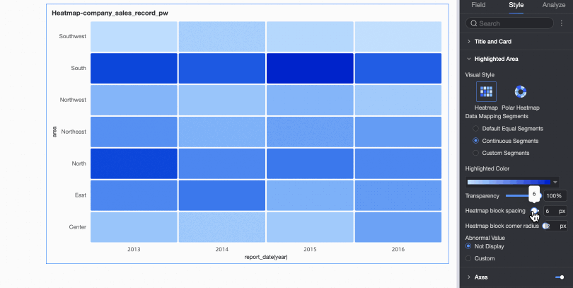
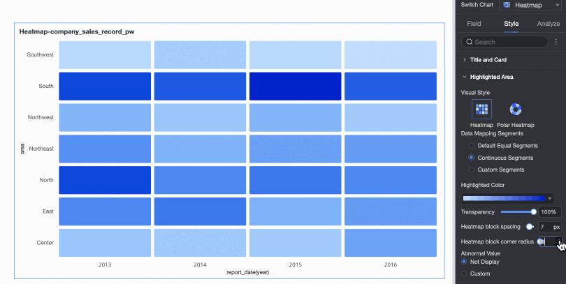
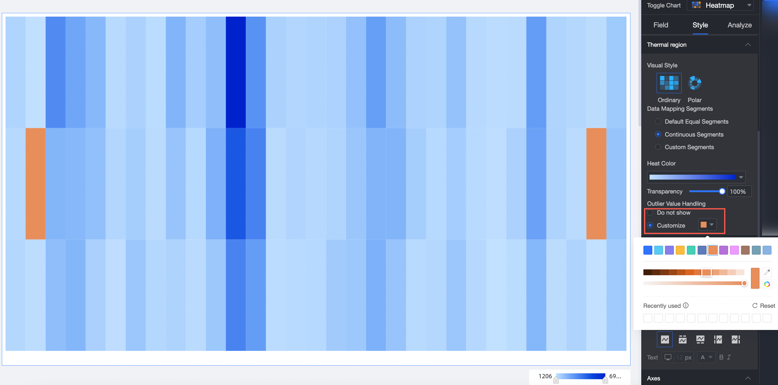
Heatmap Area
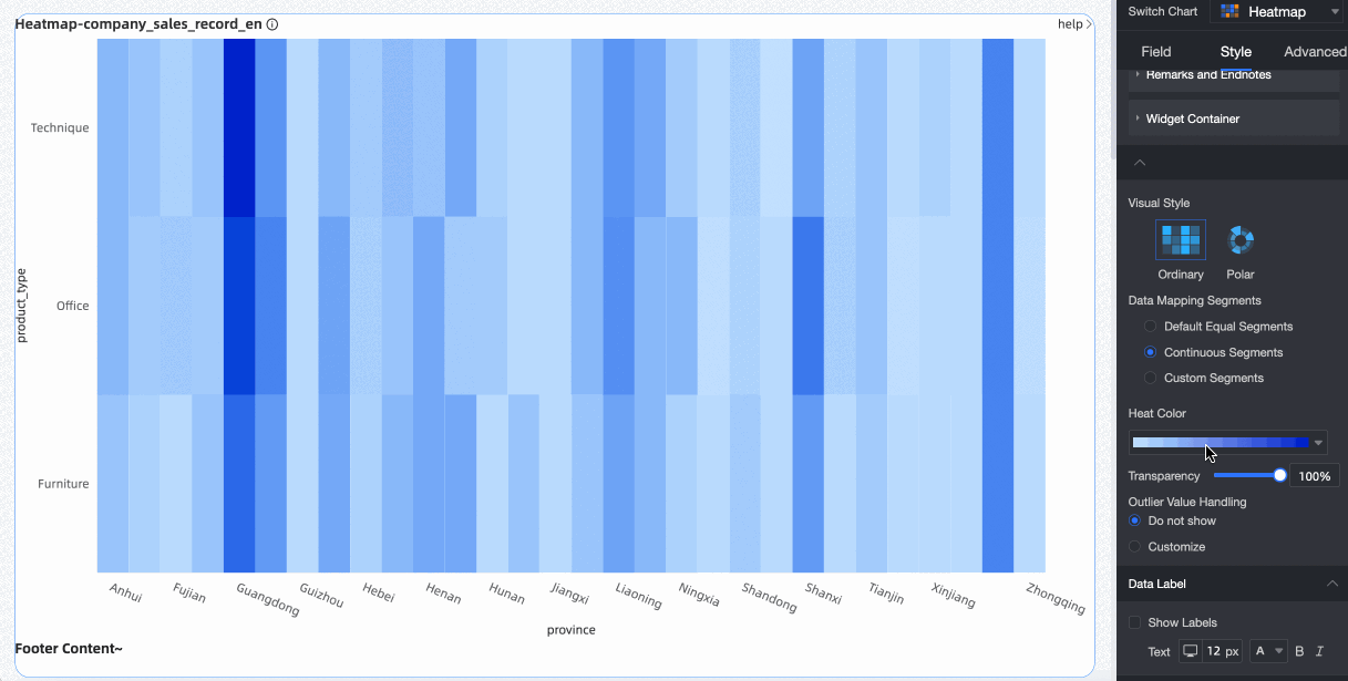
In the Heat area, configure the visualization style, data mapping ranges, heat colors, and transparency.
Configuration item | Description |
Visualization style | Supports two styles: standard heatmap and polar heatmap. |
Color scheme | If you configure a dimension field in the Heat Intensity area of the Fields panel, you can assign a color to each dimension value here. |
Data mapping range | Supports three options: Equal intervals, Continuous range, and Custom range.
|
Heat color | Supports two options: sequential gradient and diverging gradient. |
Transparency | Set transparency from 0% to 100%. |
Show line separators | Set whether to show line separators between heatmap cells and their color. |
Heatmap Block Shape | If you drag a field into the Shape Size/Measure area of the Fields panel, set the shape size of heatmap cells here. |
Thermal Interval Pitch | You can configure the pitch of heatmap blocks, with a range from 0 to 20 pixels.
Note Only standard heatmaps support configuring heatmap interval pitch. |
Heat Zone Border Radius | You can set the border radius for heatmap blocks to a value from 0 to 20 px.
Note Only standard heatmaps support configuring the border radius of heat zones. |
Outlier handling | Choose not to display outliers or customize how they appear. |


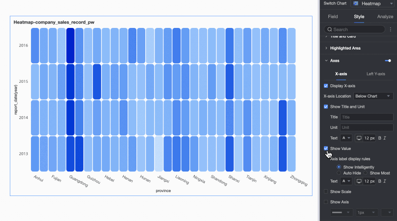
Axes
In the Axes section, configure axis styles.
The following settings apply to standard heatmaps. For polar heatmaps, configure only Show outer axis labels and Show inner axis labels.
Name | Configuration item | Description |
X-axis | Show X-axis | Set whether to show the X-axis. |
X-axis position | Set the X-axis position to top or bottom of the chart. | |
Show title and unit | Set whether to show the axis title and unit on the X-axis. | |
Show axis labels | Set whether to show axis labels on the X-axis and configure label display rules and text style. Label display rules include Smart display, Force sparse, and Max display.
| |
Show tick marks | Set whether to show tick marks on the X-axis. | |
Show axis line | Set whether to show the axis line on the X-axis and configure its style, including line type, width, and color. | |
Left Y-axis | Show left Y-axis | Set whether to show the left Y-axis. |
Show title and unit | Set whether to show the axis title and unit on the Y-axis. | |
Show axis labels | Set whether to show axis labels on the left Y-axis and configure label display rules and text style. | |
Show tick marks | Set whether to show tick marks on the left Y-axis. | |
Display Coordinate Axes | Set whether to show the axis line on the left Y-axis and configure its style, including line type, width, and color. |
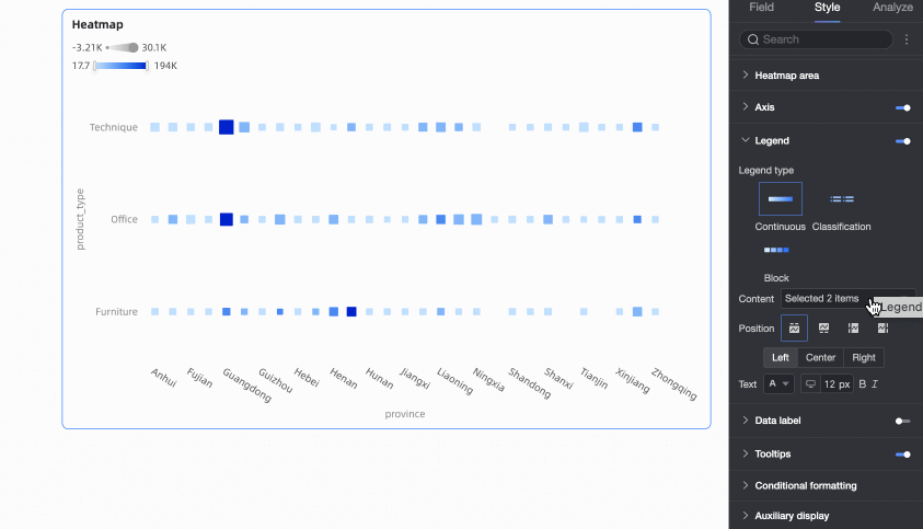
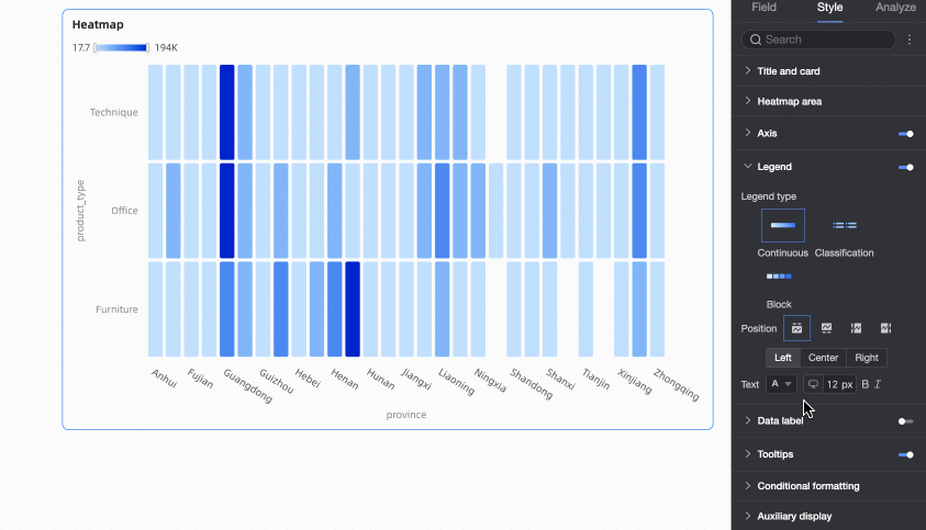
Legend
In the Legend section, click the  icon to enable the legend and configure its style.
Configuration item | Description |
Legend type | If you select Equal intervals or Custom range for Data mapping range in the Heat area, choose a legend type: Continuous, Categorical, or Block. |
Content | If you drag fields into both the Heat Intensity and Shape Size areas of the Fields panel, choose which field to show in the legend. |
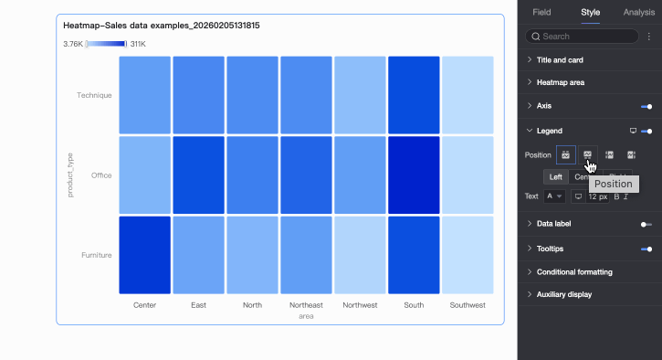
Position | Set the legend position and alignment.
|
Text | Configure text formatting for the legend. |
Mobile legend | Legend settings for PC and mobile devices are independent. Click the PC/Mobile toggle button ( |

 ) at the top of the dashboard editor to switch to mobile editing mode and configure a mobile-optimized legend.
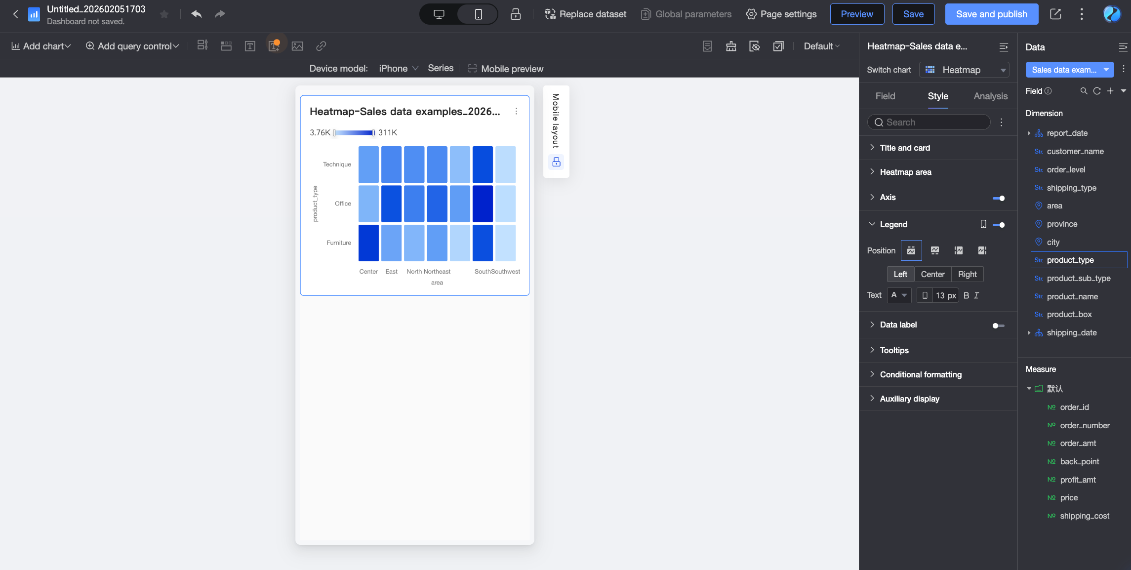
Data Labels
In the Data labels section, specify whether to display data labels.

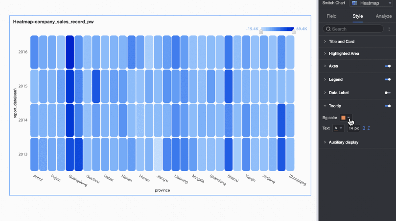
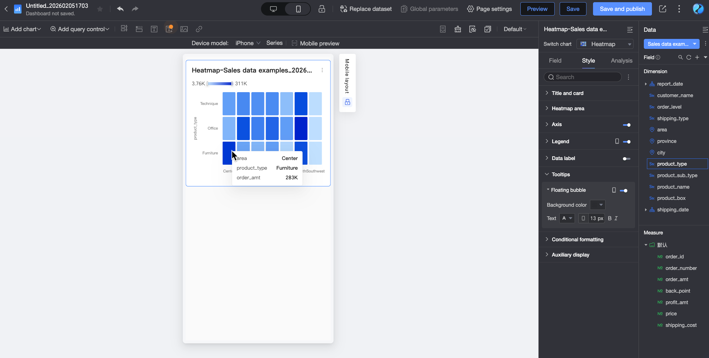
Tooltip
In the Tooltip section, configure tooltip styling.
Configuration item | Description |
Background color | Set the background fill color of the tooltip box. |
Text | Configure text style in the tooltip box, including font color, size, weight, and italic setting. |
Mobile tooltip | Tooltip settings for PC and mobile devices are independent. Click the PC/Mobile toggle button ( |
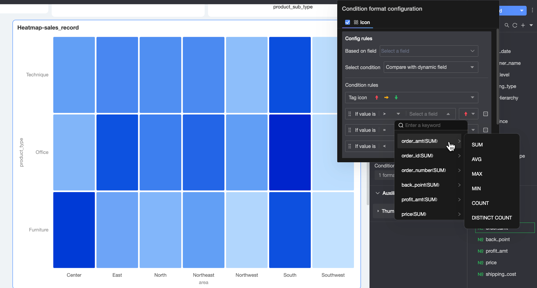
Conditional Formatting
In Conditional Formatting, define the format to display when data meets certain conditions. Click the  icon under Conditional Style. In the Conditional Formatting Configuration dialog box, select the Icon option and configure the related settings.
Only standard heatmaps support conditional formatting.

Configuration item | Description | |
Rule definition | Field | Select the field to apply conditional formatting to. |
Condition Selection | Choose how to compare data values. Options are Compare with static value and Compare with dynamic field.
| |
Conditional Rule | Select an icon for the condition and define the comparison rule.
| |
More settings | Set the size of icons shown in the chart. | |

Supplementary Display
In the Supplementary display section, configure thumbnails for the X-axis and Y-axis.
Only standard heatmaps support thumbnails.
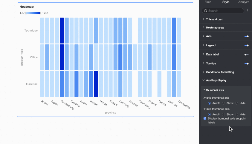
Chart analysis Configuration
Name | Description |
Drilling | If you have configured drill-down fields in the Fields panel, set the display style for drill-down levels here. For details, see Drilling. |
Filter interaction | If your analysis data spans multiple charts, use filter interaction to link them for coordinated analysis. For details, see Filter interaction. |
Go to | If your analysis data spans multiple dashboards, use dashboard navigation to link them. Navigation supports in-product navigation, component-level navigation, and external links. For details, see Navigation. |