A box plot displays the distribution of one or more sets of continuous data. It helps you identify skewness and detect outliers. This topic explains how to add data to a box plot and configure its style.
Prerequisites
You have created a dashboard. For more information, see Create a dashboard.
Overview
A box plot uses six elements to describe a data distribution: upper edge, upper quartile, median, lower quartile, lower edge, and outliers. This provides a clear view of distribution trends.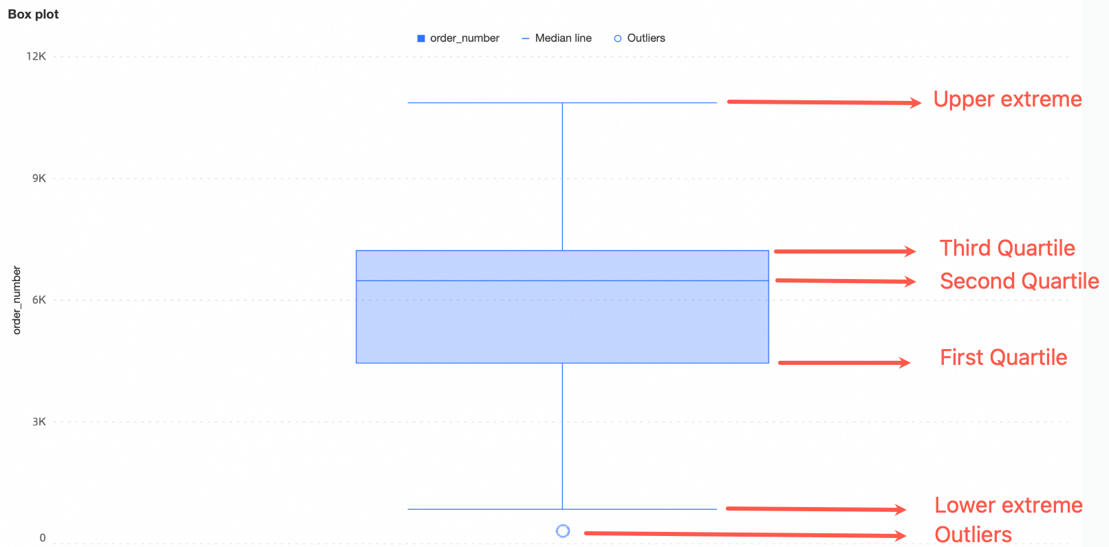
Upper and lower edges: Represent the range of the data distribution. For information about how to calculate these values, see Calculation method for upper and lower edges in this topic.
Upper quartile (Q3): The value greater than 75% of the data in the dataset.
Median: The middle value in the dataset. It is greater than 50% of the data.
Lower quartile (Q1): The value greater than 25% of the data in the dataset.
Outliers: Values less than
Q1 - 1.5 * IQRor greater thanQ3 + 1.5 * IQR. The interquartile range (IQR) is the difference between Q3 and Q1.
Scenarios
Common use cases for box plots include the following:
Data distribution analysis, such as analyzing salary levels across different regions or temperature distributions across geographical areas.
Outlier detection, such as auditing transaction amounts for unusually large or small values.
Quality management, such as monitoring the distribution range of product features to ensure consistency.
Analysis of central tendency and skewness, such as evaluating sales figures across regions to understand the average value and fluctuation range.
Advantages
Calculation capabilities: Supports multiple calculation rules for upper and lower edges. Provides advanced calculations, such as cumulative calculations, year-over-year comparisons, month-over-month comparisons, and TopN. You can also add smart auxiliary lines.
Visualization effects: Supports chart style adjustments for more intuitive displays. You can add auxiliary elements such as legends, navigators, and tooltips.
Data comparison and annotation: Supports period-over-period comparisons for data with different dimension values.
Annotation capabilities: Lets you customize comments and endnotes. Supports linking to external paths to enable interaction between your data and other systems.
Interactive operations: Supports dimension and measure filtering, in-table filtering, and more.
Example Rendered Result
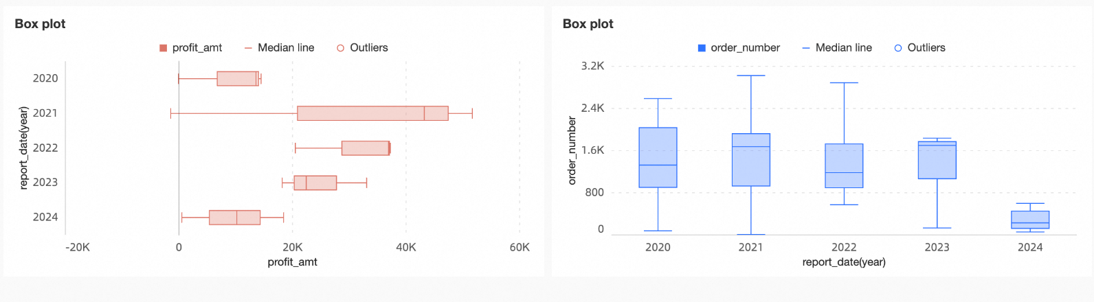
You can analyze the following from a box plot:
Central tendency: The median reflects the central tendency of the data.
Dispersion: The length of the box indicates how concentrated or dispersed the data distribution is.
Skewness: The distance from the box to the upper and lower edges indicates whether the data distribution is skewed.
Outliers: Marked outliers indicate abnormal values.
Range: The span of the whiskers and the distribution of data points reflect the range of the data distribution.
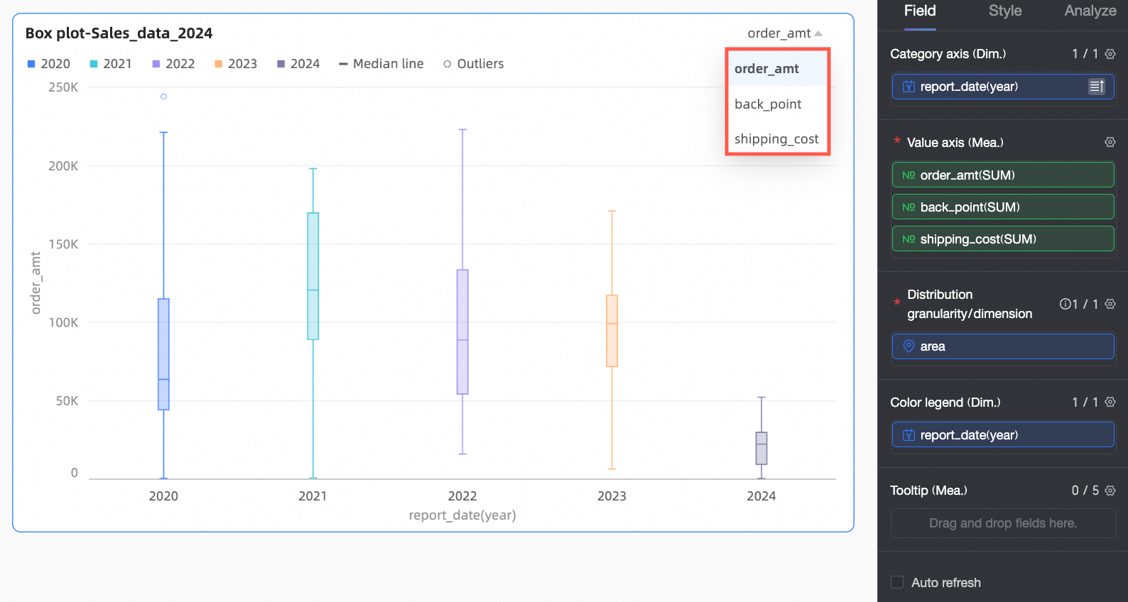
Configure Chart Fields
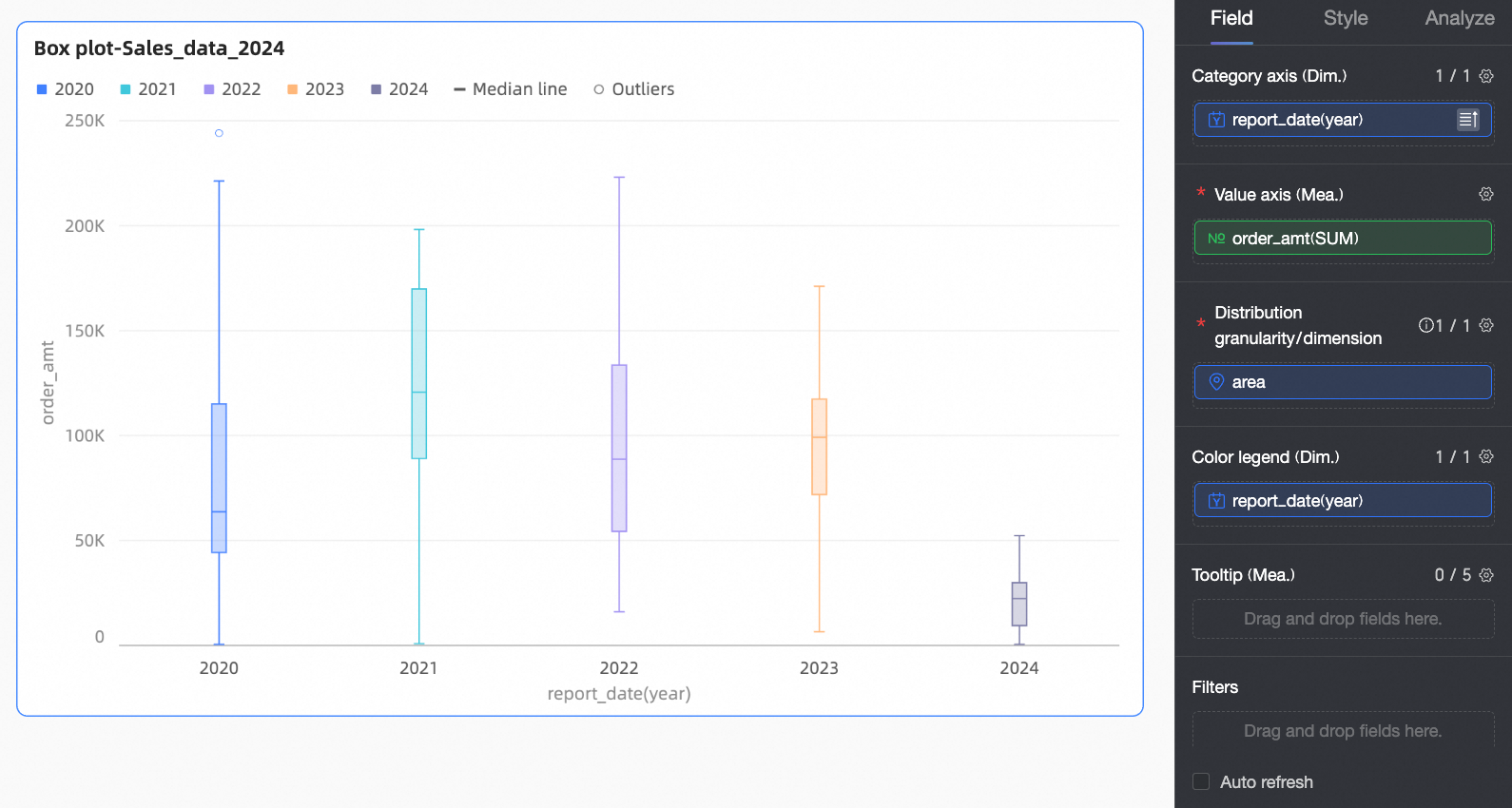
This section uses annual order amount analysis as an example to explain how to configure fields.
In the Data pane, select the required dimension and measure fields. Double-click or drag the fields to the corresponding areas on the Fields tab.
In the Category axis/Dimension area, configure the dimension for data comparison based on your analysis needs.
In this example, drag the report_date(year) field to compare order amounts by year.
In the Value axis/Measure area, configure the main analysis metric for the chart.
In this example, drag the Order amount field as the main metric.
In the Distribution granularity/Dimension area, configure the analysis granularity for the chart. Data points are generated at this granularity and used to calculate the box plot.
In this example, drag the region field to view the distribution of order amounts by region.
To refine the comparison dimension, you can configure additional dimension fields in the Color legend/Dimension area. The chart is then split based on the number of dimension values in that field. For example, you can break down annual profit amounts by product type.
This example does not use this field.
NoteYou can drag the same field into both the Category axis and Color legend areas to assign different colors based on different dimension values. The effects in different scenarios are as follows:
If there is only one field in both the Category axis and Value axis, the number of bars equals the number of dimension values on the category axis.
If there are multiple measure fields in the Value axis, the chart displays the first measure by default. You must open the field filter panel to switch to other measures.
Click Update. The system automatically updates the chart.
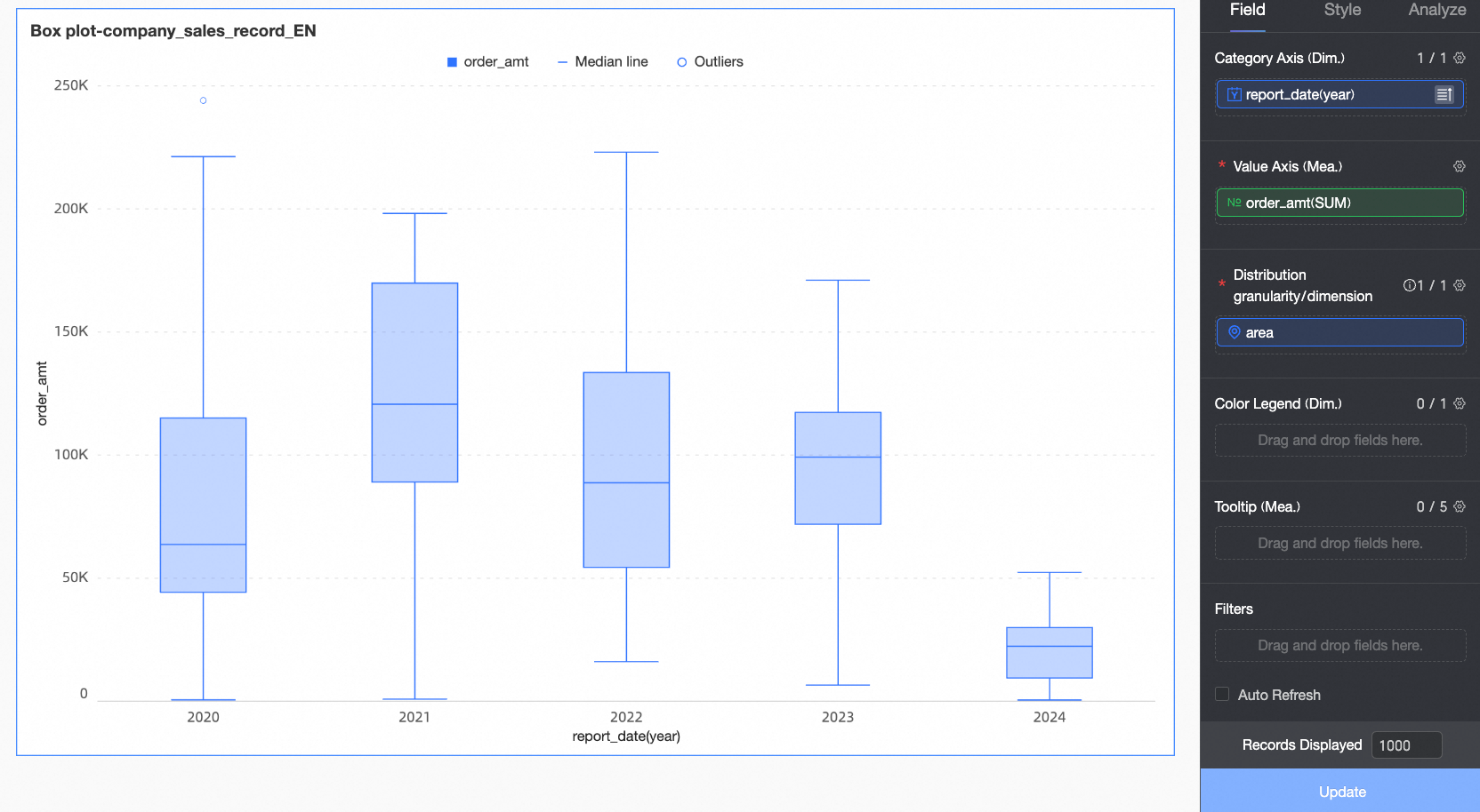
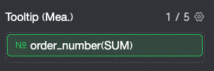
To display data for a specific measure in the tooltip, add the measure to Tooltip/Measure.
To filter out data from certain regions, drag the region field to the Filters area. Click the
 icon and select the required data in the Set Filters window.
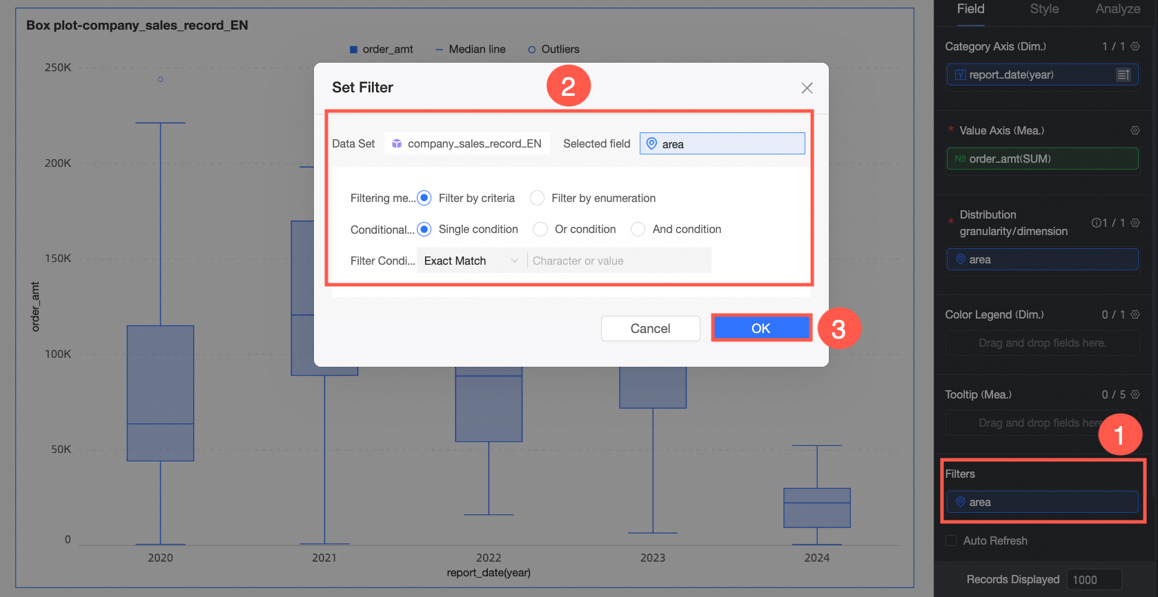
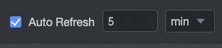
Auto-refresh
After you enable this option, the system automatically refreshes the chart data. For example, select this option, set the duration to 5, and select Minutes as the unit. The system then refreshes the chart data every 5 minutes.
Configure Chart Styles
This section describes how to configure chart styles. For information about common Title and Card settings, see Configure the chart title.
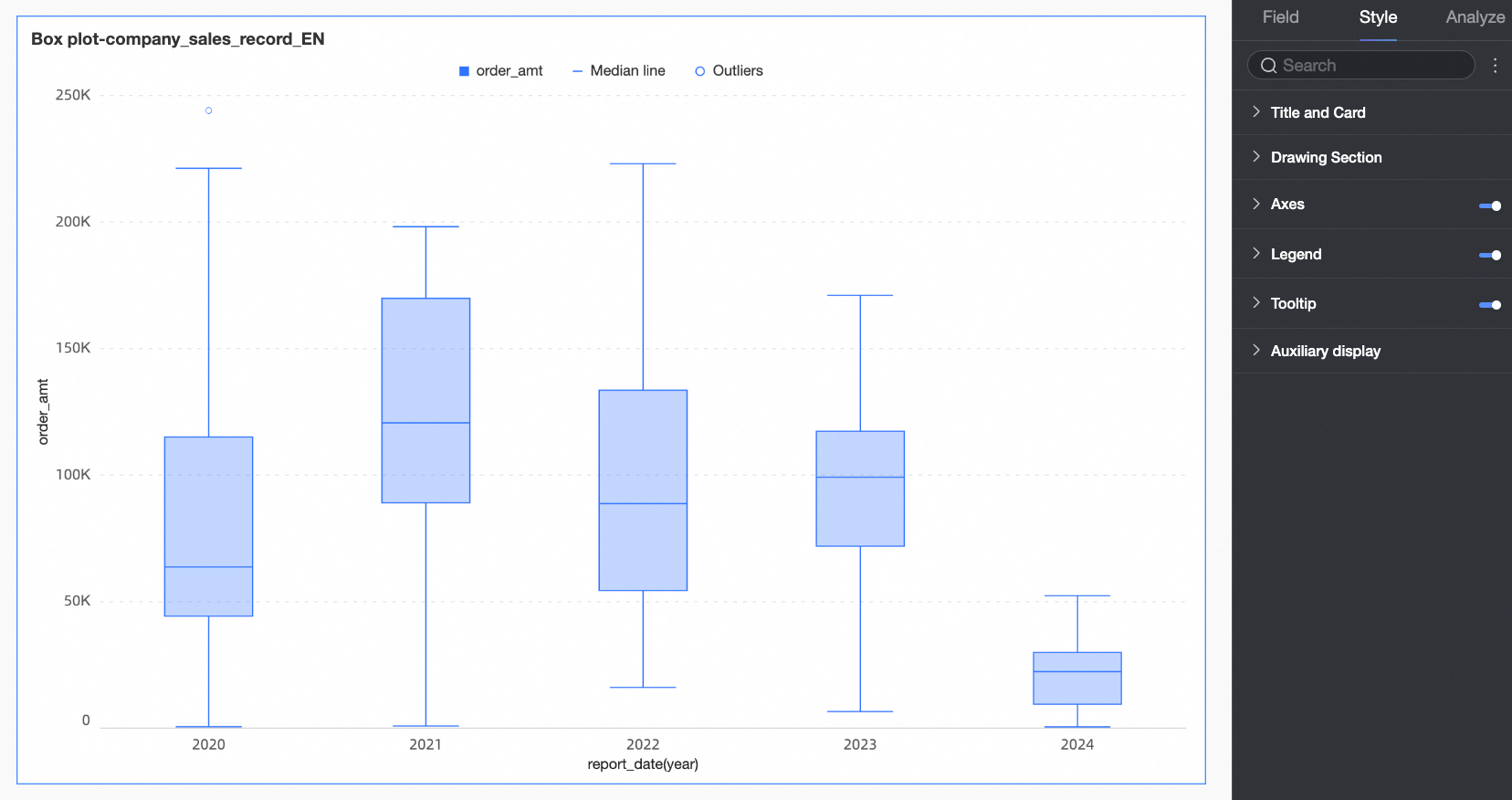
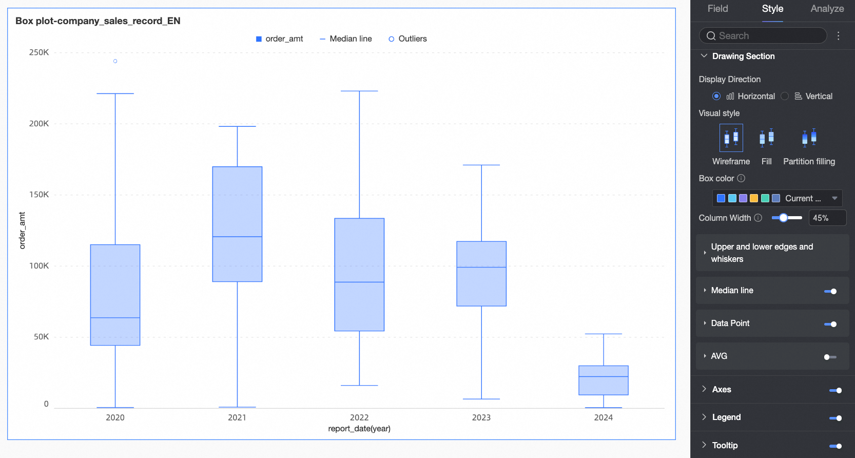
Chart Area
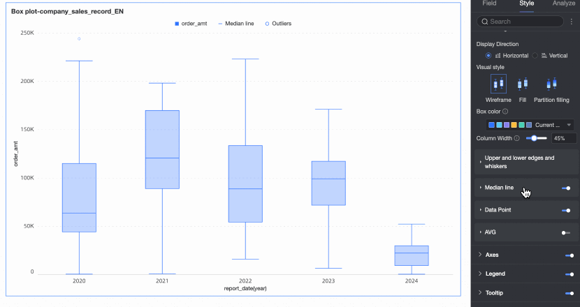
On the Style tab, in the Chart area section, configure the box plot style.
Configuration item | Configuration | Configuration Item Description |
Chart orientation | Set the orientation of the boxes. You can select Horizontal or Vertical. | |
Visualization style | Set the visual style of the boxes. You can select Wireframe, Fill, or Partitioned fill.
| |
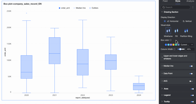
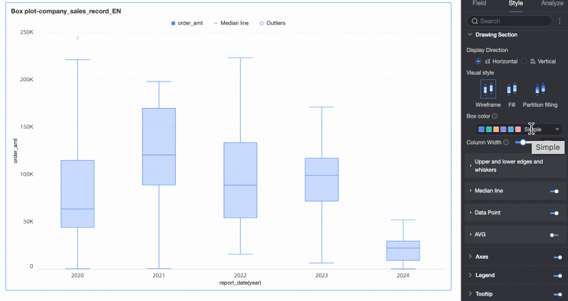
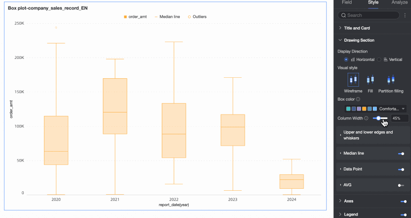
Box color | Set the color style for the boxes of the field configured in Value axis/Measure. You can customize the box color. | |
Bar Width | Set the width of the boxes. This setting has no effect if the configured width exceeds the maximum allowed width. | |
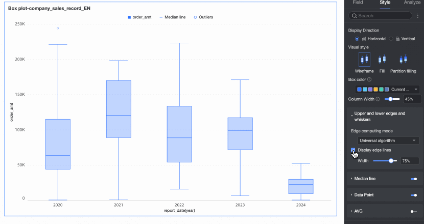
Whiskers and edges | Calculation method for upper and lower edges | Set the calculation method for the upper and lower edges. The following four methods are supported:
|
Show upper and lower edges | Specify whether to show the upper and lower edge lines of the box plot. If you show the lines, you can also set their width. | |
Median line | Specify whether to show the median line and set its style. | |
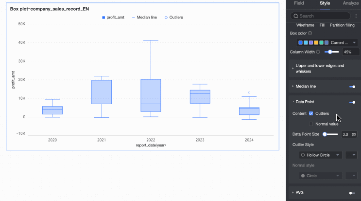
Data points | Content | Specify whether to show Outliers and Normal values in the chart. Note You can configure the style of data points only when they are shown. |
Data point size | Set the size of the data points. | |
Outlier style | Set the shape and color of the outliers. | |
Normal point style | Set the shape and color of the normal data points. | |
Average value | Average value style | If the average value is shown, set its shape and color. |
Circle size | Set the size of the shape that represents the average value. | |
Axes
On the Style tab, in the Axes section, configure axis styles. By default, the axes are displayed.
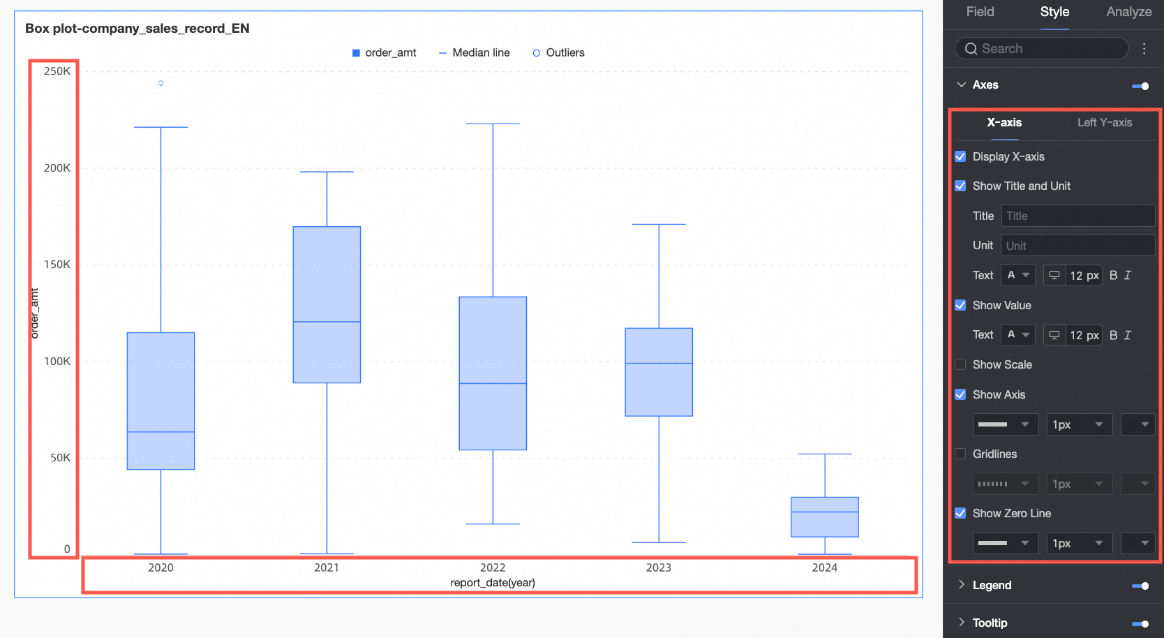
Configuration item | Configuration | Description |
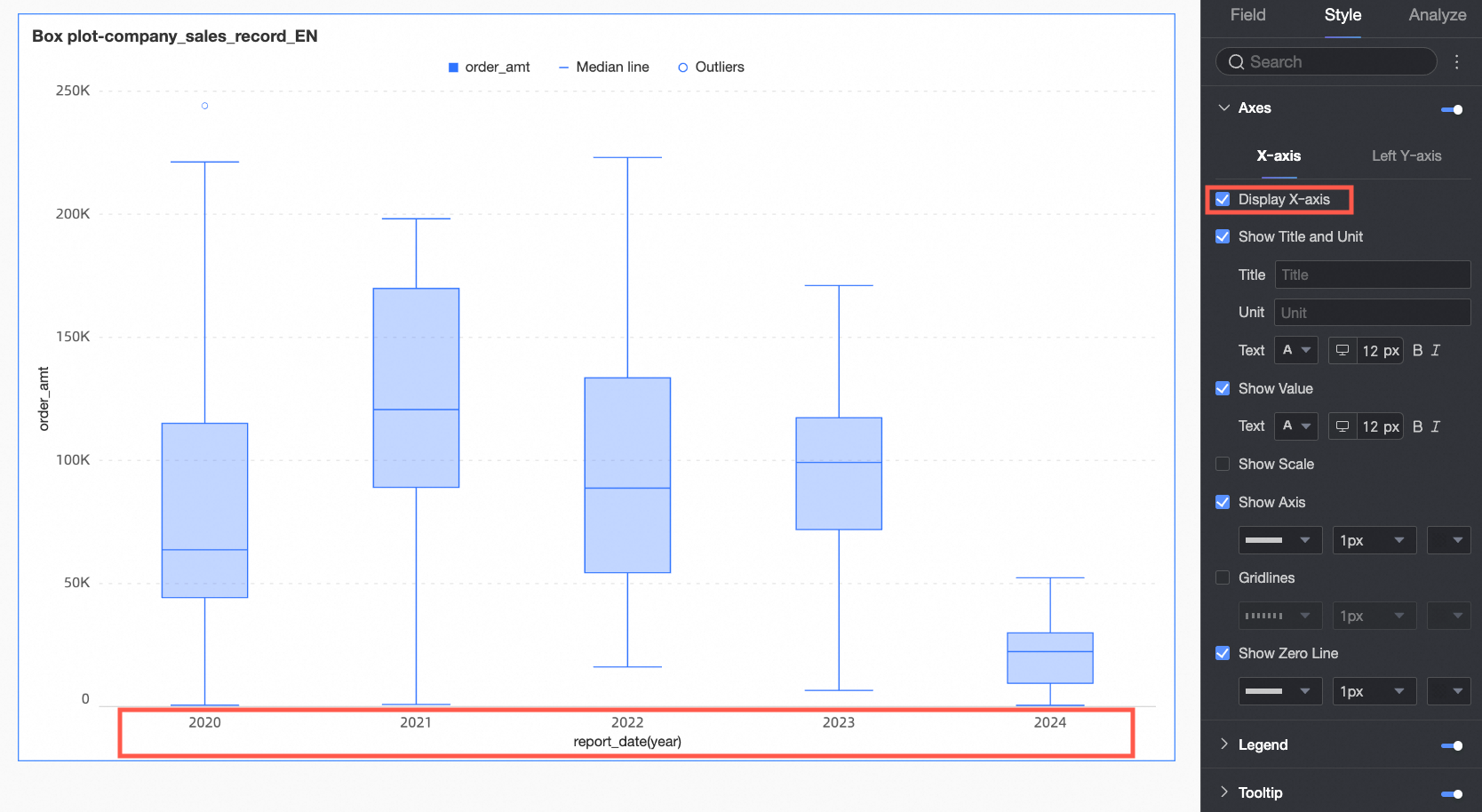
X-axis | Show X-axis | Specify whether to show the x-axis. |
Show title and unit | Specify whether to show the Title and Unit on the x-axis. You can customize the title, unit, and text style. | |
Show axis labels | Specify whether to show axis labels on the x-axis and configure the text style of the labels. | |
Show tick marks | Specify whether to show tick marks on the x-axis. | |
Show axis line | Specify whether to show the x-axis line. If you show the line, you can customize its style, including line type, width, and color. | |
Show gridlines | Specify whether to show gridlines for the x-axis. If you show the gridlines, you can customize their style, including line type, width, and color. | |
Show zero tick line | Specify whether to show the zero tick line for the x-axis. If you show the line, you can customize its style, including line type, width, and color. | |
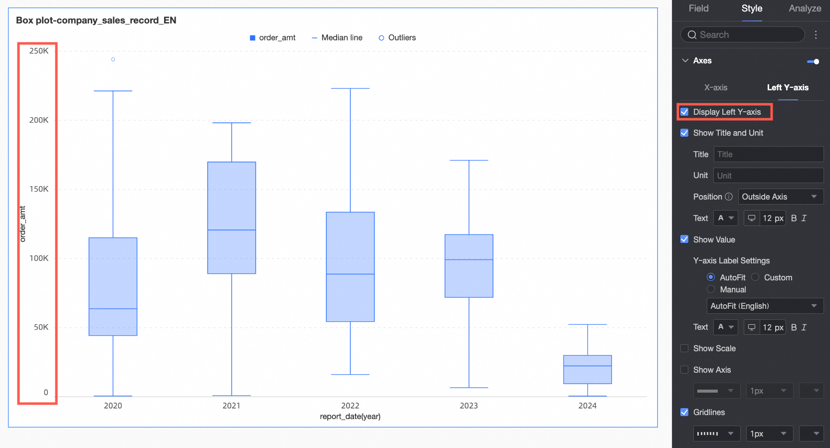
Left Y-axis | Show left Y-axis | Specify whether to show the left y-axis. |
Show title and unit | Specify whether to show the axis Title and Unit. You can customize the title, unit, and text style. | |
Show axis labels | Specify whether to show labels on the left y-axis, and configure the Label display format and Text style. | |
Show tick marks | Specify whether to show tick marks on the left y-axis. | |
Display the coordinate axis | Specify whether to show the left y-axis line. If you show the line, you can customize its style, including line type, width, and color. | |
Show gridlines | Specify whether to show gridlines for the left y-axis. If you show the gridlines, you can customize their style, including line type, width, and color. | |
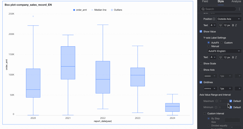
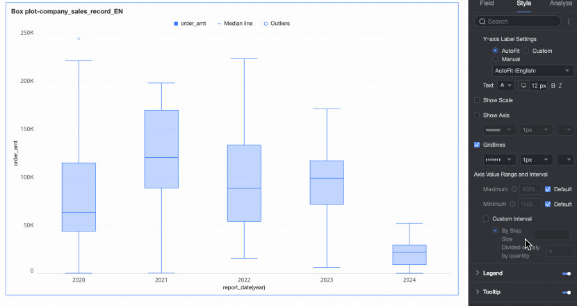
Axis range and interval | Set the maximum and minimum values for the left y-axis, and the interval size between axis values.
|
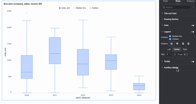
Legend
In the Legend section, click the  icon to enable the chart legend and configure its style.
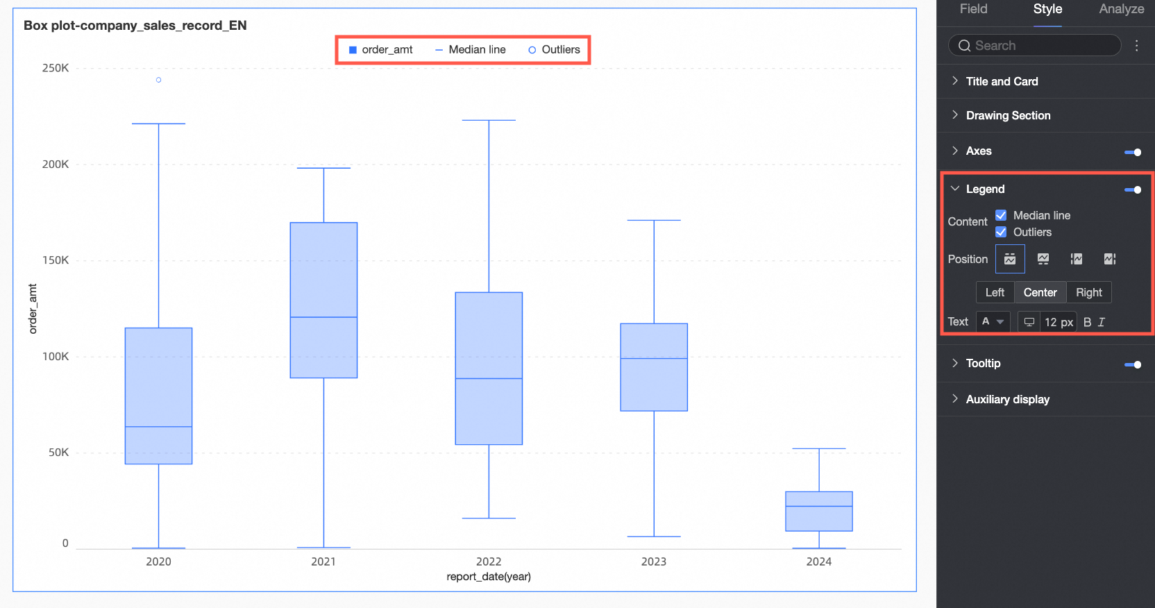
Configuration item | Configuration item description |
Content | Select whether to display the metric for the background area in the legend. |
Position | Set the display position and alignment of the legend.
|
Text | Set the legend text style. You can set the font color, size, weight, and whether it is italicized. |
Mobile legend | The legend settings for PC and mobile are independent. You can switch to the mobile editing view by clicking the PC/mobile toggle button ( |
 ) at the top of the dashboard editing page. This lets you set a separate legend for mobile, including its position and text style.
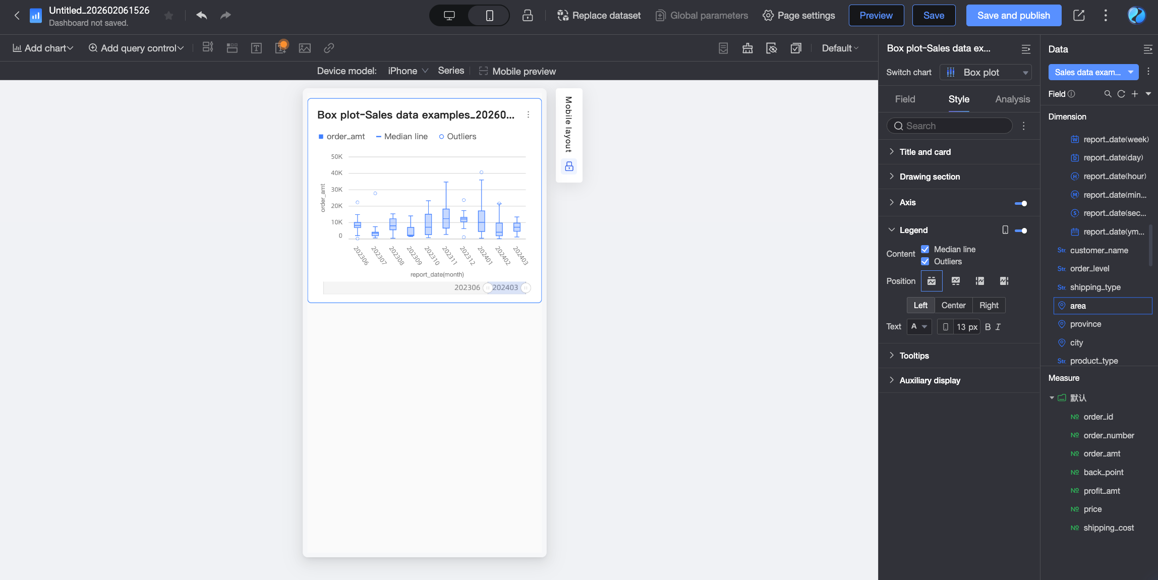
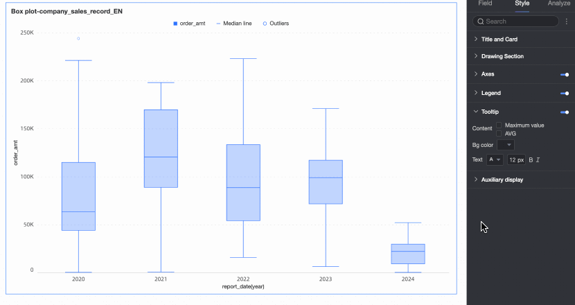
Tooltip
In the Tooltip section, click the icon to enable tooltips and configure their style.
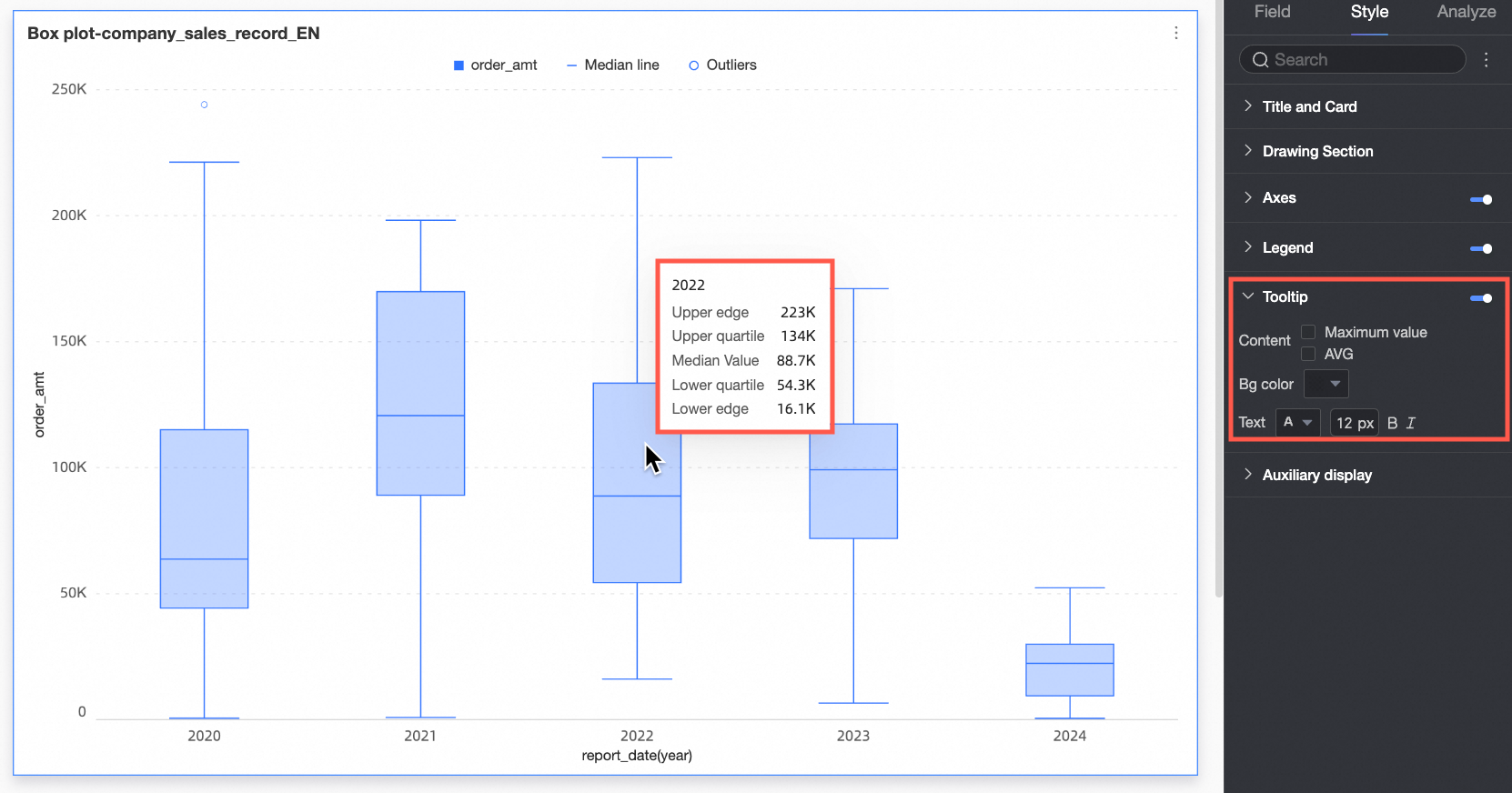
Configuration item | Description |
Content | Select whether to show the maximum and average values in the tooltip. |
Background color | Set the background color of the tooltip box. |
Text | Set the style of the text in the tooltip box. You can set the font color, size, weight, and whether it is italicized. |
Mobile tooltip | The tooltip switches for PC and mobile are independent. You can switch to the mobile editing view by clicking the PC/mobile toggle button ( |

Display Assistance
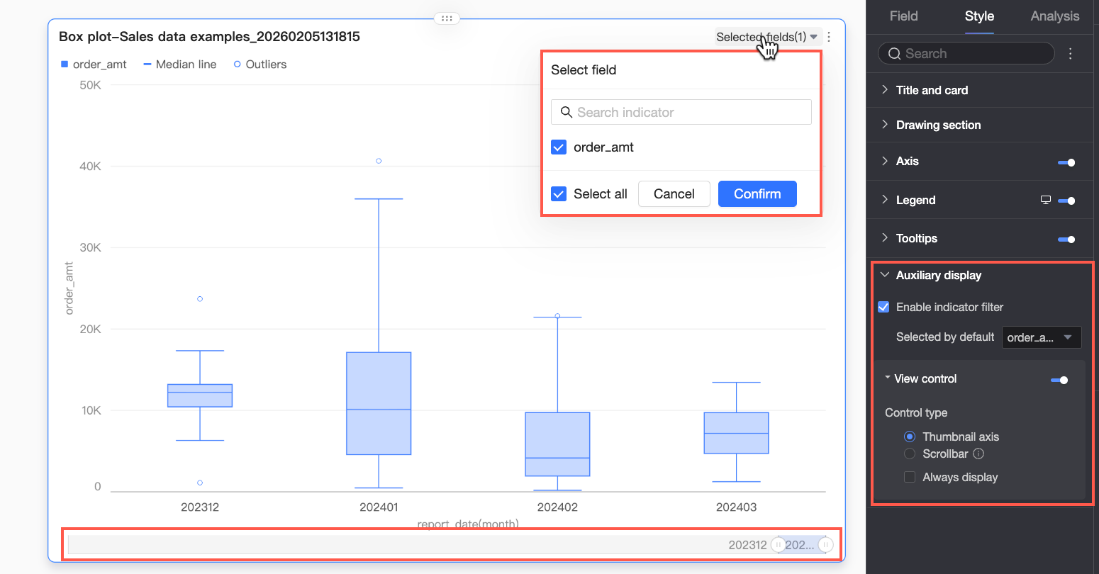
In the Display assistance section, configure the display of the metric filter and view controls.
Configuration item | Description |
Show metric filter | Specify whether to enable the in-chart metric filter. If enabled, you can further set the default selected metric field. |
View control | If the data on the chart axis is dense and cannot be fully displayed within the current container size, you can click the You can use the following two control types to manage the visible area on the chart axis: Navigator and Scroll bar.
Note If no view control is configured for the chart and the chart size is too small, the system automatically enables view controls, selects Navigator, and shows it only when the data volume exceeds the display width of the chart container. |
 icon to enable chart view controls. This allows report viewers to dynamically adjust the visible range of the chart by sliding, providing a flexible management experience while ensuring data integrity and readability.
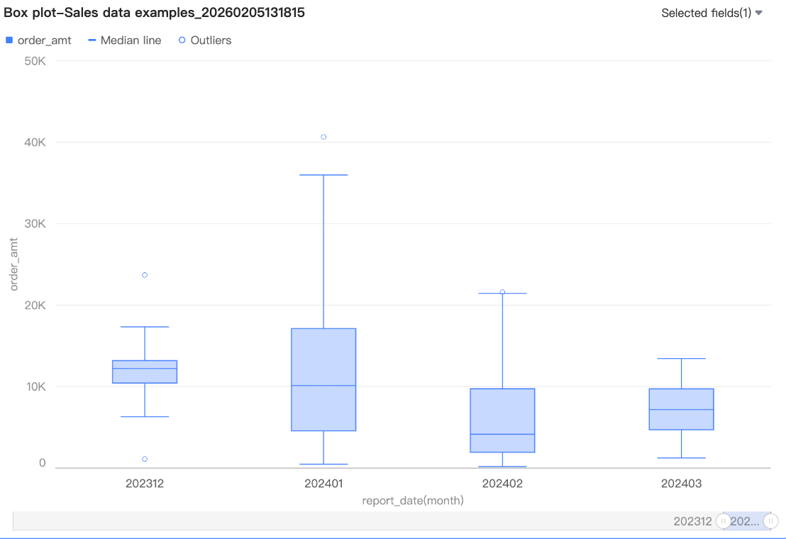 By default, the navigator is shown only when the data volume exceeds the display width of the chart container. To always show the navigator in the chart, select Always show. After you select this option, the navigator is always displayed, even if the chart data does not fill the screen.
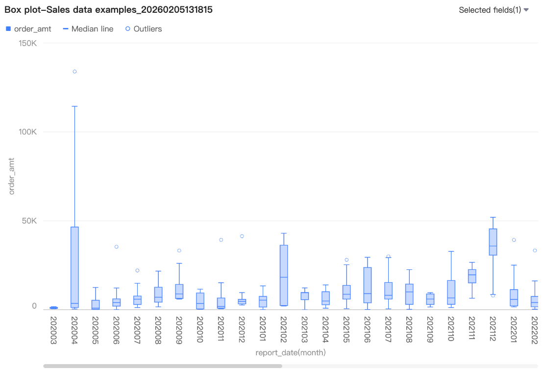 You can also set the minimum category width for the scroll bar to limit the amount of data in the current chart window. This ensures that the chart content is clearly scaled within the visible area and avoids visual clutter from overlapping data labels or overly dense data points. The default minimum category width is 32 px, with a value range of 16 px to 100 px.
Chart Analysis
Configuration item | Configuration | Description |
Data interaction | Drilling | If you have configured drilling fields in the fields pane, you can set the display style for the drilling level rows here. For more information, see Drilling. |
Filter interaction | If the data you need to analyze is in different charts, you can use filter interaction to link multiple charts for data analysis. For more information about the settings, see Filter interaction. | |
Go To | If the data you need to analyze is in multiple dashboards, you can link the dashboards for data analysis. Linking includes three methods: Internal link, In-page component, and External link. For more information about the settings, see Link. | |
Analysis and alerts | Auxiliary line | Use auxiliary lines to see the difference between the current measure value and the set value of the auxiliary line. The set value can be a static field or a calculated value. Calculated values include average value, maximum, minimum, and median. For more information about the settings, see Analysis and alerts. |
Annotations | - | If data in the chart is abnormal or requires special attention, you can use color highlights, icons, comments, or data points to annotate it. This helps you identify anomalies and take appropriate action. For more information about the settings, see Annotations. |
What to do next
If others need to view the dashboard, you can share it with specific people. For more information, see Share a dashboard.
To create a complex, topic-based analysis with a navigation menu, you can integrate your dashboards into a BI portal. For more information, see BI portal.