This topic describes the chart styles of the image carousel widget and the meaning of each configuration items.
Chart style
A image carousel is a type of media component that supports custom image carousel and carousel animation effects. It can display multiple images in turn in visual applications. 
Settings Panel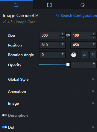
- Search for Configurations: In the right-side panel of Canvas Editor, click the Settings tab, and click Search for Configurations in the upper-right corner. Enter the required configuration item in the search box, and click the search icon to quickly locate the configuration item. Fuzzy match is supported. For more information, see Search for asset configurations.
- Size: indicates the size of a widget, including its pixel width and height. You can click the
 icon to proportionally adjust the width and height of a widget. After you click this icon again, you can adjust the width and height as needed.
 - Position: the position of a widget, which is indicated by pixel X and Y coordinates. X-coordinate indicates the pixel distance between the upper-left corner of the widget and the left border of the canvas. Y-coordinate indicates the pixel distance between the upper-left corner of the widget and the upper border of the canvas.
- Rotation Angle: the angle of a rotation that uses the center point of a widget as the rotation point. The unit is degrees (°). You can use one of the following methods to control the rotation angle of a widget:
- Directly enter the degrees in the Rotation Angle spin box or click the plus sign (+) or minus sign (-) to increase or decrease the value in the Rotation Angle spin box.
- Drag the black dot in the
 icon.
icon. - Click the
 icon to horizontally flip a widget.
 - Click the
 icon to vertically flip a widget.
- Opacity: the opacity of a widget. Valid values: 0 and 1. If this parameter is set to 0, the widget is hidden. If this parameter is set to 1, the widget is completely displayed. Default value: 1.
Global Style
Parameter
Description
Font
The font of the text in the image carousel widget. Select a font that is installed in your computer. Otherwise, the default font is used.
Font size
The font size of the text in the image carousel widget. Valid value: 10 to 100.
Animation
Parameter
Description
Automatic Carousel
Specifies whether to enable or disable automatic carousel.
Pause
The time interval to rotate the images. Unit: ms.
Speed
The duration of the animation. Unit: ms.
Special Effects
The effect of the animation. You can select Horizontal Scrolling, Vertical Scrolling, Fade, or Mosaic.
Image
Parameter
Description
Default Image
image carousel the default image. Drag the local image to the dashed box or enter the URL of the image. To delete an image, move the pointer over the image box and click Delete.
NoteIf the url field in the data panel is empty, the image in the default image configuration items is used.
Filling Method
The filling mode of the image. Valid values: Stretch to Fill Container, Fill Container, and Center.
Description: the description style of each image in the carousel. You can click the
 icon to display or hide the description.
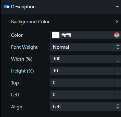
Background Color: the background color of the description.
Parameter
Description
Color Style
The style of the background color. You can select Gradient or Monochrome.
Color
The background color. This parameter is valid only when the Color Style parameter is set to Monochrome.
Start Color
The start color of the background. For more information, see color picker description. This value is valid only when the Color Style is set to Gradient.
End Color
The end color of the background. This parameter takes effect only when the Fill Style parameter is set to Gradient.
Angle
The direction in which the two color gradients begin to end.
Color: the color of the description text.
Font Weight: the font weight of the description text.
Width (%): the percentage of the description width to the widget width.
Height: the percentage of the height of the widget. Unit: %.
Top: the top padding of the description from the top border of the widget. Unit: pixels.
Left Margin: the distance between the description bar and the left boundary of the widget. Unit: pixels.
Alignment: describes the alignment of the text. You can select Left, Center, or Right.
Dot: the dot style at the bottom of the image carousel. You can click
the icon to control the visibility of the dot. 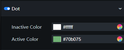
Parameter
Description
Dot Color
The dot color of the images that are not in display.
Current Color
The dot color of the image that is in display.
Data Panel
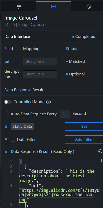
Configuration field description
Parameter | Description |
| The URL of the carousel image. It is the same as the Default Image configuration items feature under Image in the configuration panel. If you configure both parameters, the content in the Note You must configure cross-origin access for the image. If you do not specify the protocol, for example, //img.alicdn.com/tps/TB1PH6EPXXXXXXbaFXXXXXXXXXX-4001-2251.png, DataV uses the protocol of the project to request the image. |
| Optional. The description of the image. |
| Parameter | Description |
| Controlled Mode | If you turn on the switch, data is not requested when a widget is initialized. Data requests are triggered only based on callback IDs or the method configured in Blueprint Editor. If you turn off the switch, data requests are automatically triggered. By default, the switch is turned off. |
| Auto Data Request | After you select the Auto Data Request check box, you can enable dynamic polling, and manually specify the polling interval. If you do not select this check box, data is not automatically requested. You must manually refresh the page to request data or use Blueprint Editor or callback ID events to trigger data requests. |
| Data Source | In the right-side panel of Canvas Editor, click the Data tab. Click Set next to Static Data. In the Configure Datasource panel, select a data source from the Data Source Type drop-down list. Enter code for data query in the code editor, click Preview Data Response to preview the response of the data source, and then view the response. For more information, see Configure asset data. |
| Data Filter | If you select the Data Filter check box, you can convert the data structure, filter data, and perform simple calculations. If you click the plus sign (+) next to Add Filter, you can configure the script for the data filter in the editor that appears. For more information, see Use the data filter. |
| Data Response Result | The response to a data request. If the data source changes, you can click the  icon next to Data Response Result to view the data response in real time. icon next to Data Response Result to view the data response in real time. |
Interaction Panel 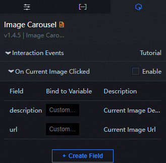
Select the Enable check box to enable interactions between widgets. When you click an image, a data request is triggered to pass callback IDs. This allows you to dynamically load data of the image carousel widget. By default, the description and url parameters are passed. For more information, see Configure a callback ID.
Configure interactions in Blueprint Editor
- In Canvas Editor, right-click a widget in the Layer panel and select Add to Blueprint Editor.
- Click the
 icon in the upper-left corner of the page.
 In Blueprint Editor, click Image Carousel in the Imported Nodes pane. You can view the image carousel parameters in the canvas, as shown in the following figure.
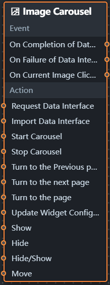
Event
Event
Description
When the data interface request is completed
The event is triggered with the processed JSON data after a data interface request is responded and processed by a filter. For more information about specific data examples, see the Data Response Result section of the Data tab in the right-side configuration panel of the canvas editor.
When a data interface request fails
The event that is returned when a data interface request fails (the request may be due to network problems or interface errors) and is processed by the filter. The event also throws the processed JSON data. For more information about specific data examples, see the Data Response Result section of the Data tab in the right-side configuration panel of the canvas editor.
When you click on the image
When you click an image, this event is triggered to pass the description and URL of the image.
Policy Action
Policy Action
Description
Request Data Interface
This action is performed to request the server data again. The data sent by an upstream data processing node or layer node is used as a parameter. For example, image carousel the API data source is
https://api.testand the data transferred to the request data interface is{ id: '1'}, the final request interface ishttps://api.test?id=1.Import data
After data of a widget is processed in accordance with its drawing format, the widget is imported for redrawing. You do not need to request server data again. For more information about specific data examples, see the Data Response Result section of the Data tab in the right-side configuration panel of the canvas editor.
Start carousel
Start to play the image in turn. The following example shows the reference data.
return {
  "index": 0 // The sequence number of the image in the component data source. By default, the value starts from 0.
}
Stop carousel
This action stops rotating the images and does not need parameter input.
Turn to the previous page
This action displays the previous image based on the sequence number of the current image and does not need parameter input.
Go to the next page
This action displays the next image based on the sequence number of the current image and does not need parameter input.
Turn to a page
Play an image without parameters.
Update component configurations
Style configurations of widgets are dynamically updated. Before this action is executed, you must click the widget in Canvas Editor, click the Settings tab in the right-side panel, and click Copy Configurations to... to obtain widget configurations. After that, change the style field for the data processing node in Blueprint Editor.
Display
Displays the widget. The following example shows the reference data.
return {
  "animationType": "",
  "animationDuration": 1000,
  "animationEasing": "linear"
};
Hide
The following example shows how to hide a widget.
return {
  "animationType": "",
  "animationDuration": 1000,
  "animationEasing": "linear"
};
Switch to the hidden state
Specifies whether to show or hide a widget. The following example shows the reference data.
return {
  "animationIn": {
    "animationType": "",
    "animationDuration": 1000,
    "animationEasing": "linear"
  },
  "animationOut": {
    "animationType": "",
    "animationDuration": 1000,
    "animationEasing": "linear"
  }
};
Move
Move a widget to a specified location. The following example shows the reference data.
return {
  // The positioning type. to indicates absolute positioning, whereas by indicates relative positioning. The default value is to.
  "positionType": "to",
  // The location, which is indicated by the x and y coordinates.
  "attr": {
    "x": 0,
    "y": 0
  },
  // The animation type.
  "animation": {
    "enable": false,
    // The duration in which animation is displayed.
    "animationDuration": 1000,
    // The animation curve, which can be set to linear|easeInOutQuad|easeInOutExpo.
    "animationEasing": "linear"
  }
};