By Damo from F(x) Team
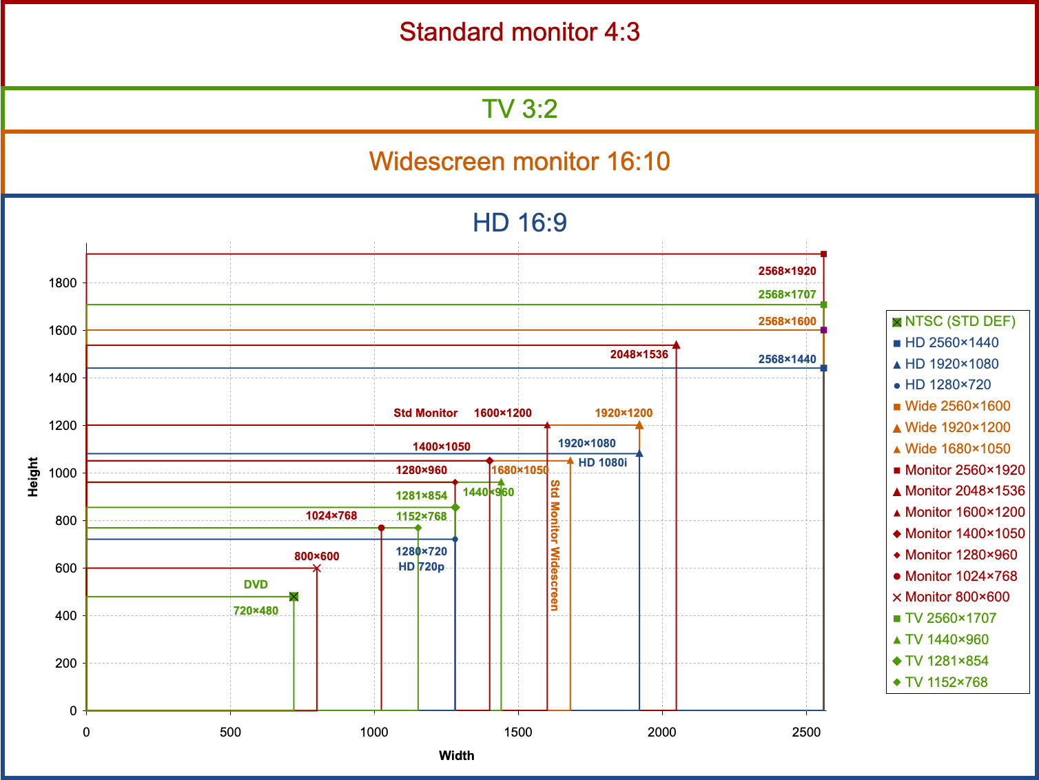
CSS proportional scaling generally means the height of the container changes proportionally to the width."This is also called the aspect ratio in many cases. As we all know, the terminals we face when developing Web pages are more complex, and the aspect ratios of these terminals are different. Common aspect ratios include:
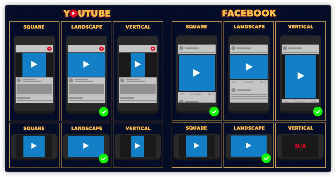
There will be more requirements in this area, especially for those doing media-related development, such as videos and images. For example, pictures and videos on Facebook:
Before the emergence of _aspect-ratio_ in CSS, some Hack methods were often used to realize similar effects, such as padding-top or padding-bottom.
<aspectratio-container>
  <aspectratio-content></aspectratio-content>
</aspectratio-container>

<style>
    .aspectratio-container {
      width: 50vmin; /* Users set values according to their needs */

      /* The layout can be adjusted */
      display: flex;
      justify-content: center;
      align-items: center;
  }

  /* It is used to increase the height of aspectratio-container */
  .aspectratio-container::after {
        content: "";
        width: 1px;
        padding-bottom: 56.25%;

        /* Aspect ratio of the element */
        margin: -1px;
        z-index: -1;
  }
</style>
With CSS custom properties, we can combine them with the calc() function to achieve the effect of container proportional scaling.
.container {
    --ratio: 16/9;
  height: calc(var(--width) * 1 / (var(--ratio)));
  width: 100%;
}
Although simpler than Hack methods, such as padding-top, it is still much more complicated than the native aspect-ratio.
.container {
    width: 100%;
  aspect-ratio: 16 / 9;
}
The following demo demonstrates the aspect ratios using the three different methods.
Demo: https://codepen.io/airen/full/ExWjeZr
You can also use @media to scale elements at different ratios on different terminals.
.transition-it {
  aspect-ratio: 1/1;
  transition: aspect-ratio .5s ease;

  @media (orientation: landscape) { & {
    aspect-ratio: 16/9;
  }}
}In Web layouts, you may often see that content overflows the container. If overflow is set to be auto or scroll, there will be horizontal or vertical scroll bars in containers.
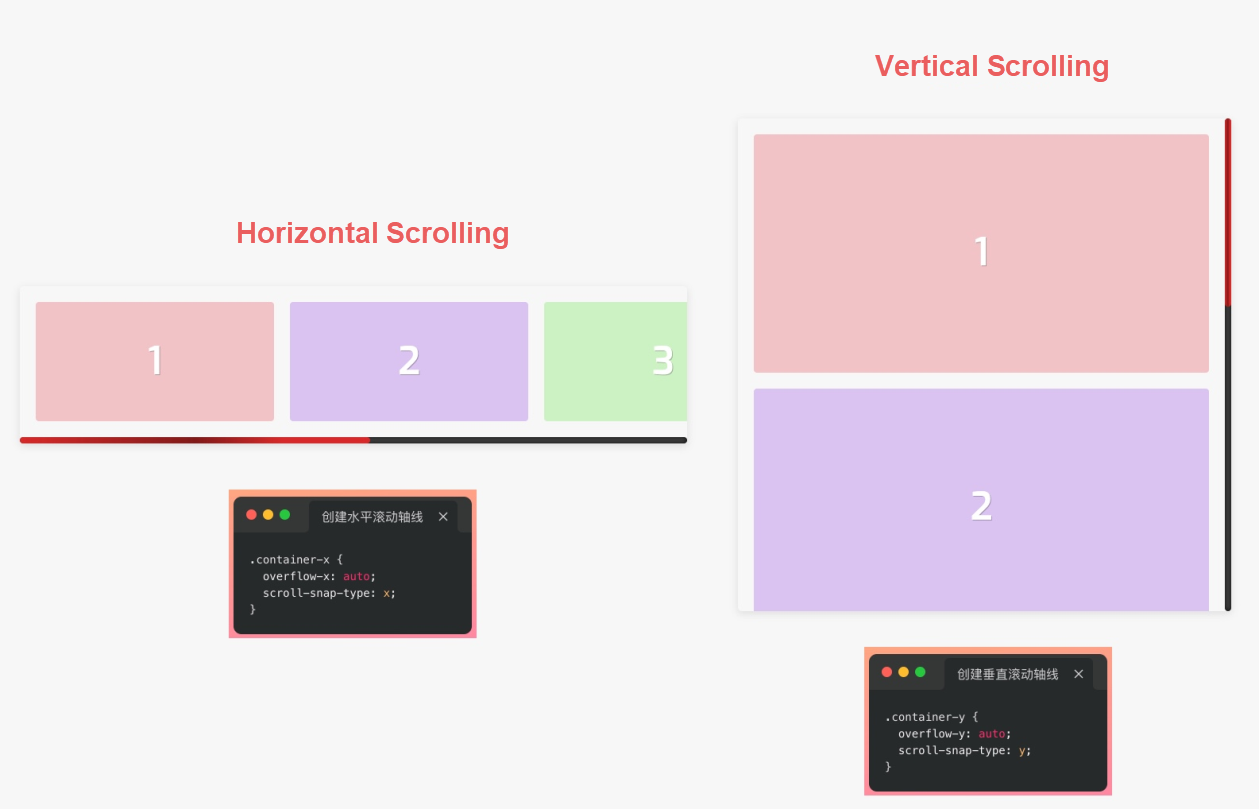
CSS has some CSS features that optimize the user experience of scrolling to provide a better user experience of scrolling, and scroll snap is one of them. CSS scroll snap is somewhat similar to the features of Flexbox and Grid layouts. It can be classified into properties for scrolling containers and properties for scrolling items.
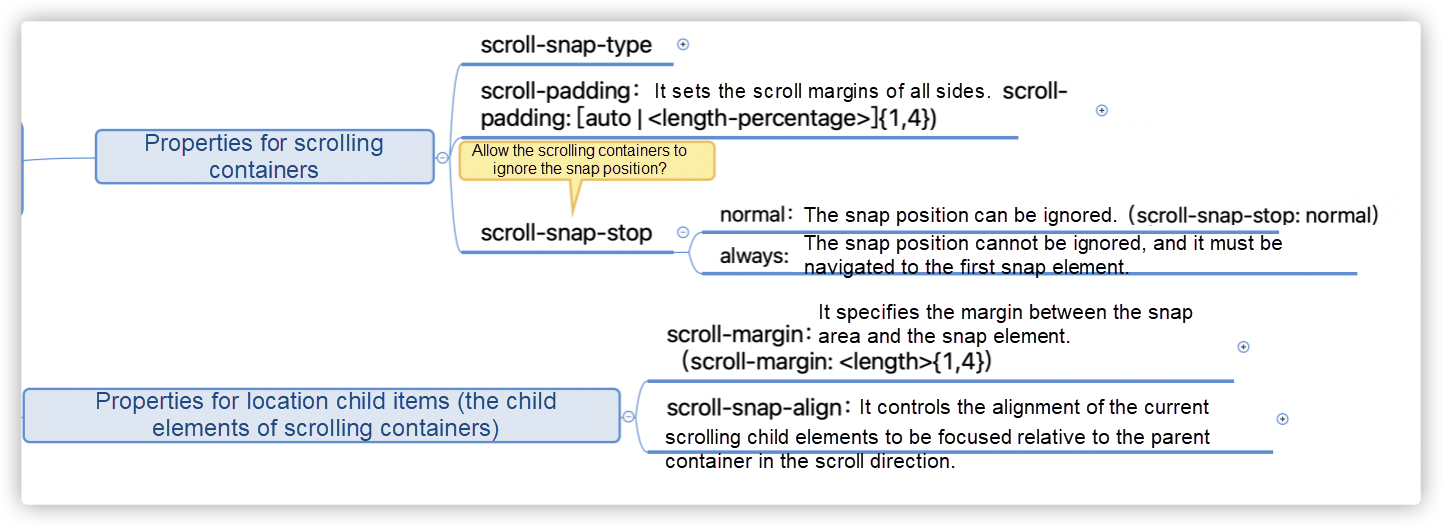
With the feature of scroll snap, we can achieve an effect similar to what is shown in the following figure without any JavaScript libraries or scripts.

Each time you scroll the content, the center of the image is aligned with the center of the container (imagine the effect of Swiper.) The key lines of code are listed below:
.container {
  scroll-behavior: smooth;
  overflow-x: auto;
  -webkit-overflow-scrolling: touch;
  scroll-snap-type: x mandatory;
  scroll-padding: 20px;
}

img {
  scroll-snap-align: center;
  scroll-snap-stop: always;
}
Demo: https://codepen.io/airen/full/mdRpboo
This feature can also implement some native interaction effects similar to those in iOS.
Demo: https://codepen.io/airen/full/PoWQPvN
You can realize the interaction effect of immersive storytelling by adding a few JavaScript scripts.
Demo: https://codepen.io/airen/full/qBRxNOo
The gap property of CSS helps us solve the layout effect that was troublesome in the past.
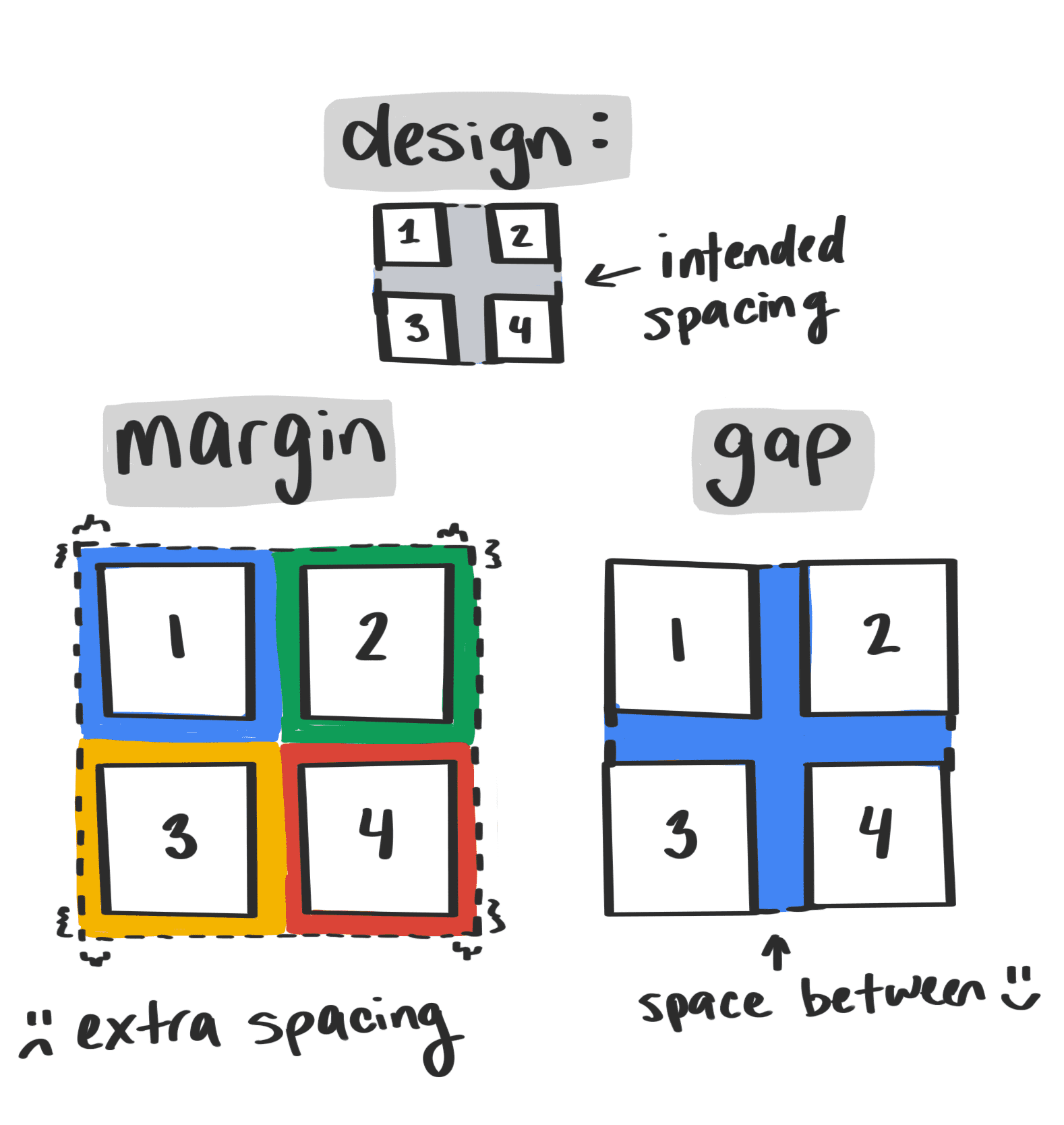
As shown in the figure above, what the designer expects is no extra spacing to the edge of the container, but there is space between adjacent items (horizontal or vertical.) Before the emergence of the gap property, margin was very annoying, especially when multiple rows and multiple columns are involved. With gap, only one line of code is required.
The CSS gap property is a shorthand property, which includes row-gap and column-gap.
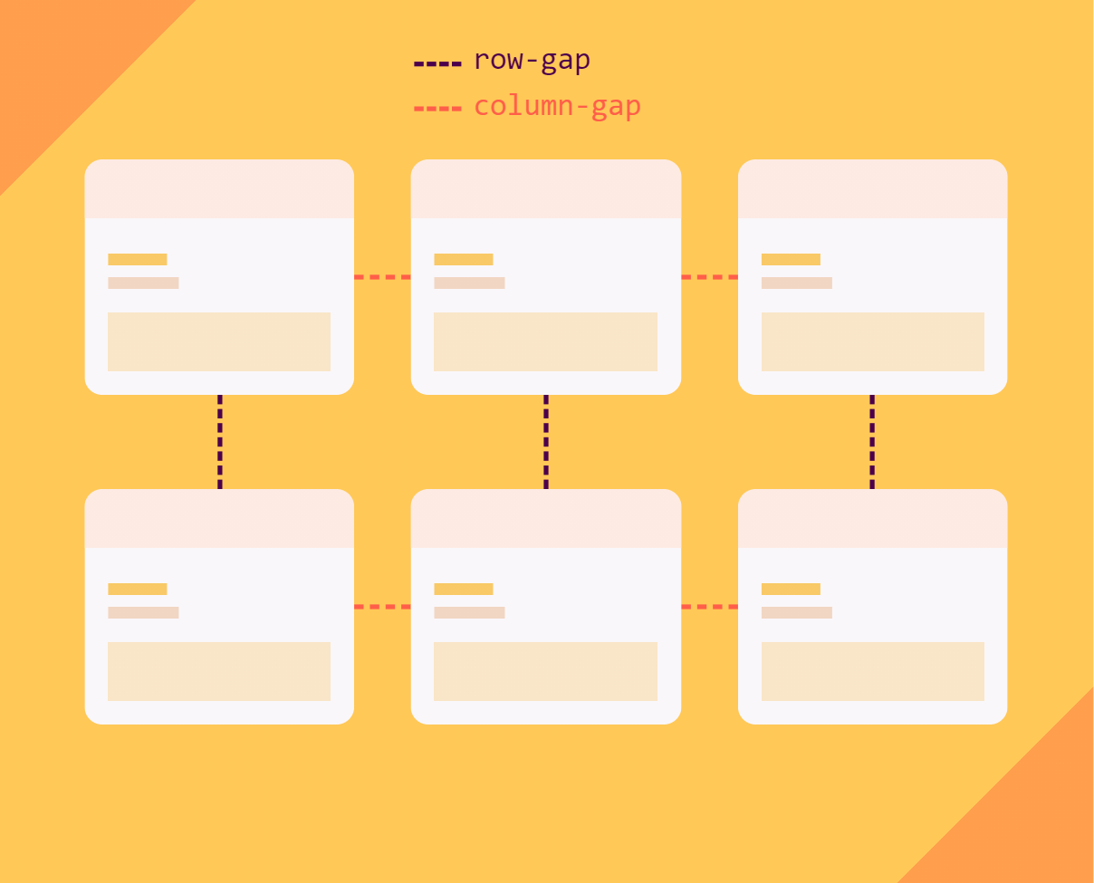
So far, the gap property can only be applied to containers with multi-column layouts, Flexbox layouts, and Grid layouts.
// Multi-column layout
.multi__column {
  gap: 5ch
}

// Flexbox layout
.flexbox {
  display: flex;
  gap: 20px
}

// Grid layout
.grid {
  display: grid;
  gap: 10vh 20%
}
The gap property can be one or two values.
.gap {
  gap: 10px;
}
// It is equivalent to
.gap {
  row-gap: 10px;
  column-gap: 10px
}

.gap {
  gap: 20px 30px;
}
//It is equivalent to
.gap {
  row-gap: 20px;
  column-gap: 30px;
}
The row-gap and column-gap are the same if gap only has one value.
Most Web developers in China only face the Left to Right (LTR) scenario, which refers to the writing mode or the reading mode of typesetting. However, those that have developed international businesses, such as businesses in Arab countries, may have encountered Right to Left (RTL) scenarios. For example, open Facebook and check the UI effects in Chinese and Arabic.

Before the emergence of logic properties, developers usually set the dir property on <html> or <body>.The value is LTR In Chinese and in RTL in Arabic. Then, different CSS styles are applied to different scenarios.
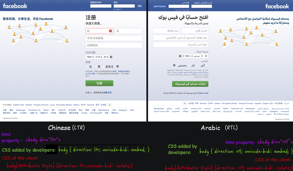
Apart from horizontal reading modes (LTR or RTL), there are also vertical reading modes.
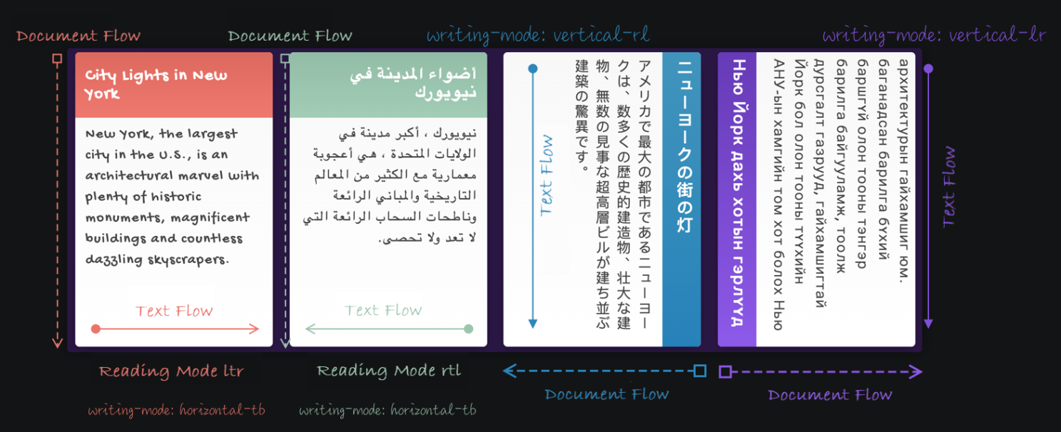
Logic properties are introduced to CSS to enable Web developers to provide different typesetting effects for different reading modes. With logic properties, many concepts have changed. For example, the x-axis and y-axis have been changed to the inline and block axes, which also change according to the writing mode.
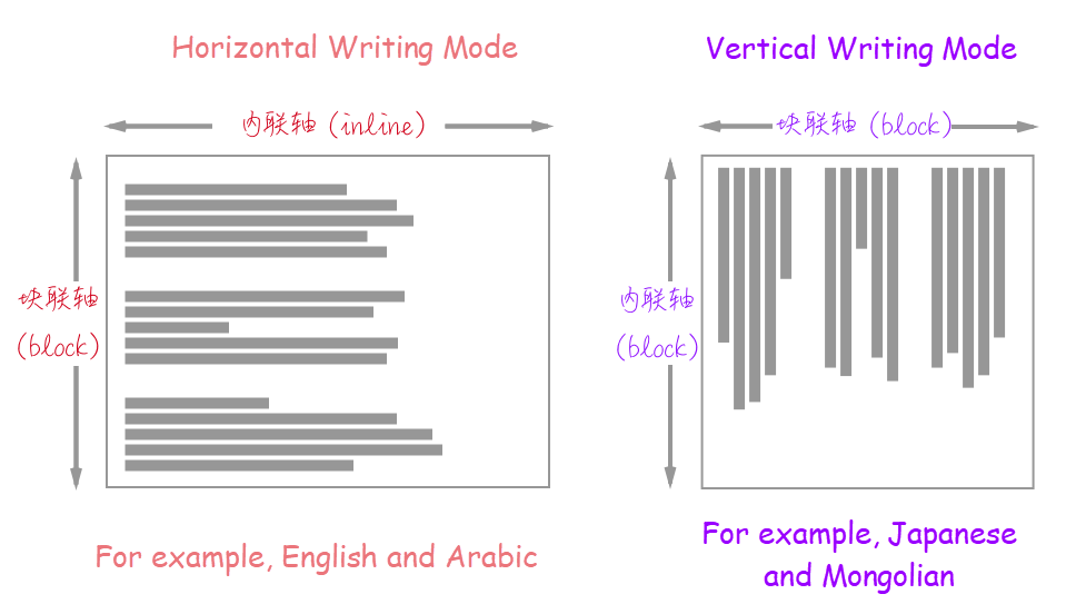
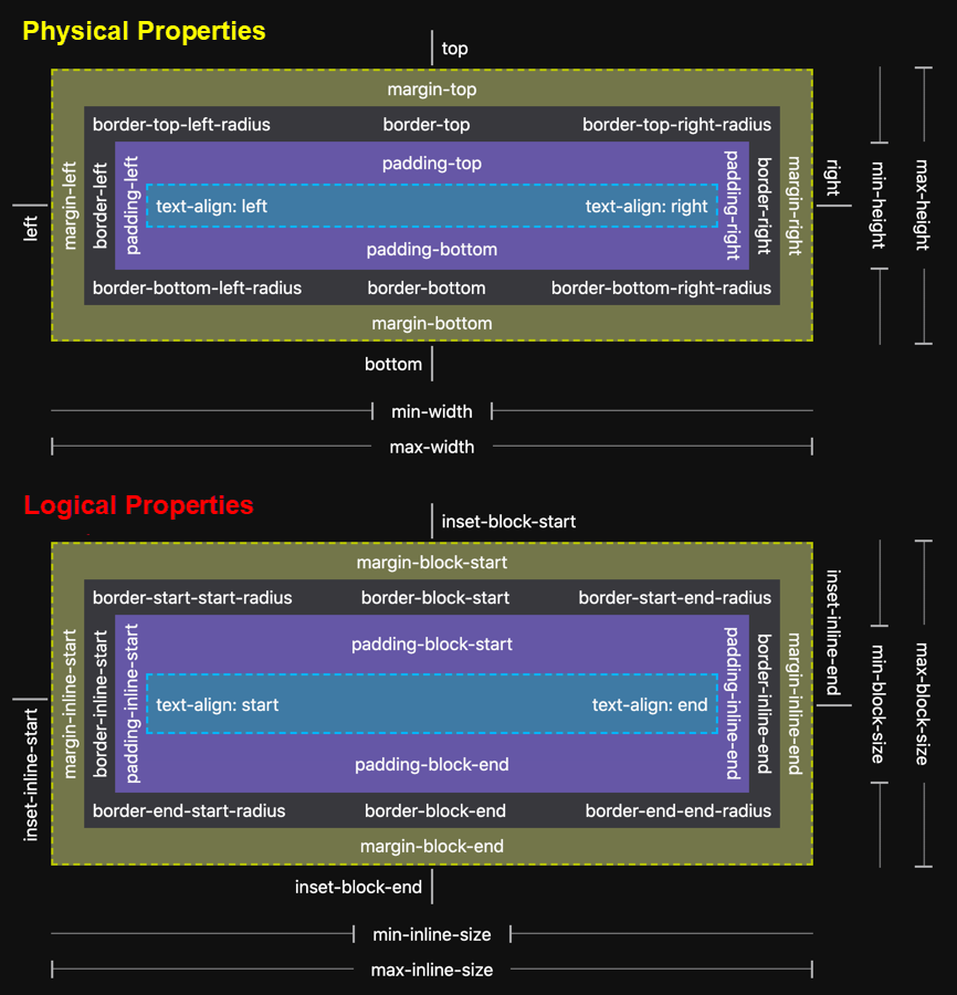
In addition, the CSS box models we are familiar with are divided into the physical box model and the logical box model.

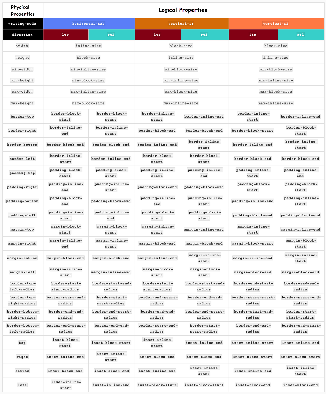
As you may have noticed, the physical properties that had top, right, bottom, and left directions now have the corresponding logical properties of inline-start, inline-end, block-start, and block-end.
I have made a more detailed table that describes the mapping relationship between physical properties and logical properties according to the W3C specification.
Back to practical production:
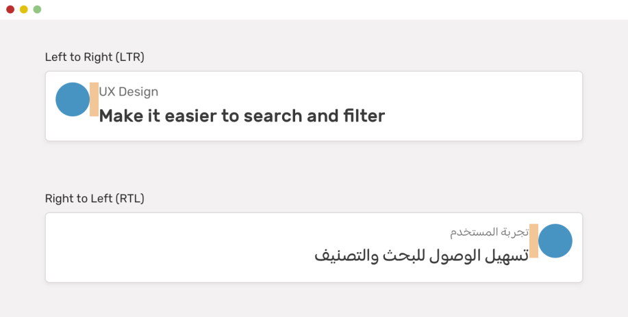
Without logic properties, we need to write the following CSS code to achieve the effect like the one shown in the preceding figure.
.avatar {
  margin-right: 1rem;
}

html[dir="rtl"] .avatar {
  margin-right: 0;
  margin-left: 1rem;
}
With the CSS logic properties, just one line of CSS code is enough.
.avatar {
  margin-inline-end: 1rem;
}
It is much simpler, especially for developers that need to meet internationalization requirements.
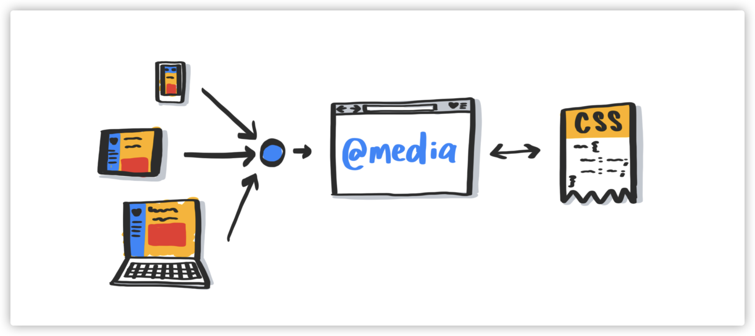
The CSS media query @media is also called CSS conditional query. The CSS Level 5 provides some new features of the media query that can query the user preferences on the device.
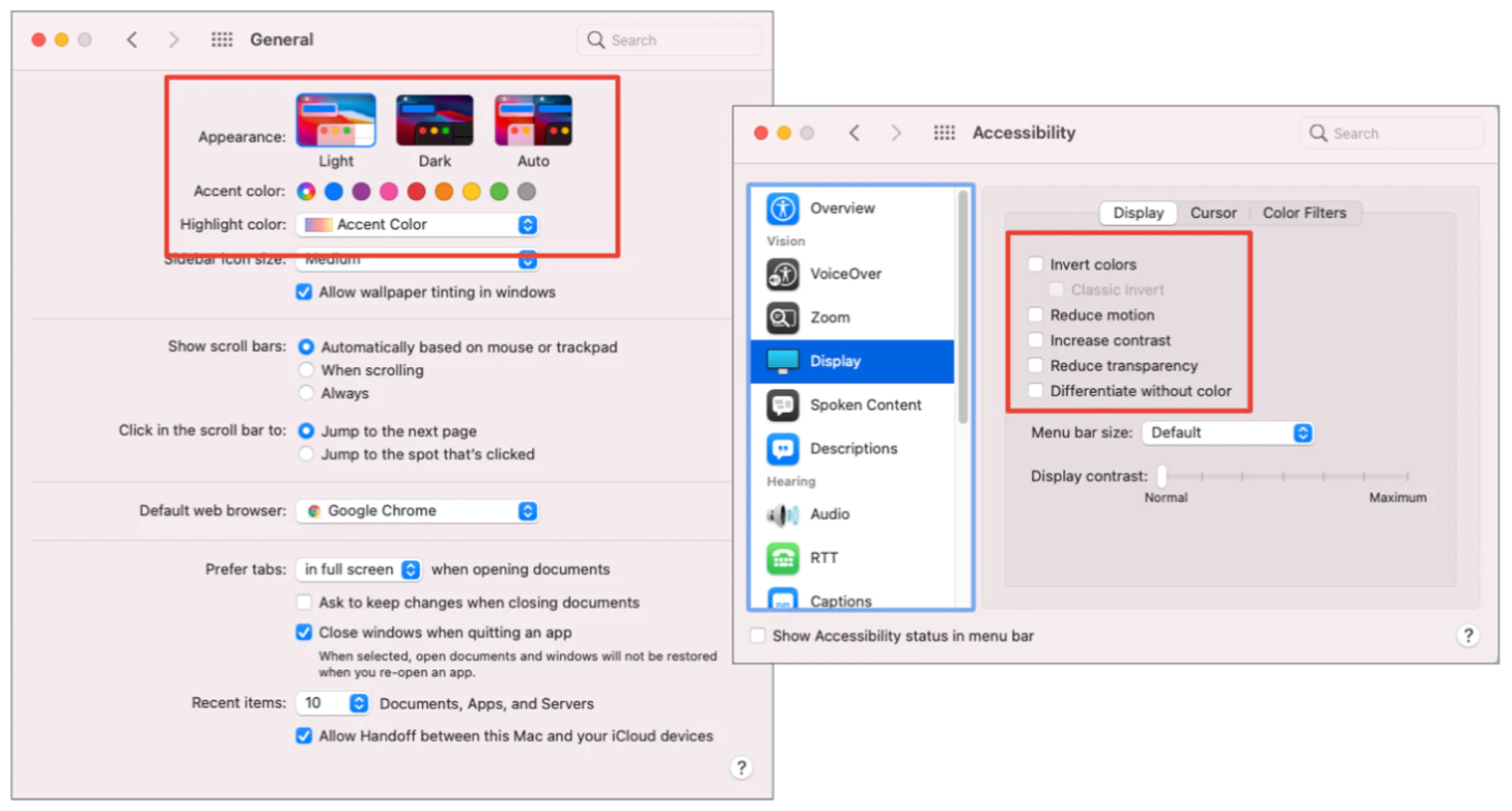
For example:
prefers-reduced-motionprefers-contrastprefers-reduced-transparencyprefers-color-schemeinverted-colorsThe usage is similar to the familiar @media from the past. For example, prefers-color-scheme can switch the skin to a dark theme.
// The code is from https://codepen.io/airen/full/ProgLL
// dark & light mode
:root {
  /* Light theme */
  --c-text: #333;
  --c-background: #fff;
}

body {
  color: var(--c-text);
  background-color: var(--c-background);
}

@media (prefers-color-scheme: dark) {
  :root {
    /* Dark theme */
    --c-text: #fff;
    --c-background: #333;
  }
}
You can also control the loading of resources according to grid data settings.
@media (prefers-reduced-data: reduce) {
  header {
    background-image: url(/grunge.avif);
  }
}

@media (prefers-reduced-data: no-preference) {
  @font-face {
    font-family: 'Radness';
    src: url(megafile.woff2);
  }
}
Other usages and effects will not be demonstrated here. However, the writing of CSS @media will become simpler in the future.
@media (width <= 320px) {
  body {
    padding-block: var(--sm-space);
  }
}

@custom-media --motionOK (prefers-reduced-motion: no-preference);

@media (--motionOK) {
  .card {
    transition: transform .2s ease;
  }
}

.card {
  @media (--motionOK) { & {
    transition: transform .2s ease;
  }}
}

@media (1024px >= width >= 320px) {
  body {
    padding-block: 1rem;
  }
}
Special statement: This sample code is from the PPT made by @argyleink.
Foldable screen devices have created new challenges for Web developers.

Fortunately, the teams of Microsoft and Samsung have provided different media query judgments for foldable screen devices.
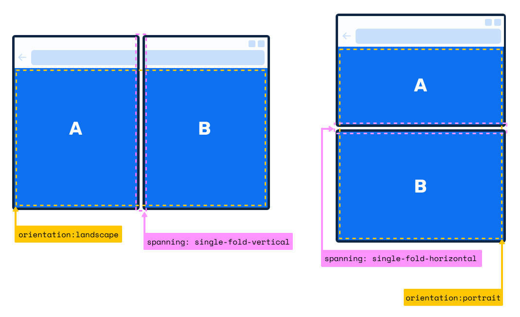
The figure above shows dual-screen devices with physical separation lines.
main {
  display: grid;
  gap: env(fold-width);
  grid-template-columns: env(fold-left) 1fr;
}

@media (spanning: single-fold-vertical) {
  aside {
    flex: 1 1 env(fold-left);
  }
}
Foldable devices without separation line:
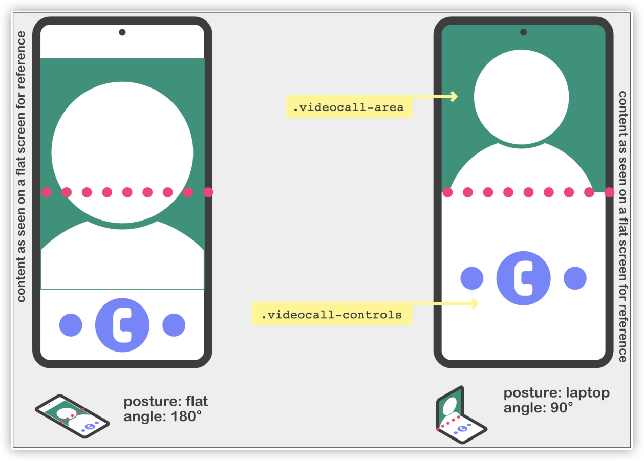
@media (screen-fold-posture: laptop){
  body {
    display: flex;
    flex-flow: column nowrap;
  }
  .videocall-area,
  .videocall-controls {
        flex: 1 1 env(fold-bottom);
  }
}
CSS comparison functions refer to min(), max(), and clamp(). We can pass values (multiple) or expressions to these functions, and they will compare the values and return the most appropriate value. In addition, these functions are similar to calc()we are familiar with and can also help us do dynamic calculations in CSS.
Let's look at min() and max() first. The only difference between them is the difference in return values:
min() function returns a minimum value from multiple parameters (or expressions) as the value of the CSS property. In other words, min() sets the maximum value, which is equivalent to max-width.max() function returns a maximum value from multiple parameters (or expressions) as the value of the CSS property. In other words, max() sets the minimum value, which is equivalent to min-width.The following figure shows the change of return value of min(50vw, 500px) when the width of the browser window changes.
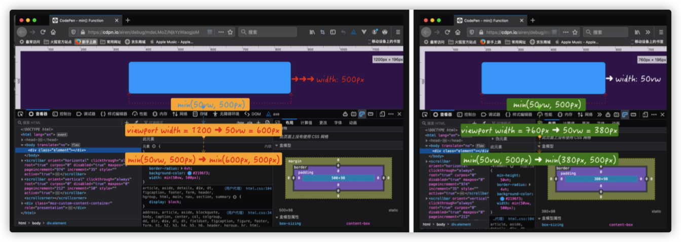
Demo: https://codepen.io/airen/full/mdeLMoZ
If the min() function in the example above is replaced by the max() function max(50vw, 500px), its return value is:
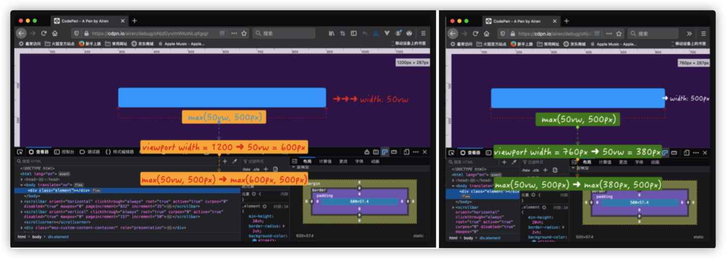
Demo: https://codepen.io/airen/full/oNjdGyv
The clamp() function is slightly different from min() and max(). It returns an interval value, an intermediate value within the range of the defined minimum and maximum values. The function accepts three parameters:
MIN)VAL), also known as the preferred valueMAX)The relationship (or the value selection method) of the three values of clamp(MIN, VAL, MAX) is listed below:
VAL is between MIN and MAX, use VAL as the return value of the function.VAL is greater than MAX, use MAX as the return value of the function.VAL is less than MIN, use MIN as the return value of the function.For example:
.element {
    /**
    * MIN = 100px
    * VAL = 50vw ➜ It is calculated according to the width of the window
    * MAX = 500px
    **/
    width: clamp(100px, 50vw, 500px);
}
For this example, the computing of the clamp() function goes through the following steps:
.element {
    width: clamp(100px, 50vw, 500px);

    /* 50vw is equivalent to half of the window width. If the window width is 760px, then 50vw is equivalent to 380px */
    width: clamp(100px, 380px, 500px);

    /* Use min() and max() to describe */
    width: max(100px, min(380px, 500px))

    /* The return value of min(380px, 500px) is 380px */
    width: max(100px, 380px)

    /* The return value of max(100px, 380px) is 380px */
    width: 380px;
}
The following demo shows the effect:
Demo: https://codepen.io/airen/full/pojVpJv
Simply put, clamp(), min(), and max() functions can all adjust values as the width of the browser window scales, but their calculated values depend on the context.
Let's look at a typical case of clamp(). Suppose that we need to apply different font sizes to different screens (or terminal scenarios.)

Before CSS comparison functions, a concept called CSS Locks was used to achieve a similar effect.
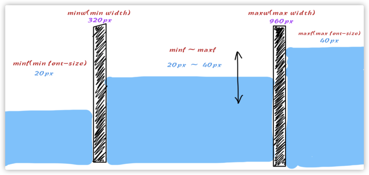
Some mathematical calculations were required.
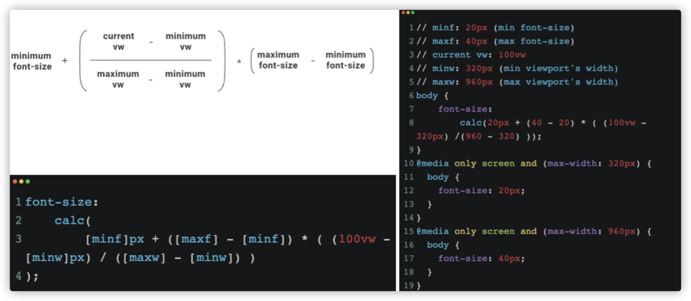
Demo: https://codepen.io/airen/full/bGqdOma
With clamp(), only one line of code is enough.
/** minf: 20px (min font-size)
 * maxf: 40px (max font-size)
 * current vw: 100vw
 * minw: 320px (min viewport's width)
 * maxw: 960px (max viewport's width)
*/
h1 {
  font-size: clamp(20px, 1rem + 3vw, 40px);
}
We can achieve effects similar to those shown in the following figure using this technology.
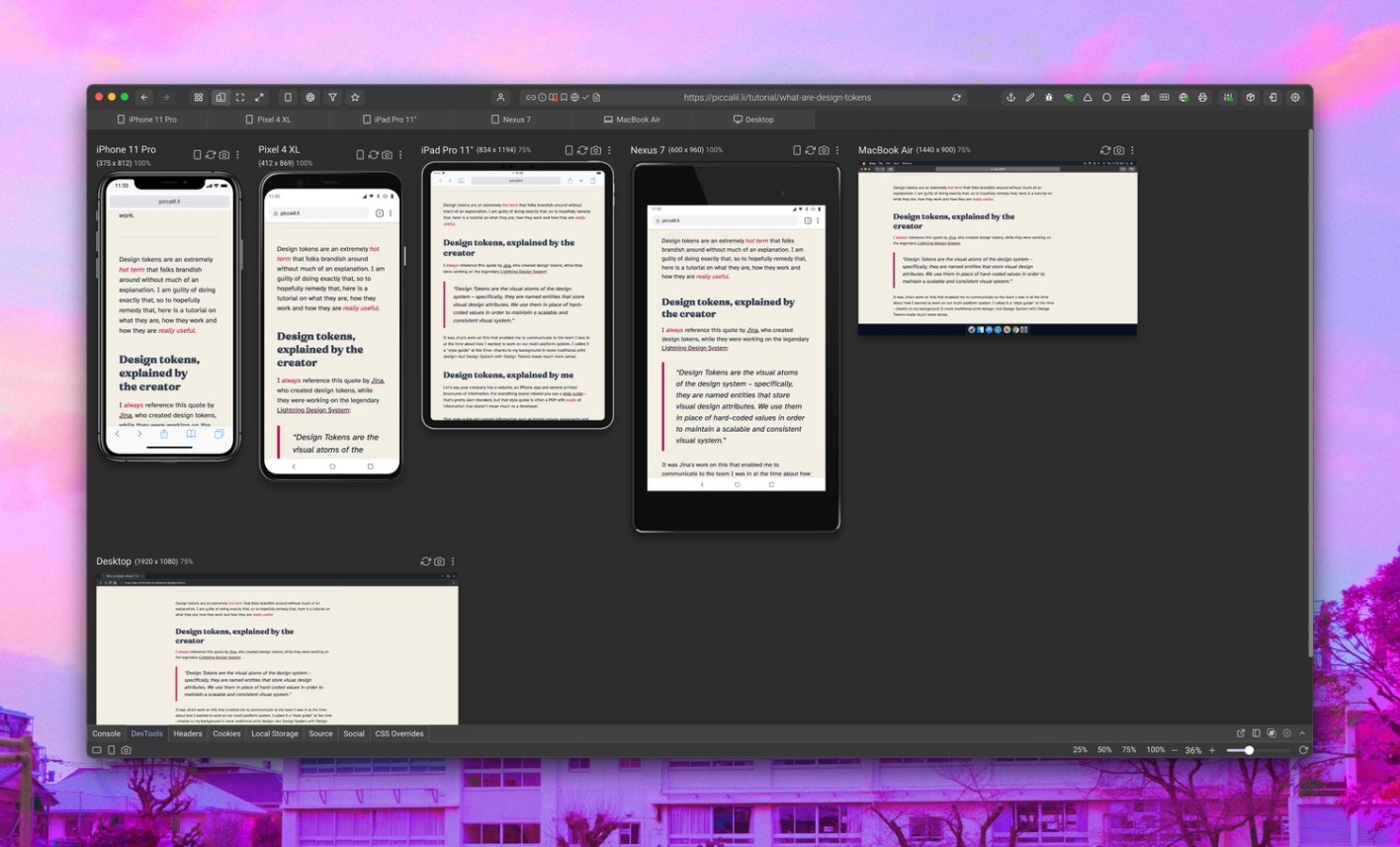
Note: The preceding figure is from the article entitled Use CSS Clamp to create a more flexible wrapper utility.
CSS content visibility refers to the content-visibility and contain-intrinsic-size properties and currently belongs to CSS Containment Module Level 2 of W3C. Its main function is to improve the rendering performance of the page.
In general, most Web applications have complex UI elements, and some content will be outside the visible area of the device. (The content overflows the visible area of the user's browser.) For example, the red area in the figure below is outside the visible area of the mobile phone screen.
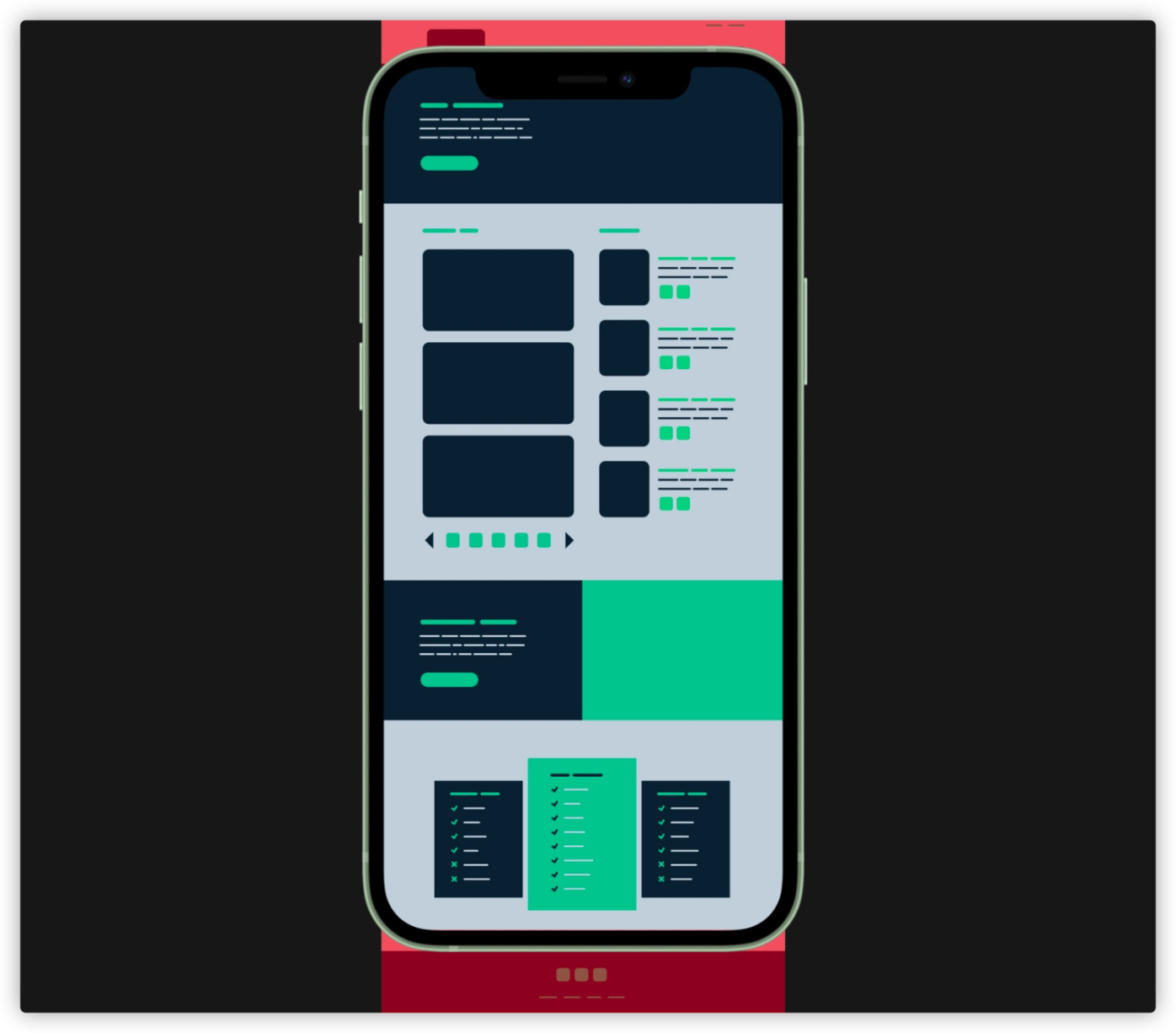
In this condition, we can use the content-visibility of CSS to skip the rendering of the content outside the screen. In other words, if there is a lot of off-screen content, this will reduce the page rendering time significantly.
Some engineers on the Google Chrome Team have performed relevant tests on content-visibility.
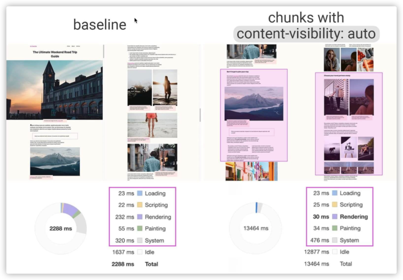
The rendering process of browsers becomes easier with the content-visibility property of CSS. In essence, this property changes the visibility of an element and manages its rendering states.
The contain-intrinsic-size property controls the intrinsic size of the element specified by content-visibility. It means that content-visibility will regard the height of the element assigned to it as 0, and the browser will change the height of this element to 0 before rendering. Thus, the height and scrolling of the page become chaotic. However, if the height has been explicitly set for the element or its child element, this behavior will be covered. If you do not explicitly set the height in your element because of some side effects, you can use contain-intrinsic-size to ensure the correct rendering of elements. Meanwhile, it can maintain the benefits of delayed rendering.
In other words, contain-intrinsic-size and content-visibility are generally used together.
section {
  content-visibility: auto;
  contain-intrinsic-size: 1000px;
}If you use browser developer tools to review your code and hover over a <img> tag, you will see something similar to the following figure.
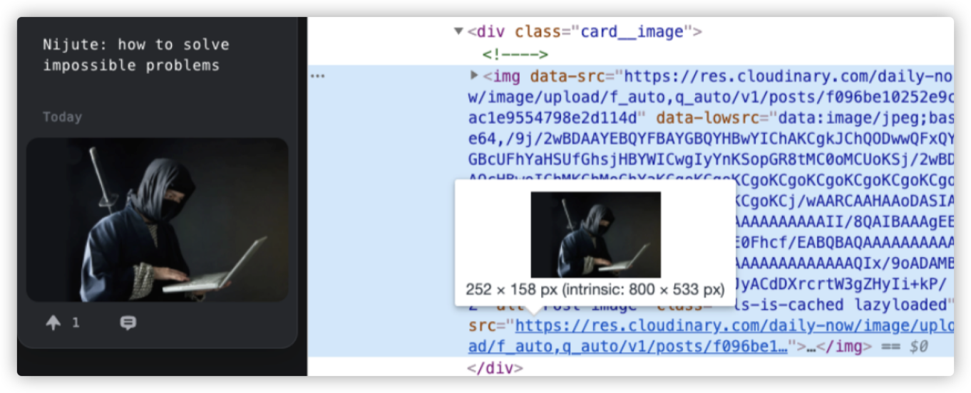
There is a line describing the size of the image under the picture floating above the src path of <img>, which is 252 x 158 px (intrinsic: 800 x 533 px). It shows two important pieces of information of the image size:
252 x 158 px, the size of img set by the developer.800 x 533 px, the original size of the image.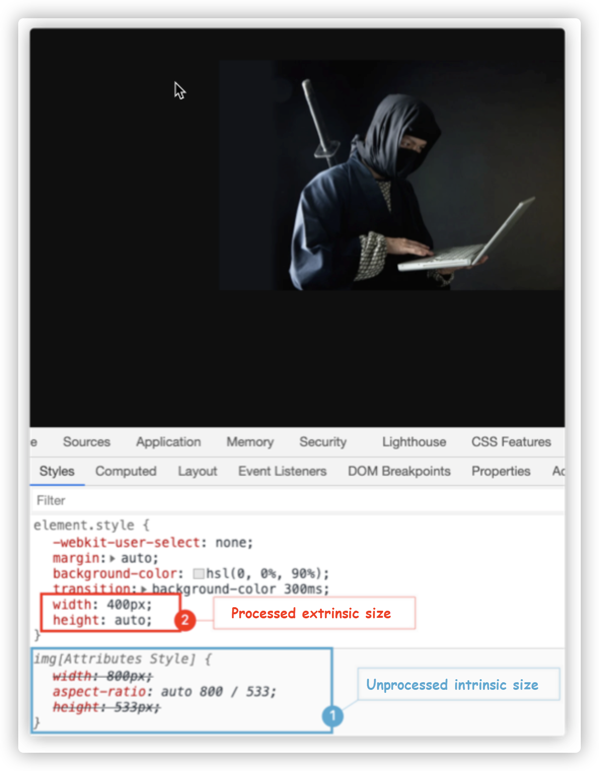
The size of an element box in CSS is set according to the content of the element box or the context. According to this feature, CSS sizes are divided into internal (intrinsic) sizes and external (extrinsic) sizes:
min-content, max-content, and fit-content can determine the size of an element according to the content of the element, so they are collectively called internal sizes.width, min-width, max-width, and other properties use percentage values (%).The following simple example shows the characteristics of CSS intrinsic sizes, namely the features of min-content, max-content, and fit-content.
<h1>CSS is Awesome</h1>

<style>
  h1 {
    width: auto;
  }
</style>
First, let's see the difference when width of h1 is set to auto and min-content, respectively.
// Extrinsic size
h1 {
    width: auto; // Change with the container
}

// Intrinsic size
h1 {
    width: min-content; // Change with the content
}
Demo: https://codepen.io/airen/full/zYZvGrY
As shown in the preceding figure, when the value of width is min-content, the width of h1 is always the length of the word "Awesome" (about 144.52px). There is no relationship between its width and the change of the container width, but it is affected by the relevant properties in the layout, such as font-size and font-family.
Then, let's see the result when width is set to max-content.

Demo: https://codepen.io/airen/full/zYZvGrY
If the value of the width in h1 is max-content, the width is the width of all rows in which h1 is located. Finally, let's see the result when width is set to fit-content.

Demo: https://codepen.io/airen/full/zYZvGrY
fit-content is much more complex than min-content and max-content:
h1 {
    width: fit-content;
}

// It is equivalent to
h1 {
    width: auto;
  min-width: min-content;
  max-width: max-content;
}
Simply put, fit-content is equivalent to the combination of min-content and max-content, and its value rules are:
fit-content is equivalent to max-content.max-content, fit-content will use the value of available space and will not cause content overflow.min-content, fit-content is equivalent to min-content.The following figure describes the relationship between them:
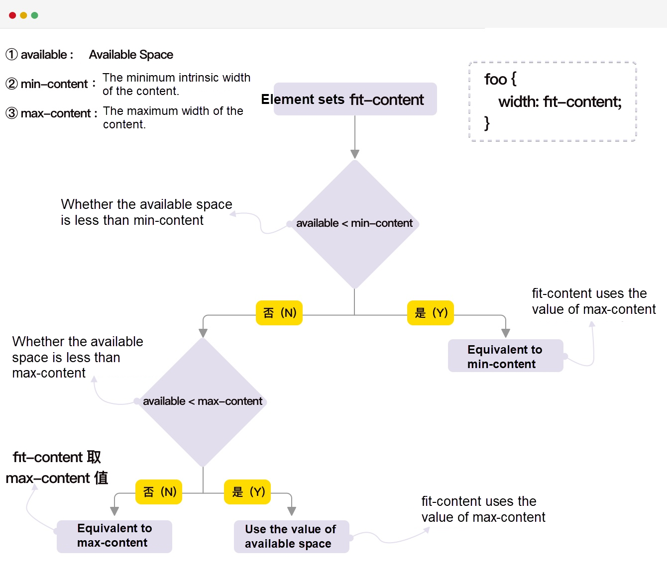
min-content, max-content, and fit-content are intrinsic sizes, which can set the properties of the container size, such as the width, height, inline-size, and block-size. However, they are invalid when used for some properties.
min-content, max-content, and fit-content are invalid when used for flex-basis.fit-content is invalid when used for the property of setting the size of grid tracks.width:fit-content is also invalid of a Grid project or a Flex project since their default width is min-content.fit-content on min-width or max-width, since it will easily cause confusion. We recommend using fit-content on width.min-content, max-content, or fit-content on the layout can help us design the internal layout, and they are also very flexible when building some self-adaptive layouts. They can build some creative layouts, especially when combined with some features of Grid and Shapes in CSS.
Finally, it should be stated that fit-content and the fit-content() function are not the same and need to be distinguished when using.
display is not new to most of you and is mainly used to format the context. I introduce it here because there are some display changes, one of which is that it can support multiple values in the future.
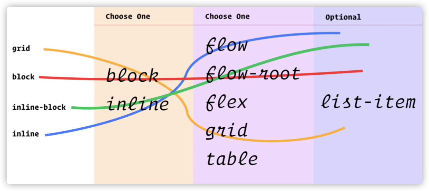
According to the latest news, double-value display has become an experimental property in the Safari browser. The descriptions of double-value display are listed below:
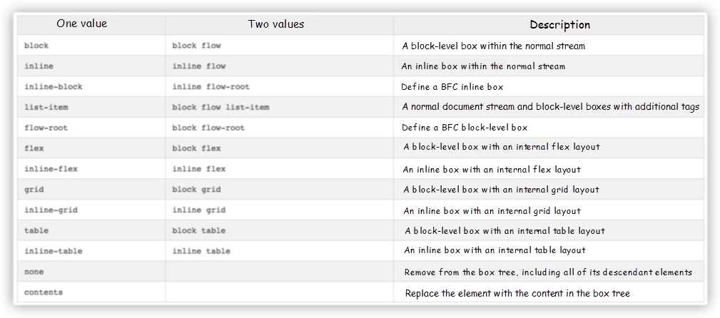
In addition, the contents property value has been added to the display. The W3C specification describes it this way:

The general meaning is:
An element that sets
display: contentsdo not generate any boxes, but its child elements can be displayed normally.
For example:
<div class="outer">
  I'm, some content
  <div class="inner">I'm some inner content </div>
</div>

<style>
  .outer {
      border: 2px solid lightcoral;
    background-color: lightpink;
    padding: 20px;
  }

  .innter {
      background-color: #ffdb3a;
    padding: 20px;
  }
</style>
The simple sample code above generates the following effect:

If we explicitly set the display: contents on the .outer element and the element itself will not be rendered, but the child elements can be rendered normally.

Demo: https://codepen.io/airen/full/abJvyoj
We can use this feature in some layouts, especially when we do not want to adjust the structure of HTML. For example, you can do the following to turn other descendant elements into Grid or Flex projects in Flexbox or Grid.
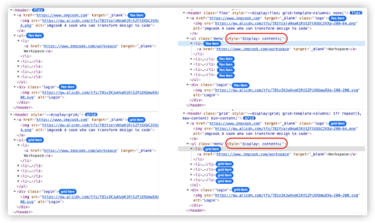
Demo: https://codepen.io/airen/full/zYZvdJb
In the discussion stage, the disputes over display: contents and display: subgrid were intense. In the end, display: contents won. Now, there is no separate display: subgrid in the Grid layout, and subgrid is moved into grid-template-columns and grid-template-rows.
There was another big dispute about display: contents and Web accessibility. If you are interested in this discussion, you can read the links below:
There are many kinds of @ rules in CSS, but everyone is familiar with @import, @media, and @supports. Here, I will briefly mention some uncommon ones, such as:
@nest and @apply for nesting@property for registering custom properties@container (which has been discussed frequently recently)@scope and @layer (mentioned in a PPT made by @argyleink recently)Those that have used CSS processors should have used nesting to organize their code, such as SCSS.
// SCSS
foo {
    color: red;

  & bar {
      color: green;
  }
}
After compilation, the code above becomes:
// CSS
foo {
    color: red;
}

foo bar {
    color: green;
}
Fortunately, W3C also discusses and defines nesting rules in CSS. The two current rules are:
foo {
    color: red;

  @nest bar {
      color: green;
  }
}

// Or
foo {
    color: red;

  & bar {
      color: green;
  }
}

// They are equivalent to
foo {
    color: red;
}

foo bar {
    color: green;
}
They can also be nested with the media query @media.
article {
  color: darkgray;

  & > a {
    color: var(--link-color);
  }
}

code > pre {
  @media (hover) {
    &:hover {
      color: hotpink;
    }
  }
}

code > pre {
  @media (hover) {
    @nest &:hover {
      color: hotpink;
    }
  }
}

article {
  @nest section:focus-within > & {
    color: hotpink;
  }
}

main {
  padding: var(--space-sm);

  @media (width >= 540px) { & {
    padding: var(--space-lg);
  }}
}
In addition to @nest, @apply can also be used. You may have seen @apply in some frontend frameworks or builders.
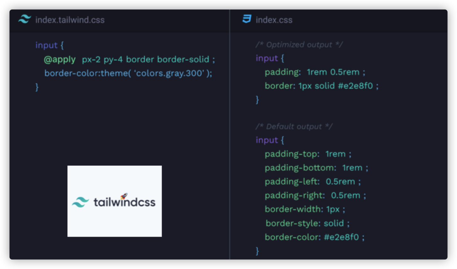
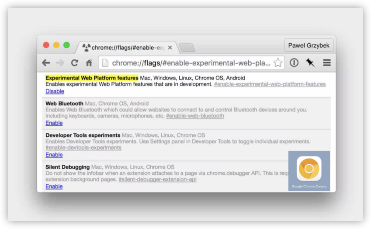
You can experience @apply in Experimental Web Platform features on the Chrome Canary browser.
Simply put, it is somewhat similar to the mixed macros @mixin and @extend in SCSS.
:root {
    --brand-color: red;
  --heading-style: {
      color: var(--brand-color);
    font-family: cursive;
    font-weight: 700;
  }
}

h1 {
    --brand-color: green;
  @apply --heading-style;
}@property is used to register a variable that belongs to CSS Houdini. However, @property is used the same way as the custom CSS properties (CSS variables), but it has a different registration method.
// Chrome 78+
// Register in JavaScript scripts
CSS.registerProperty({
    'name': '--custom-property-name',
  'syntax': '<color>',
  'initialValue': 'black',
  'inherits': false
})

// Chrome 85+
// Register in CSS files
@property --custom-property-name {
    'syntax': '<color>',
  'initialValue': 'black',
  'inherits': false
}
One of its greatest features is that it can specify whether the types and initial values of registered CSS variables can be inherited.
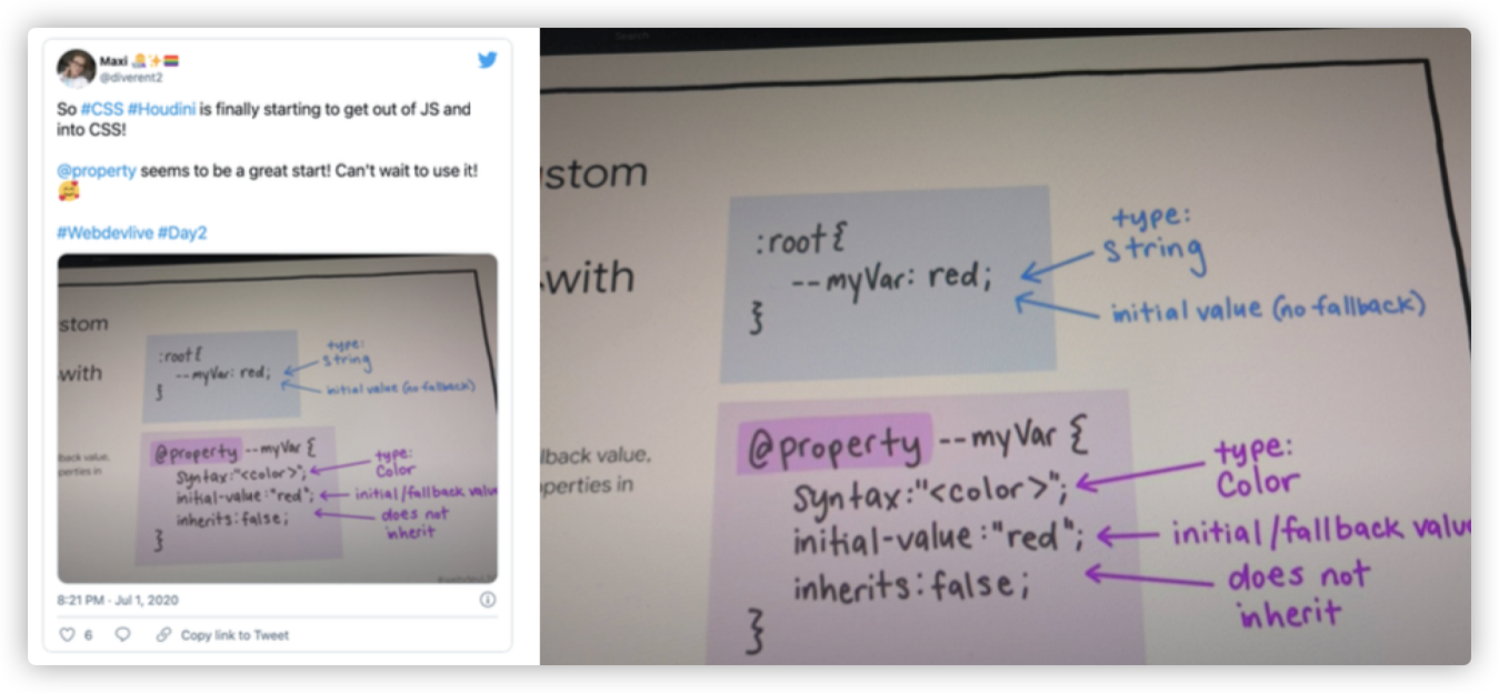
The figure above is from a tweet posted by Maxi on Twitter.
Although its use is similar to the custom properties in CSS, it is more powerful, especially in animation. It can enhance the animation capabilities of CSS and realize some animations that CSS could not achieve previously. For example:
@property --hue {
  initial-value: 0;
  inherits: false;
  syntax: '<number>';
}

@keyframes rainbow {
  to {
    --hue: 360;
  }
}
@property --milliseconds {
syntax: '<integer>';
initial-value: 0;
inherits: false;
}
.counter {
counter-reset: ms var(--milliseconds);
animation: count 1s steps(100) infinite;
}
@keyframes count { to {
--milliseconds: 100;
}}It can do more things after combining with the Paint API of CSS Houdini.
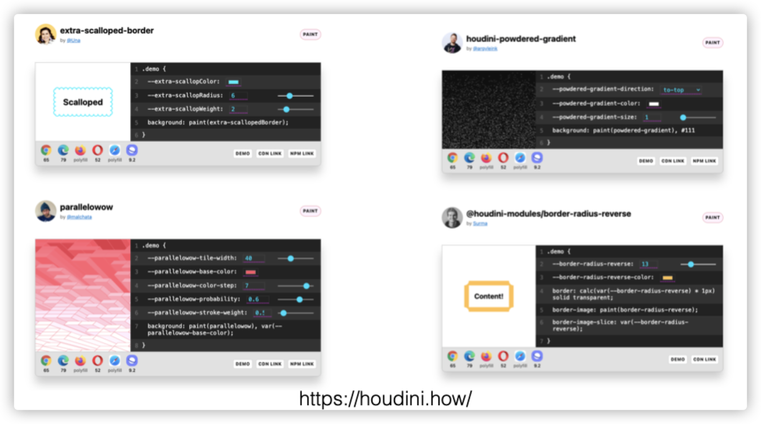
More relevant effects can be found on Houdini.how.

@container
Una Kravets shared the container query @container at Google I/O. She calls @container one of the features required by the new responsive layouts.
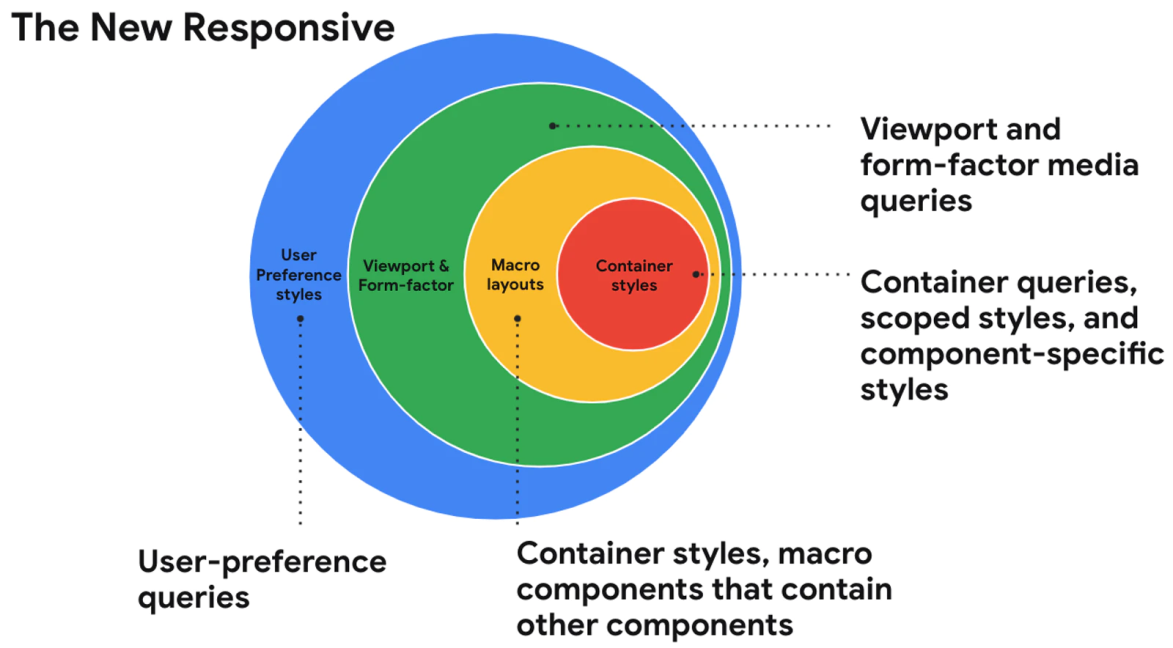
Then, what can you do with the container query @container? Suppose your designer provides you with a design draft like the following figure:
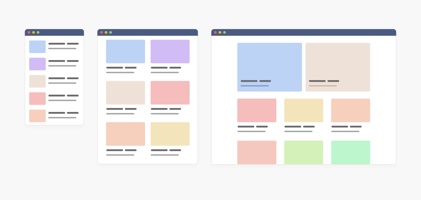
The first thing you may think about is @media. (It seems this was the only way before the container query appeared.) Now, you can change the way with @container.
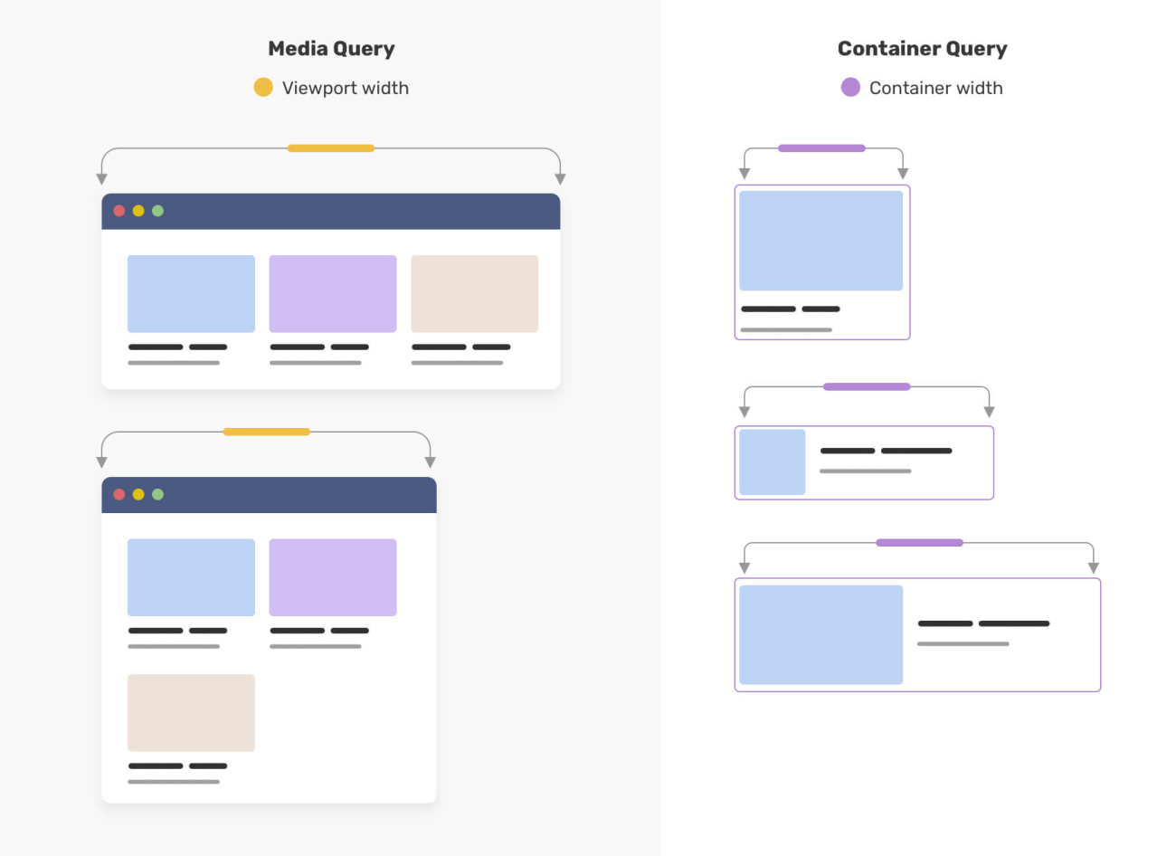
These two figures are from the article entitled CSS Container Queries For Designers written by @shadeed9. His article entitled Say Hello To CSS Container Queries also introduces container query.
It looks awesome, and it is very powerful. Its use is very similar to @media.
// Demo: https://codepen.io/una/pen/mdOgyVL
.product {
  contain: layout inline-size;
}

@container (min-width: 350px) {
  .card-container {
    padding: 0.5rem 0 0;
    display: flex;
  }

  .card-container button {
    /* ... */
  }
}
Demo: https://codepen.io/una/pen/mdOgyVL
Some applaud the @container feature, while others do not. For example, Kenton de Jong explains why he dislikes this feature in his new blog Why I Am Not A Fan of CSS Container Queries.

I like this feature and will spend some time learning and understanding @container later. Of course, discussions are good and will make this feature more mature. If you also want to participate in the discussion, click here to join us.
@layer and @scope
I have only seen the @scope rule before, which is mainly used to deal with style rule scope in CSS, but I do not have an in-depth understanding. In Una Kravets's speech at Google I/O, I saw @scope again.
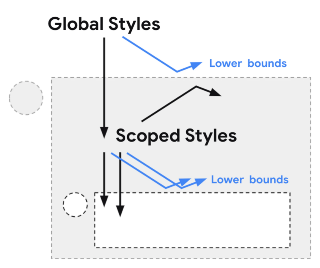
The picture above was drawn by Miriam Suzanne.
Styles of @scope allow for pass-through and component-specific styling to avoid naming conflicts. Many frameworks and plug-ins (such as CSS modules) have enabled us to do this within the framework. Now, this specification will allow us to write native encapsulation styles of CSS with readability for our components without adjusting the markup.
/* @scope (<root>#) [to (<boundary>#)]? { … } */

@scope (.tabs) to (.panel) {
  :scope { /* targeting the scope root */ }
  .light-theme :scope .tab { /* contextual styles */ }
}
Why does it look so similar to Scope in Web Component?
When I see @layer for the first time:
@layer reset {
  * { box-sizing: border-box; }
  body { margin: 0; }
}
// ...
@layer reset { /* add more later */ }

@import url(headings.css) layer(default);
@import url(links.css) layer(default);

@layer default;
@layer theme;
@layer components;

@import url(theme.css) layer(theme);

@layer default, theme, components;

@import url(theme.css) layer(theme);

@layer framework.theme {
  p {
    color: rebeccapurple;
  }
}

@layer framework {
  @layer theme {
    p { color: cyan; }
  }
}
I cannot fully understand what the code above means. I only know that @layer is called Cascade Layers. This feature was newly proposed in CSS Cascading and Inheritance Specification Level 5.

Not long after my speech, when I was sorting out this article, I found my idol @argyleink also shared a similar topic Hover: CSS! What's New in 2021?. It includes 31 CSS features and divides them based on the risk levels, including high, moderate, and low risks.
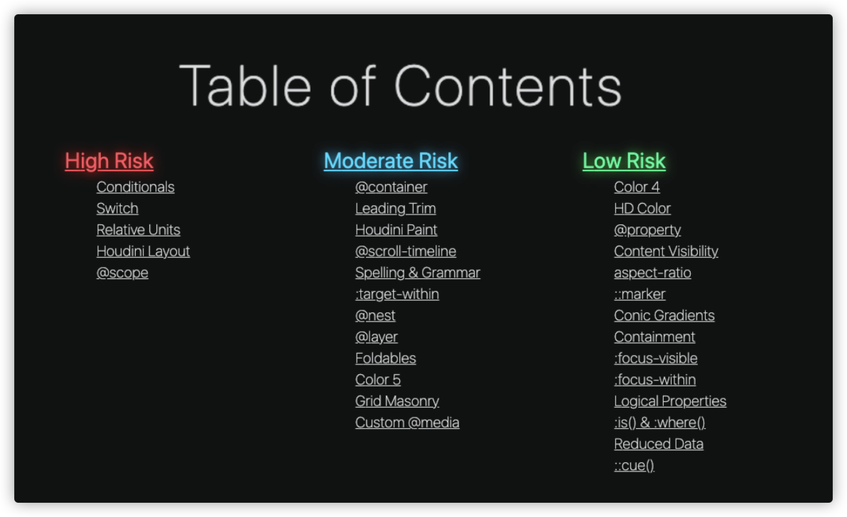
You will find that there are many similarities with the features I have introduced in this article. If you heard his speech entitled London CSS: What's New in 2020? at the CSS conference in London in 2020, you will find that the 2021 article is an upgraded version of the article from 2020.
You must love CSS very much since you have finished reading this long article. Thank you for reading. I will continue to serve you in the future and share the latest and most interesting aspects of CSS with you!
The Way to Train a Form Recognition Model on the Frontend Quickly

66 posts | 5 followers
FollowAlibaba F(x) Team - December 3, 2021
Alibaba Cloud Community - April 20, 2022
淘系技术 - December 9, 2020
HaydenLiu - December 5, 2022
Alibaba Clouder - May 3, 2018
Marketplace - April 28, 2021

66 posts | 5 followers
Follow ACK One
Provides a control plane to allow users to manage Kubernetes clusters that run based on different infrastructure resources
Learn More YiDA Low-code Development Platform
A low-code development platform to make work easier
Learn More Container Registry
A secure image hosting platform providing containerized image lifecycle management
Learn More mPaaS
mPaaS
Help enterprises build high-quality, stable mobile apps
Learn MoreMore Posts by Alibaba F(x) Team