By Damo from F(x) Team
This article discusses many CSS features that can be used now or soon. The title contains the words "New Features," but many of them are not new. They may have already appeared in your project, or you have already seen them but are just unaware of them. I will briefly review these features. I hope you like this article, and it can help you in your daily work.
If you have seen the State of CSS (2019 and 2020), there is also a special introduction to the new CSS features:
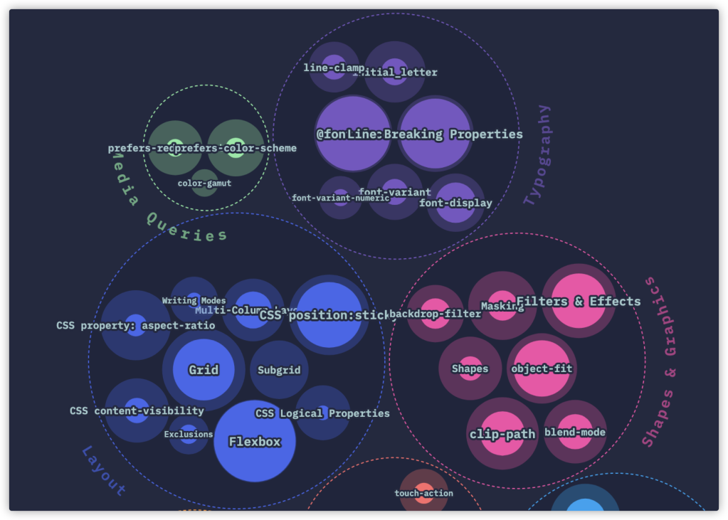
The preceding figure is taken from the State of CSS 2020.
You may feel familiar with some features but somewhat unfamiliar with others. For me, all of them are familiar. What I want to say is that the features mentioned in the figure (or report) above are only the tip of the iceberg, and many other features are not in the questionnaire and report. For example, pseudo-class selector, content visibility, and container query will be mentioned in this article.
Let's start with the CSS selector.
CSS selectors have been developed to be a huge system so far.
Now, the specifications that describe CSS selectors are mainly CSS (referring to CSS 2.1), which is further divided into CSS selector Level 3 and CSS selector Level 4. Pseudo-class selectors appear in these three parts of the specifications. The three parts are progressive, especially in Level 3 and Level 4, in which many excellent selectors have been added on the original basis. The several modern pseudo-class selectors mentioned in this article are from Level 4.
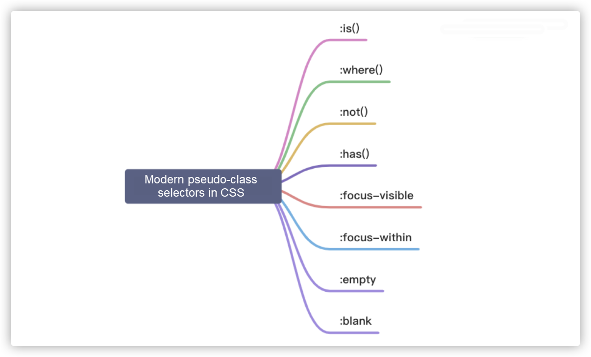
:is() and :where()
Let's take look at :is() and :where() first. @Elad Shechter once posted a tweet of a test for selector of :is() and :where():
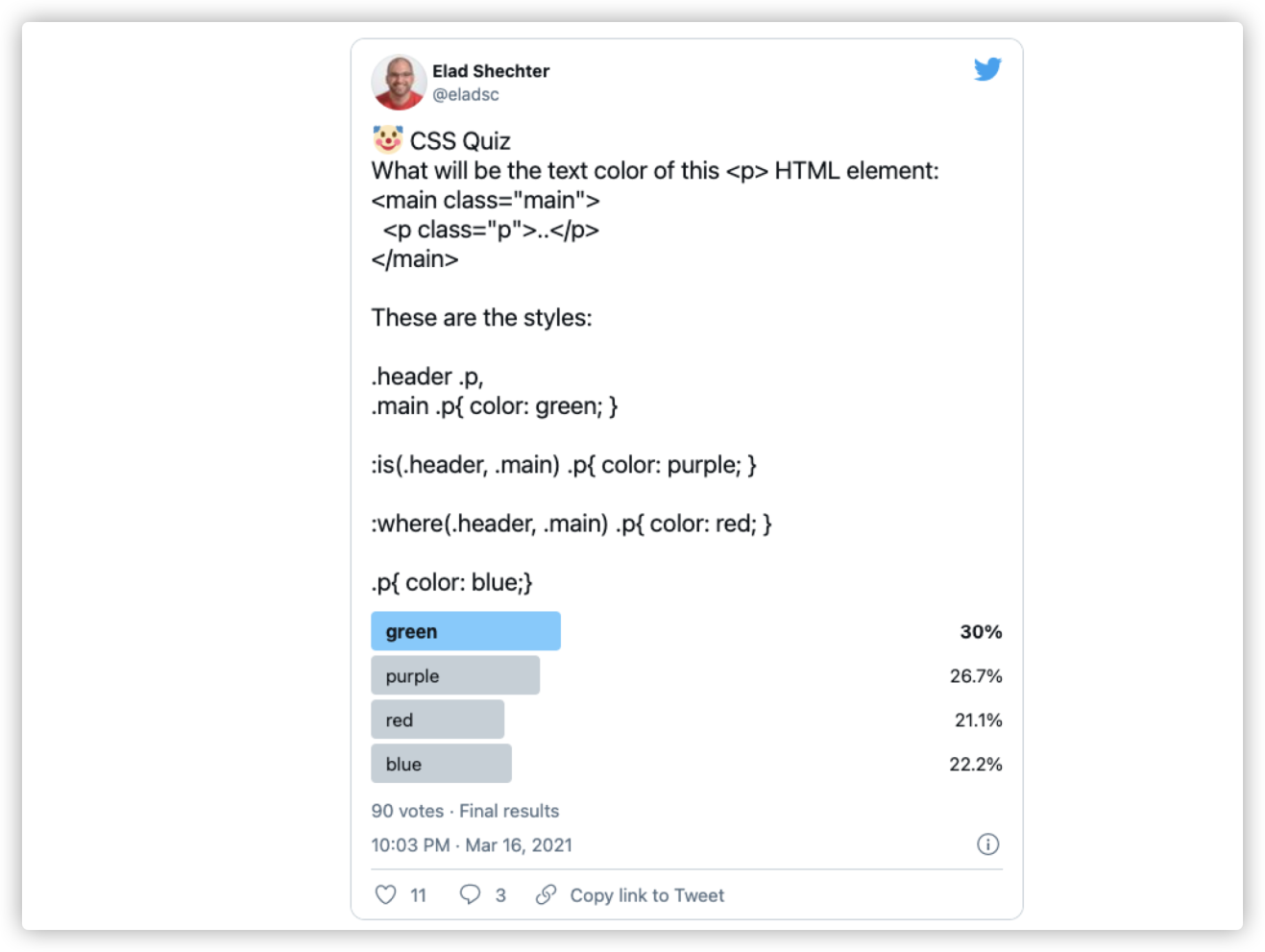
If this is your first time seeing this test, ask yourself which one is the answer (green, purple, red, or blue). If you chose purple, congratulations, you are correct!
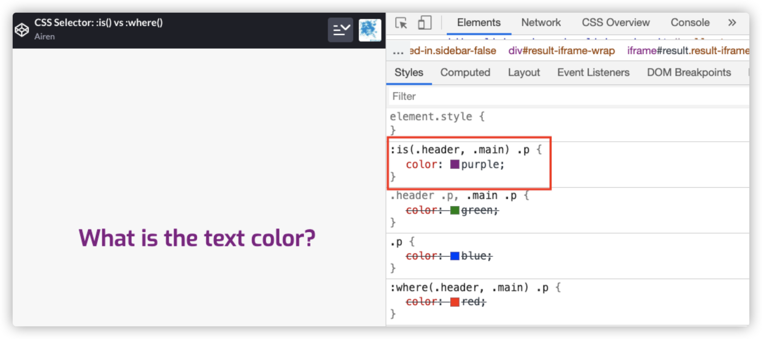
Demo address: https://codepen.io/airen/full/ExWxbKe
In the example, there are :is() and :where(), two pseudo-class selectors that you may have never known:
:is(.header, .main) .p {
    color: purple
}

:where(.header, .main) .p {
    color: red;
}
These two selectors are equivalent to:
.header .p,
.main .p {
    color: purple;
}

.header .p,
.main .p {
    color: red;
}
The only difference is that the weight of the selector. The priority of :where() is always 0, but the priority of :is() is determined by the selector with the highest priority in its selector list. The following figure can describe the relationship between them clearly:
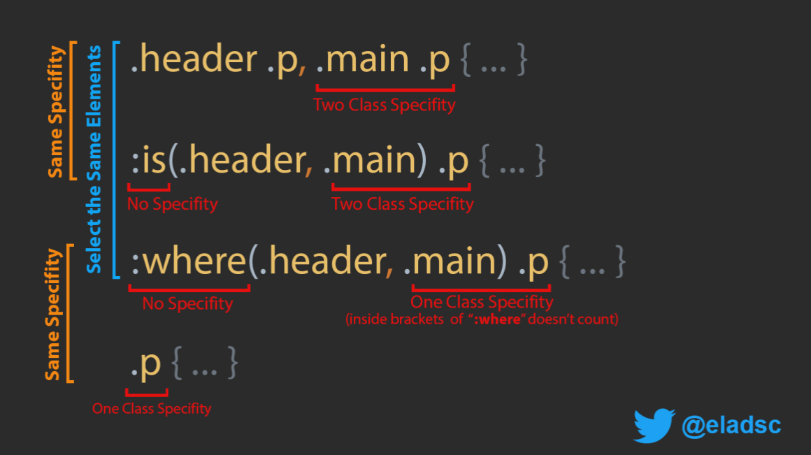
The address of the preceding figure: https://twitter.com/eladsc/status/1372445466709868545
In other words, the same element is selected by the following three selectors:
.header .p,
.main .p {
    // ...
}

:is(.header, .main) .p {
    // ...
}

:where(.header, .main) .p {
    // ...
}
The difference is that their weights are different:
.header .p,
.main .p {
    // ....
}

:is(.header, .main) .p {
    // ...
}
The two selectors in the example have the same weight (020):
:where(.header, .main) .p {
    // ...
}

.p {
    // ...
}
The selectors in the example code above have the same weight (010):
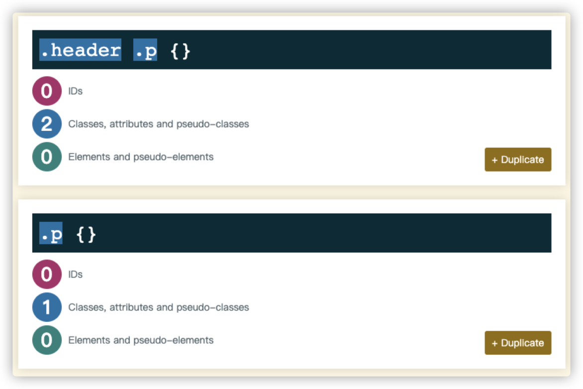
The emergence of pseudo-class selector :is() and :where() will make our selectors simpler. Here is an example of :is():
// Level 0
h1 {
  font-size: 30px;
}
//  Level 1
section h1, article h1, aside h1, nav h1 {
  font-size: 25px;
}
// Level 2
section section h1, section article h1, section aside h1, section nav h1,
article section h1, article article h1, article aside h1, article nav h1,
aside section h1, aside article h1, aside aside h1, aside nav h1,
nav section h1, nav article h1, nav aside h1, nav nav h1, {
  font-size: 20px;
}
It is described below using :is():
// Level 0
h1 {
  font-size: 30px;
}
// Level 1
:is(section, article, aside, nav) h1 {
  font-size: 25px;
}
// Level 2
:is(section, article, aside, nav)
:is(section, article, aside, nav) h1 {
  font-size: 20px;
}
Then, look at the following test again and answer what is the color of the p text.
<!-- HTML -->
<main class="main">
    <p class="p">What is the text color?</p>
</main>

// CSS
:where(.header, .main) .p {
    color: red;
}

.p {
    color: blue;
}

:is(.header, .main) .p {
    color: purple;
}

.header .p,
.main .p {
    color: green;
}
You can click here to see the answer: https://codepen.io/airen/full/dyvyJmW
:not() and :has()
When developing a frontend page, you may demand something similar to the following figure:
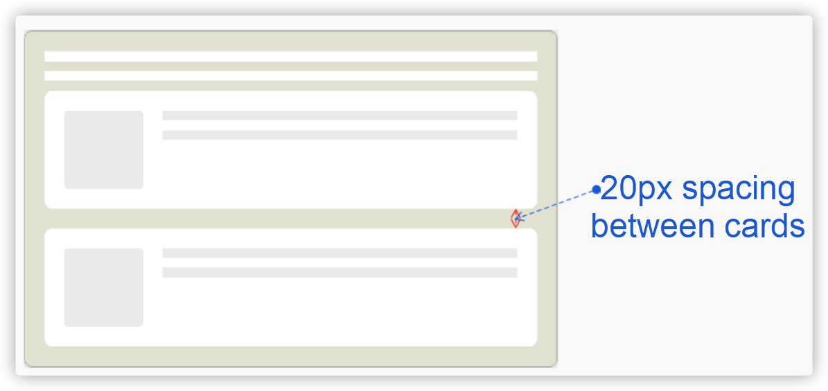
You do not want margin-bottom in the last card or margin-top in the first card. For such a scenario, :not() selector is very useful. Why?
If there is no :not() selector, you may think of the following way:
.card + .card {
    margin-top: 20px;
}

// or

.card {
    margin-bottom: 20px;
}

.card.card--last { // You may also use .card:last-child
    margin-bottom: 0;
}
If you use the :not() selector, it can be implemented like this:
.card:not(:last-child) {
    margin-bottom: 20px
}
The following figure shows the effect:
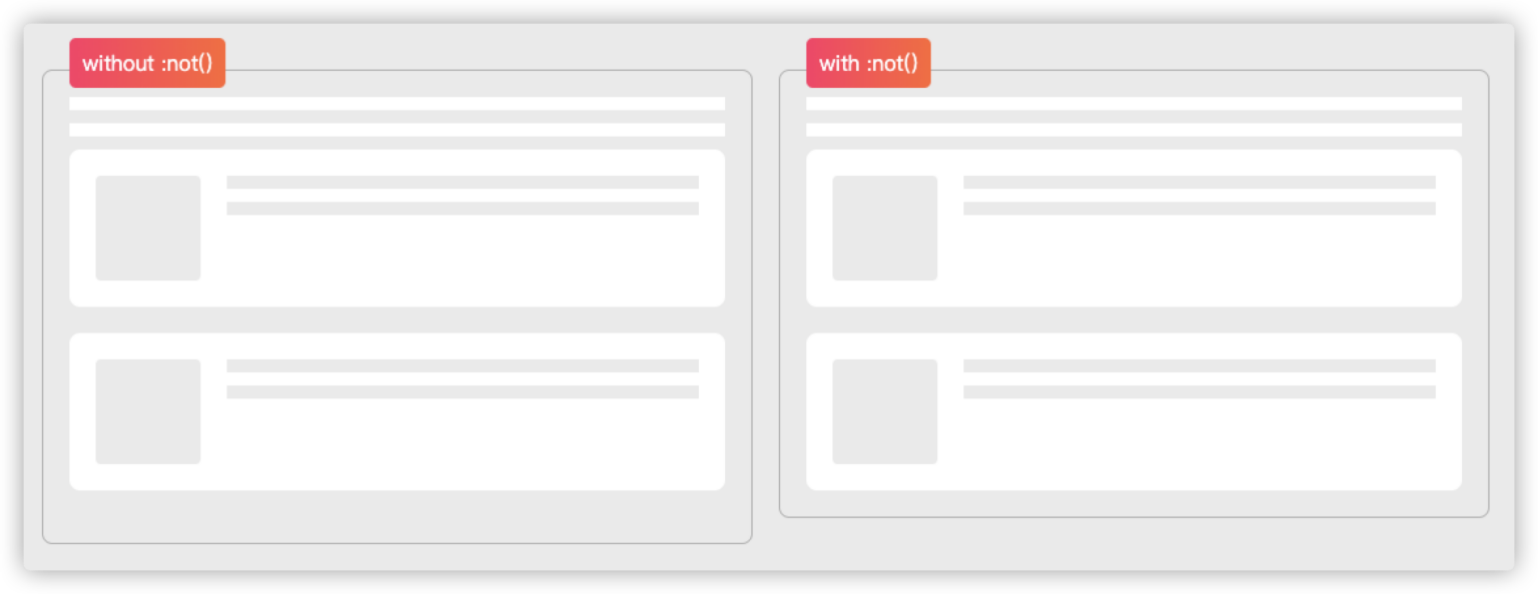
Demo URL: https://codepen.io/airen/full/MPNLEo
Although CSS selectors have been very powerful, CSS has no selector that selects from child elements to parent elements.
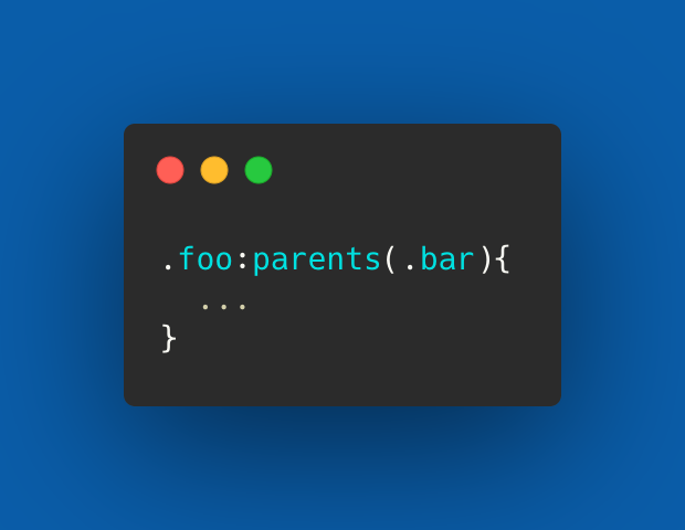
Some people want a
:parents()selector.
Although there is no :parents() selector so far, fortunately, the :has() selector is coming soon, which can select parent elements. Currently, Igalia is implementing the selector for Chrome. Its team member Brian Kardell has released an article entitled Can I :has(), in which the :has() selector is described in detail.
<section><!-- The border color of the section is blue and margin-bottom is 30px -->
  <h1>H1 Level Title</h1>
</section>

<section><!-- The border color of the section is #09f and margin-bottom is 30px -->
  <h1>H2 Level Title</h1>
</section>

<section><!-- The border color of the section is red -->
  <p>Text Paragraphs</p>
</section>

/* CSS */

// Section elements with h1 child elements will be matched
section:has(h1) {
    border-color: blue;
}
// Section elements with h2 child elements will be matched
section:has(h2) {
    border-color: #09f;
}
// Section elements with p child elements will be matched
section:has(p) {
    border-color: red;
}
// Section elements without p child elements will be matched
section:not(:has(p)) {
    margin-bottom: 30px;
}
In a browser that supports :has(), you will see the effect shown in the following figure:

The example also demonstrates the combination of :not() and :has(), but the result is completely different. :not(:has(selector)) matches parent elements that do not include selector elements. However, :has(:not(selector)) matches elements that include elements other than selector child elements. The main difference between the two is that :has(:not(selector)) must contain a child element while :not(:has()) can be matched even if it does not contain any elements.
Interestingly, there is an issue in GitHub discussing :has-child() selector. Perhaps we can use it in a component someday:
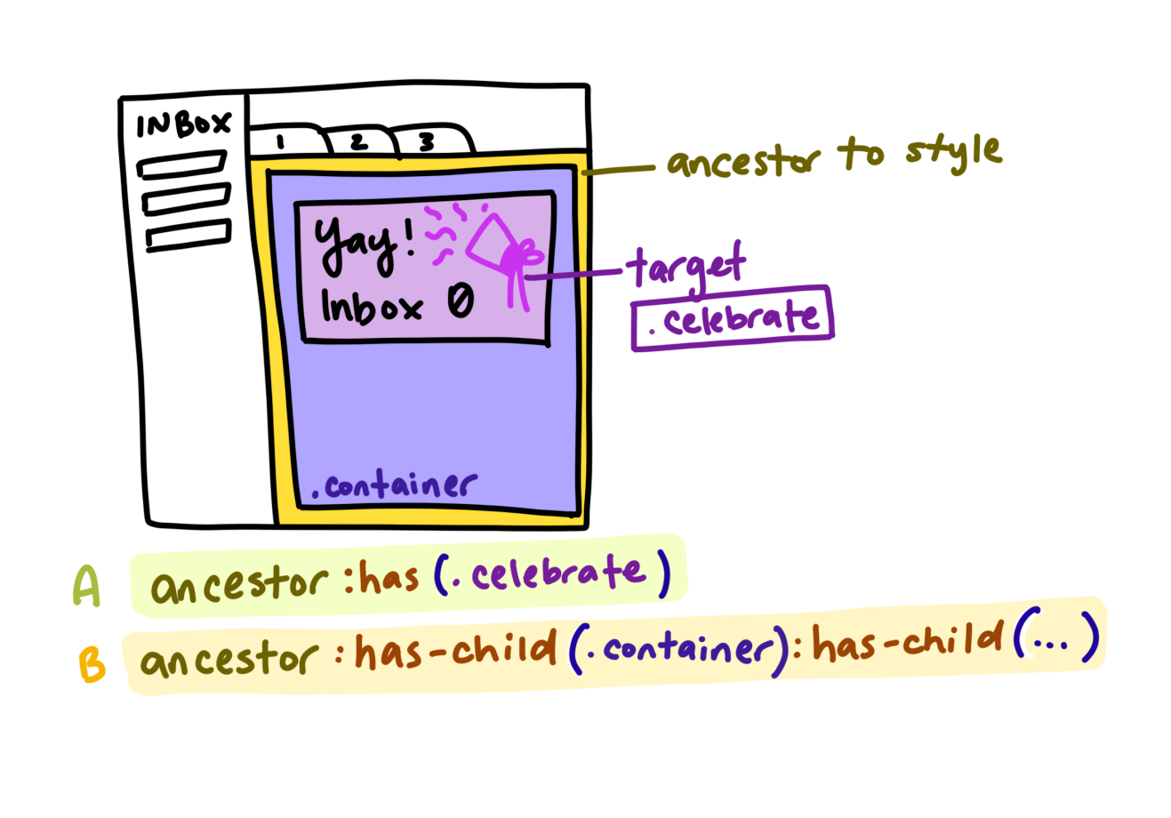
:empty and :blank
In modern Web development, the situation of empty data output is inevitable, which often brings extra troubles to the UI. For example, a certain style rule is written in the same class of UI components, but the data is empty. At this time, an issue in the following figure may appear on the page:

:empty and :blank pseudo-class selectors in CSS can avoid this issue. Both selectors are useful:
Since both of them can add styles to empty elements, what are empty elements? What are the differences between the two selectors? Empty elements are elements that have no child elements or child nodes. For example:
<!-- Empty element -->
<div class="error"></div>
<div class="error"><!-- Annotation --></div>

<!-- Non-empty element -->
<div class="error"> </div><!-- There is a space character in the middle -->
<div class="error">
</div><!-- Line break -->
<div class="error">
    <!-- Annotation -->
</div><!-- Using line breaks between annotations-->
<div class="error"><span></span></div>
Compared with :blank, :empty can only select elements without child elements. Child elements can only be element nodes or texts, including spaces. Neither annotations nor processing instructions have an impact.
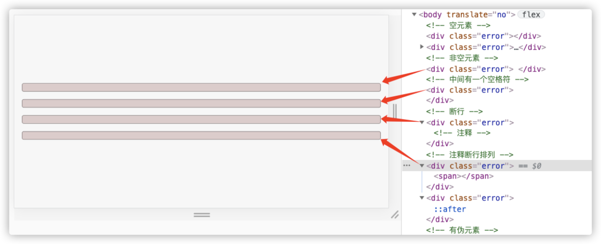
Demo: https://codepen.io/airen/full/yLMLKyo
Note: Even if pseudo-element ::before or ::after is used on empty elements to create content, they can be identified by :empty.
:blank is much more flexible than :empty, and it can be identified as long as there are no child elements in the element. However, the definition of the pseudo-class selector in W3C specifications tends to work in form controls. For example, if users have not input content in input or textarea, the submission of the form can be identified. It is somewhat similar to the function of form validation.
As early as 2018, Zell Liew discussed :empty and :blank, and posted a related blog about :empty and :blank:
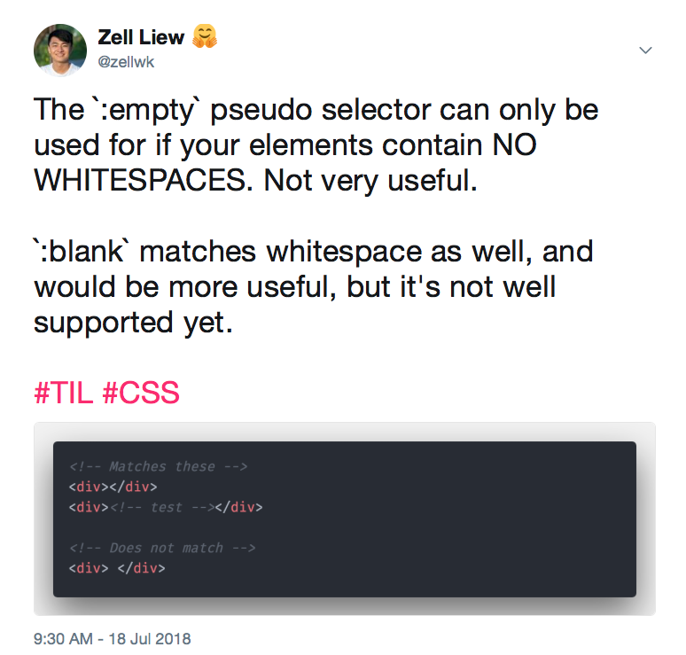
So far, :empty has been supported by mainstream browsers and can be used in practical production. However, there are still some controversies over the :blank pseudo-class selector. Click here to see related discussions.
:focus-visible and :focus-within
Programmers that write CSS code must be familiar with :focus. In the early stage, :focus can be used to set the UI style of a focusable element in the focus state, which is the style of focus ring:
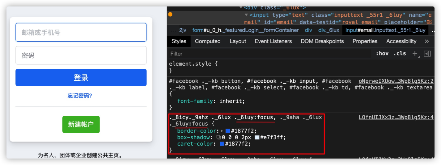
Starting from Chrome 86, :focus-visible and :focus-within were introduced to help us control the style of the UI focus ring better:

Although :focus, :focus-within, and :focus-visible can be used to set the style of the focus ring, there are still some differences among them:
:focus: When a user clicks the focus element with a mouse or presses the Tab key (or the shortcut key) on the keyboard, it triggers the style of the focus ring of the focus element.:focus-visible: When a user presses the Tab key (or the shortcut key) on the keyboard, it triggers the style of focus ring of the focus element. If you only use :focus-visible to set the style of the focus ring, the style of the focus ring is not triggered when users click the focus element with the mouse.:focus-within: It indicates that an element gets focus or its descendant elements get focus. This also means that when the element or its descendant elements get focus, it can trigger :focus-within.Let's take a look at an example:
button:focus {
  outline: 2px dotted #09f;
  outline-offset: 2px;
}

button:focus-visible {
  outline: 2px solid #f36;
  outline-offset: 2px;
}
You will find that the effects of the focus ring style are different when using the mouse to click the button versus pressing the Tab key to make the button get focus.
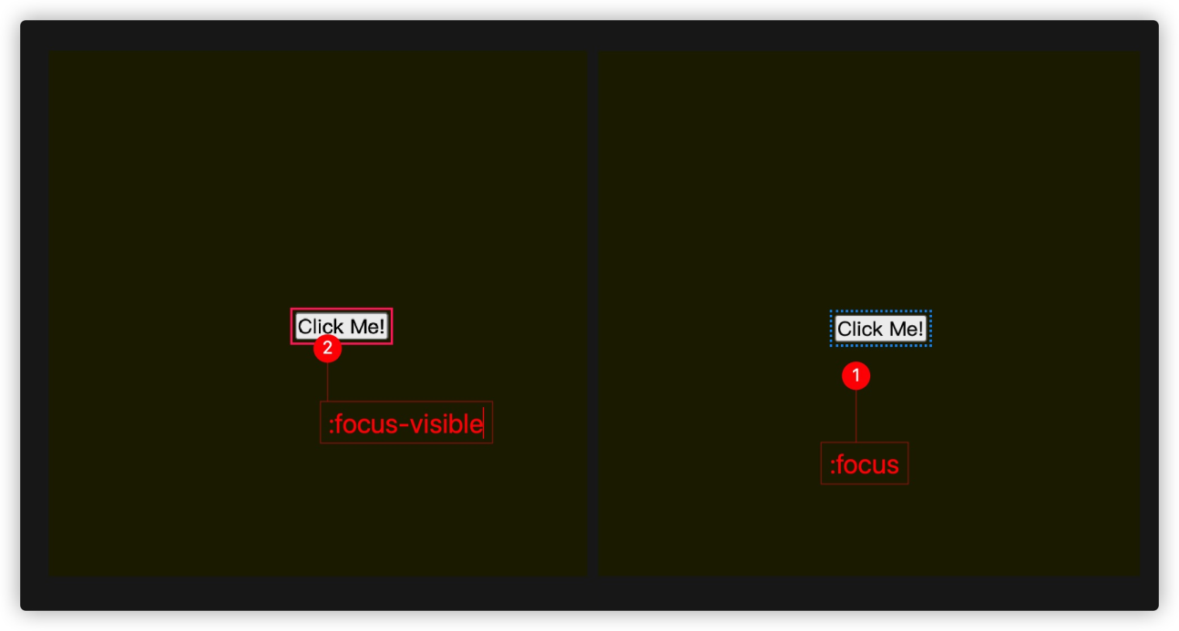
Note: :focus and :focus-visible also involve the issue of selector weight. In the example above, if we put the corresponding style of :focus selector behind :focus-visible, you will see the example below:
button:focus-visible {
  outline: 2px solid #f36;
  outline-offset: 2px;
}

button:focus {
  outline: 2px dotted #09f;
  outline-offset: 2px;
}
At this time, you will find that no matter if the user uses the Tab key on the keyboard or uses a mouse to make <button> get focus, the focus style will adopt the corresponding style of :focus.

You can use the :not() selector in CSS to give :focus and :focus-visible individual styles.
button:focus:not(:focus-visible) {
  outline: 2px dotted #416dea;
  outline-offset: 2px;
  box-shadow: 0px 1px 1px #416dea;
}

button:focus-visible {
  outline: 2px solid #416dea;
  outline-offset: 2px;
  box-shadow: 0px 1px 1px #416dea;
}
This time, the style of the focus ring changes when pressing the Tab key on the keyboard and clicking the mouse.
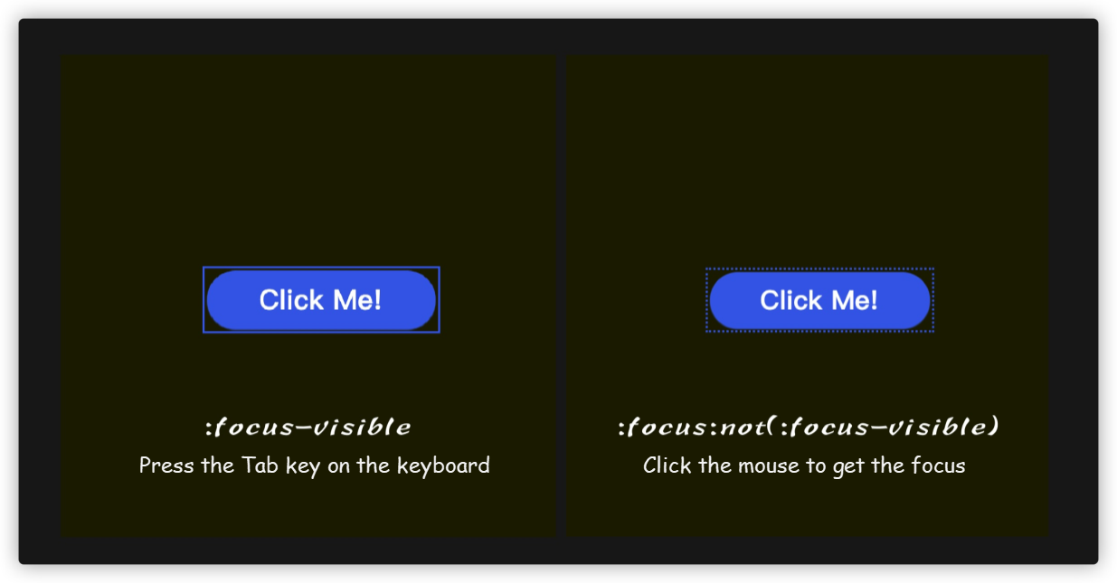
Demo: https://codepen.io/airen/full/YzGdoLq
Maybe you have thought of such a scene. You are optimizing A11Y and want to set different focus ring styles for focus elements on the mobile terminal and PC terminal. For this purpose, the preceding solution is very flexible.
:focus-within is a bit similar to the :has() pseudo-class selector, which can trigger the parent element when the child element gets focus.
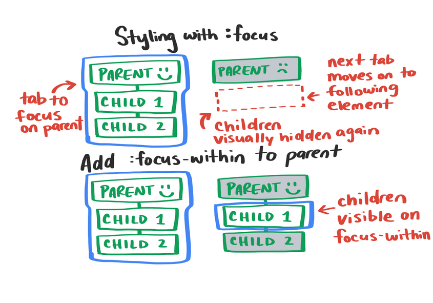
The preceding figure describes the differences between :focus-within and :focus. To put it more simply, :focus-within is somewhat similar to the event bubbling of JavaScript. Bubbling from elements that can get focus to the root element of HTML <html>, the :focus-within event can be triggered in the whole process. For example:
.box:focus-within,
.container:focus-within {
    box-shadow: 0 0 5px 3px rgb(255 255 255 / 0.65);
}

body:focus-within {
    background-color: #2a0f5bde;
}

html:focus-within {
    border: 5px solid #09f;
}
Demo: https://codepen.io/airen/full/JjRxoLE
We can make some interaction effects simpler by taking advantage of the features of the :focus-within pseudo-class selector. For example, we can implement the following example using :focus-within without any JavaScript code.
Demo: https://codepen.io/airen/full/KrPLmV
We can manage the UI effect of the focus ring of the focus element in the focus state better with the help of :focus, :focus-visible, and :focus-within.
In the world of CSS, in addition to the pseudo-class selectors mentioned here, there are many other pseudo-class selectors (or pseudo-elements), such as ::marker, :in-range, and :out-of-range.
If you are interested, you can try to use :in-range or :out-of-range to provide different UI effects for some input (such as input elements with the type of number and range; all of which have min and max properties) when the user enters a range value and a non-range value.
The From Level 4, CSS color module has added some new function values, such as hwb(), lch(), lab(), color-mix(), color-contrast(), and color(). It has also adjusted the original syntax rules of color value definition, such as rgb(), hsl(), and #rrggbb.
For example, the ways of color value description that we are familiar with are listed below:
#09f
#90eafe
rgb(123, 123, 123)
rgba(123, 123, 123, .5)
hsl(220, 50%, 50%)
hsla(220, 50%, 50%, .5)
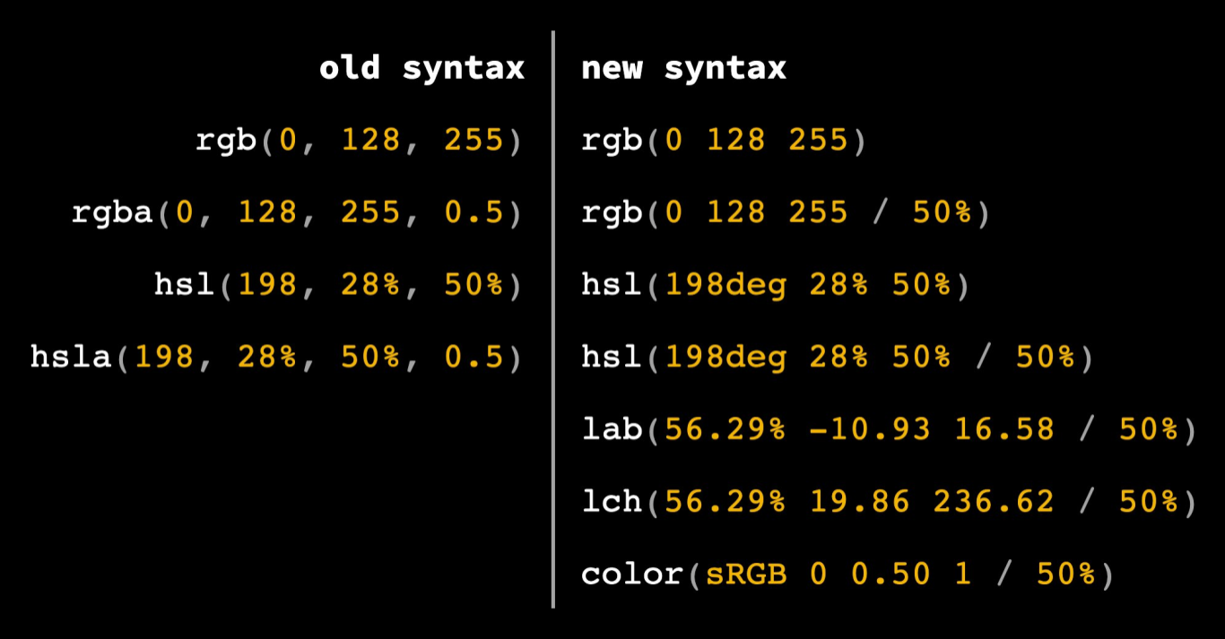
All of them have new syntax rules, especially for rgb(), rgba(), hsl(), and hsla(). In the past, the comma (,) was used as the separator, but now you can use a space as the separator. The rgb() and hsl() functions can add / between the third value and the fourth value to replace rgba() and hsla().
In addition, you can add new values to the last two bits in the syntax rule of the hexadecimal color definition to describe transparency, such as #rrggbbaa or #rgba. This syntax rule can already be seen in the code checker of Chrome browser:
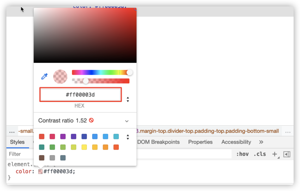
That means we can describe color values this way:
#hex-with-alpha {
  color: #0f08;
  color: #00ff0088;
}

#functional-notation {
  color: hsl(0deg 0% 0%);
  color: hsl(2rad 50% 50% / 80%);
  color: rgb(0 0 0);
  color: rgb(255 255 255 / .25);
}

#lab-and-lch {
  --ux-gray: lch(50% 0 0);
  --rad-pink: lch(50% 200 230);
  --rad-pink: lab(150% 160 0);
  --pale-purple: lab(75% 50 -50);
}
Currently, we describe colors in the sRBG color space, but the color space is a complex system. In addition to sRGB, there are other color spaces, such as LCH.
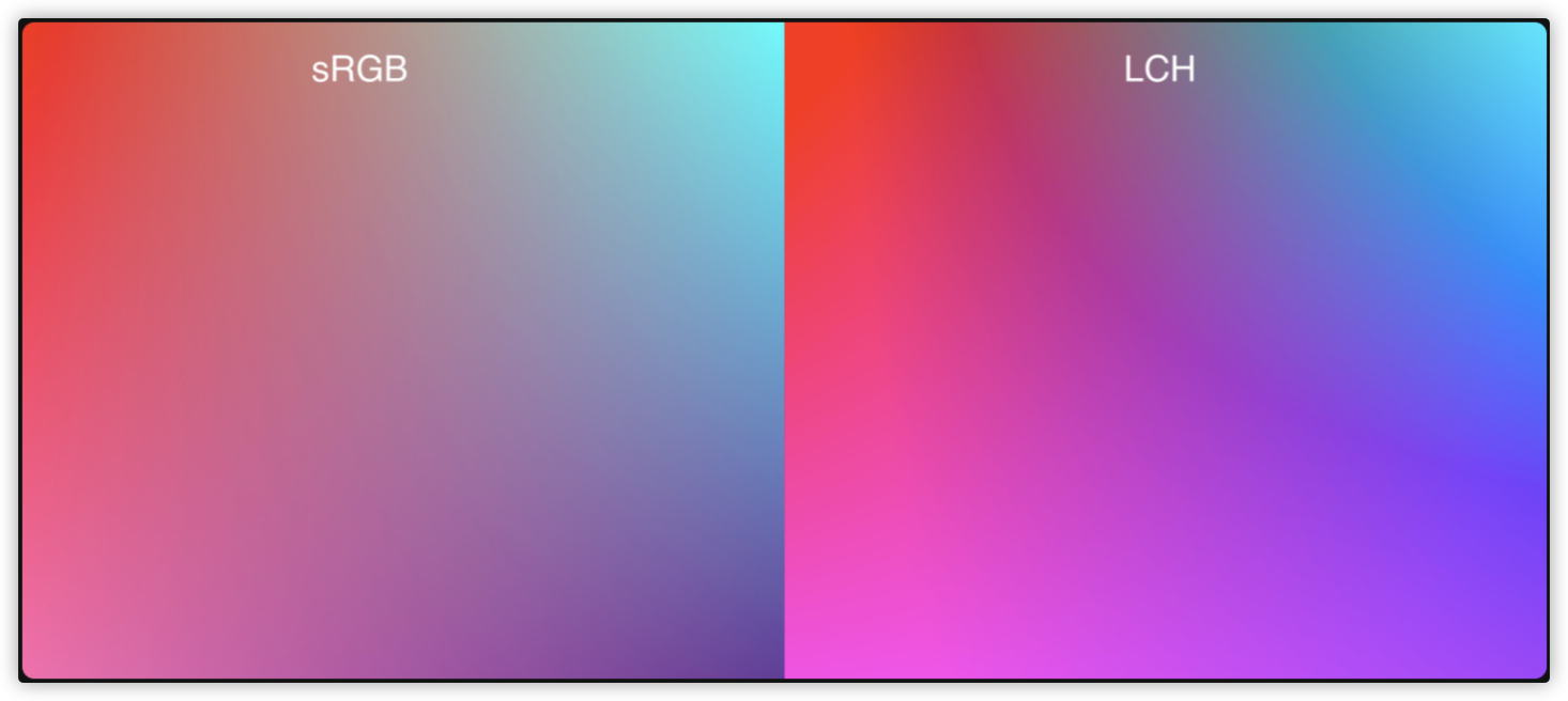
As shown in the preceding figure, the number of colors in the LCH color space is more than that in the sRGB color space, and LCH describes colors in a more detailed way.
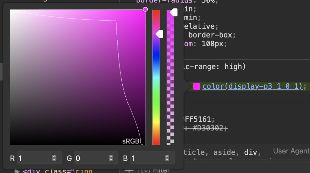
As shown in the preceding figure, you can specify a color space in the color() function.
#color-function {
  --rad-pink: color(display-p3 1 0 1);
  --rad-pink: color(lab 50% 150 -50);
  --rad-pink: color(srgb 100% 0% 50%);
}
Note: Please consider the function support (browser compatibility) and the hardware support for the color space when using the color() function to specify a color space.
The media query @media can be used in CSS to make a judgement. In the following example, the device will use the color value in the specified color space if it supports the color space.
@media (dynamic-range: high) {
  .neon-pink {
    --neon-glow: color(display-p3 1 0 1);
  }

  .neon-green {
      --neon-grow: color(display-p3 0 1 0);
  }
}
The color module of CSS selector Level 5 is stronger since its color function capability is expanded further. For example, you can add from keywords to rgb(), hsl(), hwb(), lab(), and lch() functions only to adjust a certain parameter on the basis of one color.
rgb() = rgb([from <color>]? <percentage>{3} [ / <alpha-value> ]? ) | rgb([from <color>]? <number>{3} [ / <alpha-value> ]? )
hsl() = hsl([from <color>]? <hue> <percentage> <percentage> [ / <alpha-value> ]? )
hwb() = hwb([from <color>]? <hue> <percentage> <percentage> [ / <alpha-value> ]? )
lab() = lab([from <color>]? <percentage> <number> <number> [ / <alpha-value> ]? )
lch() = lch([from <color>]? <percentage> <number> <hue> [ / <alpha-value> ]? )
Let's look at an example of hsl():
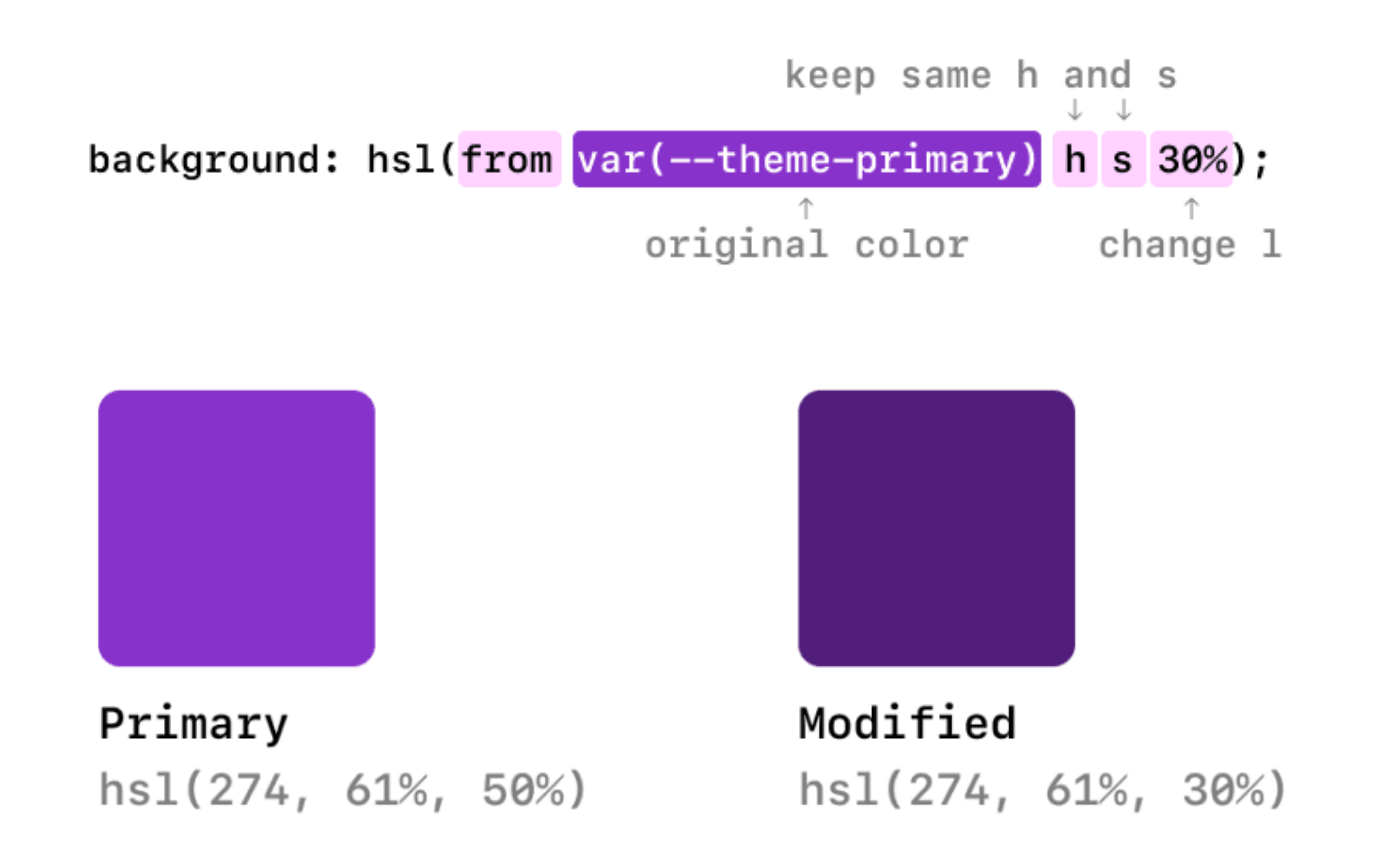
As shown in the preceding figure, based on --theme-primary (primary color, namely hsl(274, 61%, 50%)), we only adjust 1 parameter from 50% to 30% to obtain the new color hsl(274, 61%, 30%). By doing so, we can obtain the color panel produced on the basis of the change of a certain color parameter easily.
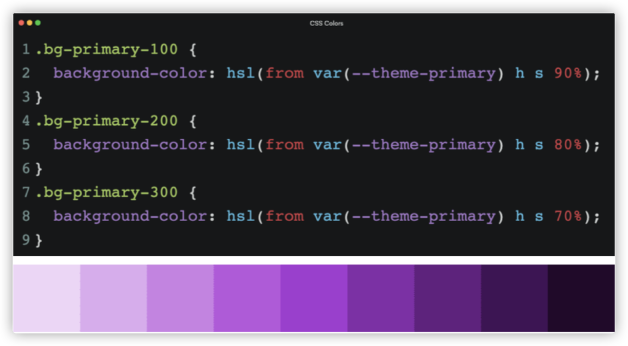
In addition, the Level 5 color module has added some new functions to describe colors, such as color-mix(), color-contrast(), and color-adjust().
.color-mix {
  --pink: color-mix(red, white);

  --brand: #0af;
  --text1: color-mix(var(--brand) 25%, black);
  --text2: color-mix(var(--brand) 40%, black);
}

.color-contrast {
  color: color-contrast(
    var(--bg)
    vs
    black, white
  );
}

--text-on-bg: color-contrast(
  var(--bg-blue-1)
  vs
  var(--text-subdued),
  var(--text-light),
  var(--text-lightest)
);

.color-adjust {
  --brand: #0af;
  --darker: color-adjust(var(--brand) lightness -50%);
  --lighter: color-adjust(var(--brand) lightness +50%);
}
Here is a brief introduction to these color functions. The color-mix() function accepts two <color> values and returns the result of their blends in a specified number in the specified color space. With no special instructions, they will be blended in the lch() color space. As shown in the following figure, red and yellow are blended in the lch() color space (default). In each lch channel, the value of red is 65%, while yellow is 35%, color-mix(red yellow 65%).
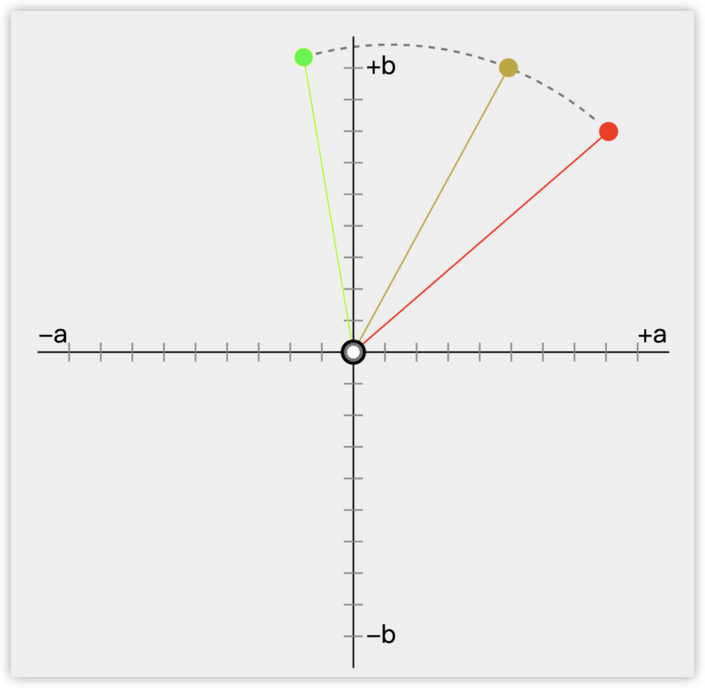
The color-contrast() function is interesting since it can improve Web accessibility. It mainly obtains a color value and compares it with other color values in a list to select the one with the highest contrast.
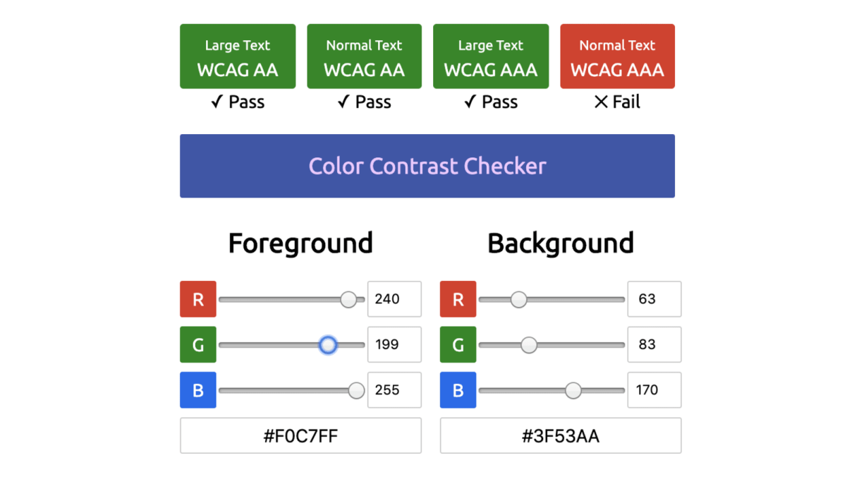
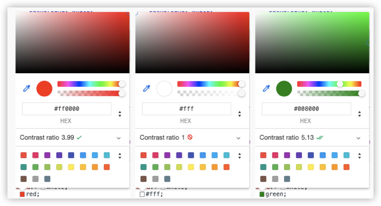
For example, in color-contrast(white vs red, white, green), it will separately compare red, white, and green with white. Since green and white have the highest contrast, it will eventually take green.
The color-adjust() function can be used to adjust the color in the given color space using a specified transformation function. Unless otherwise specified, the adjustment is carried out in the lch() color space. For example, color-adjust(#0af lightness +50%) increases the height of the color #0af in the lch color space by 50%.
In other words, in the near future, these color functions can help us control the color values in the Web. They have become the experimental properties of mainstream browsers, especially Safari, which has higher support than Chrome and Firefox.
The background property of CSS is a shorthand property, which is familiar to all of you. However, I would like to focus on background-position and background-repeat. You may ask since these two properties are not new, what is worth talking about? Even though these two properties are not new, there are several details still unfamiliar to many developers. Let's start with background-position.
background-position is used to specify the position of the background image in a container. We are familiar with the relative position of the top left corner (vertex) of the background image to the top left corner of the container, as shown in the following figure:
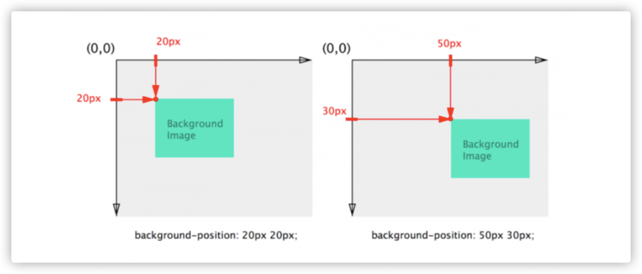
However, sometimes we want to calculate the background image position relative to the right or bottom edge of the container, as shown in the following figure:
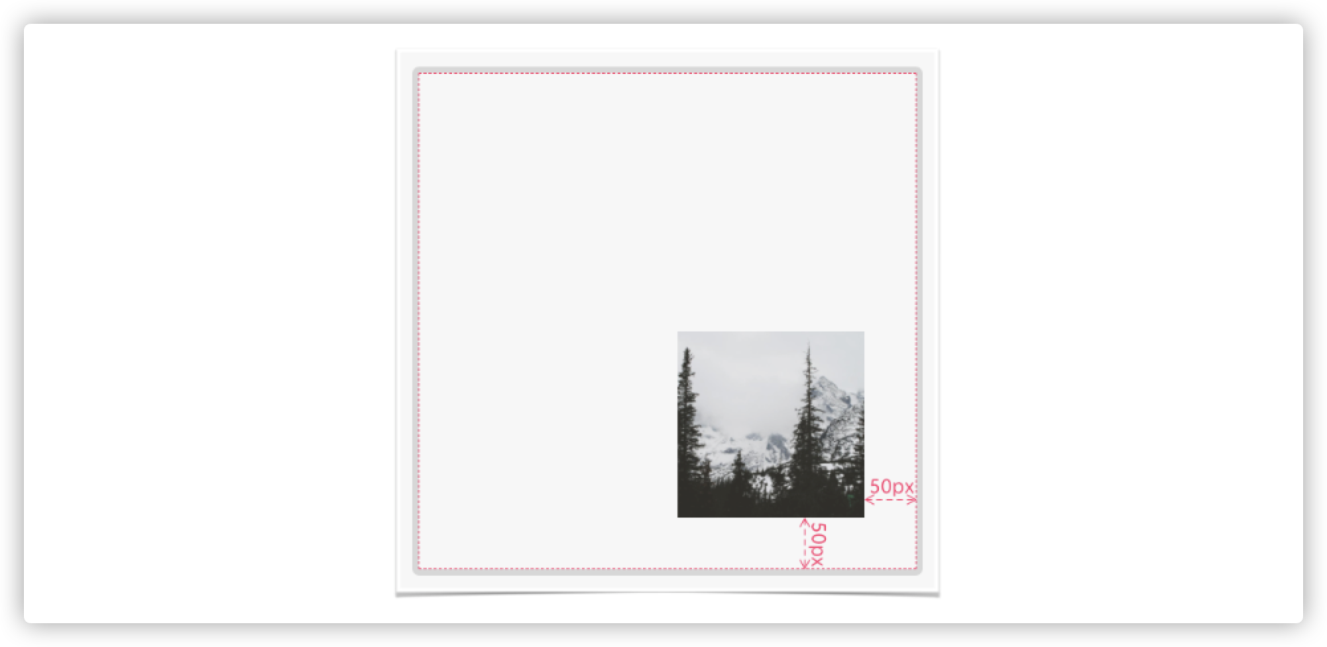
Here, we want to keep the background image 50px away from the right and bottom edges of the container. To do so, you may first think of calculating the sizes of the container and the background image to get the distances above. Then, apply the values to background-position. Of course, readers familiar with CSS may think of using the calc() function.
:root {
    --xPosition: 50px;
  --yPosition: 50px;
}

.container {
    background-position: calc(100% - var(--xPosition)  calc(100% - var(--yPosition)))
}
The calc() dynamic calculation is much more convenient than calculating the sizes of the container and background image. background-position provides another feature. We can use the keywords top, right, bottom, and left to specify the direction. For example, we are familiar with the following usage:
background-position: 50px 50px;

// It is equivalent to
background-position: top 50px  left 50px;
Then, to achieve the effect of the preceding figure, we can use keywords right and bottom to make it simple.
:root {
    --xPosition: 50px;
  --yPosition: 50px;
}

.container {
    background-position: right var(--xPosition)  bottom var(--yPosition);
}
The final effect is shown below:
Demo: https://codepen.io/airen/full/mdWyryr
Note: In the demo, the left is the effect of using calc(), while the right is the effect of using keywords.
There is a small detail to pay attention to when using background-position: percentage in background-position. The reason is that percentage-based background-position calculations are more complex.
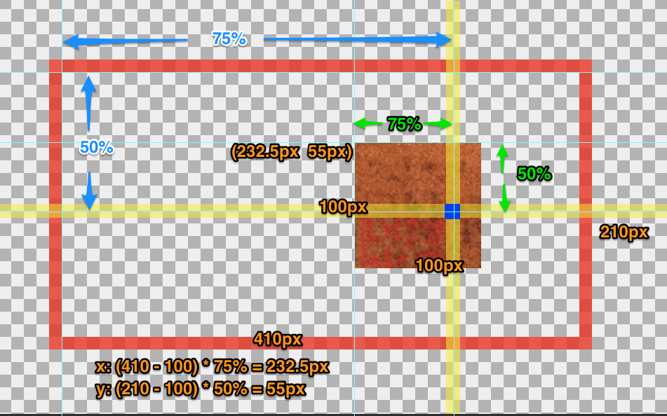
As shown in the preceding figure, the original size of the background image is 100px x 100px, and the size of the container (the element that uses this background image) is 410px x 210px. If you use background-position: 75% 50%, its calculation is below:
// background-position x-axis coordinate
x = (container width – background image width) x percentage of background-position x-axis coordinate = (410 - 100) x 75% = 232.5px

// background-position y-axis coordinate
y = (container height- background image height) x percentage of background-position y-axis coordinate = (210 - 100) x 50% = 55px
In this example, background-position: 75% 50% is equivalent to background-position: 232.5px 55px.
Note: If we combine background-size and background-position, which uses percentages, things become more complicated, especially when the value of background-size is cover or contain. Why? This is beyond the topic of this article. If you are interested, you can take this as a personal topic and explore it in depth.
In terms of background-repeat properties, in addition to no-repeat and repeat (or repeat-x and repeat-y) we are familiar with, we can use round and space.
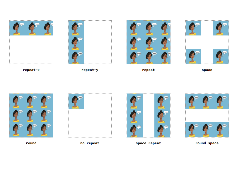
We all know that using repeat may cause the background image to be cropped when tiled. You can use round to avoid it. Its major feature is that it adjusts the size of the background image according to the width and height of the container when tiling the image. space will leave some space. In other words, the extra space is left blank between images to ensure the background images are not cropped.
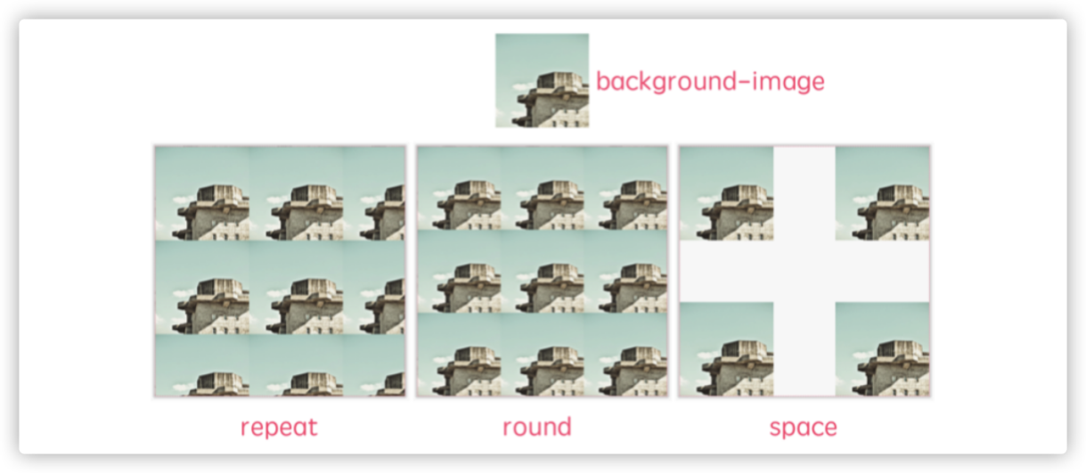
Demo: https://codepen.io/airen/full/mdWyOOj
If you are familiar with design or design software, masking and clipping will not be strange to you. Designers often use masking and clipping when drawing design drafts. With the development of CSS, these two features are now available in the world of CSS. They are defined in W3C specification CSS Masking Module Level 1, and the main functions are shown in the following figure:
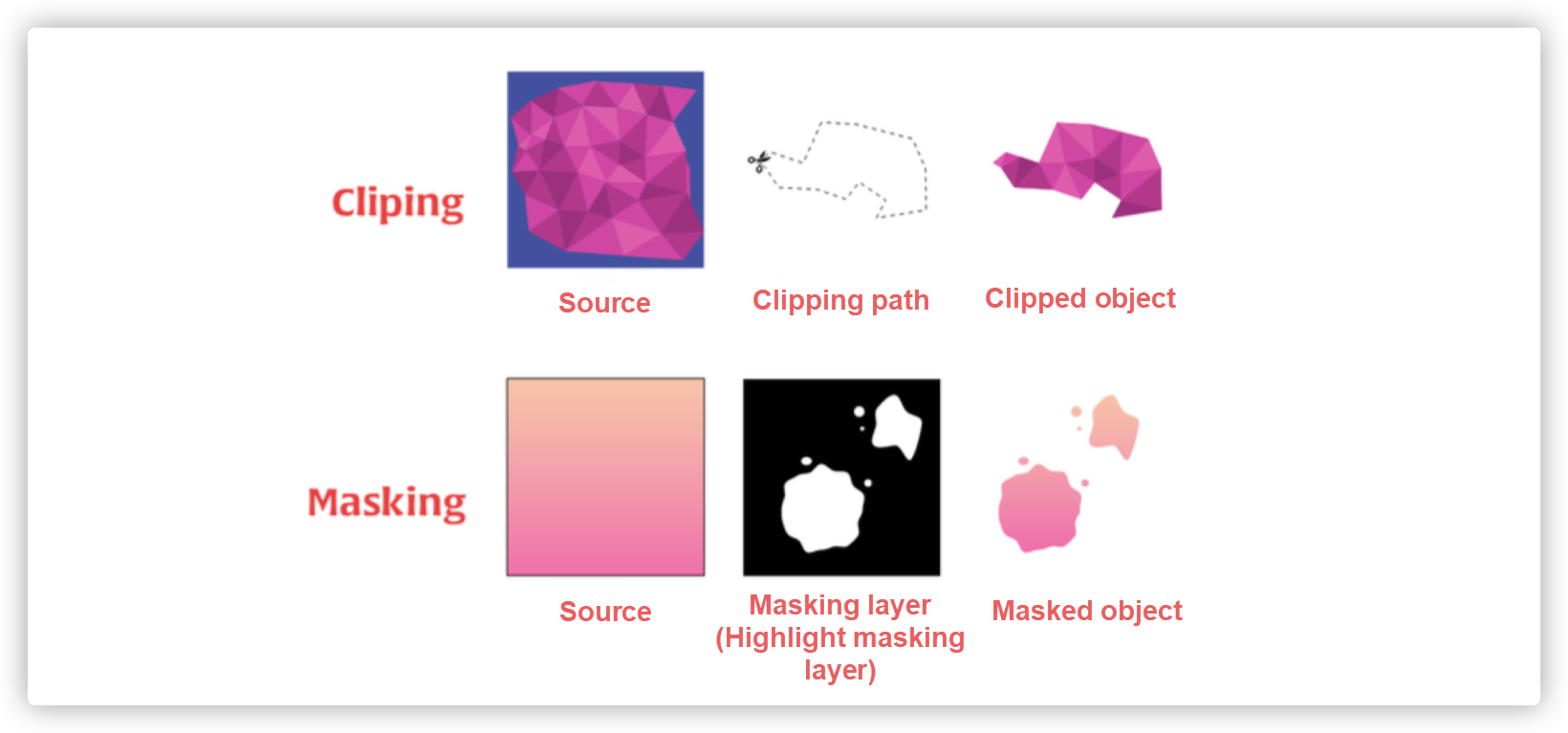
The display area of the content can be controlled flexibly.
The CSS properties corresponding to masking and clipping are mask and clip-path. mask is a shorthand property, and its rule of use is similar to background. I will show you what they can do with simple examples.
First, let's look at mask.
Demo: https://codepen.io/airen/full/MdQrvR
The emoji and text in the video are incomplete. (It looks like it is torn.) Without mask, it was almost impossible to achieve such effects. Now, it is very simple to implement with the help of mask. We just need an image like the following one (used for mask-image) called the masking image.

h1 {
    mask-image: url(mask.png);
}
We can also take advantage of the synthesis ability of mask to synthesize multiple masks:
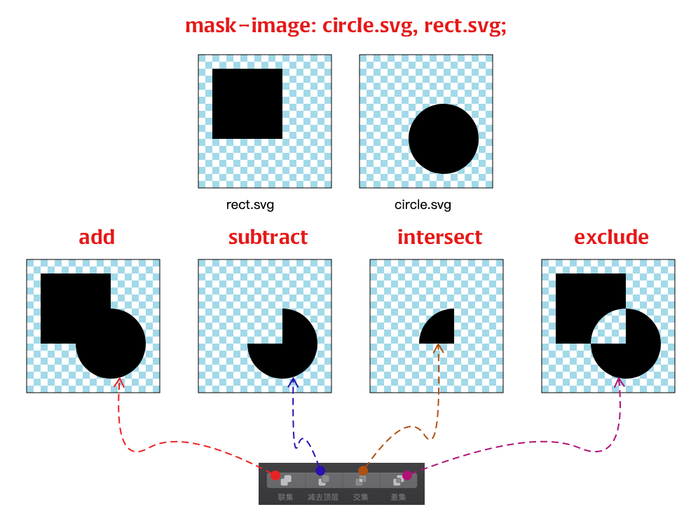
We can achieve the required effects in some business scenarios by taking advantage of the capabilities of masking.

We can also achieve the effect of skin changing.

Demo: https://codepen.io/airen/full/yWvzYy
Then, let's look at clipping. Apart from helping us control the area to be displayed, CSS clip-path can also combine different paths and function values to realize irregular graphic display. The following example is the effect displayed by Clippy:
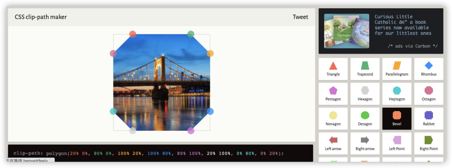
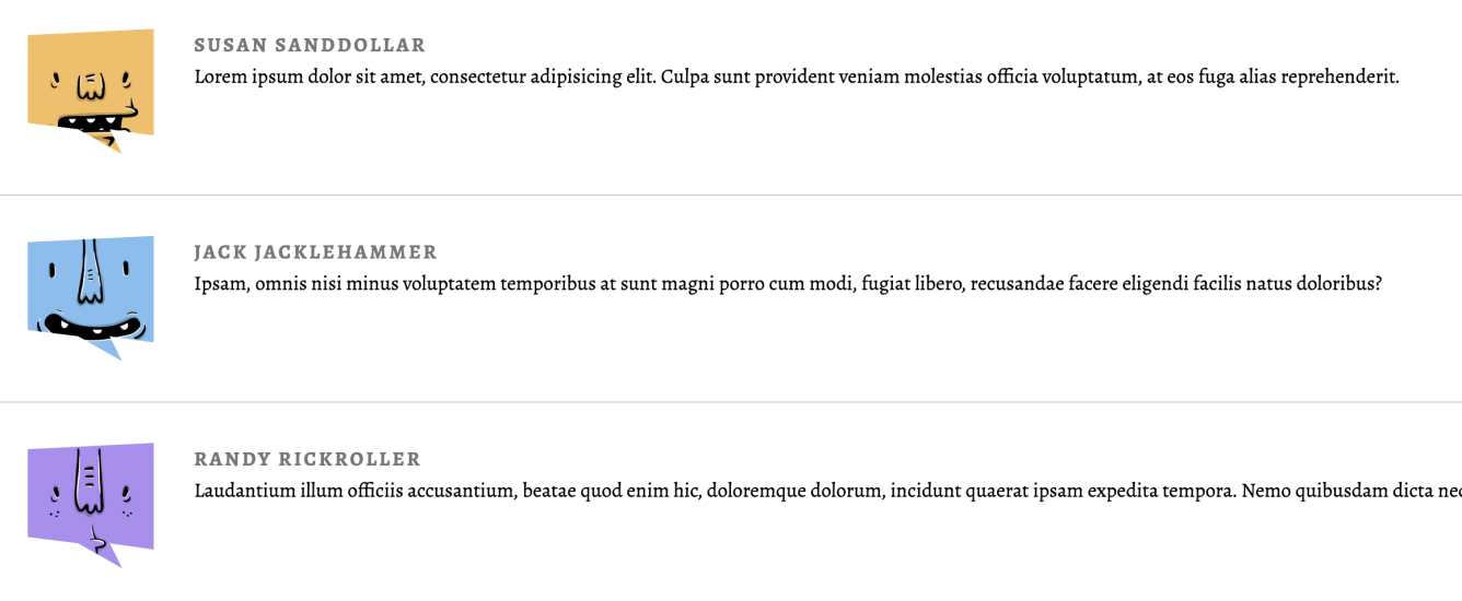
For example, in practical scenarios, when implementing some irregular and multi-state UI effects, clip-path will be very convenient.
In addition, the combination of clip-path and transition or the combination of clip-path and animation can produce better motion effects in interaction design.
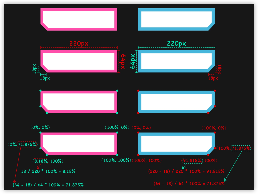
The left side is the original effect, and the right side is the effect produced when the mouse hovers:
Demo: https://codepen.io/airen/full/zYqbgRK
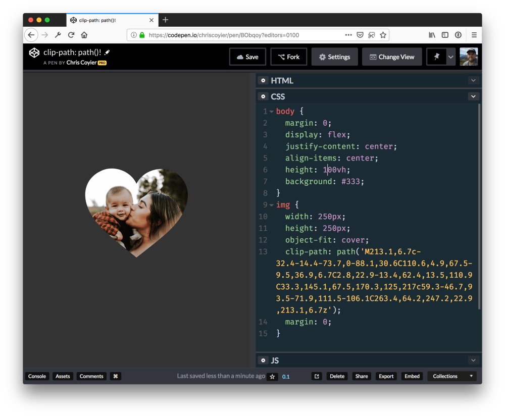
In particular, when clip-path supports the path() function, you can do more things. For example, when we want to have a heart-shaped UI effect:
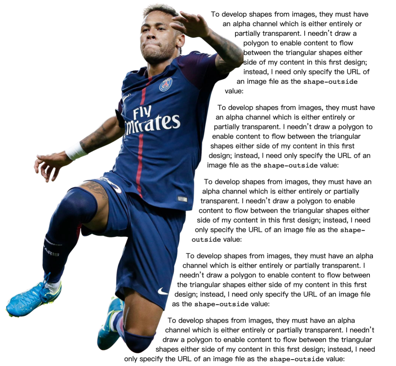
Apart from that, the combination of clip-path, float, and Shapes of CSS can achieve the layout effect of the mixed arrangement of some irregular pictures and texts.
CSS blend modes are very interesting. Currently, there are mainly two properties: mix-blend-mode and background-blend-mode. The former is used for the synthesis of multiple elements, and the latter is used for the synthesis of multiple backgrounds. They can achieve some special effects, such as effects similar to filters in Photoshop.

We can easily change the color of product pictures with the help of the blend mode features.
Demo: https://codepen.io/kylewetton/full/OJLmJoV
Here is a brief introduction to the implementation of this effect.
First, we have a product picture similar to the following one:
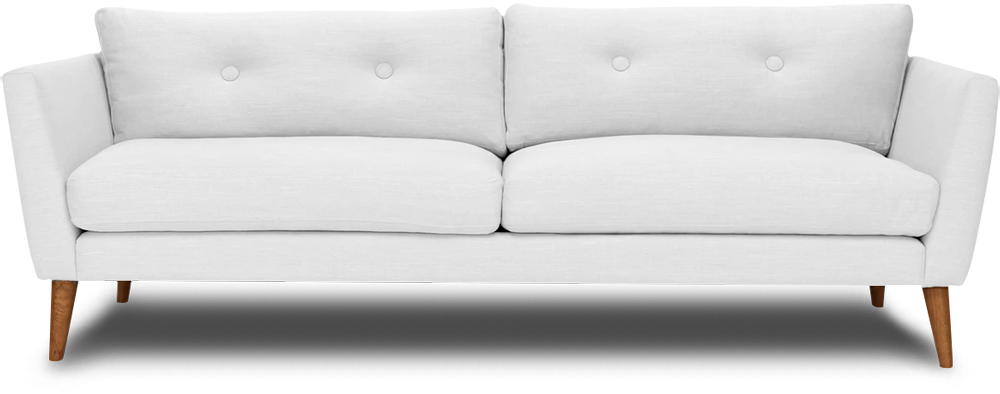
Through SVG capability, we draw a black SVG shape, which is the same as the figure above in shape:

The SVG code is not complicated.
<svg id="js-couch" class="couch__overlay" xmlns="http://www.w3.org/2000/svg" xmlns:xlink="http://www.w3.org/1999/xlink" preserveAspectRatio="none" width="1000" height="394">
  <defs>
    <path d="M996.35 77.55q-1.85-1.95-8.65-3.75l-62.4-17.1q-9.3-2.75-12.15-2.5-1.8.15-2.85.45l-.75.3q2.25-16.3 3.75-22.05 1.15-4.4 1.4-10.8.2-6.6-.7-10.85-1.25-5.65-3.1-7.8-2.95-3.35-9.65-2.7-5.95.6-39.3 1.7-38.3 1.25-39.45 1.3-10.25.5-126.75.5-5.05 0-54.2 1.3-45.8 1.25-54.05.95-19.45-.45-30.4-.7-20.2-.55-23.1-1.3-22.3-5.85-26.5 1.25-2.65 4.55-3.85 7.9-.6 1.7-.7 2.5-.65-2.2-2.05-4.55-2.75-4.65-6.45-5.2-3.85-.55-13.65-.4-7.4.1-12 .4-.4.05-18.7.9-16.55.8-19.15 1.1-3.4.4-14.6 1.1-11.3.75-13.05.65h-9.8q-8.65-.05-11.45-.4-2.85-.35-9.25-.6-6.7-.15-8.5-.25-2.7-.1-27.75-.1-25.1 0-29.6.1-92.35 1.15-99 1.65-5.15.4-20 0-15.3-.4-24.4-1.25-6.75-.6-21-1.55-12.95-.9-14.85-1.1-6.45-1.05-11.05-1.5-8.7-.85-12.85.5-5.45 1.75-8.1 4.65-3.2 3.4-2.9 8.6.25 4.65 2.1 11.8 1 3.8 2.55 9.1 1 3.85 2.35 10.1-.1 1-1.5 1-1.75 0-7.7.85-7.1 1-9.8 2.05-2.4.9-23 4.75-21.2 3.9-22.05 4.15-8.2 1.85-15.05 3.35Q7.4 69.1 5.65 70.3 2.5 72.45 2 73.1.6 75 .75 79.2q.15 4.15 1.3 12.75.9 6.85 1.45 10 .5 2.75 8.55 54 6.65 42.15 7.35 46.85 1.15 7.65 4.9 28.55 4.55 25.2 6.35 31.2 2.45 8.15 3.8 11.75 1.85 4.9 3.2 5.75 1.25.8 6.85.65 2.75-.05 5.3-.25l23.85.35q.1 0 1 .95t2 .95q1.9 0 3.4-1.4l23.1-.25 43.65.4q135.05 2.15 137.9 1.9 1.25-.1 72.9.5 72.45.65 76.85.45 8.1-.35 64 .4 143.35.95 146 1.1.55.05 75.3.3 74.7.3 79.8.6 8.65.5 68.25-.35l51.75.5 1.6.4q1.95.35 3.8.05 1.45-.25 3.5-.2 1.9 0 3.35-.3 2.1-.45 8.25-.8 6.25-.3 8.75-.05 1.7.2 8 1 5.75.3 7.4-1.75 1.75-2.2 4.95-10.85 2.8-7.55 4.05-12.4.65-2.5 3.6-17.2 2.75-13.75 3.15-14.8.45-1.25 4.45-22.85 4.05-22.4 4.4-24.4.3-1.45 3.75-25.2 3.35-23.2 4-26.3 1.15-5.5 2.35-18.8 1.4-15.7.8-23.7-.6-8.35-3.35-11.15z" id="a" />
    </defs>
  <use xlink:href="#a"/>
</svg>
You can use CSS custom properties and a small amount of JavaScript code to change the color of the product picture.
:root {
    --fill: #f36;
}

svg {
    fill: var(--fill);
  mix-blend-mode: multiply;
}
We use the multiply effect in mix-blend-mode. The code is also simple for JavaScript to dynamically change the value of --fill.
const inputEle = document.querySelector('input')

inputEle.addEventListener('change', (e)=>{
  document.documentElement.style.setProperty('--fill', e.target.value);
})
It is very simple, and you can use your imagination to achieve many creative effects.
CSS custom properties are the standard configurations in CSS. As described by the W3C specification, CSS custom properties are also called CSS variables.
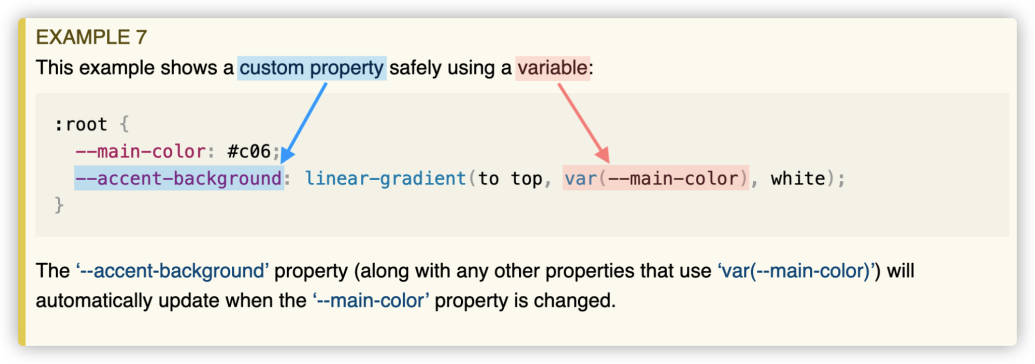
However, what I am talking about here is not how to use CSS custom properties. Instead, I want to introduce invalid variables in CSS custom properties. Invalid variables in CSS custom properties are very useful. They can achieve the switch switching effect of 1 (true) and 0 (false). In other words, they can achieve UI effects in different states.
Similarly, there are detailed descriptions of invalid variables in the W3C specification, but they can be ignored easily. Let's see how the specification describes invalid variables first.

It means:
When the value of a custom property is **initial**, **var()**** function cannot use it for replacement. Unless a valid rollback value is specified, the declaration will be invalid when calculating the value. **In CSS, -- is used to register a custom property. You can assign values to registered custom properties, including empty strings. One of the details is very interesting:
:root {
    --invalid:; // No space character or any other characters between the colon and the semicolon
  --valid: ;  // Only one space character between the colon and the semicolon
}
The --invalid custom property is called an invalid variable, and the --valid custom property is a valid variable. The preceding method of distinguishing valid variables from invalid variables makes it very hard to read for developers. In addition, some text editors may format the code according to their specifications, which may turn --invalid:; to --invalid: ; (with a space.) Therefore, we generally use keyword initial to explicitly declare a custom property as an invalid variable:
:root {
    --invalid: initial; // Invalid variable
  --valid: ;                    // Valid variable
}
If we do not use the var() function to call registered custom properties, it will not work. The var() function has two parameters. The first is the custom property, and the second is the backup value. If the first parameter is an invalid value, the second parameter will be used. Therefore, if var() has not provided the backup value (the second parameter), registered invalid custom properties (invalid variables), such as --invalid in the code above, will make the CSS style specification (declaration) invalid when calculating values.
:root {
    --invalid: initial; // Invalid variable
  --valid: ;          // Valid variable
}

foo {
    background-color: var(--invalid); // No backup value is provided, and the calculated value of background-color is invalid
  color: var(--invalid, red)        // Backup value is provided and --invalid is an invalid variable, so the backup value red will be used
}
Let's look at a simple example first:
<div class="element">
  <i>Element</i>
</div>

<i>Element</i>

<style>
  .element {
      --color: red;  // Only works on .element and its descendant elements
    }

    i {
      --foo: initial;                         // Invalid variable
      --color: var(--foo);         // Invalid variable
      background-color: var(--color, orange); // --color is an invalid variable, so the backup value orange is used
    }
</style>
Run the code above, and you will see the effect shown in the following figure:
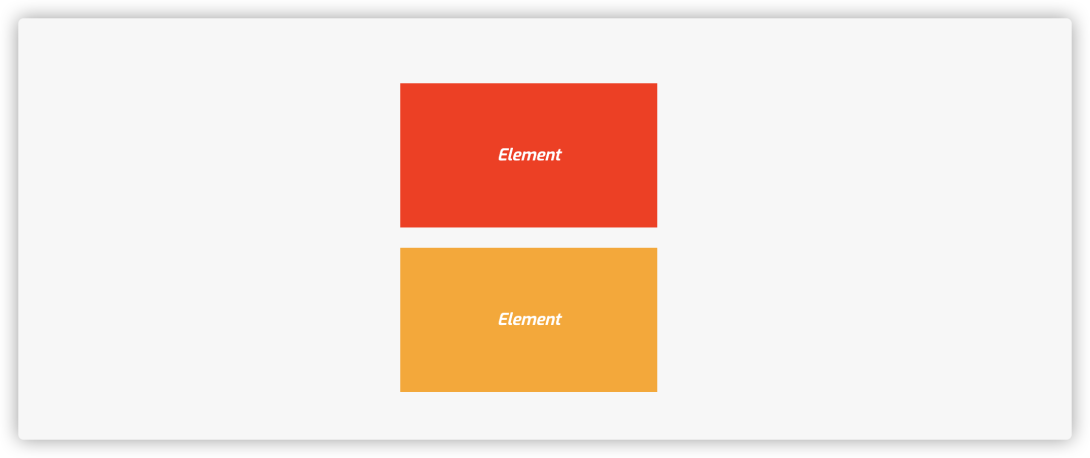
Demo: https://codepen.io/airen/full/GRWJGvx
Here is another example:
<section>Element</section>

<style>
  :root {
    --initial: initial; // Invalid variable
    --valid: ;                    // Valid variable
    }
  section {
      background-color: var(--initial, red); // It is an invalid variable, so the backup value red will be used
    color: var(--valid, red);                //    Valid variable, backup value is ignored
  }
</style>
Therefore, the effect you can see is listed below:

Demo: https://codepen.io/airen/full/poeJKpM
In this example, the color property sets the color: ; value, which will be ignored when calculating at the client. Thus, it will inherit the color value of its ancestor element. In this example, it inherits the color value black of body element.
Now, you may have some knowledge of invalid variables in CSS custom properties. Let's continue.
To make invalid variables in CSS custom properties easier to understand for developers, @Lea Verou introduced a concept similar to Switch in The --var: ; hack to toggle multiple values with one custom property.
:root {
    --ON: initial; // Invalid variable, which is equivalent to opening the backup value of var()
  --OFF:;        // Valid variable, which is equivalent to closing the backup value of var()
}
By doing so, we only need to switch between --ON and --OFF when switching between different states of UI. The following code is the example in the article written by @Lea Verou.
:root {
  --ON: initial;
  --OFF: ;
}

button {
  --is-raised: var(--OFF);

  border: 1px solid var(--is-raised, rgb(0 0 0 / 0.1));
  background: var(
      --is-raised,
      linear-gradient(hsl(0 0% 100% / 0.3), transparent)
    )
    hsl(200 100% 50%);
  box-shadow: var(
    --is-raised,
    0 1px hsl(0 0% 100% / 0.8) inset,
    0 0.1em 0.1em -0.1em rgb(0 0 0 / 0.2)
  );
  text-shadow: var(--is-raised, 0 -1px 1px rgb(0 0 0 / 0.3));
}

button:hover {
  --is-raised: var(--ON);
}

button:active {
  box-shadow: var(--is-raised, 0 1px 0.2em black inset);
}
The final effect is shown below:
Demo: https://codepen.io/airen/full/XWNYRga
The preceding example is simple. However, we can use this feature to achieve more complex UI effects, such as the following multi-skin changing effect.
label {
  --box-shadow: var(--ON);
  --box-shadow-active: var(--OFF);
  box-shadow: 0 0 0 3px var(--box-shadow, rgba(0, 0, 0, 0.05))
    var(--box-shadow-active, #2196f3);
  cursor: pointer;
}

label.dark {
  background-color: var(--dark-bgcolor);
}

label.light {
  background-color: var(--light-bgcolor);
}

label.blue {
  background-color: var(--blue-bgcolor);
}

#dark:checked ~ div .dark,
#light:checked ~ div .light,
#blue:checked ~ div .blue {
  --box-shadow: var(--OFF);
  --box-shadow-active: var(--ON);
}

.nav {
  color: var(--light, var(--light-color)) var(--dark, var(--dark-color))
    var(--blue, var(--blue-color));
  background-color: var(--light, var(--light-bgcolor))
    var(--dark, var(--dark-bgcolor)) var(--blue, var(--blue-bgcolor));
}

a.active,
a:hover {
  background-color: var(--light, var(--light-active-bgcolor))
    var(--dark, var(--dark-active-bgcolor))
    var(--blue, var(--blue-active-bgcolor));
}

/* Set the switch */
:root {
  --ON: initial;
  --OFF: ;

  /* Dark */
  --dark-color: rgba(156, 163, 175, 1);
  --dark-bgcolor: rgba(17, 24, 39, 1);
  --dark-active-bgcolor: rgba(55, 65, 81, 1);

  /* Light */
  --light-color: rgba(55, 65, 81, 1);
  --light-bgcolor: rgba(243, 244, 246, 1);
  --light-active-bgcolor: rgba(209, 213, 219, 1);

  /* Blue */
  --blue-color: rgba(165, 180, 252, 1);
  --blue-bgcolor: rgba(49, 46, 129, 1);
  --blue-active-bgcolor: rgba(67, 56, 202, 1);
}

#dark:checked ~ .nav {
  --light: var(--OFF);
  --dark: var(--ON);
  --blue: var(--OFF);
}

/* Default value: Light */
#light:checked ~ .nav {
  --light: var(--ON);
  --dark: var(--OFF);
  --blue: var(--OFF);
}

#blue:checked ~ .nav {
  --light: var(--OFF);
  --dark: var(--OFF);
  --blue: var(--ON);
}
The effect is shown below:
Demo: https://codepen.io/airen/full/OJbEzzw
No JavaScript code is used in the example. Is it interesting? If you are interested, you can also try to achieve this effect.

66 posts | 5 followers
FollowAlibaba F(x) Team - December 6, 2021
淘系技术 - December 9, 2020
Alibaba Cloud Community - April 20, 2022
HaydenLiu - December 5, 2022
Alibaba Clouder - May 3, 2018
Marketplace - April 28, 2021

66 posts | 5 followers
Follow YiDA Low-code Development Platform
A low-code development platform to make work easier
Learn More mPaaS
mPaaS
Help enterprises build high-quality, stable mobile apps
Learn MoreMore Posts by Alibaba F(x) Team