If you want to display different types of data or different scales of data in a line chart, you can add multiple y-axes to the line chart. This topic describes how to create a line chart with multiple y-axes.
Prerequisites
A dashboard is created. For more information, see Create a dashboard.
Logs are collected to a Logstore. For more information, see Data collection overview.
Indexes are created. For more information, see Create indexes.
Background information
If data scales significantly differ, a line chart with a single y-axis cannot display data trends as expected. In this case, you can use a line chart with multiple y-axes. In this topic, the website access logs of Company A are used as an example. The following list describes the resource information and sample log:
Resource information
Project: test-demo
Logstore: website_log
Dashboard: website
Sample log
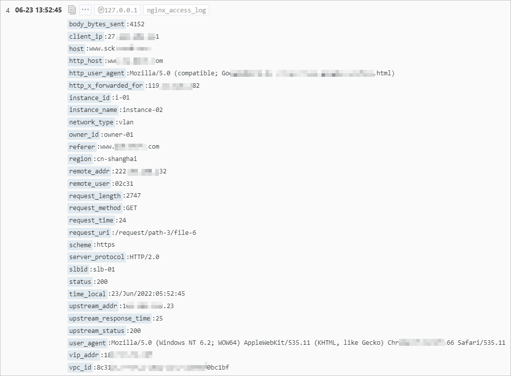
Create a line chart with multiple y-axes for a query statement
In this example, the number of requests that are sent from the China (Shanghai) region and the number of requests that are sent from the China (Hangzhou) region are displayed in a line chart. The blue line indicates the trend of requests that are sent from the China (Shanghai) region and the green line indicates the trend of requests that are sent from the China (Hangzhou) region.
1. Add a chart
In the upper-right corner of the dashboard page, click Edit. In edit mode, choose .
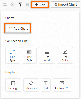
2. Configure a chart
Configure parameters on the General Configurations tab: On the right side of the Edit Chart page, select Line Chart Pro in the Chart Types section and configure the parameters in the Query and Analysis Configurations section based on the following figure. On the left side of the Edit Chart page, configure the query time range, Logstore, and query statement for the chart. Then, click Apply in the upper part of the page to view the configuration effects of the chart.
* | select __time__ - __time__ % 60 as time, count_if(region='cn-shanghai') AS count1, count_if(region='cn-hangzhou') AS count2 GROUP BY time order by time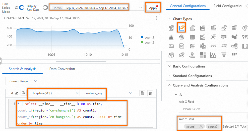
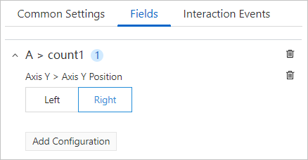
Add and configure a second y-axis: The number of requests sent from the China (Shanghai) region and the number of requests sent from the China (Hangzhou) region significantly differ. If the two trends share the same y-axis in a line chart, the trend of requests that are sent from the China (Hangzhou) region is not obvious. In this case, you can configure the parameters on the Field Configuration tab to add a second y-axis to the right of the line chart. The second y-axis indicates the number of requests that are sent from the China (Hangzhou) region.
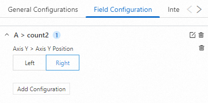
Preview configuration effects: The line chart displays two y-axes that have different scales. The left y-axis indicates the number of requests that are sent from the China (Shanghai) region and the right y-axis indicates the number of requests that are sent from the China (Hangzhou) region.
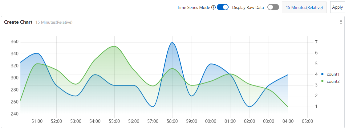
Save the chart and the dashboard: In the upper-right corner of the Edit Chat page, click OK to save the chart. In the upper-right corner of the dashboard page, click Save to save the dashboard.
Create a line chart with multiple y-axes for multiple query statements
Specify two query statements
In this example. the number of successful requests per minute and the number of failed requests per minute are displayed in a line chart. The blue line indicates the number of successful requests and the green line indicates the number of failed requests.
1. Add a chart
In the upper-right corner of the dashboard page, click Edit. In edit mode, choose .
2. Configure the chart
Configure parameters on the General Configurations tab: On the right side of the Edit Chart page, select Line Chart Pro in the Chart Types section. On the left side of the Edit Chart page, configure the query time range, Logstore, and query statement for the chart. Then, click Apply in the upper part of the page to view the configuration effects of the chart.

Query Statement A: Count the number of successful requests per minute.
status in [200 299] | SELECT __time__-__time__ % 60 AS Time, count(1) AS OK GROUP BY Time ORDER BY Time LIMIT 1000Query Statement B: Count the number of failed requests per minute.
NOT status in [200 299] | SELECT __time__-__time__ % 60 AS Time, count(1) AS ERROR, status GROUP BY Time, status ORDER BY Time LIMIT 1000
Add and configure a second y-axis: The numbers of successful and failed requests significantly differ. If the two trends share the same y-axis in a line chart, the trend of failed requests is not obvious. In this case, you can configure the parameters on the Field Configuration tab to add a second y-axis to right of the line chart. The second y-axis indicates the number of failed requests.
Preview configuration effects: The line chart displays two y-axes that have different scales. The left y-axis indicates the number of successful requests and the right y-axis indicates the number of failed requests.
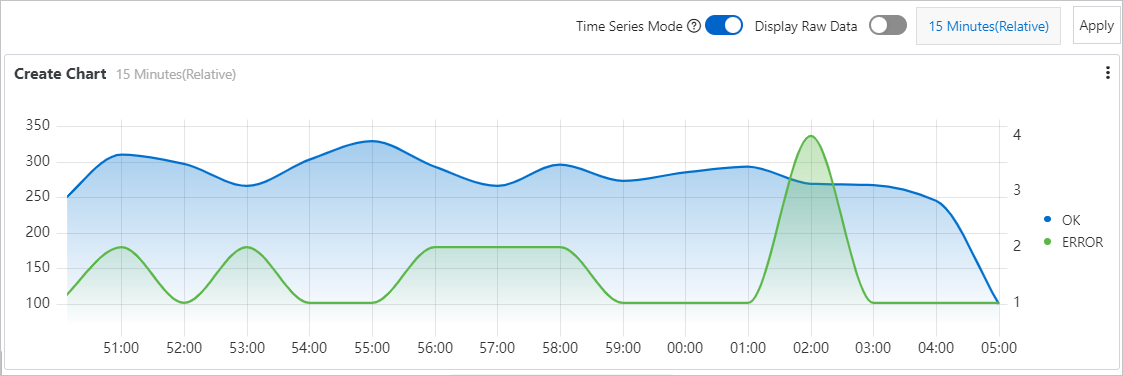
Save the chart and the dashboard: In the upper-right corner of the Edit Chat page, click OK to save the chart. In the upper-right corner of the dashboard page, click Save to save the dashboard.
Specify three query statements
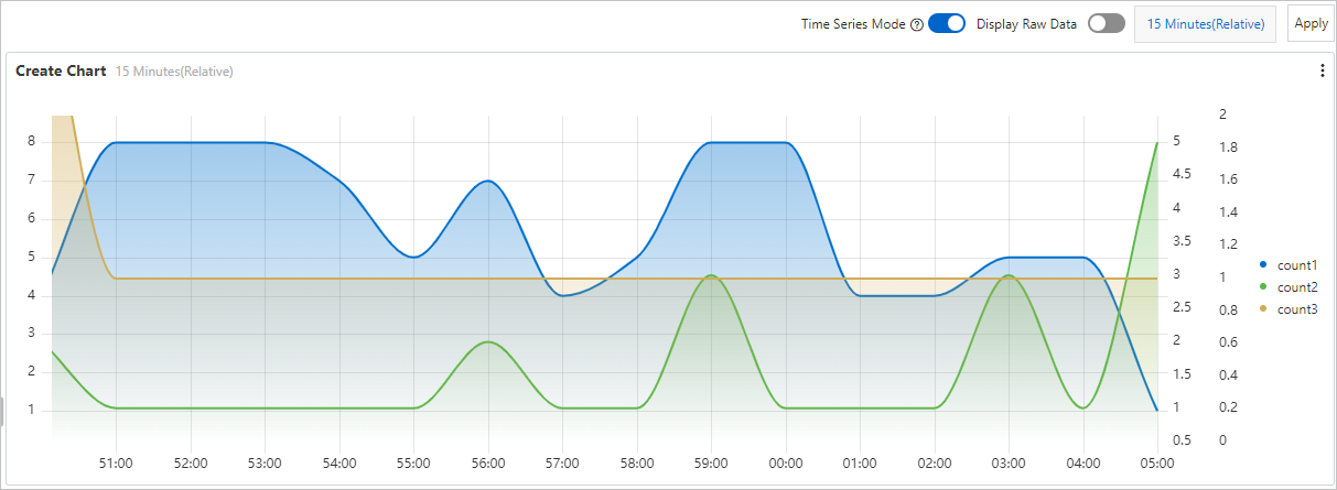
In this example, the numbers of requests by request duration within a minute are displayed in a line chart. The blue line indicates the trend of requests whose duration ranges from 10 to 50 seconds, the green line indicates the trend of requests whose duration ranges from 50 to 100 seconds, and the yellow line indicates the trend of requests whose duration is longer than 100 seconds.
1. Add a chart
In the upper-right corner of the dashboard page, click Edit. In edit mode, choose .
2. Configure the chart
Configure parameters on the General Configurations tab: On the right side of the Edit Chart page, select Line Chart Pro in the Chart Types section. On the left side of the Edit Chart page, configure the query time range, Logstore, and query statement for the chart. Then, click Apply in the upper part of the page to view the configuration effects of the chart.
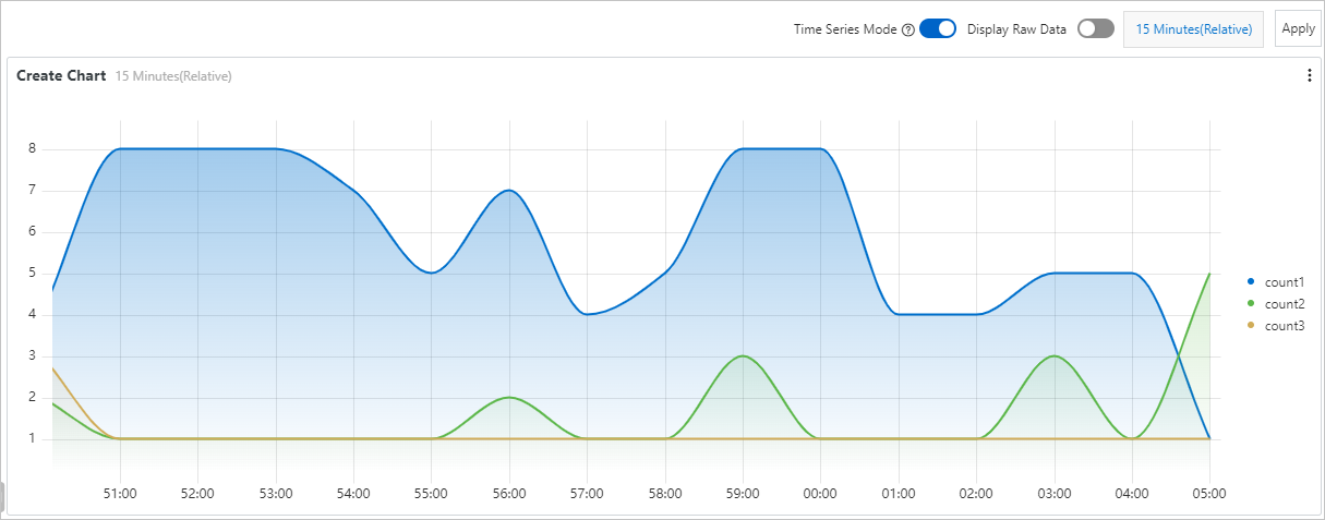
Query Statement A: Count the number of requests whose duration ranges from 10 to 50 seconds.
request_time in [10 50) | SELECT __time__-__time__ % 60 AS Time, count(1) AS count1, request_time GROUP BY Time, request_time ORDER BY Time LIMIT 1000Query Statement B: Count the number of requests whose duration ranges from 50 to 100 seconds.
request_time in [50 100) | SELECT __time__-__time__ % 60 AS Time, count(1) AS count2, request_time GROUP BY Time, request_time ORDER BY Time LIMIT 1000Query Statement C: Count the number of requests whose duration is longer than 100 seconds.
request_time >= 100 | SELECT __time__-__time__ % 60 AS Time, count(1) AS count3, request_time GROUP BY Time, request_time ORDER BY Time LIMIT 1000
Add and configure two y-axes: The numbers of requests by request duration significantly differ. If the three trends share the same y-axis in a line chart, the trends of count2 and count3 are not obvious. In this case, you can configure parameters on the Field Configuration tab to add a y-axis for the results of Query Statement B and add a y-axis for the results of Query Statement C.
ImportantIf you add two or more y-axes on the same side, you must configure an ID for each y-axis to differentiate the y-axes.
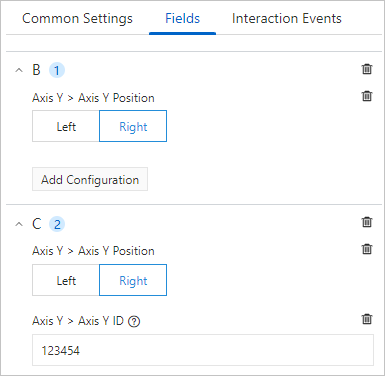
Preview configuration effects: The line chart displays three y-axes that have different scales. The three y-axes correspond to count1, count2, and count3.
Save the chart and the dashboard: In the upper-right corner of the Edit Chat page, click OK to save the chart. In the upper-right corner of the dashboard page, click Save to save the dashboard.
References
You must configure a query statement when you add a chart. For more information, see Query and analysis.
For more information about the parameters on the Field Configuration tab of the Edit Chart page, see Configurations on the Field Configuration tab.