This topic explains how to set grouped column charts and stacked column charts.
Prerequisites
Log data is collected. For more information, see Collect text logs from servers.
Indexes are created. For more information, see Create indexes.
Step 1: Query and analyze data
Log on to the Simple Log Service console. In the Projects section, click the project you want.
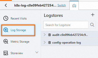
In the left-side navigation pane, click Log Storage. In the Logstores list, click the logstore you want.
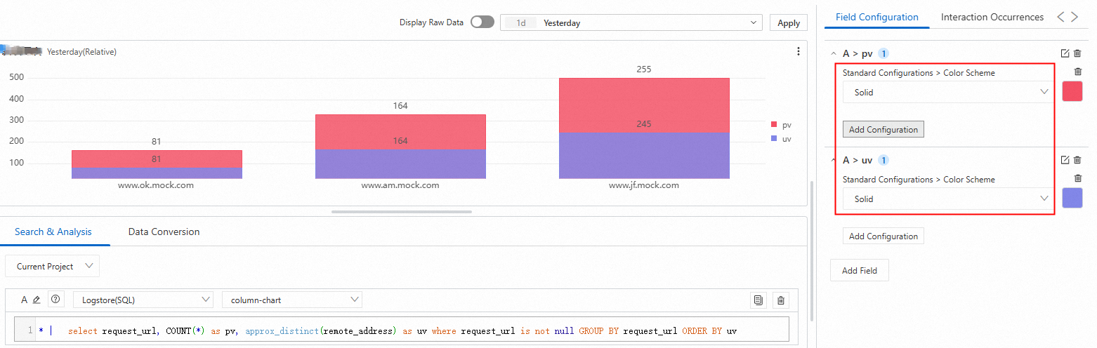
Enter the query and analysis statement, and set the time range for your query and analysis, such as Last 15 Minutes.
In the following example, the approx_distinct function estimates the count of unique IP addresses for each URL:
* | select request_url, COUNT(*) as pv, approx_distinct(remote_address) as uv GROUP BY request_url ORDER BY uv
Step 2: Add a chart
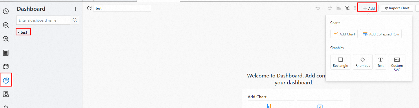
In the left-side navigation pane, choose Dashboard > Dashboards. In the dashboard list, click the dashboard you want. In the upper-right corner of the dashboard page, click Edit. In edit mode, click Add > Add Chart.
On the General Configurations tab, click
 in the Chart Types section. On the Search & Analysis tab, select Logstore (SQL) and choose the logstore you want, then enter the query statement. Select a time range, such as Last 15 Minutes, and click OK > Save.
: Choose
request_urlas the X-axis, and chooseuvandpvas the Y-axis.
Step 3: Set stacking and color for the grouped column chart
Set the stacked column chart
In the Column Settings section, set Stacking to Yes.
Set different colors for the grouped column chart
In the Standard Configurations section, set Color Scheme to Solid, and then set the display colors for the fields pv and uv.