A colored map uses different shades of color to show the size and distribution of data. This topic describes how to add data to a colored map and configure its styles.
Prerequisites
You have created a dashboard. For more information, see Create a Dashboard.
You have converted the geographic area field. For more information, see Configure fields.
NoteSuppose the geographic area field to be added to the chart is area. The field is converted to geographic information only when the
 icon is displayed. For a detailed list of regions, see public-area-info .xlsx. This file is for reference on geographic area matching only and does not represent the political views of Quick BI.
Limits
A colored map consists of Geographic Area/Dimension and Color Saturation/Measure.
The geographic area is determined by a dimension. You can select only one dimension, and it must be geographic information, such as a province.
Color saturation is determined by measures. You can select at least one and up to five measures, such as Order Amount and Profit Amount.
Chart Overview
Scenarios
You can use colored maps to show the spatial distribution of data. They are suitable for datasets that contain geographic location information. The map shows aggregated, continuous information for each region. The position on the map represents the geographic location, and the color represents the data value.
Benefits
Visualization: Supports area-based map styles.
Interaction: Supports zooming by selecting an area, switching metrics, and filtering within the component.
Example Output
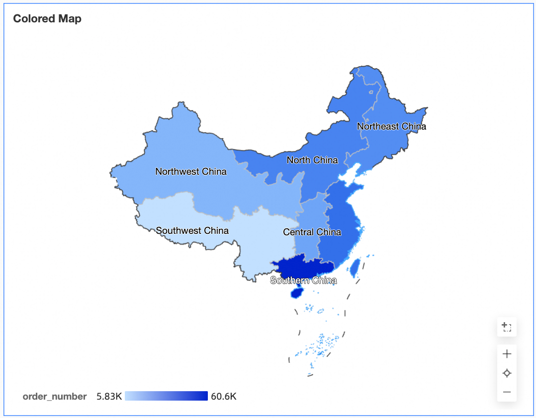
Animation example
Configure Chart Data
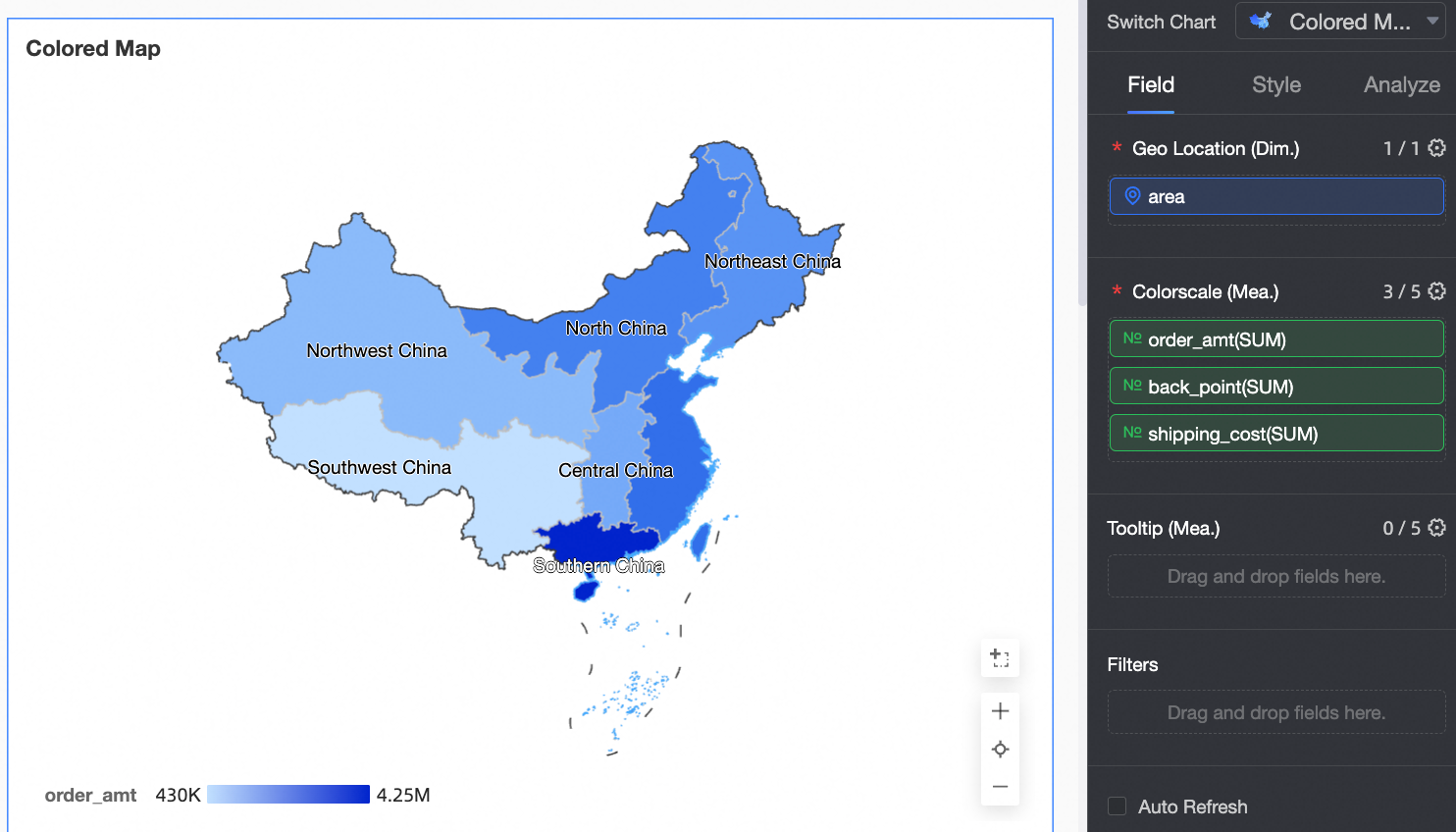
On the Data tab, select the required dimension and measure fields.
In the Dimensions list, find the area field. Double-click it or drag it to the Geographic Area/Dimension field.
In the Measures list, find Order Amount, Profit Amount, and Shipping Cost. Double-click them or drag them to the Color Saturation/Measure field.
Click Update. The system automatically updates the chart.
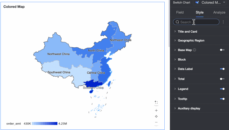
Configure Chart Styles
The following sections describe how to configure the styles for the chart. For information about common chart style settings, see Configure the Chart Title.
You can enter a keyword in the search box at the top of the configuration section to quickly find a configuration item. You can also click the  icon on the right to Expand/Collapse All Categories.
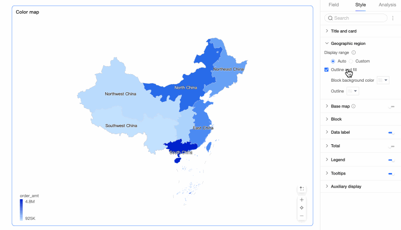
Geographic Area
In the Geographic Area section, configure Display Range and Border and Fill.
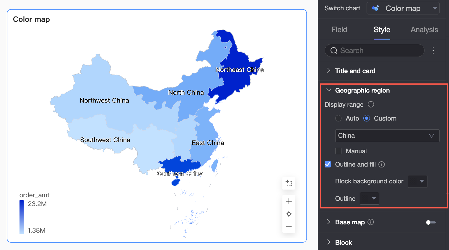
Display Range: You can select Auto or Custom. In this example, China is selected.
NoteAuto automatically adjusts the range based on the data. Custom lets you manually set the range. In interactive analysis scenarios, the range is always automatically displayed based on the data.
The custom display range currently supports only global continents and countries, along with regions, provinces, and cities in China.

Turn on Manual Adjustment to automatically generate the current Centroid and Scaling value. You can also modify these values manually.

Border and Fill: Configure whether to display borders and areas. You can also set the fill color for areas and the color of border lines.
NoteBorders cannot be displayed for some regions.
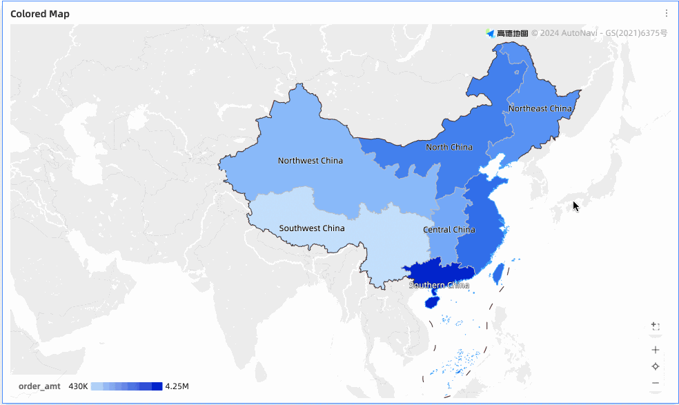
Basemap
In the Basemap section, configure Show Basemap, Basemap Style, and Show Global Basemap.
Show Basemap: Click the
 switch to show or hide the basemap information.
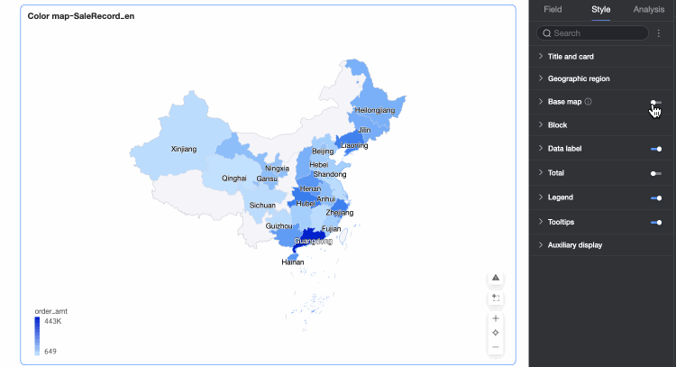
Basemap Style: Multiple styles of Amap basemaps are supported.
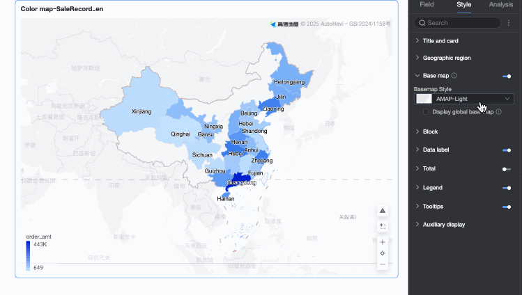
Show Global Basemap: Select this option to display global information, such as cities, on the basemap.
 Note
NoteUsage limits for global basemaps: Each Quick BI organization can preview map charts that contain basemap information for regions outside China 1,000 times per month. The number of previews is calculated based on the number of basemap initializations. If the limit is exceeded, only basemap information for regions within China is displayed.
Mobile Basemap Settings: Click the mobile icon (
 ) at the top of the page to switch to mobile view. You can then enable the basemap for the colored map on mobile devices and configure its Basemap Style and whether to Show Global Basemap.
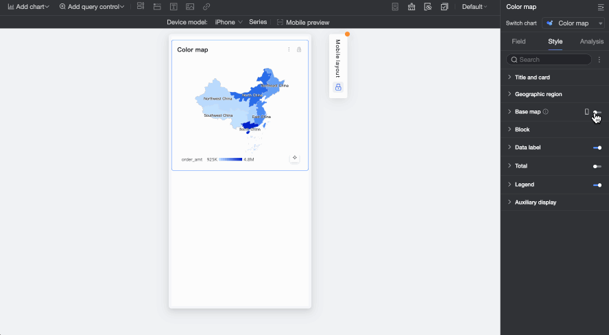
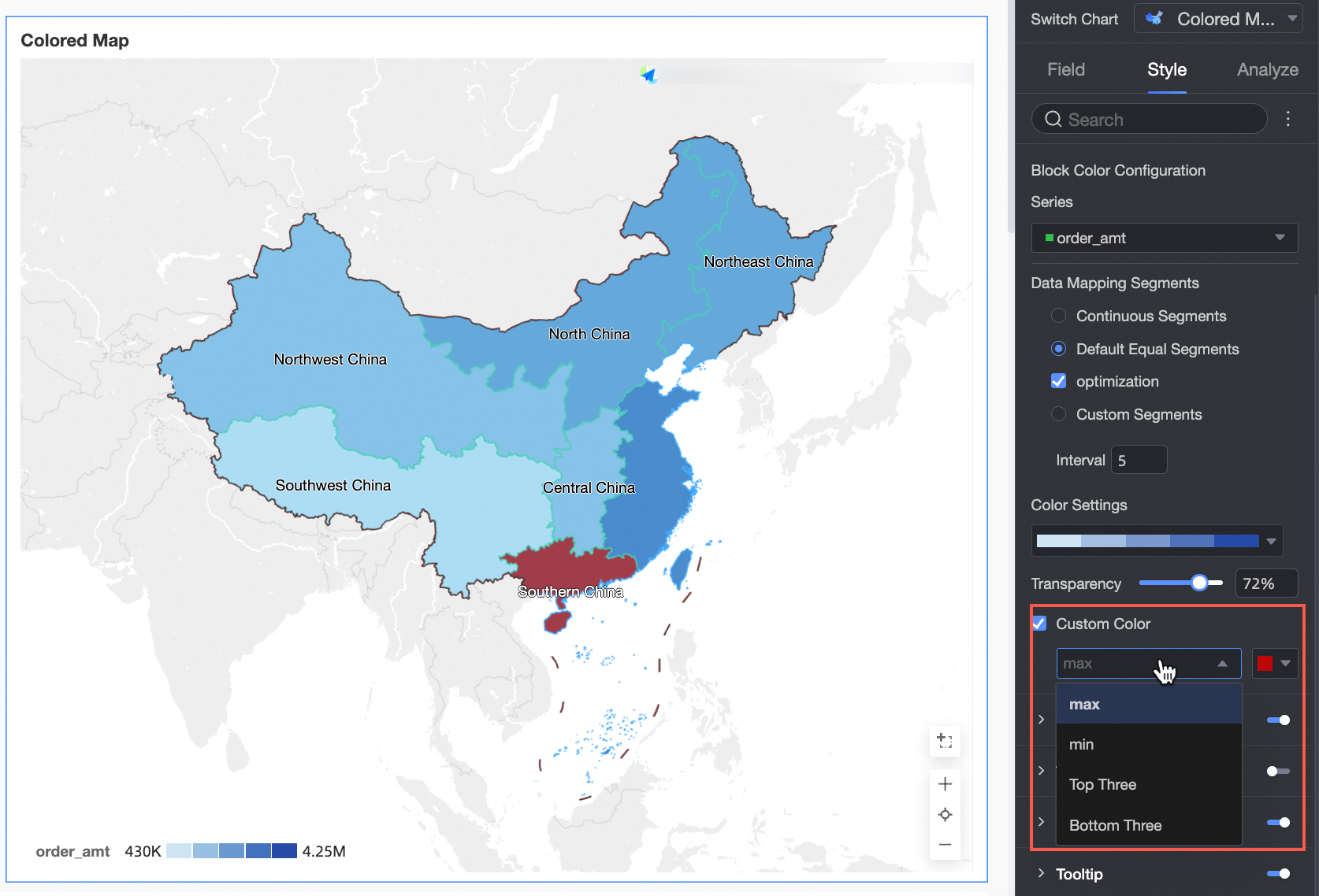
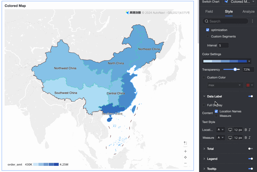
Block
In the Areas section, configure Area Color Configuration and Extreme Value Color Configuration.
Area Color Configuration: Select a measure series and configure its theme color, transparency, and data mapping range.
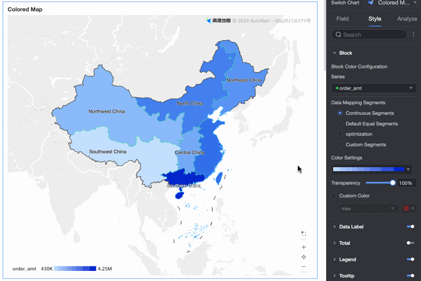
Extreme Value Color Configuration: Configure and mark colors for the maximum value, minimum value, top three values, and bottom three values.
Data Labels
In the Data Labels section, configure whether to show data labels and their styles.
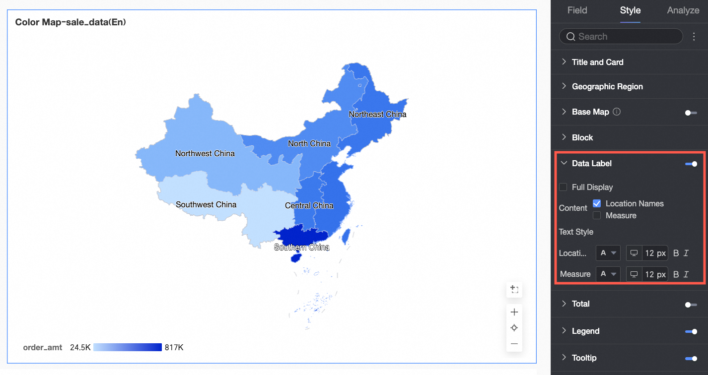
Content: You can show both the Region Name and the Measure. Select Show All to display all data label content.
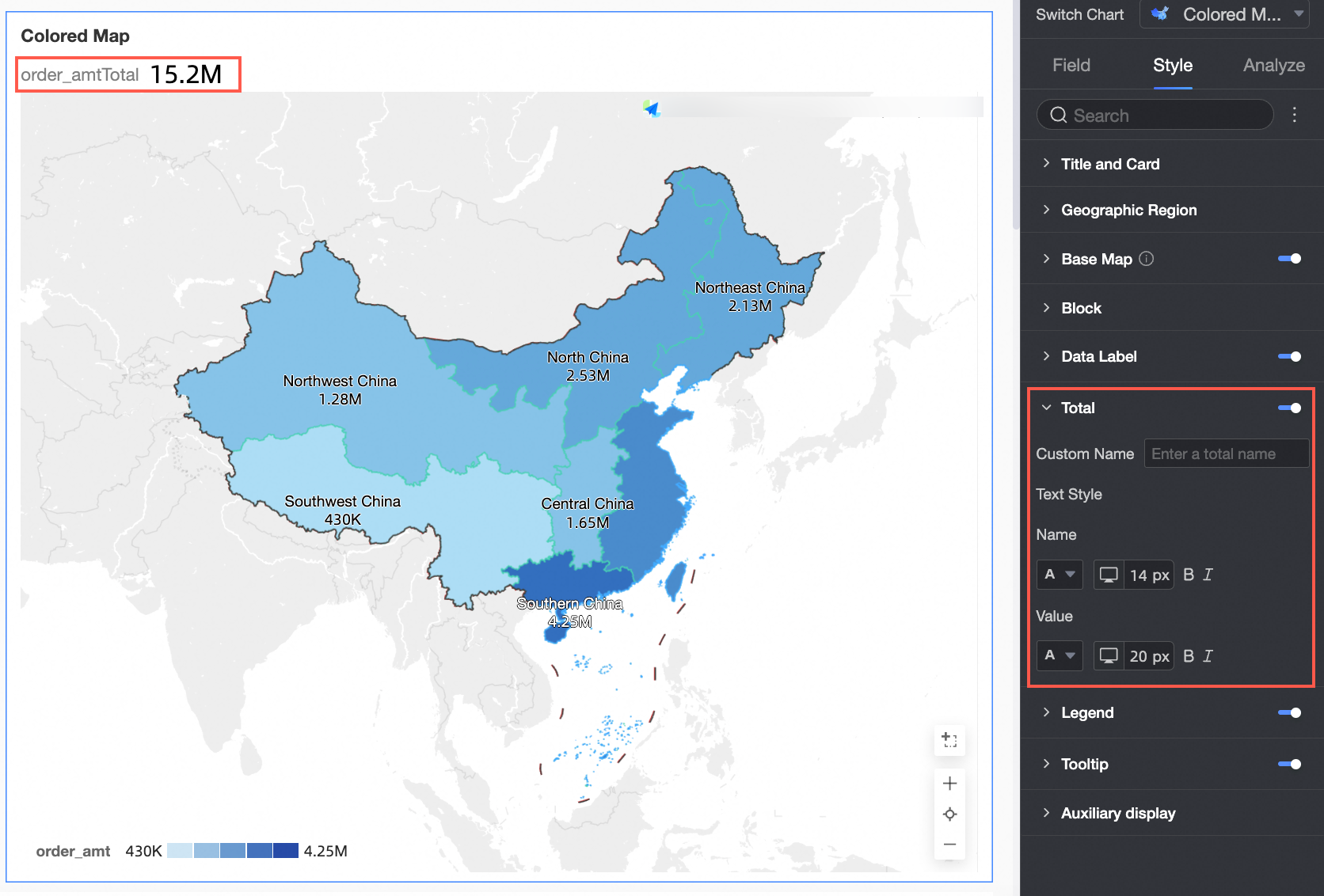
Total
In the Total section, configure whether to show the total, and set a Custom Name and Style.
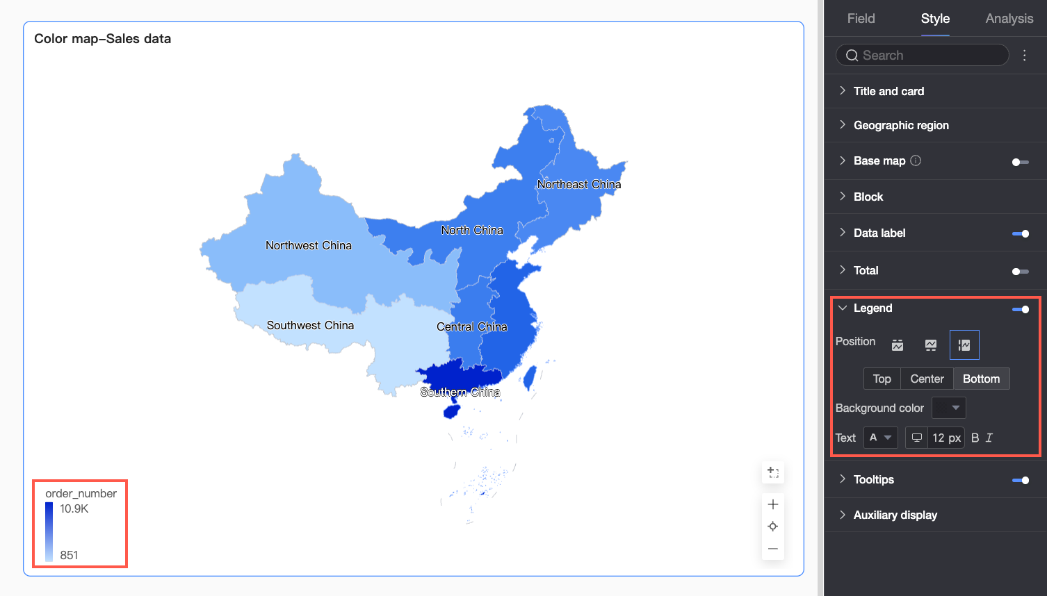
Legend
In the Legend section, click the  icon to enable the chart legend and configure its style.
Configuration Item | Description |
Position | Set the display position and alignment of the legend.
|
Background Color | Set the background fill color for the legend. |
Text | Set the text style for the legend. You can configure the font color, size, weight, and whether it is italic. |
Mobile Legend Configuration | The legend settings for PC and mobile are independent. You can switch between PC and mobile views by clicking the icon ( |
 ) at the top of the dashboard edit page. This lets you configure a suitable legend for each terminal separately. You can customize the position, background color, and text style of the mobile legend.
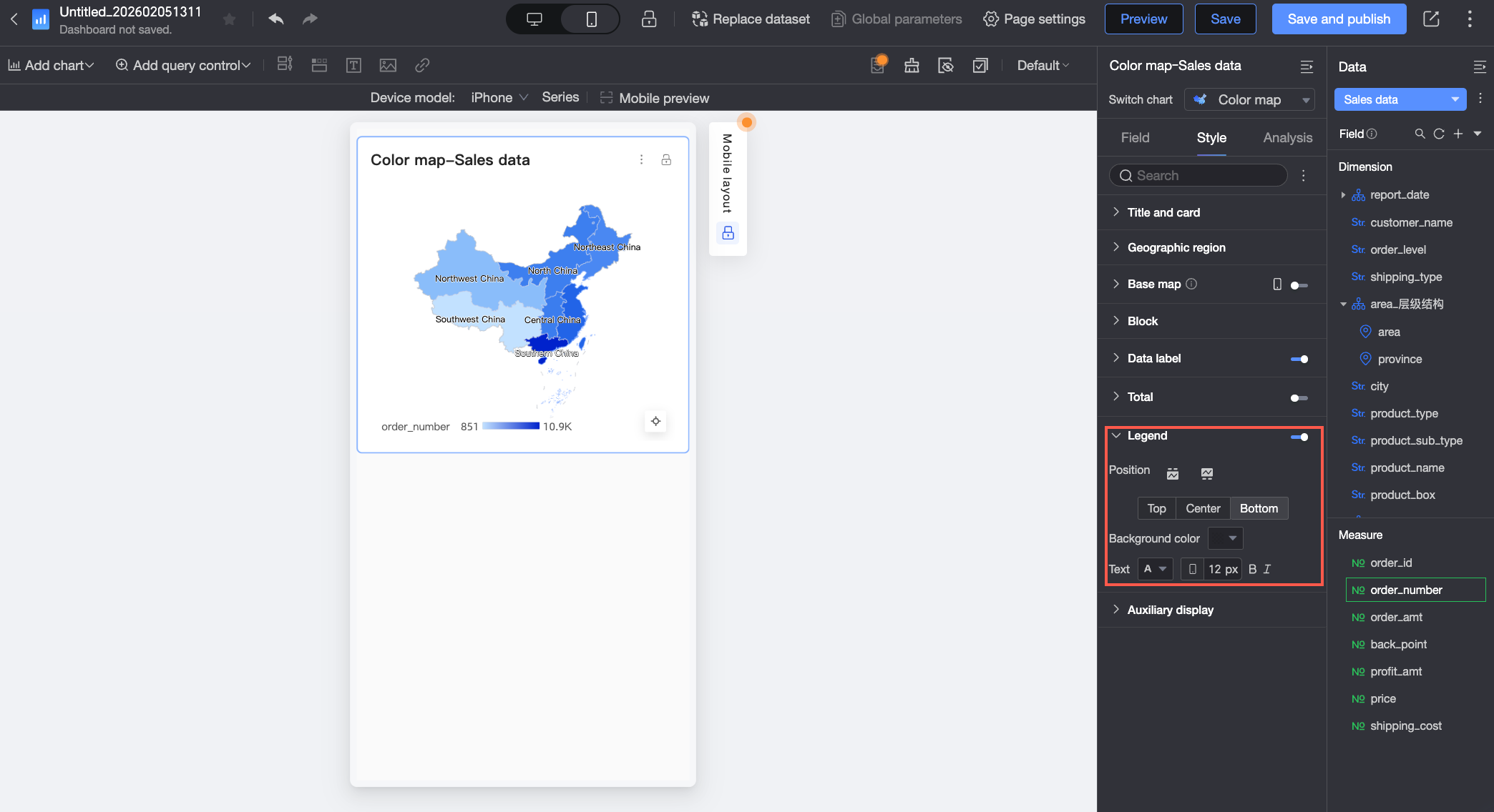
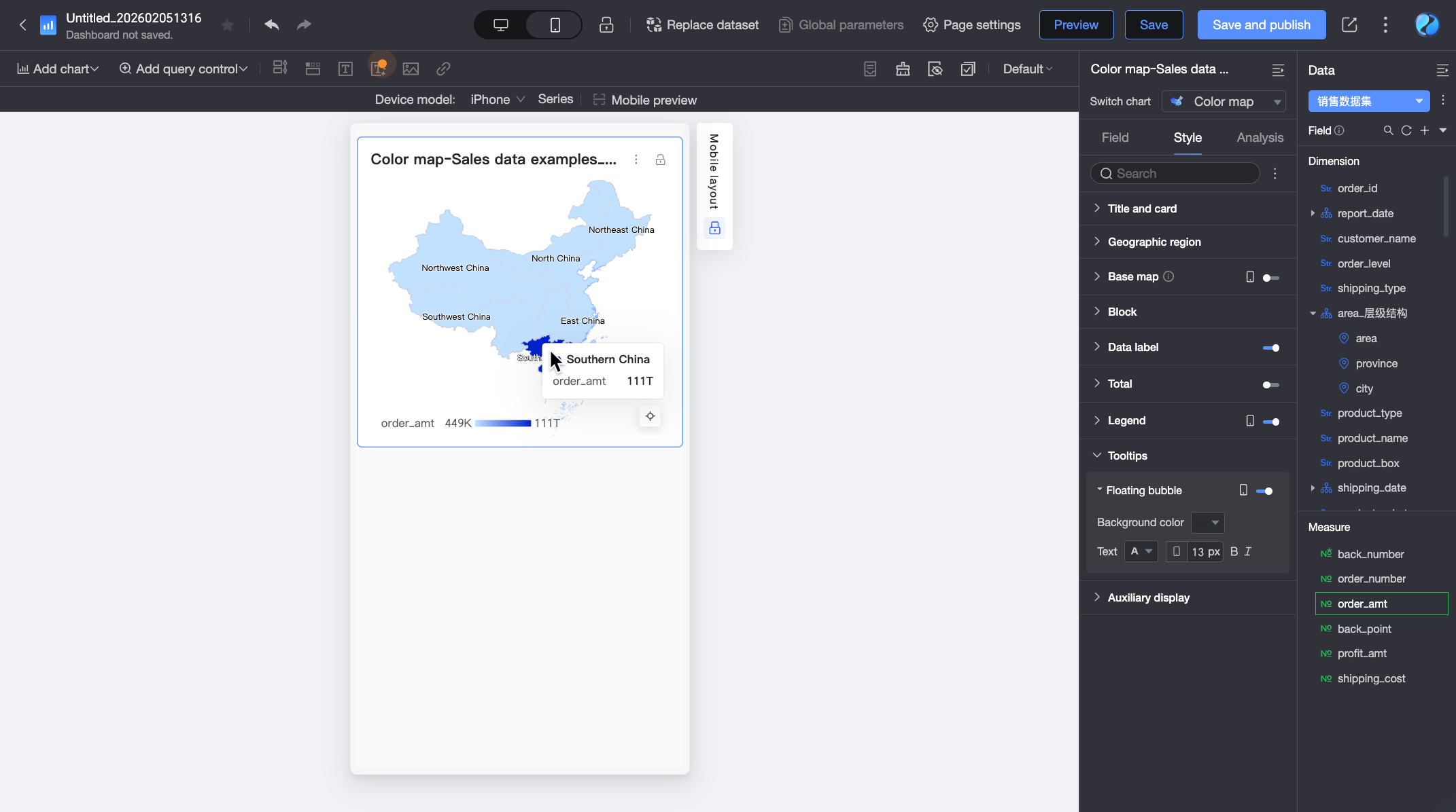
Tooltip
In the Tooltip section, click the icon to enable tooltips and configure their style.
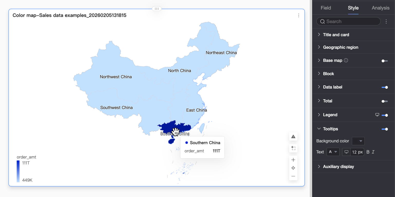
Chart Configuration Item | Configuration Item Description |
Background Color | Set the background fill color for the tooltip. |
Text | Set the text style in the tooltip. You can configure the font color, size, weight, and whether it is italic. |
Mobile Tooltip | The tooltip switches for PC and mobile are independent. You can switch to the mobile editing view by clicking the PC/mobile switch icon ( |
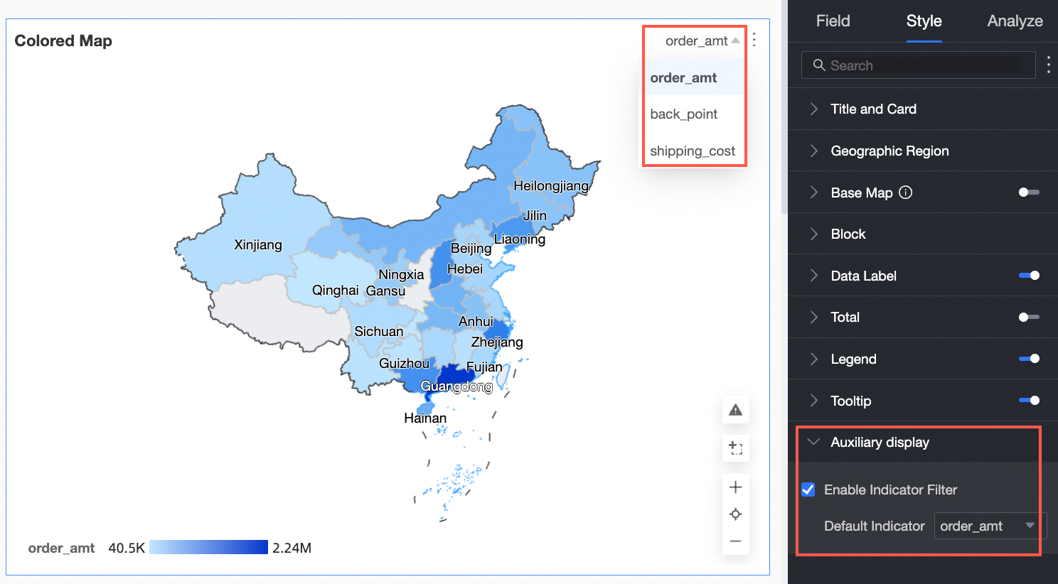
Auxiliary Display
In the Auxiliary Display section, select Enable Metric Filter Display to configure the displayed metric items.
Configure Chart Analysis
Configuration Item | Name | Description |
Data Interaction | Drill-down | If you have configured drill-down fields in the field panel, you can set the display style for drill-down level rows here. For more information, see Drill-down. |
Filter Interaction | If the data you need to analyze is in different charts, you can link the charts for interactive data analysis. For more information, see Filter Interaction. | |
Jump | If the data you need to analyze is in multiple dashboards, you can jump between dashboards for data analysis. Jumps include Parameter Jump and External Link. For more information, see Jump. | |
Annotation | - | If data in the chart is abnormal or requires special attention, you can use color highlights, icons, comments, or data points for annotation. This helps you identify anomalies and take action. For more information, see Annotation. |