A drop-down list is an interactive control for data visualization screens in Quick BI. It allows report viewers to select a value from a predefined list of options. This value is then used as a query condition to retrieve specific data. This topic describes how to add and configure a drop-down list.
Prerequisites
You have created a data visualization screen. For more information, see Create a Data Visualization Screen.
You have added a ticker board widget. For more information, see Ticker board.
Example
Add a Drop-down List Control
On the dashboard edit page, click Interaction on the top menu bar to add a drop-down list control.
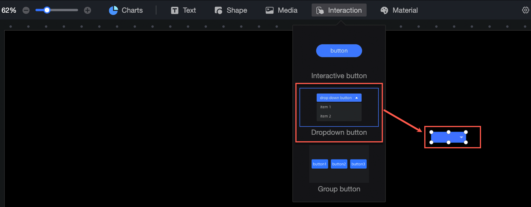
Configure the drop-down list as follows.
Configuration Item
Description
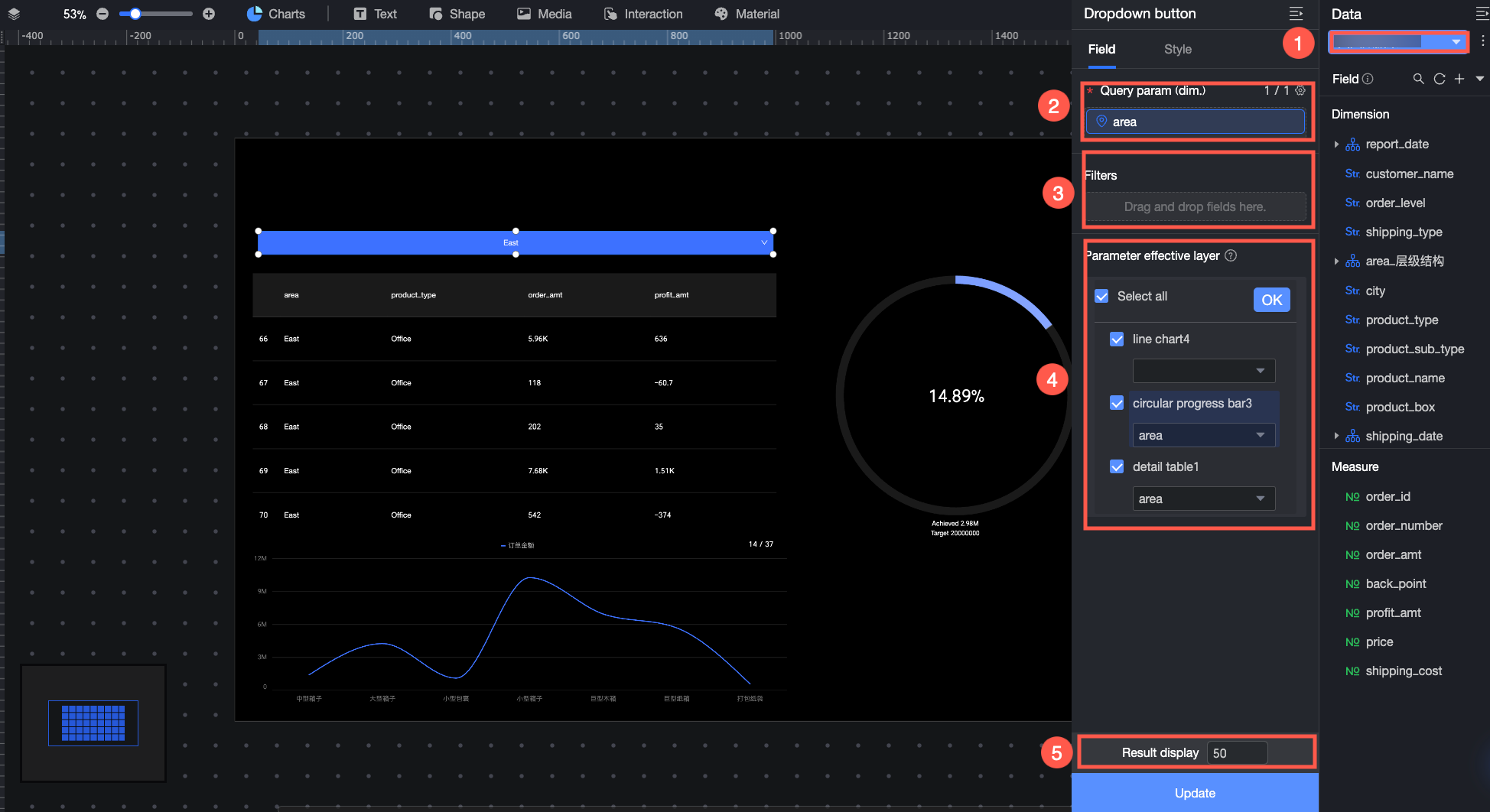
① Source dataset
On the Data panel, add a dataset for the drop-down list to use as the source for query parameters.
② Query parameter
On the Fields panel, drag the field that you want to use as the source for the drop-down list options to the Query Parameter area.
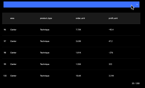
When a report viewer performs a query, they can select a value from this field in the drop-down list to query specific data. For example, if the query parameter is Region, selecting Northeast from the drop-down list displays data for the Northeast region.
③ Filter
If you want the report to show only specific information and have report viewers operate only on that data, drag the field you want to filter by to the Filter area on the Fields panel. Then, click the
 icon to configure filter conditions in the Set Filter dialog box. For example, you can set the report to show data only for the Northeast and East China regions.
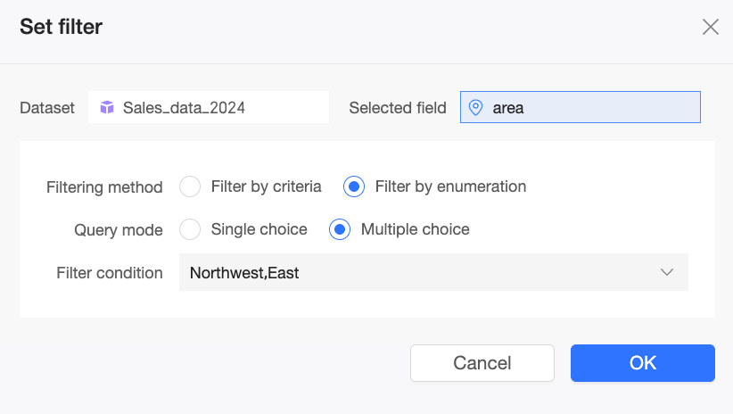
④ Affected Layers
After you configure the items and click Update, go to the Affected Layers area on the Fields panel. Select the charts and their foreign key fields that are controlled by the drop-down list's query parameter. You can select charts from different datasets to enable cross-dataset queries using the drop-down list. After you select a chart:
If the chart and the query parameter belong to the same dataset, the field that is the same as the query parameter is automatically selected. You can also manually switch to another field.
If the chart and the query parameter belong to different datasets, you must manually select a foreign key field.
The data in the selected charts is automatically adjusted based on the option selected in the drop-down list.
NoteAfter you configure the affected charts, if you switch the dataset for a chart and the query parameter field does not exist in the new dataset, the drop-down list conditions will not apply to that chart during queries. The field configuration for that chart in the Affected Layers area will display "Dimension field does not exist". You must update the information for the affected chart.
After you configure the affected charts, if you replace the original query parameter field in the drop-down list with another field or change the dataset for the drop-down list, the query may return empty results. You must reconfigure a valid query parameter field or update the information for the affected charts.
⑤ Result Display
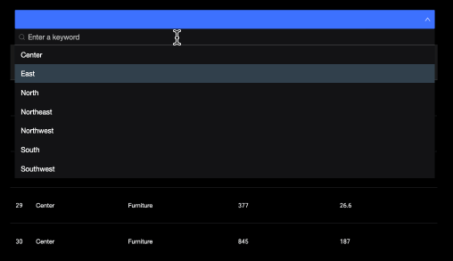
Set the number of option values to display in the drop-down list.
NoteThe default value is 50, and the maximum value is 1,000. You can enter any integer from 1 to 1,000 as needed.
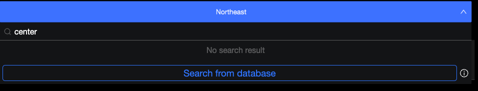
If the drop-down list contains many option values, you can enter keywords in the search box to quickly find the option you need.
If you cannot find the desired result in the drop-down list, try searching from the database.
(Optional) You can also perform the following data operations:
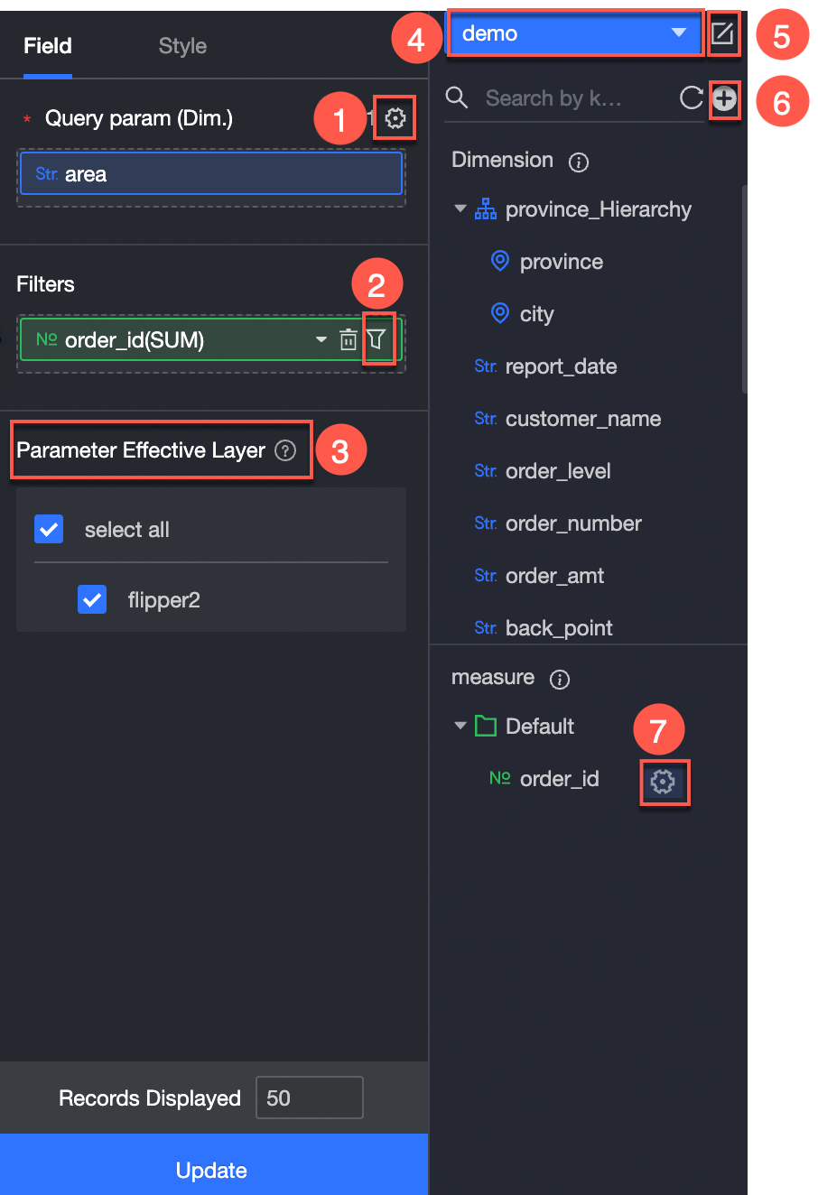
Batch configure field formats (①). For more information, see Batch configure field styles.
Set field filters (②). For more information, see Filter data.
Add interactive components (③).
Switch datasets (④). For more information, see Switch datasets.
Edit the dataset (⑤). For more information, see Edit a dataset.
Process data, such as creating a calculated field or a new group dimension (⑥). For more information, see Create Calculated Field and Create a New Group Dimension.
Copy a field (⑦). For more information, see Copy and convert to a dimension.
Configure Drop-down List Styles
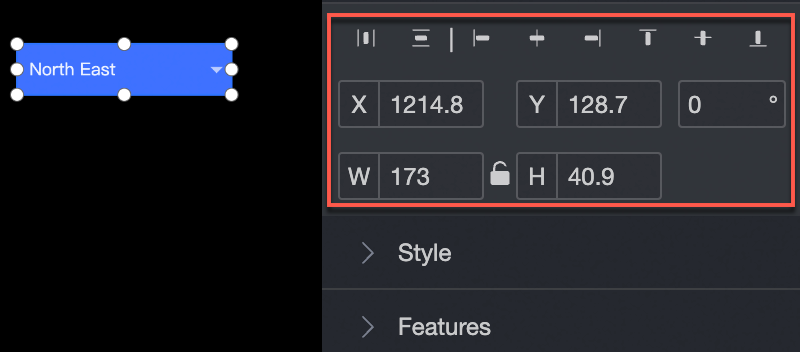
Position and Size
In the configuration section, you can configure the position and size of the drop-down list:
Adjust the alignment of the drop-down list. The available options are align left, center, and align right.
Adjust the position of the drop-down list. Set the X-axis and Y-axis values relative to the upper-left corner.
Adjust the angle of the drop-down list. Set the rotation angle.
Adjust the size of the drop-down list. Set the width (W) and height (H) values.
Lock the drop-down list. After the drop-down list is locked, you cannot adjust its size or position.
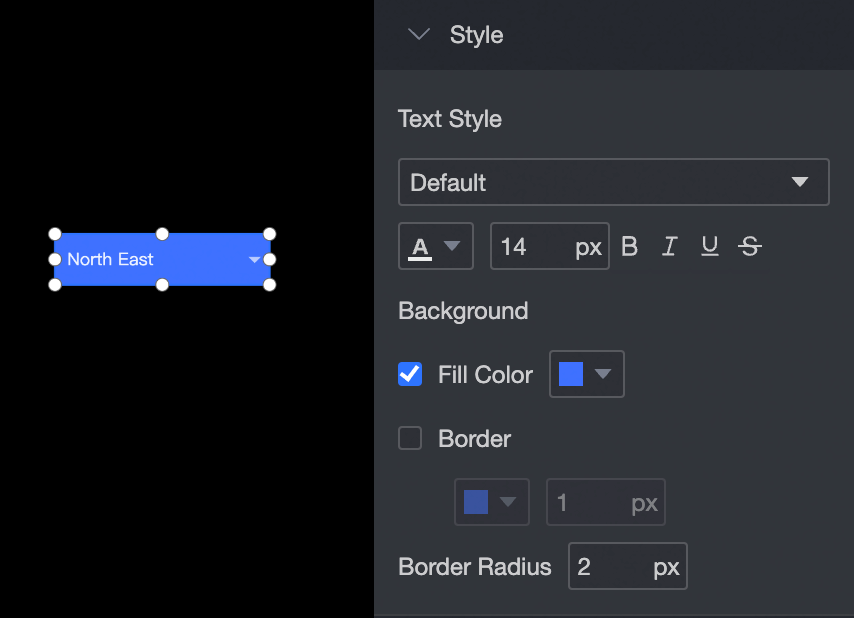
Text Style
In the configuration section, you can configure the text style for the drop-down list:
Adjust the font style of the text. You can set the font, color, font size, and apply bold or italic formatting.
Adjust the background. You can set the background fill color.
Adjust the border. You can set the border style, color, and width.
Adjust the border radius. You can set the radius for the corners of the drop-down list.
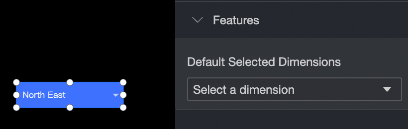
Features
You can set the dimension values for the drop-down list.