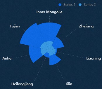
Classification polar area chart is a type of pie chart, which can clearly and intelligently
display the proportion of each category. The classification polar area chart supports
the display of labels outside the chart, and supports the display by type and multi-series
data configuration. This topic describes the meaning of each configuration items of
the classification polar area chart.
Settings
Search for Configurations: In the right-side panel of Canvas Editor, click the Settings tab, and click Search for Configurations in the upper-right corner. Enter the required configuration item in the search box, and click the search icon to quickly locate the configuration item. Fuzzy match
is supported. For more information, see Search for widget configuration items.
Size: indicates the size of a widget, including its pixel width and height. You can click
the icon to proportionally adjust the width and height of a widget. After you click this
icon again, you can adjust the width and height as needed.
Position: the position of a widget, which is indicated by pixel X and Y coordinates. X-coordinate indicates the pixel distance between the upper-left corner of the widget and the
left border of the canvas. Y-coordinate indicates the pixel distance between the upper-left corner of the widget and the
upper border of the canvas.
Rotation Angle: the angle of a rotation that uses the center point of a widget as the rotation point.
The unit is degrees (°). You can use one of the following methods to control the rotation
angle of a widget:
Directly enter the degrees in the Rotation Angle spin box or click the plus sign (+)
or minus sign (-) to increase or decrease the value in the Rotation Angle spin box.
Drag the black dot in the icon.
Click the icon to horizontally flip a widget.
Click the icon to vertically flip a widget.
Opacity: the opacity of a widget. Valid values: 0 and 1. If this parameter is set to 0, the widget is hidden. If this parameter is set to 1, the widget is completely displayed. Default value: 1.
Chart
Margins: Click the icon to control the visibility and concealment of custom margins. The distance between
the chart area and the four boundaries of the widget. Unit: px. Default value: px.
Display of Categories: If a s series is included in the widget data panel, the classification display configuration
takes effect. You can set Classification to Stacked or Clustered.
Pie: the style of the pie chart.
Parameter
Description
Stroke Color
The stroke color of the pie chart.
Stroke Width
The stroke weight of the pie chart.
Value Label: the style of value labels in the pie chart. You can click the icon to control the value labels.
Parameter
Description
Position
The position where the value label text is displayed. Valid values: Inside and Outside.
Text Style
The font style, text weight, font size, and color of the value label text.
Offset
The offset value of the value label in the horizontal and vertical directions.
Legend: the legend style of the category polar area chart. You can click the icon to display the legend.
Parameter
Description
Paging Allowed
Turn on the switch, when the number of legends is too large to be arranged, page turning
display can be allowed; turn off the switch, page turning is not allowed.
Layout
The position of the legend relative to the start coordinate of the widget. Valid values:
Top Left, Top Center, Top Right, Bottom Left, Bottom Center, and Bottom Right.
Coordinate Axes: the radial axis of the pie chart.
Inner Radius: the inner radius of the pie chart.
Outer Radius: the outer radius of the pie chart.
Axis Label: the style of the axis labels in the inner diameter of the pie chart. You can click
the icon to control the visibility and concealment of the axis labels.
Parameter
Description
Font Family
The font style of the axis label text. This parameter is optional. Default value:
Microsoft Yahei.
Font Weight
The font weight of the axis label text.
Font Size
The font size of the axis label text.
Font Color
The color of the axis label text.
Axis Line: the style of the axis of the inner diameter of the pie chart. You can click the
icon to control the display and concealment of the axis.
Parameter
Description
Color
The color of the axis.
Width
The thickness of the axis.
Type
The type of the axis. Valid values: Solid, Dashed, and Dotted.
Series
CSV data: If you turn on the switch, you can use columns in the CSV data file to map to values
and data series. If you turn off the switch, the Series Mapping takes effect configuration items. You can click the icon to control the display and concealment of the CSV data switch.
Parameter
Description
Auto Extract
If you turn on the switch, the widget uses CSV data to automatically parse fields
and display them. If you turn off the switch, the fields are not automatically parsed.
Numeric Field Only
If you turn on the switch, CSV data only parses fields of the data type. If you turn
off the switch, CSV data automatically parses all fields.
Data Series: Click the or icon on the right to add or delete a data series. Click the or icon to configure the arrangement style of multiple data series. Click the icon to copy the configurations of the selected data series and add a data series
with the same configuration.
Parameter
Description
Mapping Between
The Field Value and Series Name configuration items only take effect when you turn on CSV Data and turn off the Auto Extract configuration items switch.
Field Value: the data series field value, which can be customized. If the field is empty, the
system displays the s field values in the component data as the series field values. If this parameter
is not empty, you must ensure that the data is returned in the order.
Series Name: the display name of the data series series, which can be customized.
The Series S Value and Series Display configuration items only take effect when CSV Data is hidden and the Series Mapping configuration items switch is turned on.
Series s value: the mapping value of the data series, which can be customized. If the field is empty,
the system displays s field values in the component data as series field mapping values. If this parameter
is not empty, you must ensure that the data is returned in the order.
Series Display: The display name of the data series. You can customize the display name.
Fill color
The fill color of the pie chart under this series.
Series Mapping: If you turn on the switch, this parameter takes effect only when the data contains
the s values of the series. You can set the color and name of a specific series by using
Mapping Fields. If you turn off the switch, the Mapping Fields configuration items is disabled.
Other
Tooltip: The style of the dialog box that appears when you move the pointer over or click
a fan on the Preview or Publish page. You can click the icon to enable or disable the dialog box.
Figure 1. Tooltip Panel
Figure 2. Tooltip Example
Parameter
Description
Text Style
The style of the text in the dialog box, including the character font style, character
weight, font size, and color.
Background Box
The background frame style of the dialog box.
Background Color: the background color of the dialog box.
Padding: The inner margin of the dialog box. Unit: px.
Border
Border Width: the width of the dialog box border. Unit: px.
The value of each sector, which determines the percentage of each sector in the entire
pie chart.
s
The series of each sector, which corresponds to the data series field values in the Configuration panel.
Table 2. Parameters
Parameter
Description
Controlled Mode
If you turn on the switch, data is not requested when a widget is initialized. Data
requests are triggered only based on callback IDs or the method configured in Blueprint
Editor. If you turn off the switch, data requests are automatically triggered. By
default, the switch is turned off.
Auto Data Request
After you select the Auto Data Request check box, you can enable dynamic polling,
and manually specify the polling interval. If you do not select this check box, data
is not automatically requested. You must manually refresh the page to request data
or use Blueprint Editor or callback ID events to trigger data requests.
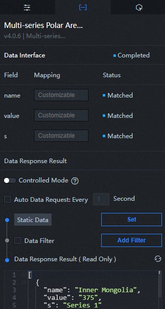
Data Source
In the right-side panel of Canvas Editor, click the Data tab. Click Set next to Static Data. In the Configure Datasource panel, select a data source from the Data Source Type
drop-down list. Enter code for data query in the code editor, click Preview Data Response
to preview the response of the data source, and then view the response. For more information,
see Configure widget data.
Data Filter
If you select the Data Filter check box, you can convert the data structure, filter
data, and perform simple calculations. If you click the plus sign (+) next to Add Filter, you can configure the script for the data filter in the editor that appears. For
more information, see Use the data filter.
Data Response Result
The response to a data request. If the data source changes, you can click the icon next to Data Response Result to view the data response in real time.
Interaction
Interaction event
Description
On Click of Data Item
Select the Enable check box to enable interactions between widgets. When you click a sector of a classification
polar area chart, a data request is triggered and a callback value is thrown to dynamically
load data of different sectors. By default, the name, value, and s values in the data are thrown. For more information, see Component callback ID configuration.
On Click of Legend
Select the Enable check box to enable interactions between widgets. When you click a sector of a classification
polar area chart, a data request is triggered and a callback value is thrown to dynamically
load data of different sectors. The value and checked values in the data are thrown by default. For more information about the configuration,
see Component callback ID configuration.
Configure interactions in Blueprint Editor
In Canvas Editor, right-click a widget in the Layer panel and select Add to Blueprint Editor.
Click the icon in the upper-left corner of the page.
On the blueprint editor configuration page, click the Multi-series Polar Area Chart component in the Import Node column. On the canvas, you can view the blueprint editor
configuration parameters of the classification polar area chart as shown in the following
figure.
Event
Event
Description
On Completion of Data Interface Request
The event is triggered with the processed JSON data after a data interface request
is responded and processed by a filter. For more information about specific data examples,
see the Data Response Result section on the Data tab of the canvas editor.
On Failure of Data Interface Request
When a data interface request fails (the request may be caused by network problems
or interface errors, etc.), the event is returned and processed by the filter, and
the processed JSON-formatted data is also thrown. For more information about specific
data examples, see the Data Response Result section on the Data tab of the canvas editor.
On Click of Data Item
The event that is thrown when the sector of the classification polar area chart is
clicked, and the data item corresponding to the sector is also thrown.
On Click of Legend
The event that is thrown when the legend of the classification polar area chart is
clicked, and the data item corresponding to the legend is also thrown.
Action
Action
Description
Request Data Interface
This action is performed to request the server data again. The data sent by an upstream
data processing node or layer node is used as a parameter. For example, if the classification
polar area chart is configured with the API data source as http://api.test and the data passed to the Request Data Interface action is { id: '1'}, the final request interface is http://api.test?id=1.
Import Data Interface
After data of a widget is processed in accordance with its drawing format, the widget
is imported for redrawing. You do not need to request server data again. For more
information about specific data examples, see the Data Response Result section on the Data tab of the canvas editor.
Highlight
Highlight the element corresponding to the data item. The following example shows
the reference data.
{
  data: {
    x: 'Shanghai' // You can list multiple highlighting conditions, similar to filter.
  },
  options: {
    style: {
      fill: 'red'
    },
    selectMode: 'single',
    cancelHighlightFirst: true
  }
}
Cancel Highlight
Unhighlights the corresponding element of the data item. The following example shows
the reference data.
{
  data: {
    x: 'Shanghai'
  },
  options: {
    mode: 'single' // If this parameter is set to single, only one highlight is canceled if multiple data items are hit. If this parameter is set to multiple, all highlights are canceled if multiple data items are hit.
  }
}
Clear Widget
Clear component data. No parameters are required.
Update Widget Configurations
Style configurations of widgets are dynamically updated. Before this action is executed,
you must click the widget in Canvas Editor, click the Settings tab in the right-side
panel, and click Copy Configurations to... to obtain widget configurations. After that, change the style field for the data
processing node in Blueprint Editor.
Show
A widget is shown without the need to specify parameters.
Hide
A widget is hidden without the need to specify parameters.
Hide/Show
A widget is hidden or shown.
Move
A widget is moved to a specified location. The following example shows the reference
data.
    {
      // The positioning type. to indicates absolute positioning, whereas by indicates relative positioning. The default value is to.
        "positionType": "to",
      // The location, which is indicated by the x and y coordinates.
      "attr": {
        "x": 0,
        "y": 0
      },
      // The animation type.
      "animation": {
        "enable": false,
        // The duration in which animation is displayed.
        "animationDuration": 1000,
        // The animation curve, which can be set to linear|easeInOutQuad|easeInOutExpo.
        "animationEasing": "linear"
      }
    }
 icon to proportionally adjust the width and height of a widget. After you click this
icon again, you can adjust the width and height as needed.
icon to proportionally adjust the width and height of a widget. After you click this
icon again, you can adjust the width and height as needed.
 icon.
icon.
 icon to horizontally flip a widget.
 icon to vertically flip a widget.

 icon to control the visibility and concealment of custom margins. The distance between
the chart area and the four boundaries of the widget. Unit: px. Default value: px.
icon to control the visibility and concealment of custom margins. The distance between
the chart area and the four boundaries of the widget. Unit: px. Default value: px.


 or
or  icon on the right to add or delete a data series. Click the
  or
or  icon to configure the arrangement style of multiple data series. Click the
  icon to copy the configurations of the selected data series and add a data series
with the same configuration.
icon to copy the configurations of the selected data series and add a data series
with the same configuration.


 Sample code in the preceding figure:
  icon next to Data Response Result to view the data response in real time.
 icon in the upper-left corner of the page.
