By Xulun from F(x) Team
As the business puts forward more demands for frontend, CSS, one of the three essential frontend tools, is becoming more complex. It has put pressure on beginners. In terms of each specific property, CSS is not complicated, but the main problem is there are so many knowledge points. You may have struggled to learn the main knowledge points, but you will be submerged into new knowledge after browsing questions online or reading books related to CSS written by experts.
The human brain is not good at memorizing scattered knowledge points, but if there is a logical line that can connect the knowledge, it can facilitate the brain to memorize and search the knowledge. This clue should be logical and preferably interesting.
The animation of CSS is such an interesting clue from which you can understand the properties of CSS in the changes of an animation.
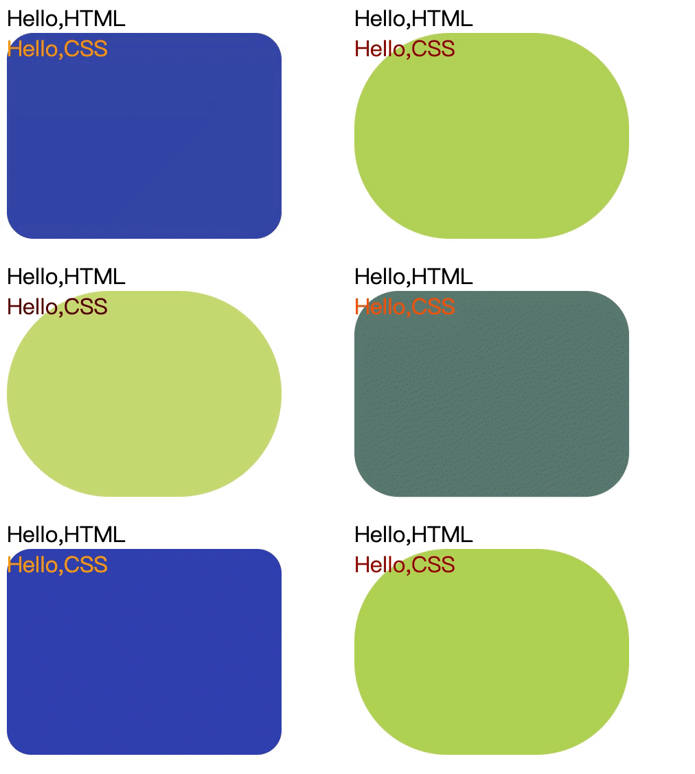
For example, CSS adds the border-radius property of a rounded rectangle. Then, what is the effect with different sizes of rounded corners? Instead of changing the size repeatedly, it is more convenient to produce an animation:
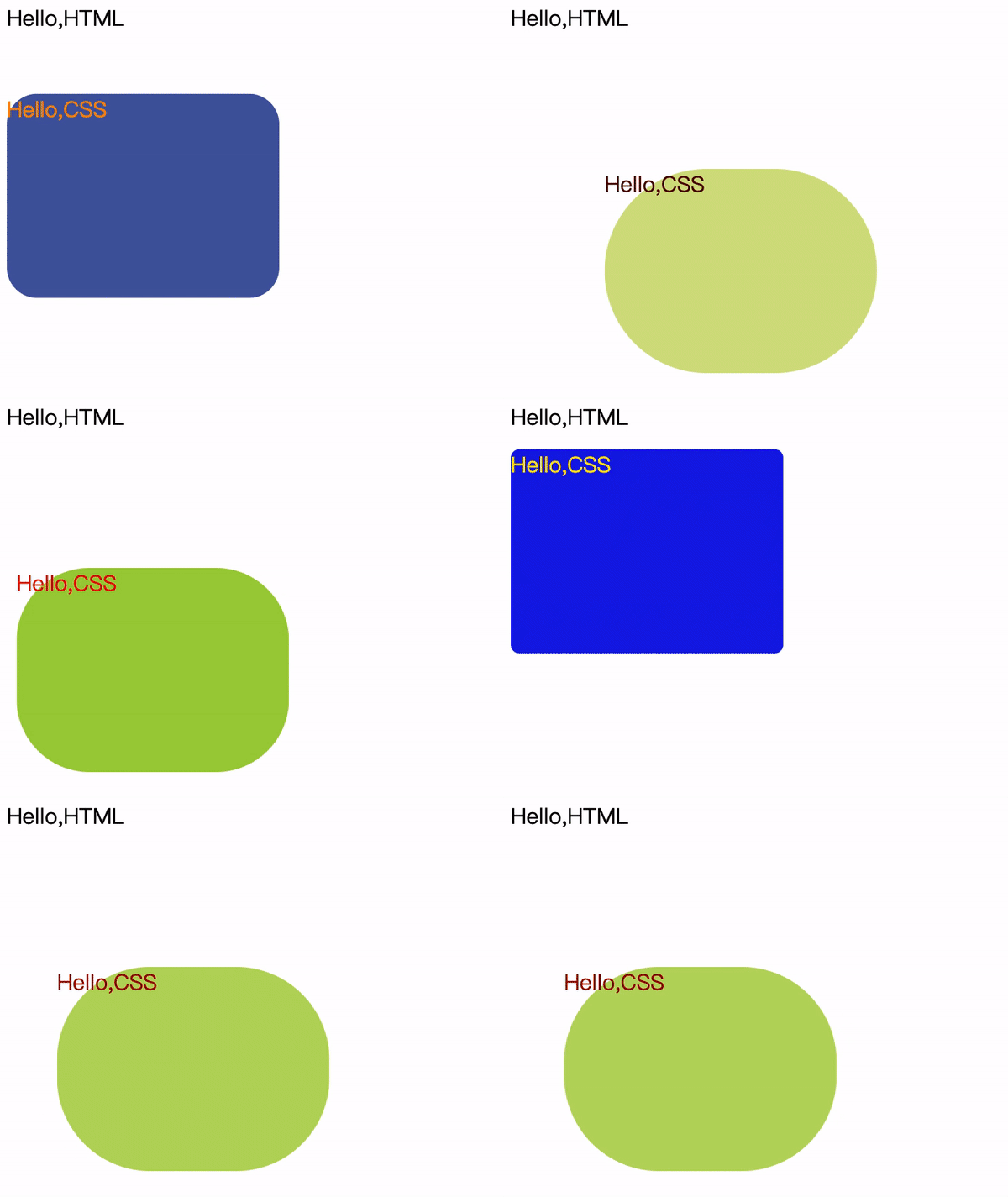
We can also transform its moving position:
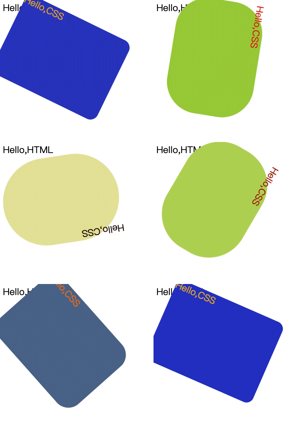
We can even make it turn around:
Before connecting other properties together, let's understand the animation first.
The key to animation is motion. We have to answer a few questions:
The results of these questions constitute the elements of animation.
The first question is – what is the subject of movement? It is HTML labels or complex components constituted by labels? For us, the main thing is:
Where does it move? This is the CSS property to change. This is also the knowledge point of CSS that we want to connect other properties together.
When does it move? We need to specify the duration of the animation, the timing of the start, etc. This is a technical property of pure animation.
How does it move? Does it move at a constant speed, accelerate, accelerate first and then decelerate, or make a Bezier curve? This is the technical property of animation.
How many times does it move? Does it move once, many times, or keep moving? This is also a technical property of pure animation.
Let's start with a simple CSS property animation called transition. It is composed of the above four properties:
Let's look at an example:
        #hellocss {
            transition-property: width;
            transition-duration: 5s;
            transition-timing-function: linear;
            transition-delay: 1s;
        }
This animation specifies that if the width changes, the width changing animation for five seconds will be delayed by one second. The speed of change is constant.
We set an initial width and add background and foreground colors to watch clearly:
    <style>
        #hellocss {
            background-color: blue;
            color: yellow;
            width: 20px;
            transition-property: width;
            transition-duration: 5s;
            transition-timing-function: linear;
            transition-delay: 1s;
        }
    </style>
Since it is animation, there must be changes. Thus, we write the following JavaScript code:
    <script>
        function trans1(){
            let hcss1 = document.getElementById("hellocss");
            hcss1.style.width = "100px";
        }
    </script>
Then, find an event to trigger this change. For example, when the page is loaded, we perform this:
  <body onload="trans1()">
    <div>Hello,HTML</div>
    <div id="hellocss">Hello,CSS</div>
    <script>
        function trans1(){
            let hcss1 = document.getElementById("hellocss");
            hcss1.style.width = "100px";
        }
    </script>
  </body>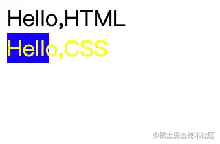
The complete code is listed below:
<!DOCTYPE html>
<html>
  <head>
    <meta charset="utf-8" />
    <style>
        #hellocss {
            background-color: blue;
            color: yellow;
            width: 20px;
            transition-property: width;
            transition-duration: 5s;
            transition-timing-function: linear;
            transition-delay: 1s;
        }
    </style>
  </head>
  <body onload="trans1()">
    <div>Hello,HTML</div>
    <div id="hellocss">Hello,CSS</div>
    <script>
        function trans1(){
            let hcss1 = document.getElementById("hellocss");
            hcss1.style.width = "100px";
        }
    </script>
  </body>
</html>
After becoming proficient with it, we can abbreviate the four properties into one:
transition: width 5s linear 1s;If there is no delay, the 4th item may not be written. The 3rd item can also be omitted if the ease method that is slow first and then fast is applied. If the first item is to change everything, it can be written as all. However, the second item, the duration of the animation, cannot be omitted. If it is not written, the default value is 0 seconds, and there is nothing to display.
All properties that can be calculated linearly can be used for animation. In addition to easy-to-understand coordinate properties (such as width, height, and position), the property of color is a good scenario that is often used for animation. Let's look at an animation process from yellow characters on a blue background to black characters on a white background:
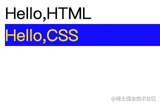
<!DOCTYPE html>
<html>
  <head>
    <meta charset="utf-8" />
    <style>
        #hellocss {
            background-color: blue;
            color: yellow;
            transition: all 10s linear 1s;
        }
    </style>
  </head>
  <body onload="trans1()">
    <div>Hello,HTML</div>
    <div id="hellocss">Hello,CSS</div>
    <script>
        function trans1(){
            let hcss1 = document.getElementById("hellocss");
            hcss1.style.backgroundColor = "white";
            hcss1.style.color="red";
        }
    </script>
  </body>
</html>
The animation of the transition above is relatively simple. However, as for how many times to loop, how to change backward and restore it, or how many times to change in the middle, we need to specify more properties. These requirements can be met by keyframes animation.
The advantage of keyframes animation is that the starting and ending points are specified in keyframes, and the requirements for writing events do not change. The entire thing is completed in CSS:
        @keyframes color_change{
            from {
                background-color: blue;
                color: yellow;
            }
            to {
                background-color: white;
                color: black;
            }
        }
Then, we refer to the defined keyframes animation in a CSS selector and specify the animation duration, changing curve, and delay at the same time:
        #hellocss {
            animation-name: color_change;
            animation-duration: 10s;
            animation-timing-function: linear;
            animation-delay: 1s;
        }
When it comes to keyframes animation, we can finally specify how many times to play, such as three times in a row:
        #hellocss {
            animation-name: color_change;
            animation-duration: 10s;
            animation-timing-function: linear;
            animation-delay: 1s;
            animation-iteration-count: 3;
        }
It can even be played indefinitely:
animation-iteration-count: infinite;The playback loop is not enough. We also want to change forward first and change back. Therefore, we can set the direction as alternating play:
animation-direction: alternate;We can try to run it by putting the properties above together:
<!DOCTYPE html>
<html>
  <head>
    <meta charset="utf-8" />
    <style>
      @keyframes color_change {
        from {
          background-color: blue;
          color: yellow;
        }
        to {
          background-color: white;
          color: black;
        }
      }
      #hellocss {
        animation-name: color_change;
        animation-duration: 5s;
        animation-timing-function: linear;
        animation-delay: 1s;
        animation-iteration-count: infinite;
        animation-direction: alternate;
      }
    </style>
  </head>
  <body>
    <div>Hello,HTML</div>
    <div id="hellocss">Hello,CSS</div>
  </body>
</html>
from and to, which are aliases of 0% and 100%, can also be written like this:
      @keyframes color_change {
        0% {
          background-color: blue;
          color: yellow;
        }
        100% {
          background-color: white;
          color: black;
        }
      }
This way, we can increase the percentage and make the change more interesting:
      @keyframes color_change {
        0% {
          background-color: blue;
          color: yellow;
        }
        50% {
          background-color: yellowgreen;
          color: red;
        }
        100% {
          background-color: white;
          color: black;
        }
      }
What if you want to pause the animation? We can do this by modifying the property of animationPlayState as paused. For example, we click the first div to implement the pause feature:
  <body>
    <div onclick="trans1()">Hello,HTML</div>
    <div id="hellocss">Hello,CSS</div>
    <script>
      function trans1() {
        let hcss1 = document.getElementById("hellocss");
        hcss1.style.animationPlayState = "paused";
      }
    </script>
  </body>
We can now finally see how the first animation at the beginning of this article is written:
      @keyframes color_change {
        0% {
          background-color: blue;
          color: yellow;
          border-radius: 0px;
        }
        50% {
          background-color: yellowgreen;
          color: red;
        }
        100% {
          background-color: palegoldenrod;
          color: black;
          border-radius: 100px;
        }
}The simplest way to translate is to use the property of transform:translate. Let's take the second animation at the beginning of the article as an example:

Let's move the color-changing rounded rectangle down by 100px and then 100px to the right:
            0% {
                background-color: blue;
                color: yellow;
                border-radius: 0px;
                transform:translate(0px,0px)
            }
            50% {
                background-color: yellowgreen;
                color: red;
                transform:translate(0px,100px)
            }
            100% {
                background-color: palegoldenrod;
                color: black;
                border-radius: 100px;
                transform:translate(100px,100px)
            }
}Finally, let's look at the rotation property.

        @keyframes color_change{
            0% {
                background-color: blue;
                color: yellow;
                border-radius: 0px;
                transform:translate(0px,0px);
                transform:rotate(0deg);
            }
            50% {
                background-color: yellowgreen;
                color: red;
                transform:translate(0px,100px);
                transform:rotate(90deg);
            }
            100% {
                background-color: palegoldenrod;
                color: black;
                border-radius: 100px;
                transform:translate(100px,100px);
                transform:rotate(180deg);
            }
}Let's go back to the basics and learn the box model through animation.
The most basic elements of the box are width and height. There is no need to say more. Let's make a wide and high animation and experience it first:
<!DOCTYPE html>
<html>
  <head>
    <meta charset="utf-8" />
    <style>
        @keyframes box_change {
            0% {
                height: 50px;
                width: 50px;
            }
            50% {
                height: 200px;
                width: 50px;
            }
            100% {
                height: 200px;
                width: 200px;
            }
        }
        .box1 {
            background-color: blue;
            color: yellow;
            opacity: 0.65;
            animation-name: box_change;
            animation-duration: 10s;
            animation-delay: 1s;
            animation-timing-function: ease;
            animation-iteration-count: infinite;
            animation-direction: alternate;
        }
    </style>
  </head>
  <body>
      <div class="box1">Hello Box</div>
  </body>
</html>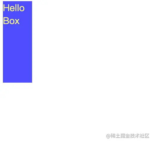
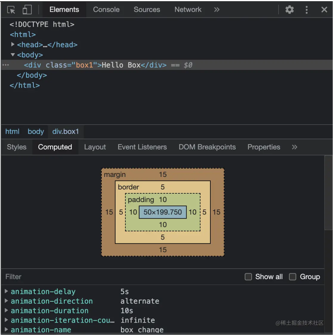
In addition to the width and height, the box has an external border. Inside the border is padding, and outside the border is margin.
Including the border, the box has four directions: top, bottom, left, and right:
        border-width: 5px;
        border-top-color: #f5222d;
        border-bottom-color: #cf1322;
        border-left-color: #a8071a;
        border-right-color: #820014;
        padding: 10px;
        margin: 15px;
Let's add color and shape to the border, with margin and padding, and see how it works out:

The code is listed below:
<!DOCTYPE html>
<html>
  <head>
    <meta charset="utf-8" />
    <style>
      @keyframes box_change {
        0% {
          height: 50px;
          width: 50px;
          border-style: solid;
        }
        50% {
          height: 200px;
          width: 50px;
          border-style: dotted;
        }
        100% {
          height: 200px;
          width: 200px;
          border-style: dashed;
        }
      }
      .box1 {
        background-color: blue;
        color: yellow;
        border-width: 5px;
        border-top-color: #f5222d;
        border-bottom-color: #cf1322;
        border-left-color: #a8071a;
        border-right-color: #820014;
        padding: 10px;
        margin: 15px;
        animation-name: box_change;
        animation-duration: 10s;
        animation-delay: 1s;
        animation-timing-function: ease;
        animation-iteration-count: infinite;
        animation-direction: alternate;
      }
    </style>
  </head>
  <body>
    <div class="box1">Hello Box</div>
  </body>
</html>
Open developer tools of Chrome, we can more clearly see the relationships between content, padding, border, and margin:
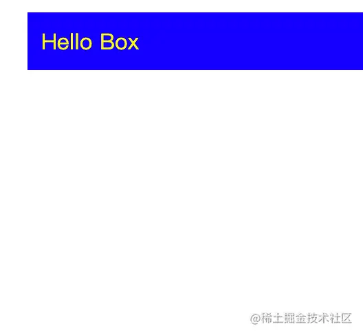
The border is taken as 5px just to make it easier to identify, but it's too ugly. Thus, we change it to 2px. The effect is much better:

66 posts | 5 followers
FollowAlibaba Clouder - May 17, 2021
Alibaba Clouder - May 3, 2018
Hanks - April 21, 2020
Alex - January 22, 2020
Alibaba F(x) Team - August 29, 2022
Alibaba Clouder - November 19, 2018

66 posts | 5 followers
Follow Web Hosting Solution
Explore Web Hosting solutions that can power your personal website or empower your online business.
Learn More YiDA Low-code Development Platform
A low-code development platform to make work easier
Learn More mPaaS
mPaaS
Help enterprises build high-quality, stable mobile apps
Learn More Web Hosting
Explore how our Web Hosting solutions help small and medium sized companies power their websites and online businesses.
Learn MoreMore Posts by Alibaba F(x) Team