This topic describes how to configure parameters on the Field Configuration tab of charts on a dashboard and configure alert rules for the charts to help identify abnormal metrics on the dashboard.
Overview
Dashboards are expected to help users identify abnormal metrics in charts at the earliest opportunity. To meet this requirement, you can configure threshold settings on the Field Configuration tab of the charts. You can specify thresholds for metrics based on your business requirements and configure display effects based on the specified thresholds. This way, you can check whether the monitored metrics reach or exceed the specified thresholds. For example, you can configure threshold settings for a chart named request-success-rate to display the chart in green if the success rate is greater than 70% and in red if the success rate is less than 70%. You can also configure an alert rule to trigger alert notifications if the chart is displayed in red. Procedure:
Specify thresholds and background colors for a chart: Add a dashboard named
sampleand add a chart namedrequest-success-rateto the dashboard. Specify a threshold and threshold-based background colors for thesuccess_ratefield. If the success rate is greater than 70%, the chart is displayed in green. If the success rate is less than 70%, the chart is displayed in red.Configure an alert rule for the chart: Configure an alert rule for the
request-success-ratechart to trigger alert notifications if the success rate is less than 70%. Specify a DingTalk group as the notification method.Configure an interaction occurrence for the chart: Configure the
Create Custom HTTP URLinteraction occurrence for the success_rate field. Then, you can click the value belowsuccess_ratein the chart to go to the alert details page.
1. Specify thresholds and background colors for a chart
1.1 Add a dashboard and a chart
Add a dashboard: Log on to the Simple Log Service console. Click the project that you want to manage. In the left-side navigation pane of the page that appears, choose and add a dashboard named
sample.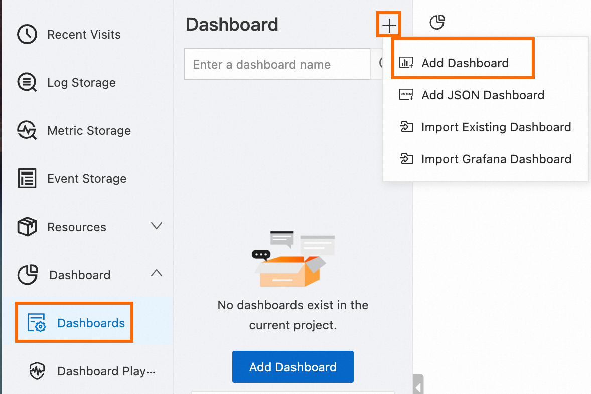
Add a chart: Click Add Chart to add a chart named
request-success-rateon the sample dashboard.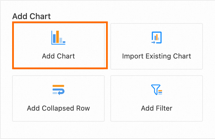
1.2 Configure the chart
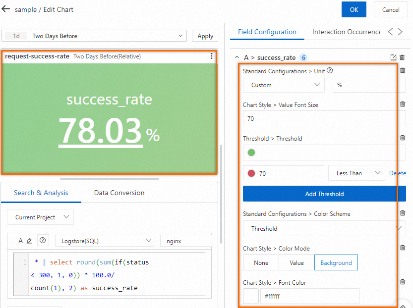
Configure parameters on the General Configurations tab of the chart: On the right side of the Edit Chart page, select Single Value Chart Pro in the Chart Types section and configure the Title parameter in the Basic Configurations section. On the left side of the Edit Chart page, configure the query time range, Logstore, and query statement for the chart. After you complete the configuration, click Apply in the upper part of the Edit Chart page to view the configuration effects of the chart.
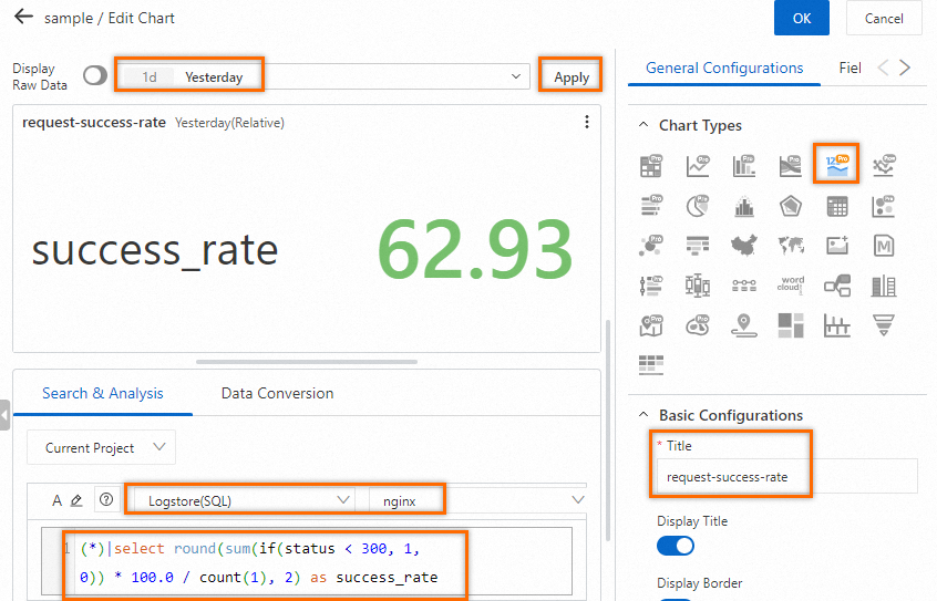
Query statement:
(*)|select round(sum(if(status < 300, 1, 0)) * 100.0 / count(1), 2) as success_rateConfigure parameters on the Field Configuration tab of the chart: Specify a threshold and threshold-based background colors for the success_rate field. If the success rate is greater than 70%, the chart is displayed in green. If the success rate is less than 70%, the chart is displayed in red.
On the right side of the Edit Chart page, click the Field Configuration tab. On the tab, click Add Field and select A > success_rate from the drop-down list.
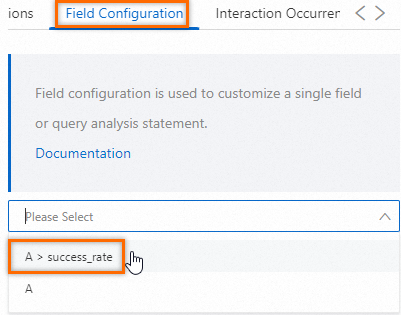
Configure the following parameters for the success_rate field and the background colors for the chart:
Standard Configurations > Unit: Set the unit for the value of the
success_ratefield to %.Chart Style > Value Font Size: Set the font size for the value of the
success_ratefield to 70.Threshold > Threshold: Set the threshold for the value of the success_rate field to 70.
Standard Configurations > Color Scheme: Select a color scheme for the chart. The background color of the chart is displayed based on the threshold that you specify. If the value of the
success_ratefield is less than 70%, the background color of the chart is red. If the value of the success_rate field is greater than 70%, the background color of the chart is green.Chart Style > Color Mode: Select a color mode for the chart. Valid values: None, Value, and Background. None indicates that no color is displayed for the chart. Value indicates that the font color is specified for the chart. Background indicates that the background color is specified for the chart.
Chart Style > Font Color: Set the font color for the value of the
success_ratefield to #ffffff, which specifies white.For more information, see Attributes of charts.
1.3 Save the chart and the dashboard
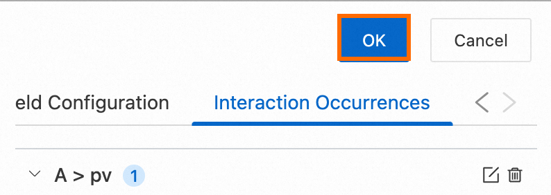
In the upper-right corner of the Edit Chart page, click OK.
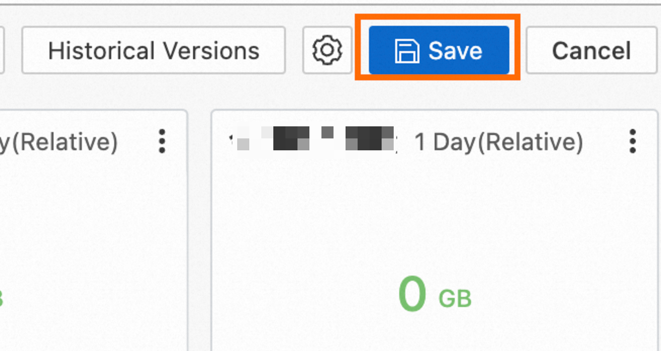
In the upper-right corner of the dashboard page, click Save.
2. Configure an alert rule for the chart
2.1 Create an alert rule
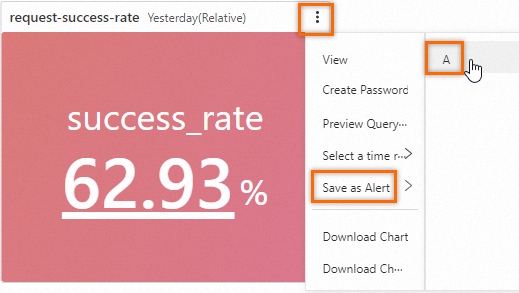
In the upper-right corner of the chart, choose to create an alert rule.
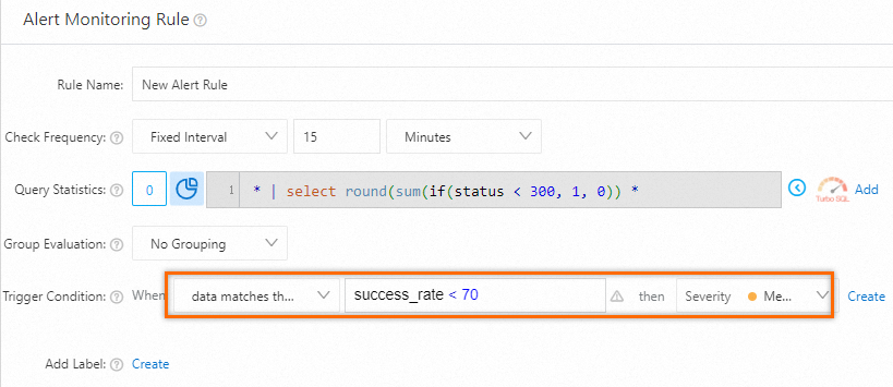
2.2 Configure trigger conditions for the alert rule
In the Alert Monitoring Rule panel, specify data matches the expression, success_rate < 70 for the Trigger Condition parameter and retain the default settings for other parameters.
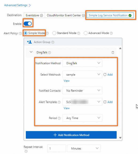
2.3 Configure an alert policy
In the Alert Monitoring Rule panel, set the Alert Policy parameter to Simple Mode and the Notification Method parameter to DingTalk and retain the default settings for other parameters.
2.4 View the triggered alerts
View the details of alerts that are triggered based on the alert rule and copy the URL of the alert details page. You can use the URL to configure an interaction occurrence for the chart.
In the left-side navigation pane, click Alerts. On the page, click the alert rule that you want to manage.
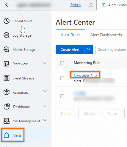
In the Alert History section, view the alert notification records and copy the URL in the address bar of the browser for subsequent settings.

3. Configure an interaction occurrence for the chart
3.1 Enter the edit mode of the chart
Enter the edit mode of a dashboard: In the dashboard list, click the
sampledashboard. In the upper-right corner of the dashboard page, click Edit.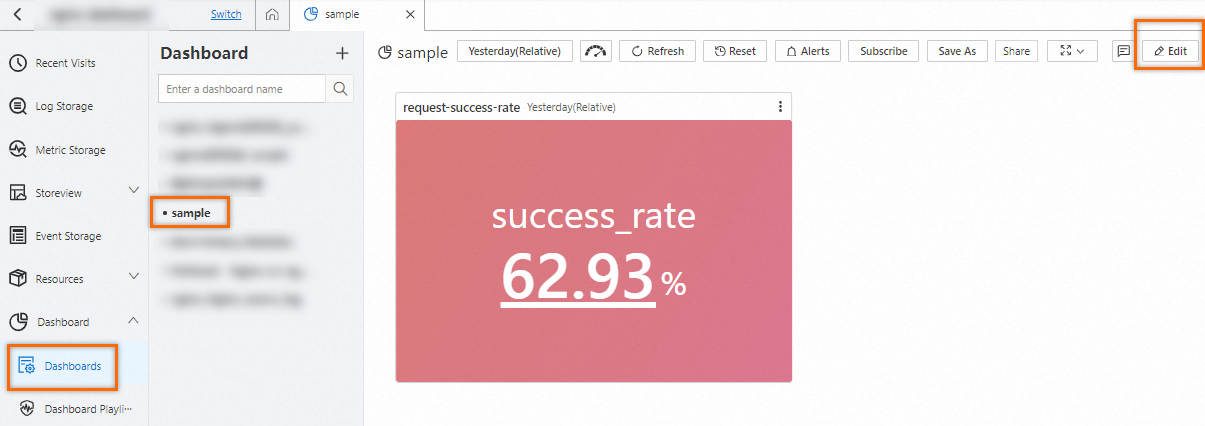
Enter the edit mode of a chart: In the upper-right corner of the
request-success-ratechart, choose .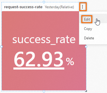
3.2 Add the success_rate field for configuration
On the right side of the Edit Chart page, click the Interaction Occurrences tab. On the tab, click Add Field and select A > success_rate from the drop-down list.
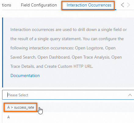
3.3 Configure an interaction occurrence
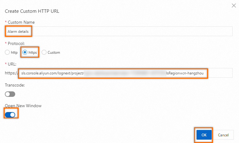
Click Add Event and select Create Custom HTTP URL from the drop-down list. In the Create Custom HTTP URL dialog box, configure the parameters based on the following figure and click OK.
3.4 Save the chart and the dashboard
In the upper-right corner of the Edit Chart page, click OK.

In the upper-right corner of the dashboard page, click Save.

3.5 Verify the interaction occurrence
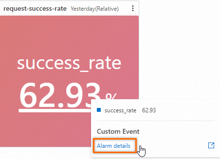
In the chart, click the value below success_rate and click Alarm details in the popover that appears. Then, the alert details page is displayed in a new window.
 > Save as Alert > A