A vertical bar chart shows the trend of data over a period of time and compares the data of different categories. This topic describes how to add data to a vertical bar chart and how to configure the style of a vertical bar chart.
Prerequisites
A data dashboard is created. For more information, see Create a data dashboard.
TensorBoard
Insert data
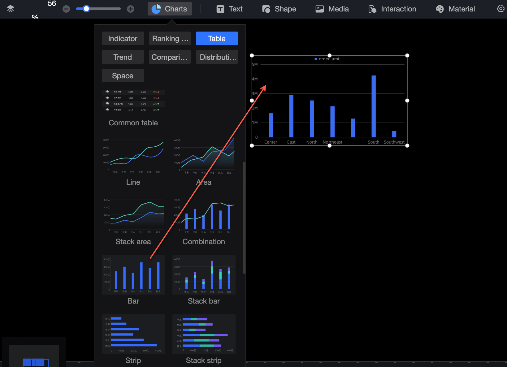
In the Component Library section of the chart in, find column chart and drag it to the canvas.
Click select a dataset, and follow the instructions in the following figure to add data. The updated icon is as follows.
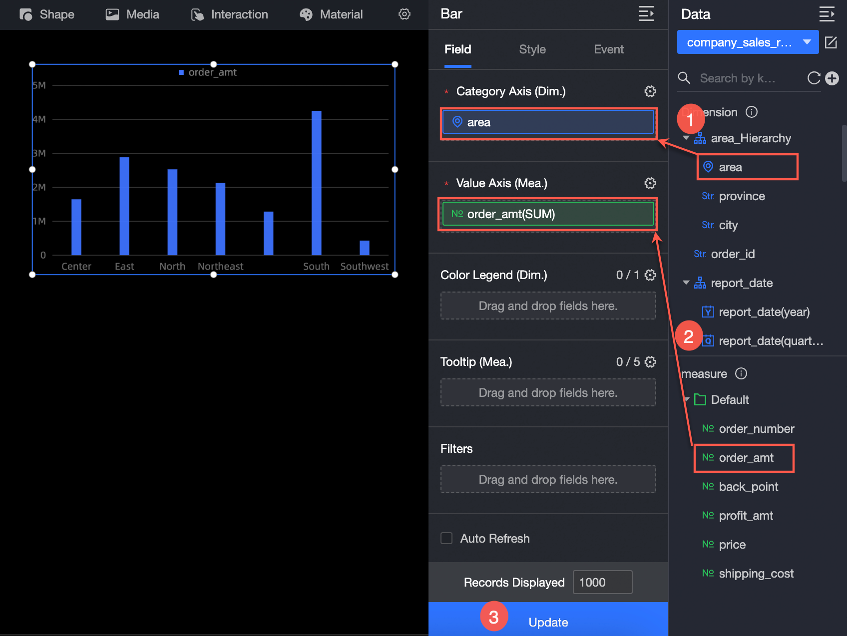
You can also perform the following operations on the data: 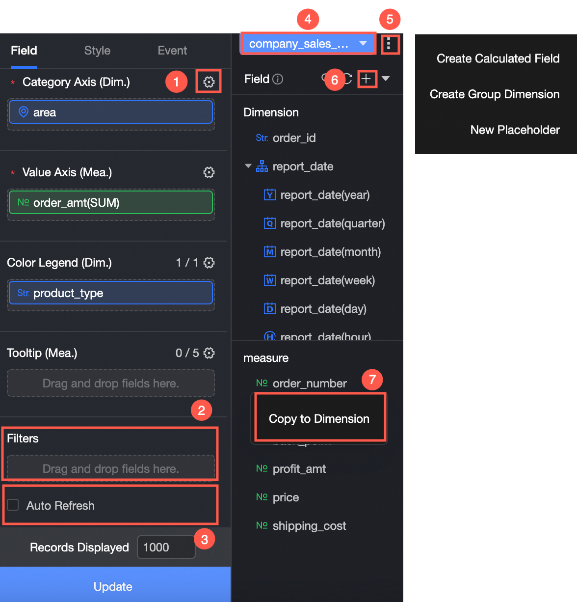
Configure multiple field formats. For more information, see Configure multiple field formats.
Configure field filtering. For more information, see Filter data.
Set automatic data refresh (③). For more information, see Scheduled data refresh.
Switch a dataset. For more information, see Switch a dataset.
Edit a dataset. For more information, see Edit a dataset.
Data transformation (⑥). For more information, see Create a calculated field, Create a grouping dimension, and Create a Placeholder.
Copy fields (⑦). For more information, see Copy fields to dimensions.
Configure the chart style
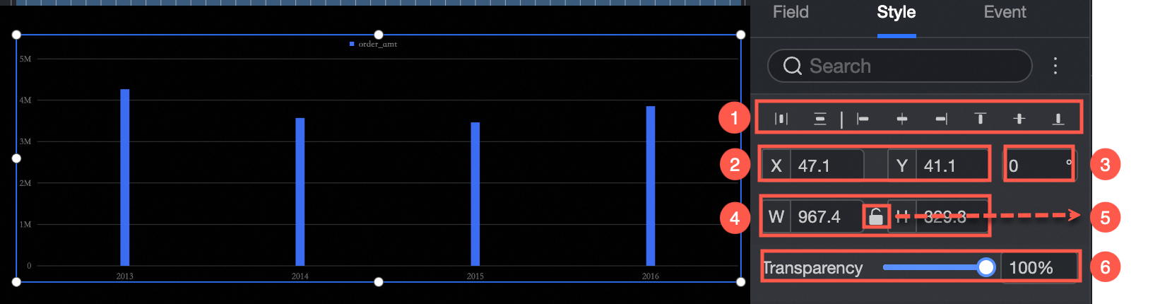
Location and size
In the configuration section, you can configure the components as follows:
Adjust widget alignment (①): supports left alignment, center alignment, and right alignment.
Adjust the size of the widget (②): Use the upper left corner as the origin, set the values of the X and Y axes, and adjust the position.
Adjust the angle of the component (③): Set the value of the rotation angle.
Adjust the size of the component (④): Set the values of W and H to adjust the width and height of the component.
Lock component (⑤): After locking the component, the size of the component cannot be adjusted.
Adjust Transparency (⑥): Set the transparency of the widget
Drawing area
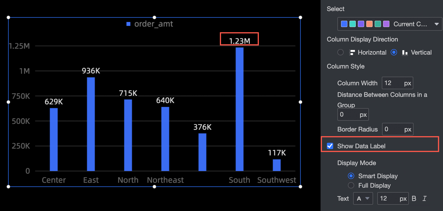
You can set the widget in the drawing area as follows:
Color System Selection: Select the color of the column.
Column Display Direction: Set the column display direction, including horizontal and vertical.
Column Style: Set the column width, distance between columns, and fillet radius of the column.
Display label: Specify whether to display label, display mode, and text size and color. Display modes include Smart Display and Full Display.
Legend
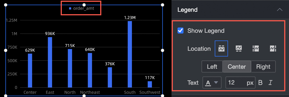
You can configure the widget in the legend section as follows:
Show Legend: Set whether to show the legend.
Position: When setting the display legend, you can set the position of the legend.
Text: When you set the display legend, you can set the size and color of the legend text.
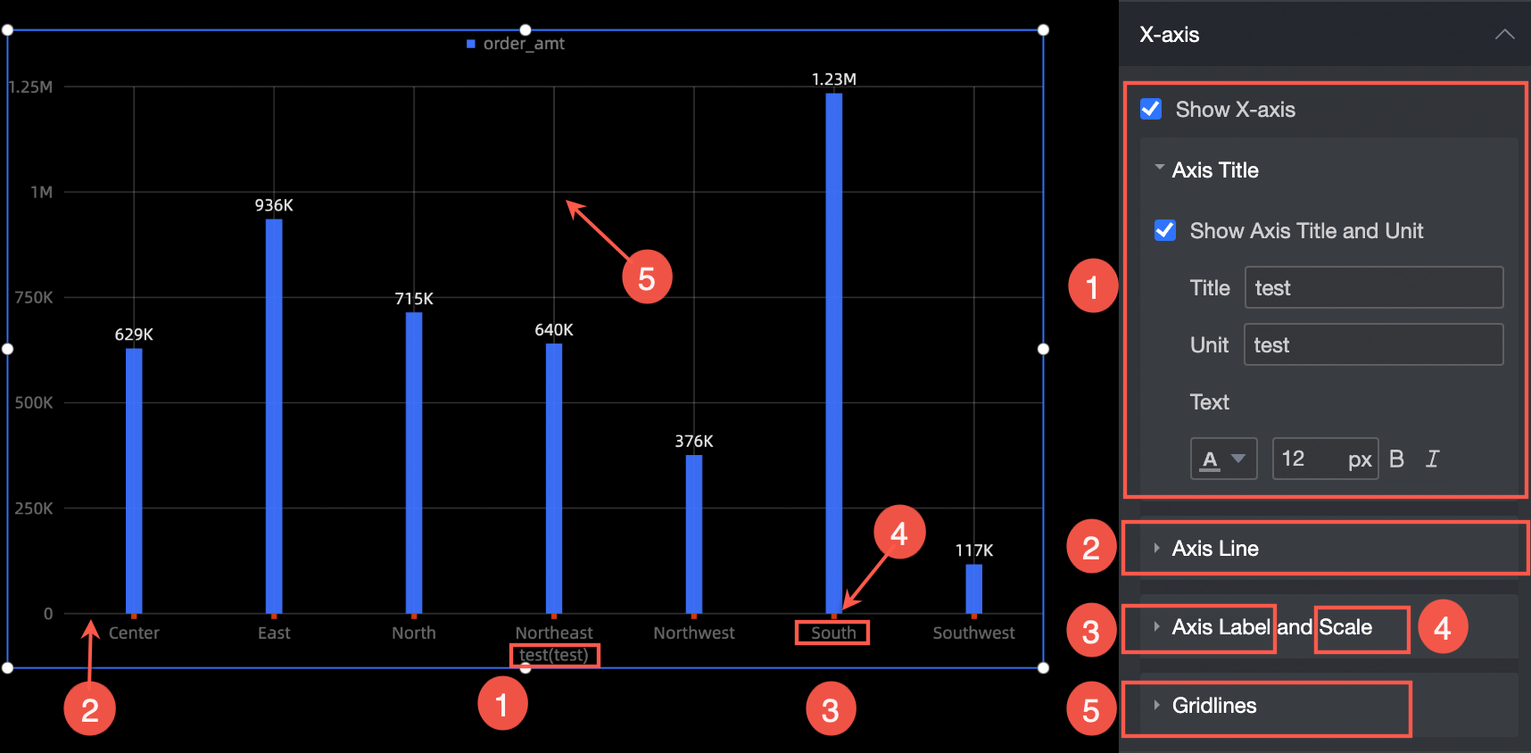
X-axis
In the x-axis section, you can configure the following settings:
Display x-axis: Specify whether to display x-axis.
Axis Title: When setting the display x-axis, you can set whether to display the axis title and unit, axis title, axis unit, and text size and color.
Axis: When setting the display x-axis, you can set whether to display the axis and the color of the axis.
Axis Label and Scale: When you set the display x-axis, you can set whether to display the axis label and scale, the text color of the axis label, and the style of the scale.
Gridlines: When setting the display x-axis, you can set whether to display grid lines and the width and color of grid lines.
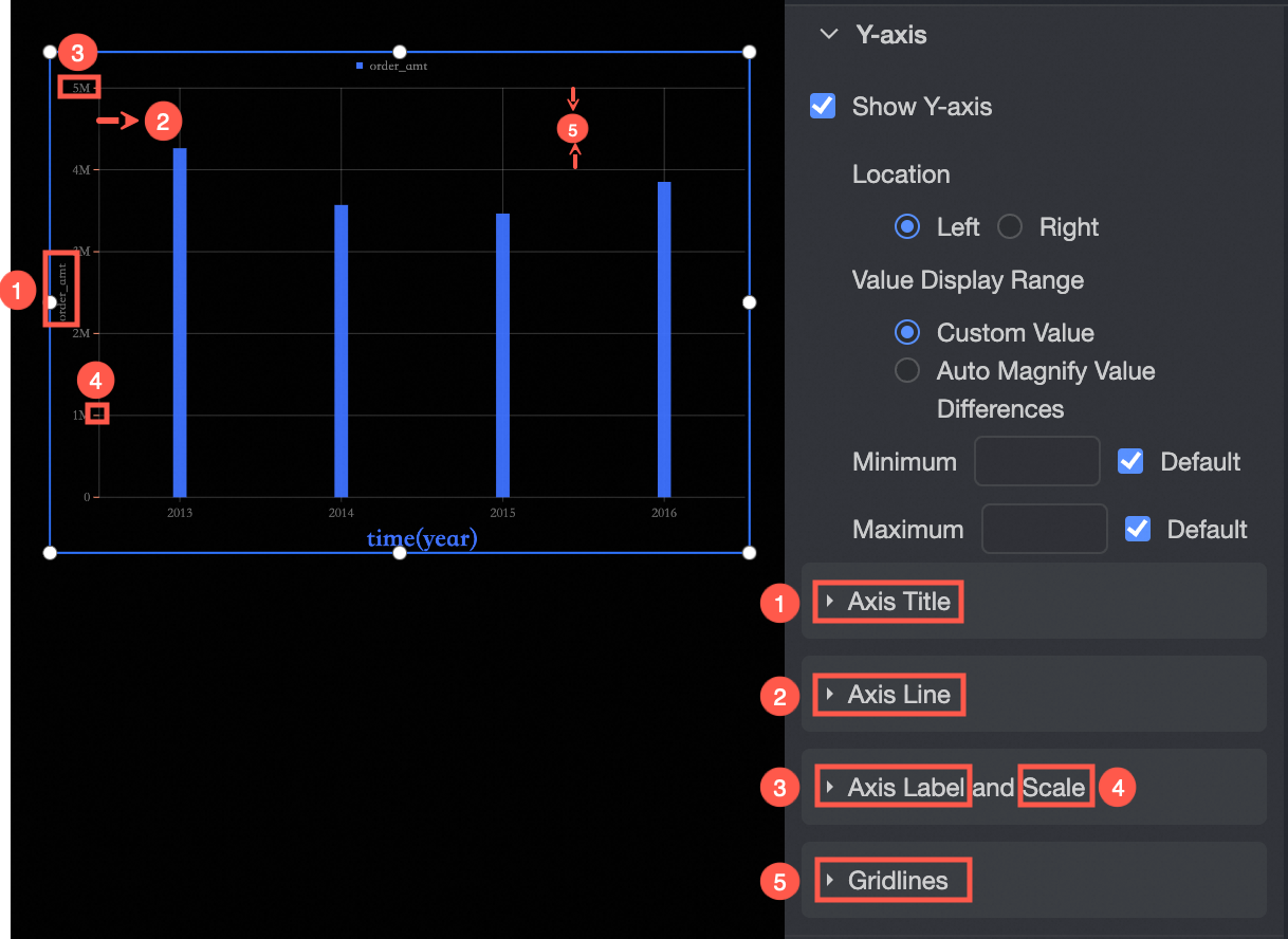
Y-axis
You can configure the component in the Y-axis section as follows:
Display Y Axis: Specify whether to display the Y axis and the position, value display range, maximum value, and minimum value of the Y axis.
Axis Title: You can specify whether to display the axis title and unit, axis title, axis unit, and text size and color.
Axis: You can specify whether to display the axis and the color of the axis.
Axis Label and Scale: You can specify whether to display the axis label and scale, the text color of the axis label, and the style of the scale.
Gridlines: When you set the display y-axis, you can set whether to display grid lines and the width and color of grid lines.
Tooltips
You can set the tooltip mode in the Tooltip section.
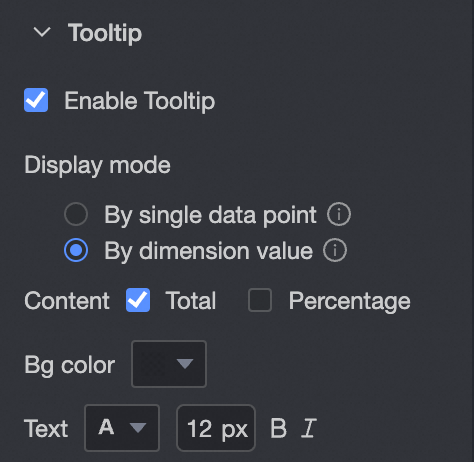
Chart configuration items | Description |
Display mode | The display mode of the prompt information. You can select By Single Data Point or By Dimension Value. |
Description | If the display method is By Single Data Point, Proportion is supported. If you set the Display Method parameter to By Dimension, you can set this parameter to Total or Proportion. |
Background color | Set the background color. |
Text | Sets the prompt text style. |
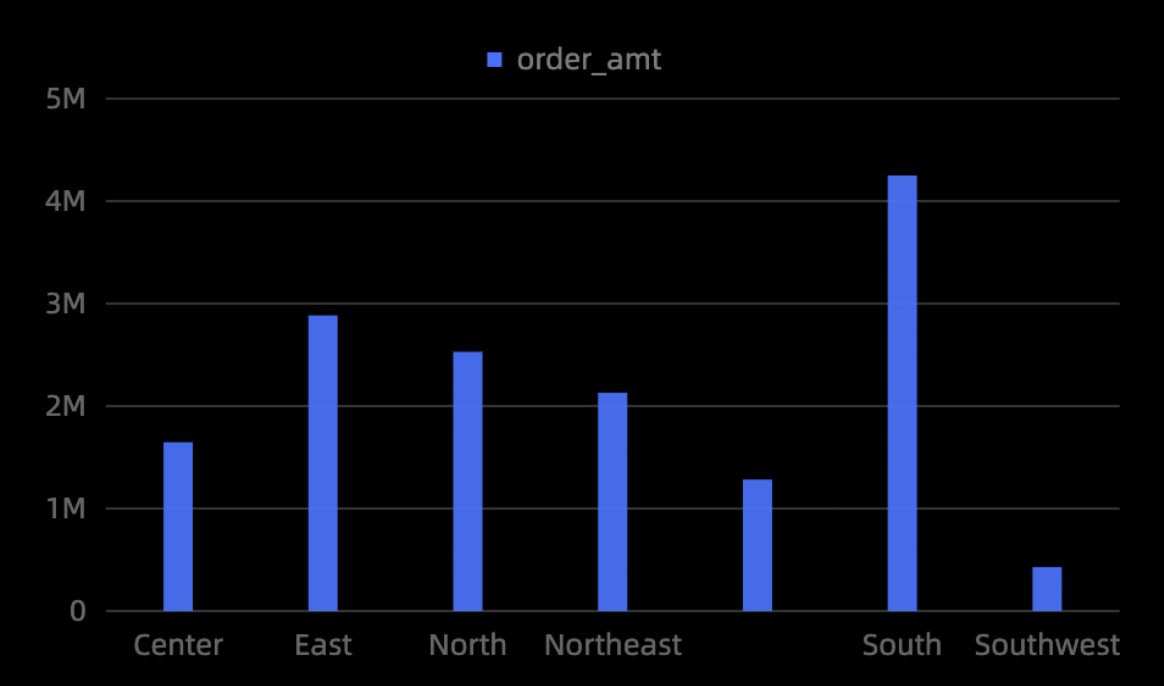
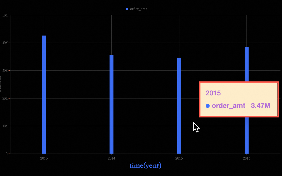
The following figure shows the output:
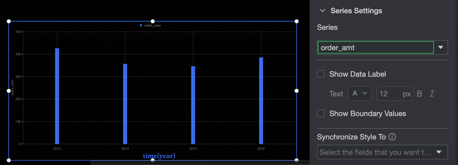
Series settings
In the Series Settings section, you can perform the following steps:
Select Series: Select a dimension or measure based on the business scenario.
Display label: Specify whether to display label and the color and size of label text.
Show Max: displays the labels of the maximum and minimum values on the column chart.
Synchronize Style to: synchronizes the current conditional format to other metrics.