stacked bar chart are suitable for displaying three-dimensional datasets to show the distribution of data. This topic describes how to add data to a stacked bar chart and configure a style.
Prerequisites
A data dashboard is created. For more information, see create a Visualization Screen task.
TensorBoard
Add data
On the Charts tab of the Widget Library section, drag the bar chart to the canvas.
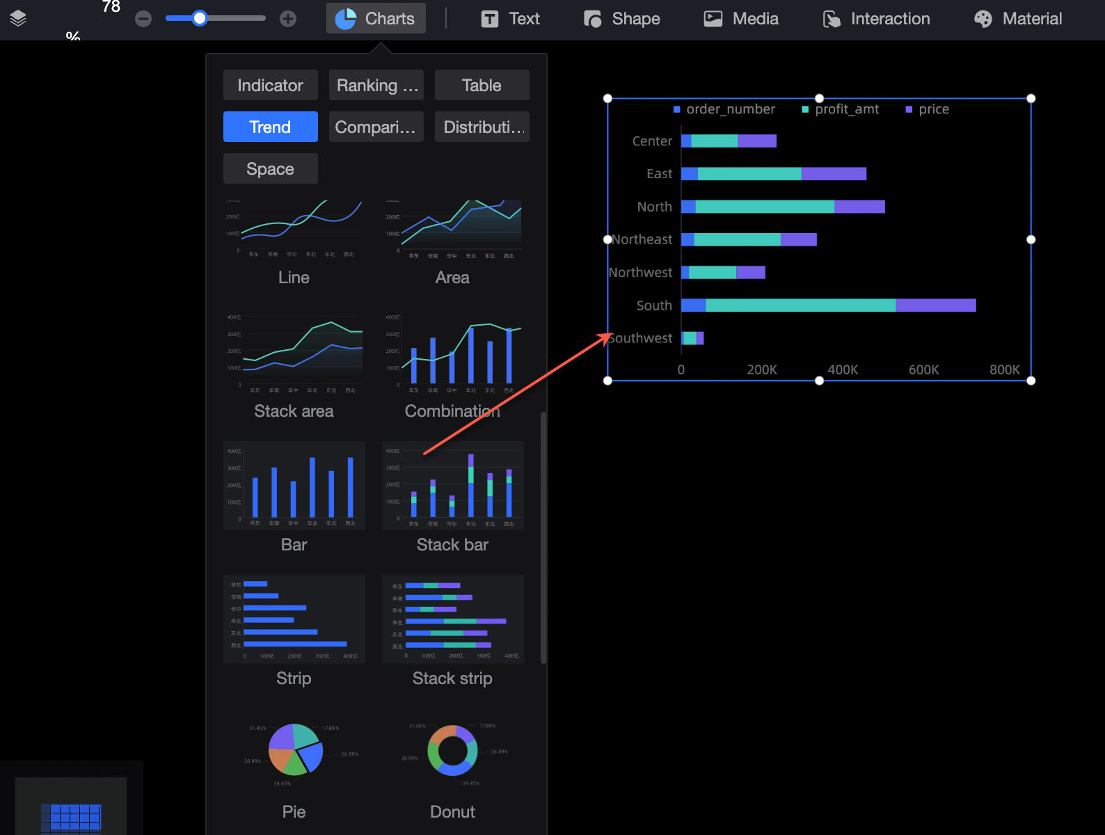
Click Select Dataset and follow the instructions in the following figure to add data. The updated icons are shown in the following figure.
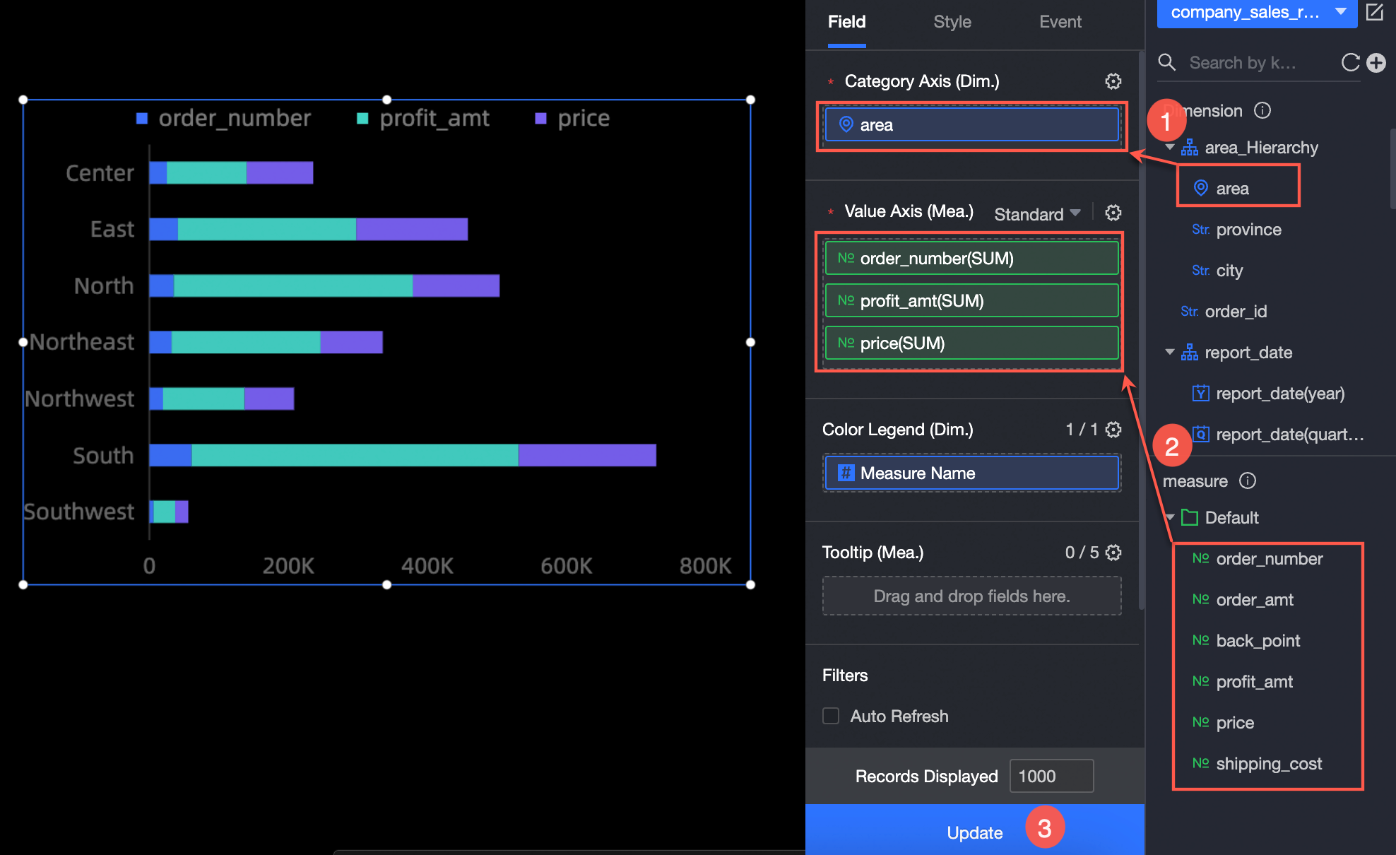
You can also perform the following operations on the data: 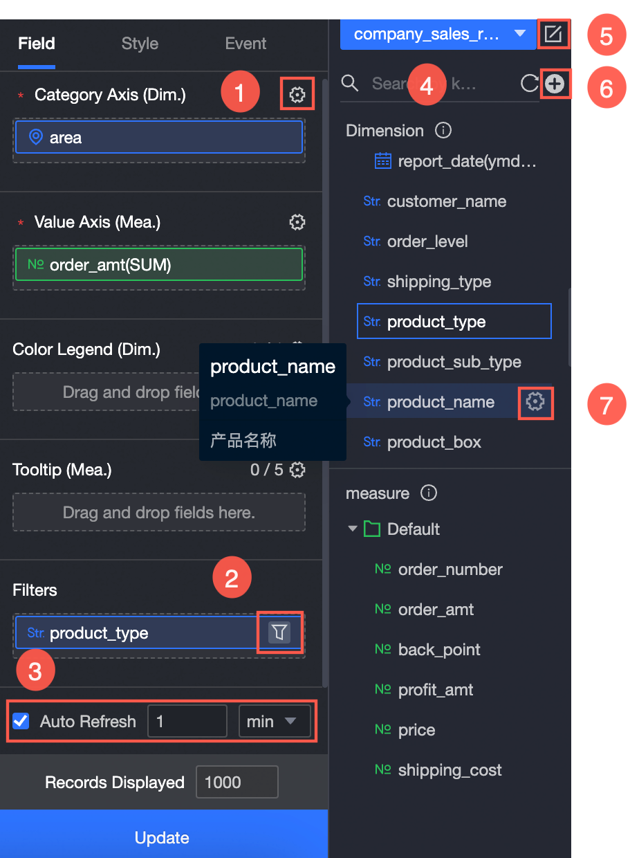
Configure multiple field formats. For more information, see Configure multiple field formats.
Configure field filtering. For more information, see Filter data.
Configure automatic data refresh (③). For more information, see Scheduled data refresh.
Switch a dataset. For more information, see Switch a dataset.
Edit a dataset. For more information, see Edit a dataset.
Data processing (⑥). For more information, see Create a calculated field and Create a group dimension.
Copy fields. For more information, see Copy and convert fields.
Configure the chart style
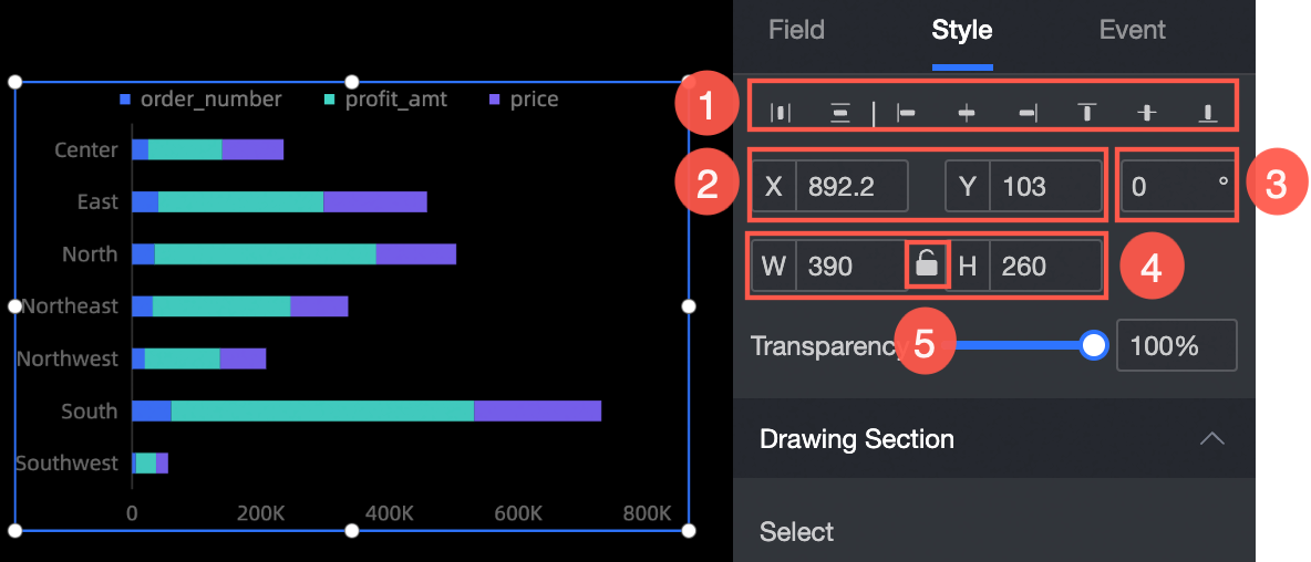
Location and size
You can set the widget in the Position and Size sections as follows:
Adjust widget alignment (①): supports left alignment, center alignment, and right alignment.
Adjust the size of the widget (②): Use the upper left corner as the origin, set the values of the X and Y axes, and adjust the position.
Adjust the angle of the component (③): Set the value of the rotation angle.
Adjust the size of the component (④): Set the values of W and H to adjust the width and height of the component.
Lock component (⑤): After locking the component, the size of the component cannot be adjusted.
Drawing area
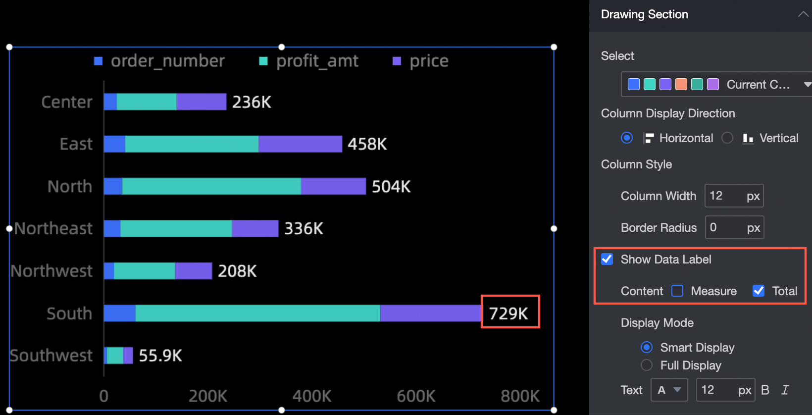
You can set the widget in the drawing area as follows:
Color System Selection: Select the color of the column.
Column Display Direction: Set the column display direction, including horizontal and vertical.
Column Style: Sets the column width and fillet radius of the column.
Display label: Specify whether to display label, display mode, and text size and color. Display modes include Smart Display and Full Display.
Legend
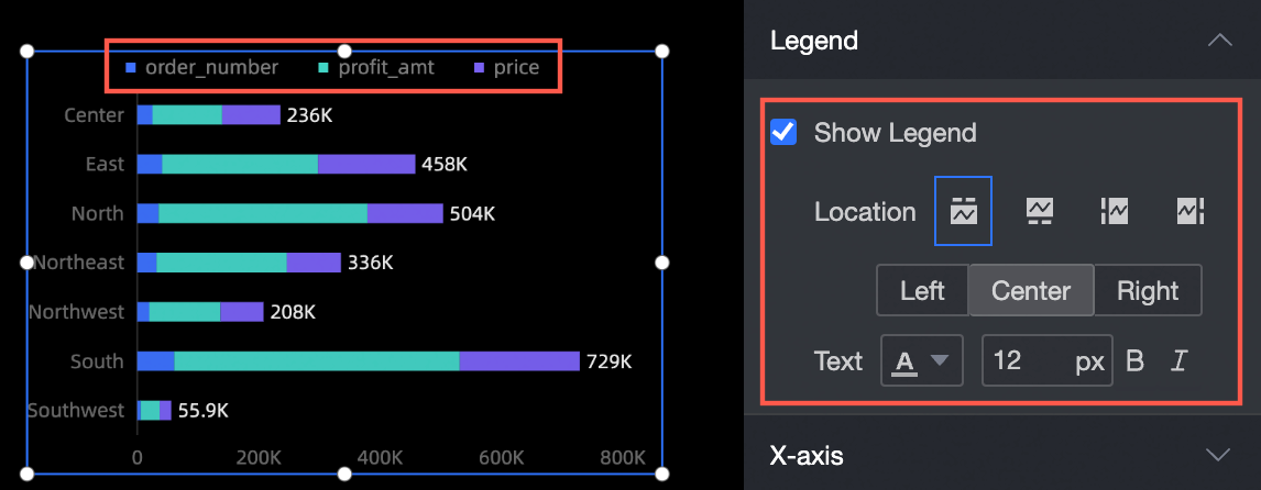
You can configure the widget in the legend section as follows:
Show Legend: specifies whether to show the legend.
Position: When setting the display legend, you can set the position of the legend.
Text: When you set the display legend, you can set the size and color of the legend text.
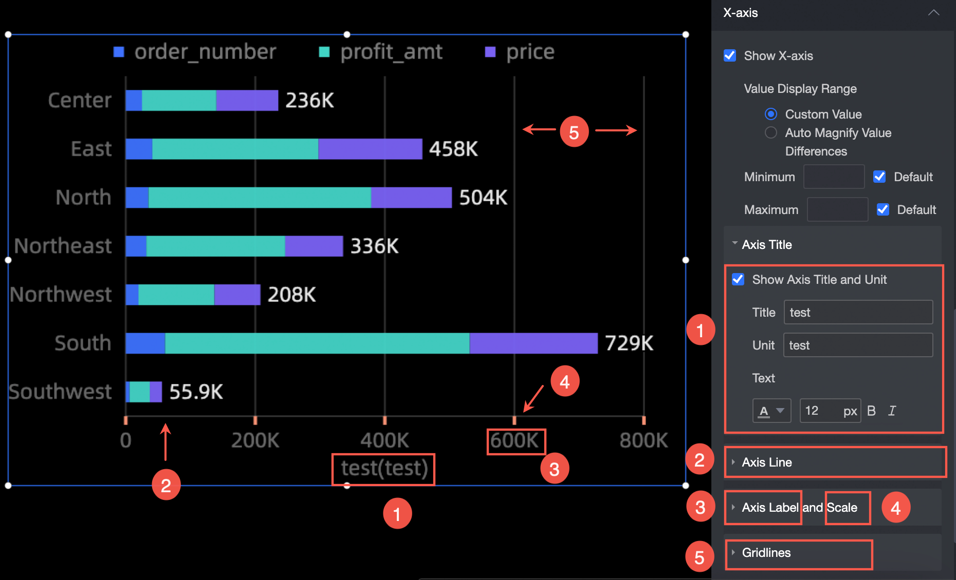
Axes
Take x-axis as an example. In the x-axis section, you can perform the following operations:
Show Axis Title and Unit: Set the axis title, unit, and text style (①).
Axis: Set the type, thickness, and color of the axis (②).
Axis Label and Scale: Specify the text style, scale weight, and color of the axis label.
Network Line: Specify the type, thickness, and color of the grid line.
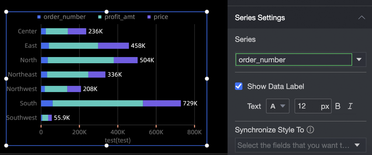
Series Settings
In the Series Settings section, you can perform the following operations:
Select Series: Select a dimension or measure based on the business scenario.
Display label: Set whether to display label and the color and size of label text.
Synchronize Style to: synchronizes the current conditional format to other metrics.