stacked area chart can be used to show the trend of data over time and the proportion of area they occupy. This topic describes how to add data to a stacked area chart and configure a style.
Effect diagram 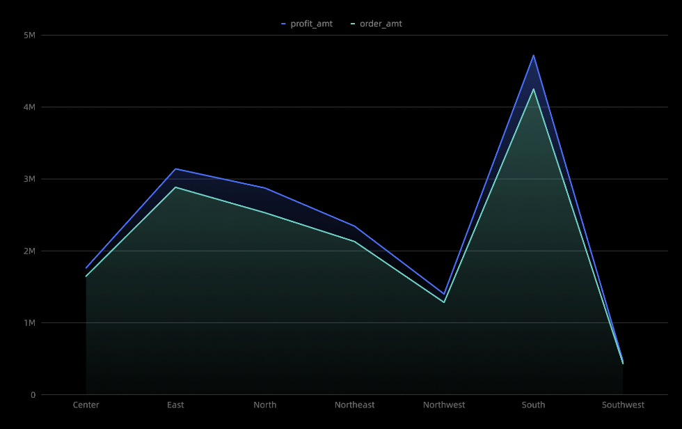
Configuration data
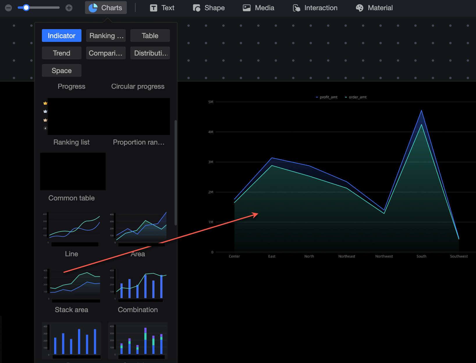
On the chart in the Widget Library section, find the stacked area chart and drag it to the canvas.
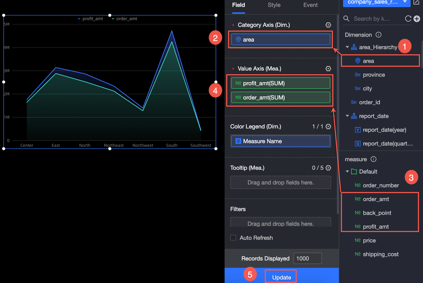
Click Select Dataset and follow the instructions in the following figure to add data.
You can also perform the following operations on the data: 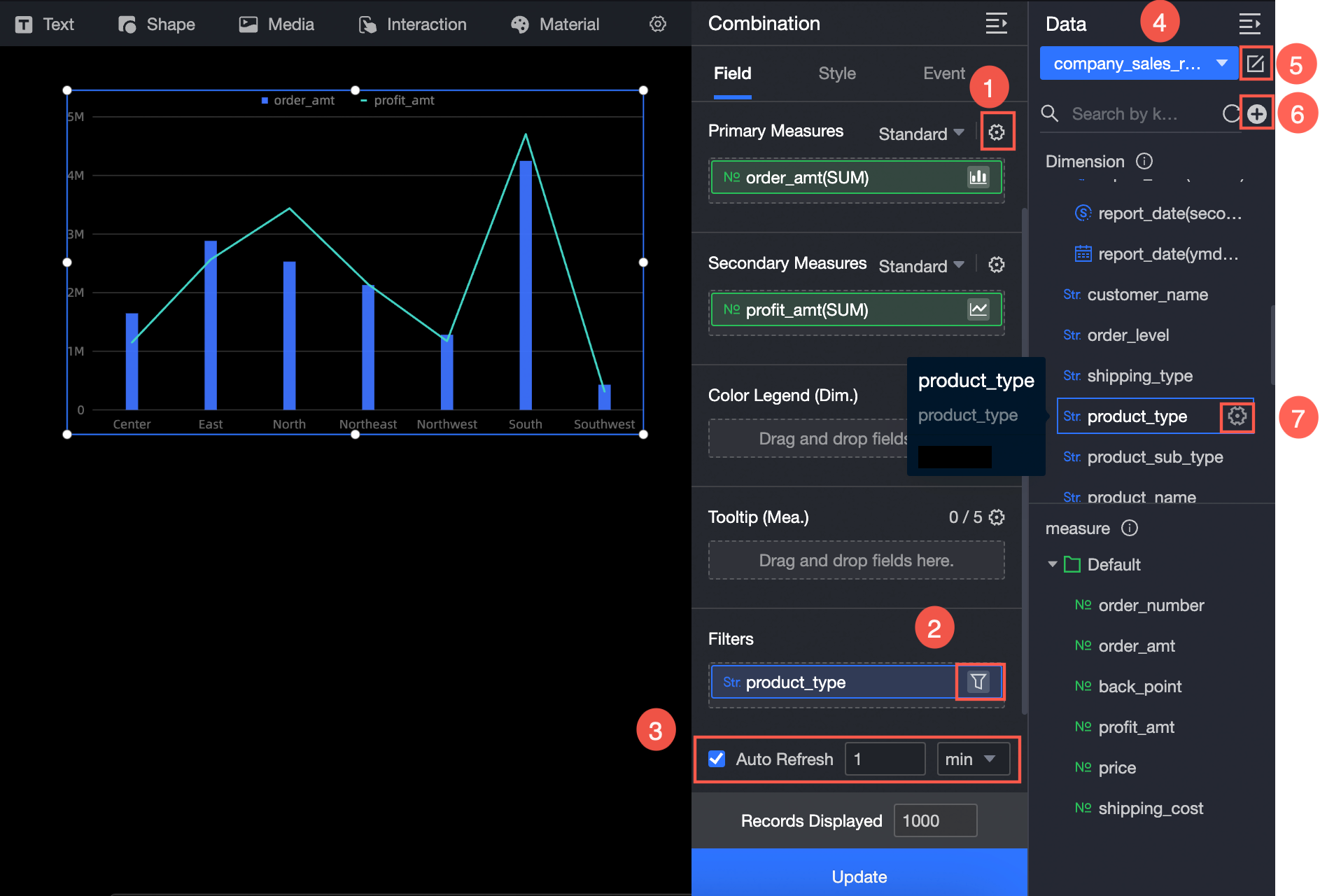
Configure multiple field formats. For more information, see Configure multiple field formats.
Configure field filtering. For more information, see Filter data.
Configure automatic data refresh (③). For more information, see Scheduled data refresh.
Switch a dataset. For more information, see Switch a dataset.
Edit a dataset. For more information, see Edit a dataset.
Data processing (⑥). For more information, see Create a calculated field and Create a group dimension.
Copy fields. For more information, see Copy to Dimension.
Configure Style
Location and size
You can configure the components in the configuration section as follows:
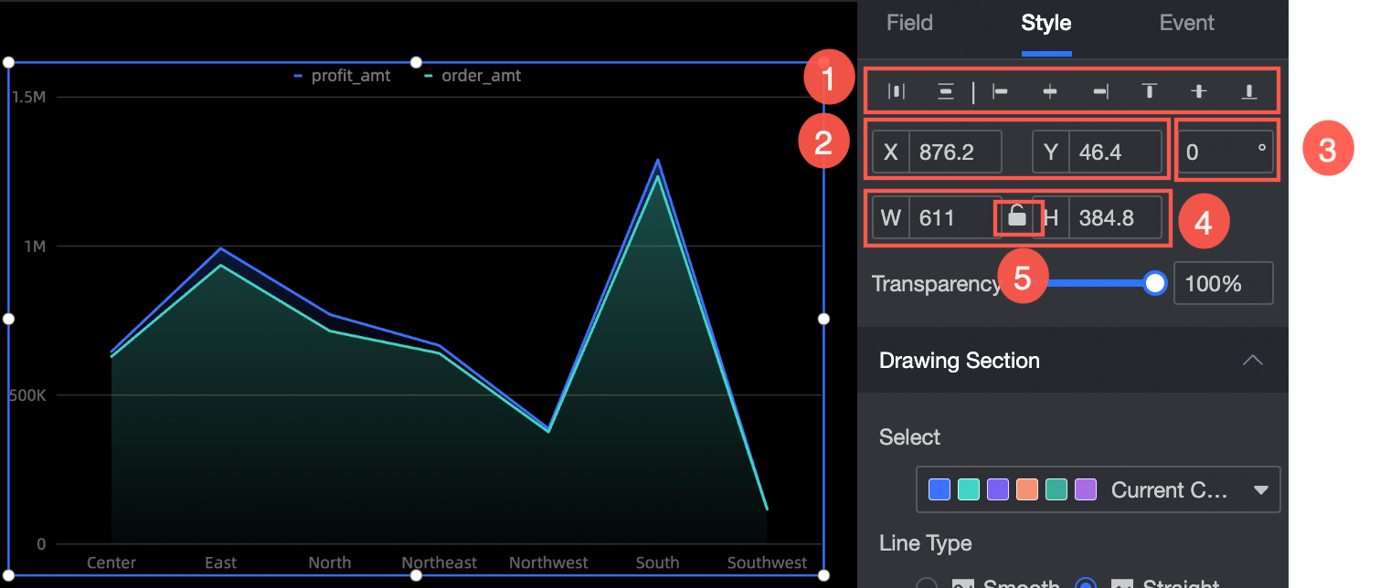
Adjust widget alignment (①): supports left alignment, center alignment, and right alignment.
Adjust the size of the widget (②): Use the upper left corner as the origin, set the values of the X and Y axes, and adjust the position.
Adjust the angle of the component (③): Set the value of the rotation angle.
Adjust the size of the component (④): Set the values of W and H to adjust the width and height of the component.
Lock component (⑤): After locking the component, the size of the component cannot be adjusted.
Drawing area
You can set the stacked area chart style in the drawing area. The following operations are supported:
Color: Set the color of the stacked area chart.
Line Type: Set the line type, including Curve and Line.
Null Value Processing: If the data is empty, you can set the parameter to 0 (the line is not disconnected) or the line is disconnected.
Line Size: Specify the line type and line thickness.
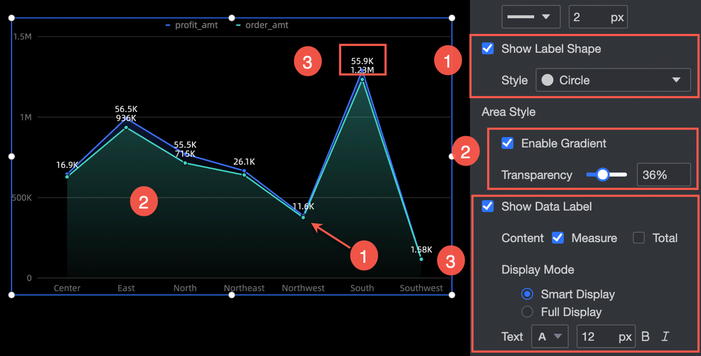
Show Marker Point: Set the marker point style, which supports circle, hollow circle, diamond, and hollow diamond (①).
Area Style: Turn on Gradient Effect (②) and set the transparency of the Gradient Effect.
Display label: Select a label display mode (Smart Display or Full Display) and a text style (②).
Legend
In the Legend section, you can set the position (up, down, sit, right) and text style of the legend. 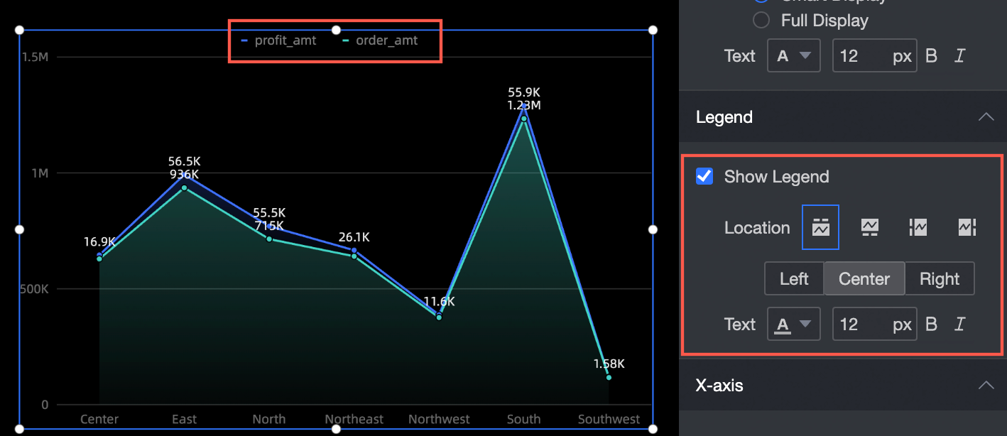
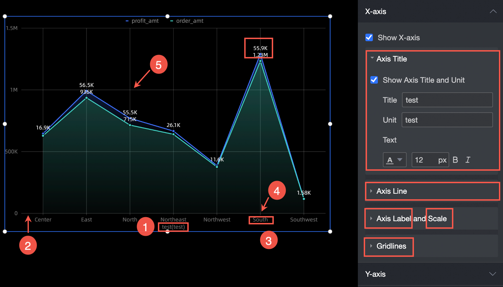
Axes
Take x-axis as an example. In the x-axis section, you can perform the following operations:
Show Axis Title and Unit: Set the axis title, unit, and text style (①).
Axis: Set the type, thickness, and color of the axis (②).
Axis Label and Scale: Set the text style of the axis label and the scale thickness and color (③ and ④).
Network Line: Specify the type, thickness, and color of the grid line.
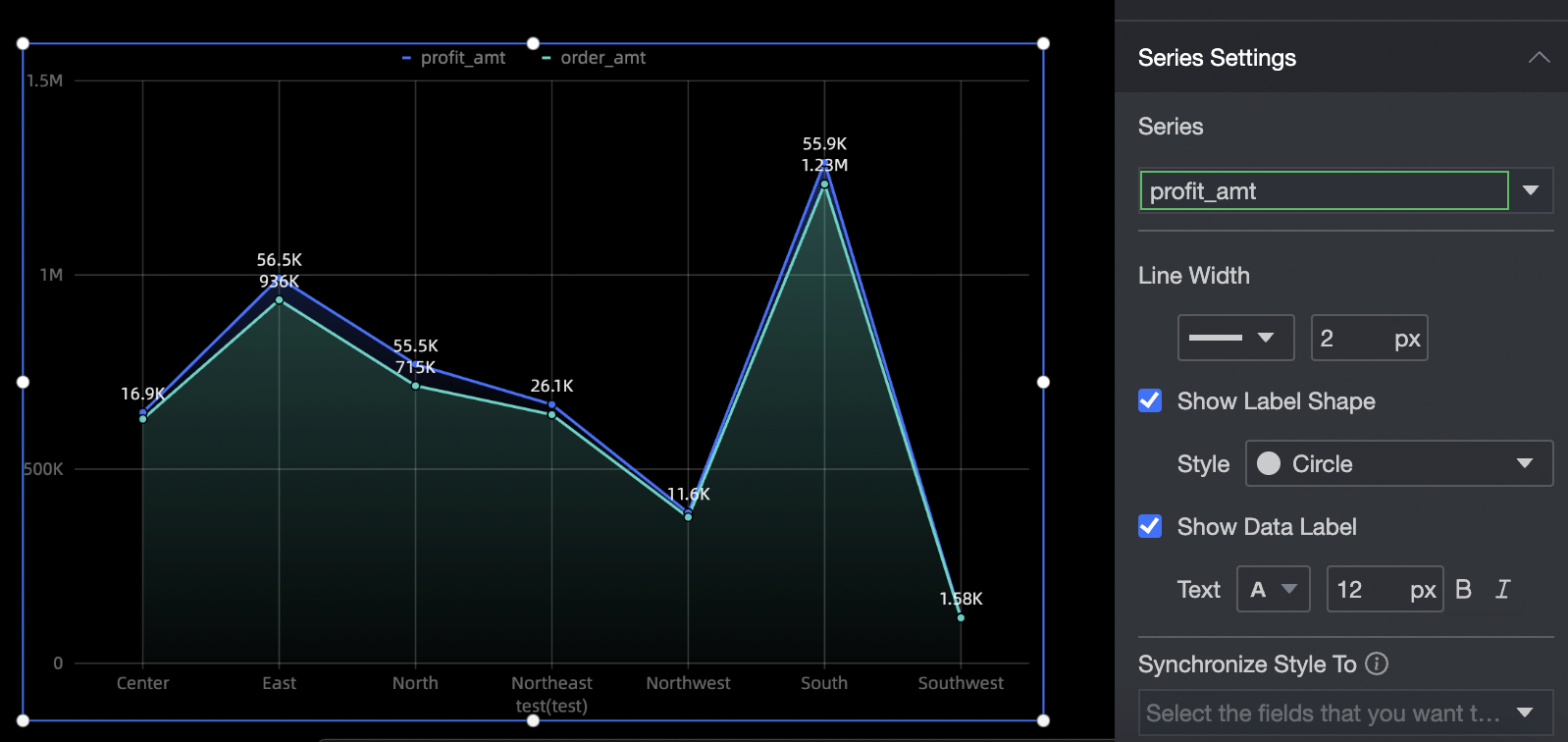
Series Settings
In the Series Settings section, set the stacked area chart series.
Select Series: Select a measure in the Indicators section.
Line Size: Specify the line style and line thickness of the measurement item.
Show Marker Points: specifies the style of the marker points for the target measure. The style supports circle, hollow circle, diamond, and hollow diamond.
Display label: Set the size, bold, or italic of the label.
Synchronize Style to: synchronizes the current series settings to other metrics.