A Simple Log Service bar gauge is a data visualization tool. You can configure a bar gauge that contains multiple bars to display different data in a comprehensive manner. You can also configure a bar gauge that contains a single bar used as a progress bar to display the percentage of a metric or the proportion of data in an intuitive manner. This topic describes how to configure a bar gauge.
Overview
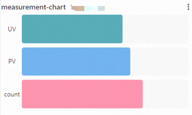
In most cases, a bar gauge that contains multiple bars is used in top-N analysis.
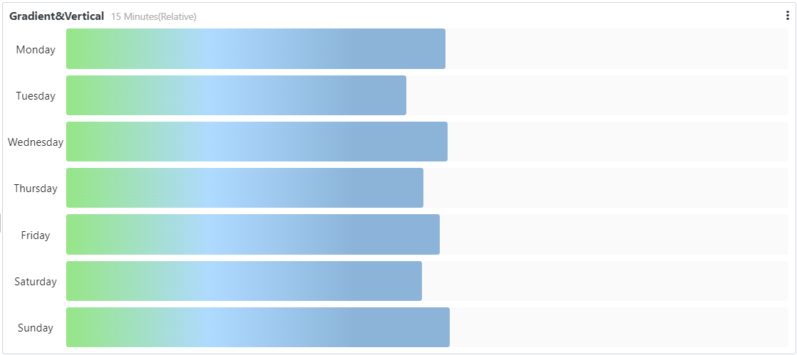
In most cases, a bar gauge that contains a single bar is used as a progress bar to display the percentage of a metric or the proportion of data.
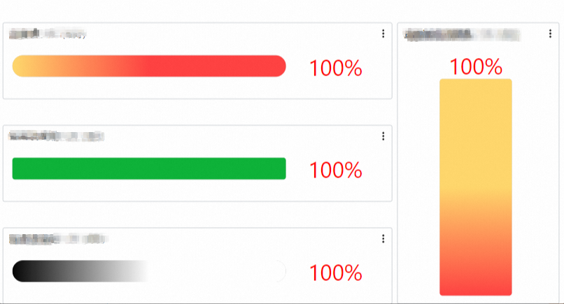
For more information about how to add a bar gauge, see Add a chart to a dashboard.
Configuration effect
Bar gauge type | Sample bar gauge | References |
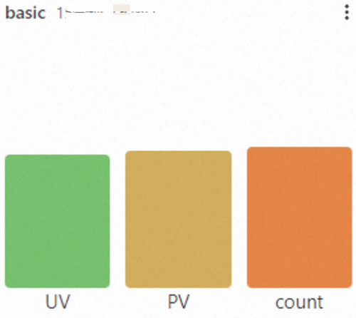
Basic bar gauge |
| |
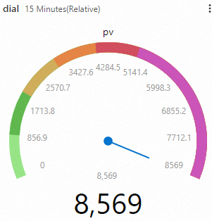
Dial |
| |
Bar gauge that supports multi-statement query |
|
Configure a basic bar gauge
Log on to the Simple Log Service console. In the Projects section, click the project you want.
In the left-side navigation pane, choose Dashboard > Dashboards. In the dashboard list, click the dashboard you want. In the upper-right corner of the dashboard page, click Edit. In edit mode, click Add > Add Chart.

On the right side of the Edit Chart page, select Bar Gauge Pro in the Chart Types section and configure parameters in the Style Settings section based on the following figure. On the left side of the Edit Chart page, configure the query time range, Logstore, and query statement for the bar gauge. After you complete the configuration, click Apply in the upper part of the Edit Chart page to view the configuration effects of the bar gauge.
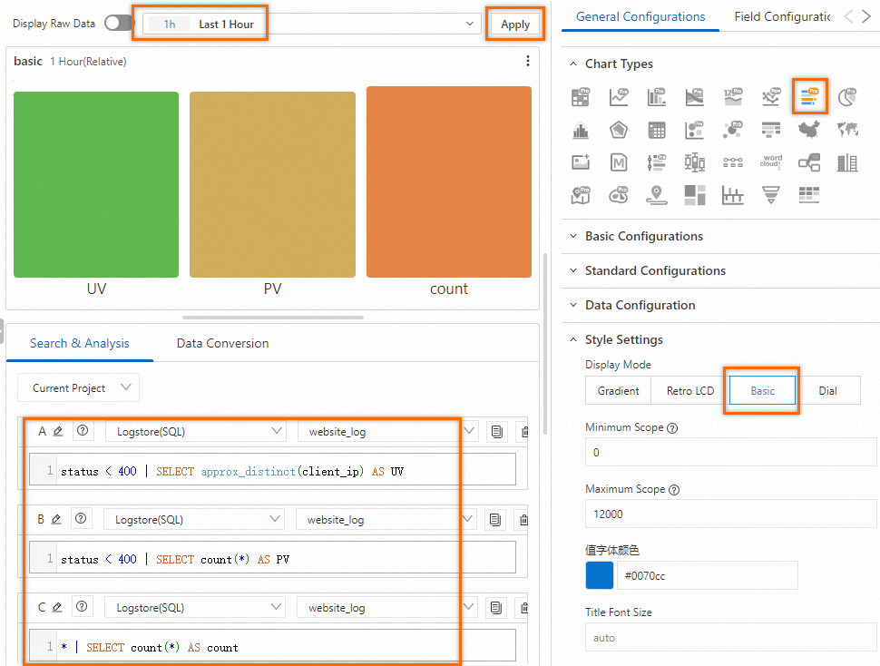
The following query statement is used to query the number of unique visitors (UVs) of a web page:
status < 400 | SELECT approx_distinct(client_ip) AS UVThe following query statement is used to query the number of page views (PVs) of a web page:
status < 400 | SELECT count(*) AS PVThe following query statement is used to query the number of logs:
* | SELECT count(*) AS count
Configuration on the General Configurations tab
You can configure global settings for a bar gauge on the General Configurations tab.
Parameters in the Basic Configurations section
Parameter
Description
Title
The title of the bar gauge.
Display Title
If you turn on Display Title, the title of the bar gauge is displayed.
Display Border
If you turn on Display Border, the borders of the bar gauge are displayed.
Display Background
If you turn on Display Background, the background color of the bar gauge is displayed.
Display Time
If you turn on Display Time, the query time range of the bar gauge is displayed.
Fixed Time
If you turn on Fixed Time, the query time range of the bar gauge is independent of the global time range of the dashboard.
Parameters in the Standard Configurations section
Parameter
Description
Format
The display format of numeric values.
Unit
The unit of numeric values.
Number of Digits after Decimal Point
The decimal places of numeric values.
Display Name
The name of the display field.
If you specify a value for the Display Name parameter, the value is used as the names for all display fields in the bar gauge. If you want to change the name of a display field, you must configure parameters on the Field Configuration tab.
Color Scheme
The color scheme of the bar gauge. Valid values:
Built-in: uses the built-in color scheme.
Solid: uses the color that you select.
Threshold: uses different colors for different values based on the specified thresholds for the values.
Parameters in the Data Configuration section
Parameter
Description
Display Mode
The display mode of data in the bar gauge. Valid values:
Calculation Result: displays the calculation results of all values of a field based on the query and analysis results.
All Values: displays all values of a field based on the query and analysis results.
Function
If you set the Display Mode parameter to Calculation Result, you must select a function to calculate query and analysis results.
For example, if you set the Function parameter to Maximum Value, the bar gauge displays the maximum value of a field based on the query and analysis results.
Layout
The layout of the bar gauge. Valid values:
Horizontal: The bars are arranged from left to right.
If you set the Layout parameter to Horizontal, you can configure the Minimum Width parameter to specify the minimum width of the bars.
Vertical: The bars are arranged from bottom to top.
If you set the Layout parameter to Vertical, you can configure the Minimum Height parameter to specify the minimum height of the bars.
Minimum Width
The minimum width of the bars.
Show Percentage
Specifies whether to display the percentage of the value of each bar to the maximum value.
Show Title
If you turn on Show Title, the title of the bar is displayed.
Parameters in the Style Settings section
Parameter
Description
Display Mode
The display mode of the bar gauge. Valid values:
Gradient: The bar gauge has a gradient and is displayed based on threshold settings.
Retro LCD: The bar gauge is split into Liquid Crystal Display (LCD) progress bars.
Basic: The bar gauge is displayed in a single color.
Dial: The bar gauge is displayed as a dial.
Show Blank Area
If you turn on Show Blank Area, the unfilled areas of the bars are rendered as gray.
NoteIf you set the Display Mode parameter to Retro LCD, this parameter is not available.
Minimum Scope
The minimum value of data that you want to display.
Maximum Scope
The maximum value of data that you want to display.
Value Font Color
The color of the numeric values.
Value Font Size
The font size of the numeric values.
Title Font Size
The font size of the title.
Edge Shape
The edge shape of the bar gauge.
Width
The width of the bars in the bar gauge.
Background Color
The background color of the bar gauge.
Parameters in the Search & Analysis Settings section
Parameter
Description
Displayed Fields
The field that you want to display in the bar gauge.
Use Query Result
After you turn on Use Query Result, you can configure the Field of Maximum Value parameter.
Parameters in the Threshold section
Parameter
Description
Threshold Mode
The display mode of the thresholds.
Threshold
The thresholds of numeric values.
If you set the Color Scheme parameter to Threshold and specify thresholds in the Threshold section, the bars in the bar gauge are displayed in different colors based on the specified thresholds.
Parameters in the Value Mapping section
Parameter
Description
Value Mapping
The text or icon that you want to use to replace a specified value in the bar gauge.
For example, if you set the Value parameter to 200, the Mapping Type parameter to Text, and the Mapping Value parameter to Success, all values of 200 in the bar gauge are replaced with Success.
Parameters in the Variable Replacement section
Parameter
Description
Variable Replacement
The settings for variable replacement. You can click AddVariable Replacement to add a filter of the Variable Replacement type to the table. After you configure the settings for variable replacement on the General Configurations tab, Simple Log Service adds a filter in the upper-left corner of the table. You can select a value from the filter drop-down list. Then, Simple Log Service automatically replaces the variable in the query statement of the table with the variable value indicated by the value that you select, and performs a query and analysis operation. For more information, see Example 2: Configure variable replacement.
Parameters in the Documentation section
Parameter
Description
Add Documentation Link
The button that allows you to specify custom document links and descriptions. After you configure the settings, the specified information is displayed in the upper-right corner of the bar gauge.
Configuration on the Field Configuration tab
You can configure personalized display settings for the results of a single query statement or for a single column of data in the results. For more information, see Configuration on the General Configurations tab.
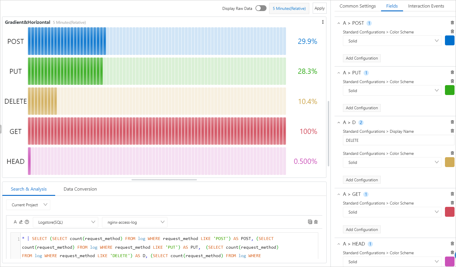
The query statement shown in the following figure is used to query the number of requests by request method. The results of the query statement are displayed in a bar gauge. On the Field Configuration tab, you can configure different colors for bars. The following figure shows the configuration effects of the bar gauge.
A > POST: Select Solid from the Standard Configurations > Color Scheme drop-down list and specify blue for the bar of the POST field.
A > PUT: Select Solid from the Standard Configurations > Color Scheme drop-down list and specify green for the bar of the PUT field.
A > D: Select Solid from the Standard Configurations > Color Scheme drop-down list and specify yellow for the bar of the D field. DELETE is a keyword in SQL syntax and cannot be used as a field name in analytic statements. In this case, you can specify DELETE in the Standard Configurations > Display Name field.
A > GET: Select Solid from the Standard Configurations > Color Scheme drop-down list and specify red for the bar of the GET field.
A > HEAD: Select Solid from the Standard Configurations > Color Scheme drop-down list and specify purple for the bar of the HEAD field.
Configuration on the Interaction Occurrences tab
You can configure an interaction occurrence for the results of a single query statement or for a single column of data in the results to analyze data in a finer-grained manner. Supported types of interaction occurrences include Open Logstore, Open Saved Search, Open Dashboard, Open Trace Analysis, Open Trace Details, and Create Custom HTTP URL. For more information, see Interaction occurrences.
For example, in the A section, you can configure an Open Logstore interaction occurrence for the results of Query Statement A. After you configure the interaction occurrence, you can click a point in a bar of the bar gauge and click Open Logstore. Then, you are navigated to the Logstore that you specify.
