This topic describes the chart styles of the QR code widget and the meaning of each configuration items.
Chart style
A QR code is a component that can be scanned and displayed after the associated content is generated into a QR code style. 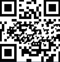
Settings
Search Configuration: Click Search Configuration in the upper-right corner of the Configuration panel. In the Search Configuration panel, enter the name of the configuration items that you want to search for to quickly locate the configuration items. Fuzzy match is supported. For more information, see Search for asset configurations.
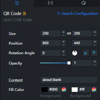
Size: indicates the size of a widget, including its pixel width and height. You can click the
 icon to lock the aspect ratio of the widget and modify the width and height of the widget in equal proportion. Click again to unlock. The aspect ratio is not limited after unlocking.
 Position: the position of a widget, which is indicated by pixel X and Y coordinates. X-coordinate indicates the pixel distance between the upper-left corner of the widget and the left border of the canvas. Y-coordinate indicates the pixel distance between the upper-left corner of the widget and the upper border of the canvas.
Rotation Angle: the angle of a rotation that uses the center point of a widget as the rotation point. The unit is degrees (°). You can use one of the following methods to control the rotation angle of a widget:
Directly enter the degrees in the Rotation Angle spin box or click the plus sign (+) or minus sign (-) to increase or decrease the value in the Rotation Angle spin box.
Drag the
 black dot in the icon to control the rotation angle of the widget.
 Click the
 icon to flip the widget style.
 Click the
 icon to flip the widget style.
Opacity: Valid values: 0 to 1. If this parameter is set to 0, the widget is hidden. If this parameter is set to 1, the widget is completely displayed. Default value: 1.
Input Content: Enter the content that is displayed after the QR code is scanned. You can obtain the content from the text field in the Data panel. If both this configuration items and the data are configured, the configuration in the data takes precedence.
Fill Color: the colors of the foreground and background of the QR code widget.
Border Style: the style of the border of the QR code widget, including the line type, corner angle, width, and color of the border.
LOGO: The LOGO icon style in the middle of the two-dimensional code. You can click the
 icon to control the display and concealment of the LOGO icon style.
 Parameter
description
Image Link
The image displayed by the logo. To use an image on a remote server, enter the URL of the image in the upper-right corner. Click Preview in the image box to preview the large image style. Click Change in the dashed box below the image box. For more information about how to change the image design asset, see Use the interface.
Image Size
The size of the LOGO image, including the width and height of the image, in px. LOGO picture size can be used normally within 30%.
Image Fillet
The fillet size of the LOGO image. Unit: pixels. If the value is 0, there is no rounded corner, and the image is square. The larger the setting value, the larger the radian value of the image rounded corners.
Background Color
The background color of the logo image.
Border Style
The border style of the LOGO image, including the line type of the border, the corner angle of the border, the width value of the line, and the line color.
Data panel
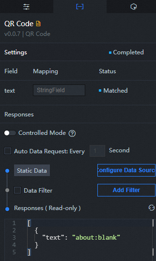
text: Generate the content of the two-dimensional code.
Interaction tab
This widget does not support interaction events.
Configure interactions in Blueprint Editor
In Canvas Editor, right-click a widget in the Layer panel and select Add to Blueprint Editor.
Click the
 icon in the upper-left corner.
 In Blueprint Editor, click the QR Code component in the Import Nodes pane. The following figure shows the parameters on the canvas.
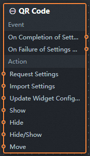
Events
Events
Description
When the interface description request is completed
The event is triggered with the processed JSON data after a data interface request is responded and processed by a filter. For more information about specific data examples, see the Data Response Result section of the Data tab in the right-side configuration panel of the canvas editor.
When the interface description request fails
The event that is returned when a data interface request fails (such as network problems or interface errors) and is processed by the filter. The event also throws the processed JSON data. For more information about specific data examples, see the Data Response Result section of the Data tab in the right-side configuration panel of the canvas editor.
Action
Action
Description
Request API Description
This action is performed to request the server data again. The data sent by an upstream data processing node or layer node is used as a parameter. For example, if the two-dimensional code is configured with the API data source as
https://api.testand the data transferred to the request interface to describe the action is{ id: '1'}, the final request interface ishttps://api.test?id=1.Import Interface Description
After data of a widget is processed in accordance with its drawing format, the widget is imported for redrawing. You do not need to request server data again. For more information about specific data examples, see the Data Response Result section of the Data tab in the right-side configuration panel of the canvas editor.
Update component configurations
Style configurations of widgets are dynamically updated. Before this action is executed, you must click the widget in Canvas Editor, click the Settings tab in the right-side panel, and click Copy Configurations to... to obtain widget configurations. After that, change the style field for the data processing node in Blueprint Editor.
Display
Displays the widget. The following example shows the reference data.
return {
  "animationType": "",
  "animationDuration": 1000,
  "animationEasing": "linear"
};
Hide
The following example shows how to hide a widget.
return {
  "animationType": "",
  "animationDuration": 1000,
  "animationEasing": "linear"
};
Switch to the implicit state
Specifies whether to show or hide a widget. The following example shows the reference data.
return {
  "animationIn": {
    "animationType": "",
    "animationDuration": 1000,
    "animationEasing": "linear"
  },
  "animationOut": {
    "animationType": "",
    "animationDuration": 1000,
    "animationEasing": "linear"
  }
};
China Mobile
Move a widget to a specified location. The following example shows the reference data.
return {
  // The positioning type. to indicates absolute positioning, whereas by indicates relative positioning. The default value is to.
  "positionType": "to",
  // The location, which is indicated by the x and y coordinates.
  "attr": {
    "x": 0,
    "y": 0
  },
  // The animation type.
  "animation": {
    "enable": false,
    // The duration in which animation is displayed.
    "animationDuration": 1000,
    // The animation curve, which can be set to linear|easeInOutQuad|easeInOutExpo.
    "animationEasing": "linear"
  }
};