By Si'er from F(x) Team
Before figuring out the effects of different colors, we need to understand how human eyes capture and perceive them.
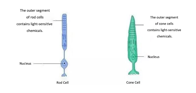
Rod cells and cone cells are two types of light-sensitive cells in our retina. Rod cells maintain our scotopic vision. They enable us to see things under low-light levels but cannot distinguish between colors. On the contrary, cone cells are not so sensitive to light but help us appreciate a colorful world.

We all know that visible light is composed of light waves of different wavelengths. When it reaches an object, some waves are absorbed while others are reflected into people's eyes. With the help of the three types of photoreceptor cells, namely S-cones, M-cones, and L-cones, we can perceive colors. Each type is sensitive to a specific range of wavelengths. For example, M-cones are more sensitive to green than L-cones, while S-cones are almost idle to green. So, our perception of color is not because of the light wave called "purple" or "light pink" in the physical world, but it is the result of signals to our brains from these cone cells stimulated by light waves. In reality, there are many more colors in the physical world than humans can perceive.
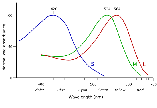
So, the more types of cone cells in his retina, the more colors a human can see. The 1% of people in the world that do not have L-cones are victims of color weakness or color blindness. Since red and green lights stimulate the other two types of cone cells in the same way, red and green look like the same color to them.
Let's see what colors animals can perceive:
There are a small number of tetrachromatic women in the world. Do you want to know if you are one of them? If so, take this vision test at Bilibili, and don't forget to disable the eye protection mode. So, the next time you hear your girlfriend rant about lipstick color codes, it's possible that she can really distinguish hundreds of different colors with her naked eyes!
Fun Fact: Most insects have five or six types of cone cells, and some crustaceans even have 12! So, in their eyes, humans are color-blind!
About 60 million people in China suffer from color weakness, and about 20 million suffer from color blindness, meaning about 5%-8% of men and 0.5%-1% of women in China are color-blind. Among them, about 6% have trichromatic vision (color weakness), about 2% have bichromatic vision (color blindness), and very few are monochromats (total color blindness). Now, we understand that partial and total color blindness are the results of a human lacking a certain type of photoreceptors in cone cells, and the color weakness is because the eye has a weaker ability to distinguish between a certain color due to the abnormal proportion of photosensitive pigments.
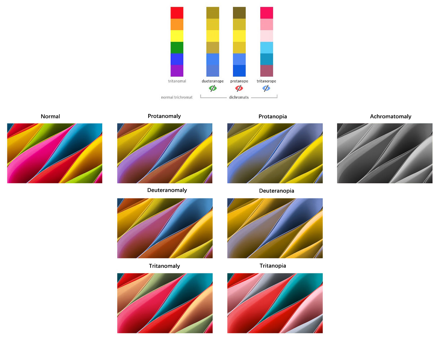
Some people with color blindness or color weakness also have serious vision problems. For example, one of the symptoms of blue cone monochromatism (BCM) is visual impairment, photophobia, and severe myopia. Therefore, in addition to the difficulties with identifying colors, these people with vision defects are likely to experience problems that healthy humans cannot imagine.

A BCM child has to lower his head very close to the desktop when writing.
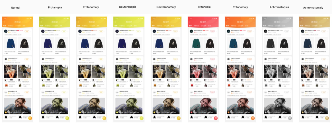
For that reason, it is necessary to consider this group of people when we research and design our products. Therefore, we have made a Sketch plug-in that renders a drawing board into the appearance in the eyes of each type of color blindness or weakness so designers and developers can easily notice the parts that are not inclusive enough in terms of color design.
A color model is a mathematical model that describes colors as value tuples. In modern printing, the CMYK color model is often used, whereas RGB, HSV, and HSL color models are commonly used in display systems.
In the RGB model, a specific color is produced when the three primary colors (red, green, and blue) are mixed at a certain ratio. For example, a yellow color is generated when 100% red and green are mixed. In practice, we map red, green, and blue to the x, y, and z axes in a cubic 3D space. Although RGB is the color model used by most display systems, it is not a human-friendly choice because our perception of color is often based on these questions:
RGB model can hardly bring us an intuitive solution because humans do not regard colors as mixed lights of red, green, and blue.

HSL and HSB(HSV) color models are more human-friendly, expandable solutions upgraded from the RGB model. HSL and HSV color models are virtually the same, except for the different definitions of brightness or lightness:
HSL and HSB models have the same definition for hue but are different in saturation, lightness, and brightness:
Taking the same color code #FF5000 as an example, the values in HSB and HSL look like this:
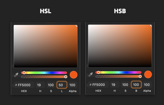
It is worth noting that CSS supports the HSL model, so make sure you have picked the right value.
CIELAB is an absolute color space defined by the International Commission on Illumination (CIE) in 1976, aiming at building a unified, perceivable, and device-independent space of color. L indicates the perceived brightness, and a and b are the four colors unique to human vision: red, green, blue, and yellow. All colors perceivable to human eyes can be found in this two-dimensional diagram. Each group of Lab** values accurately defines a color. Although these are abstract values, they look the same as expected in an accurate display system under suitable observation conditions.
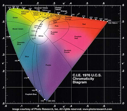
RGB and CMYK models are device-dependent, which means the same RGB value may look very different on different displays. Usually, it is necessary to convert the value to a specific common standard, such as sRGB or Adobe RGB.
In practice, the color modulation of Lab mode in Photoshop offers a smooth and comfortable experience because it best fits the way our human eyes perceive colors.
For an intelligent design, we need to transform the designer's experience to the rules or samples that machines can understand.
Many colors carry special connotations in a specific culture or domain. For example, in general, red implies danger or failure to reach the standard while green represents safety or success. However, such connotations change in different fields or countries. On the Chinese stock market, red is a sign of rising, and green is a sign of falling, but things are the opposite in the international stock market. That's why machines also need to understand specific application circumstances and the cultural background of target users.
Since the birth of the Internet, cross-cultural, cross-regional, and conventional color schemes have been formed for many functional components of websites. For example, prompts for successful actions, errors, failures, reminders, and links have fixed colors.
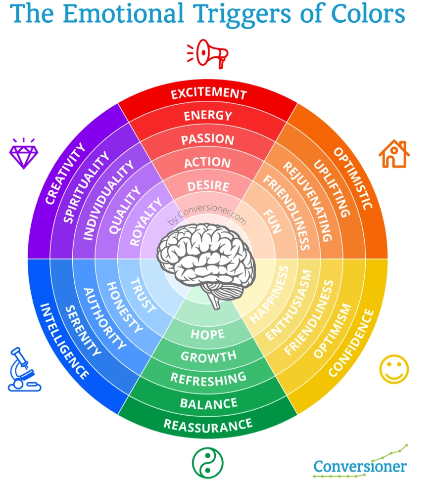
In addition to connotations, emotional expression is also an important aspect of color. Different color schemes will imply different emotions and may even have certain psychological impacts on the interpretation of information. Therefore, when using machines to generate colors, we need to consider the connotation and psychological implications of specific colors in a particular domain and culture.
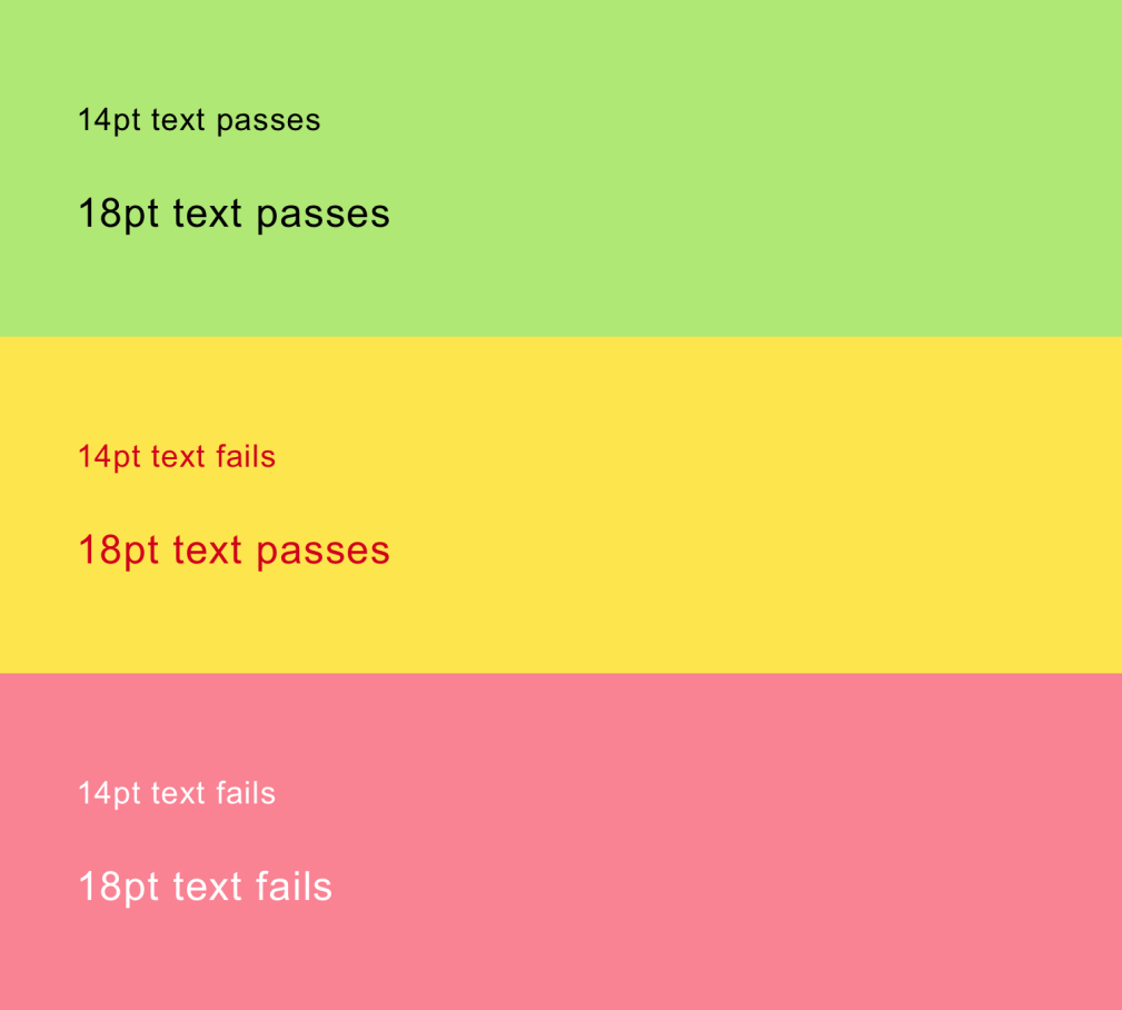
The size of the element has a great influence on the color saturation and contrast. In psychophysics, the concept "just noticeable difference (JND)" was introduced to describe the minimal change that humans or animals can perceive to a particular type of sensory stimuli. In an information visualization task, the color selection needs to be adjusted according to the size of the graphics so the expression of two kinds of information can be distinguished clearly. From the interactive demo by Connor Gramazio, you can see how each channel in the CIELAB color model is influenced as the size of elements changes. Similarly, when calculating the contrast of UI elements, we should also look at the size of the foreground and the background elements because the font size directly affects the final contrast value. We will dig deeper in this regard on the topic of the font size.
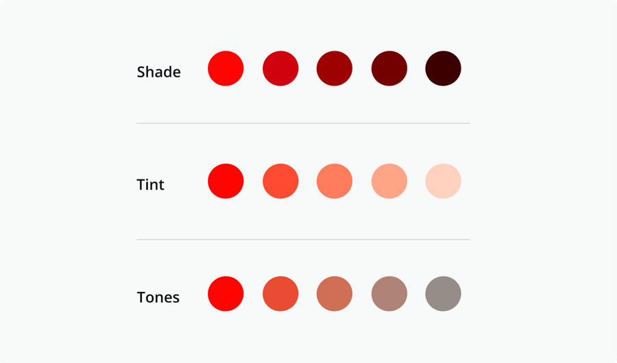
Shade is formed by mixing a color with black to reduce the brightness. Tint refers to mixing a color with white, which will increase the brightness. Tone means to mix a color with gray, and the mixed color is usually darker but softer than the original solid color. The above three-color modulation methods mix a solid color with a neutral color (gray, black, and white) to reduce the saturation, but the hue remains unchanged.
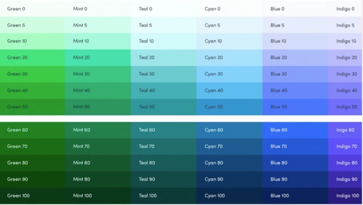
It's better to distinguish the intensity selected in light and dark modes.
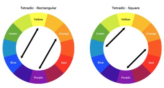
Generally, a great color scheme is selected on a color wheel (a circular color scale) by the following methods:
This method is to select opposite colors on the color wheel. This is not used in practice unless a very strong visual contrast is needed.
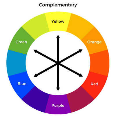
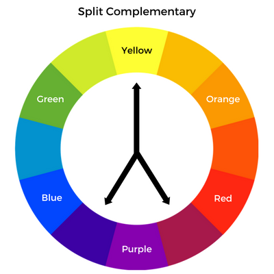
This method causes slightly less visual impact than the complementary method.
A naturally harmonious color scheme is selected.
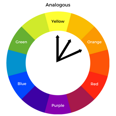
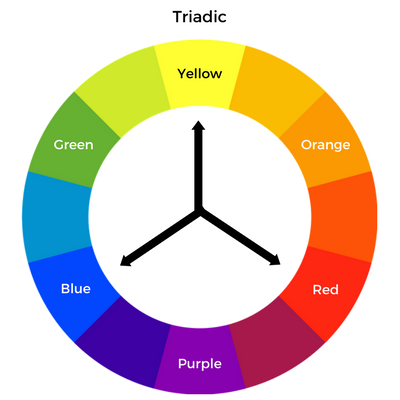
It is better to choose one of them as the primary color and others as the secondary colors.
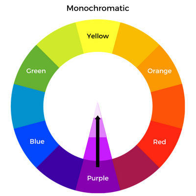
Black or white is blended with a solid color to produce variants with different lightness.
A very practical application scenario is that hundreds of millions of users of the Taobao mobile app are using the skin change function, but only for the five icons on the tab bar at the bottom of the homepage and the navbar at the top of the five pages. Apparently, this is not as expected by users that are often looking for global skin change. Assuming that all modules of a page are configurable, how can we generate and replace all colors based on the theme color when the user taps on the Apply button to change the skin?
First of all, each skin color palette must have a theme color. Let's take "icy blue" as an example. Its theme color is #3173E5 (H:218, S:79, B:90). So, how can we change the theme color for the search button at the top, the icons in the "golden area" below it, and the various elements in business-mindset-boosting brand colors across the page?

For example, the cat head icon for New Arrivals has gradient colors (H:11, S:75, B:100 - H:347, S:100, B99). We can keep their saturation (S) and brightness (B) unchanged and set the hue (H) value to the desired theme color (in this case, 218) to get the new skin color.
Some may jump out and ask, what about the "business mindset"? The primary brand color of our business is changed, but we must convey a consistent business mindset to consumers. Well, the answer depends on whether we want to make a product with a better visual experience or put some questionable, subjective business demands on top of the user experience. It is pretty reasonable that the color of an icon changes with the skin selected by the user because no one knows it means "New Arrivals" just by looking at a red cat head icon.

Here, we don't elaborate on what degree of skin change is reasonable. It's the job of PMs and PDs. We simply focus on the solutions for such application scenarios, which can be implemented by changing the hue. This way, machines can follow the rule and generate new designs automatically.
For the accessibility solution, a core principle is that the contrast must reach a certain value, or users may have a poor reading experience. Web Content Accessibility Guidelines (WCAG) 2.0 suggests that the contrast ratio of foreground to background should reach at least 4.5:1 or level AA. The enhanced version should reach 7:1 or level AAA. How can I check the contrast? There are many options online, such as Color.review, WebAIM, and CONTRAST CHECKER.
The Assistant in Sketch can also give the result:
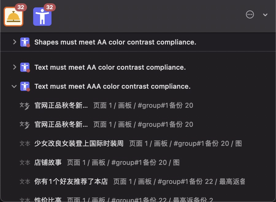
After getting the contrast result, how do we drive the machine to make color corrections automatically? Before revealing the answer, let's see how the contrast is calculated:
The contrast is the comparison ratio of the relative luminance of two colors. The calculation formula is (L1 + 0.05) / (L2 + 0.05), and the value range is 1:1 to 21:1. L1 is the relative luminance of the lighter color, and L2 is the relative luminance of the darker color. Note: Here, the relative luminance has nothing to do with the L in the HSL model. It is the normalized value from the darkest 0 to the brightest white 1. The calculation method given by WCAG is converted from RGB values because most web systems today apply the RGB model:
For the sRGB colorspace, the relative luminance of a color is defined as L = 0.2126 R+ 0.7152 G+ 0.0722 *B
whereR,GandBare defined as: if RsRGB<= 0.03928 thenR= RsRGB/12.92 elseR= ((RsRGB+0.055)/1.055) 2.4 if GsRGB<= 0.03928 thenG= GsRGB/12.92 elseG= ((GsRGB+0.055)/1.055) 2.4 if BsRGB<= 0.03928 thenB= BsRGB/12.92 elseB= ((BsRGB+0.055)/1.055) 2.4
and RsRGB, GsRGB, and BsRGBare defined as: RsRGB= R8bit/255 GsRGB= G8bit/255 BsRGB= B8bit/255
Therefore, to reach the contrast standard, you can simply move the foreground or background color down to below AA (4.5) or AAA (7).
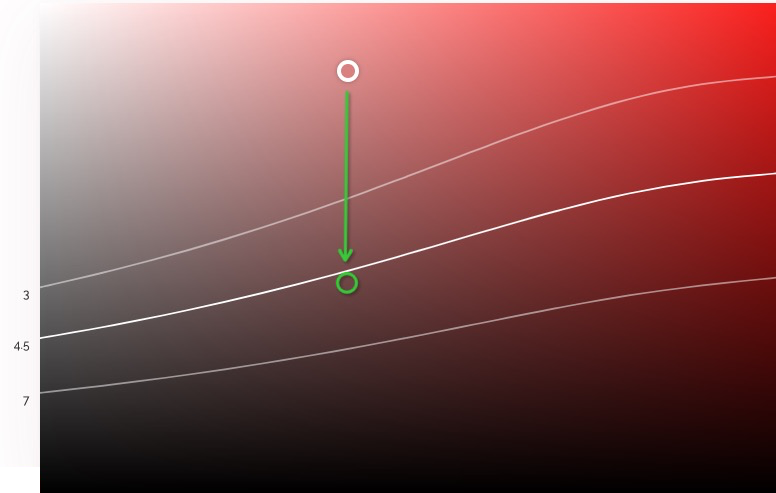
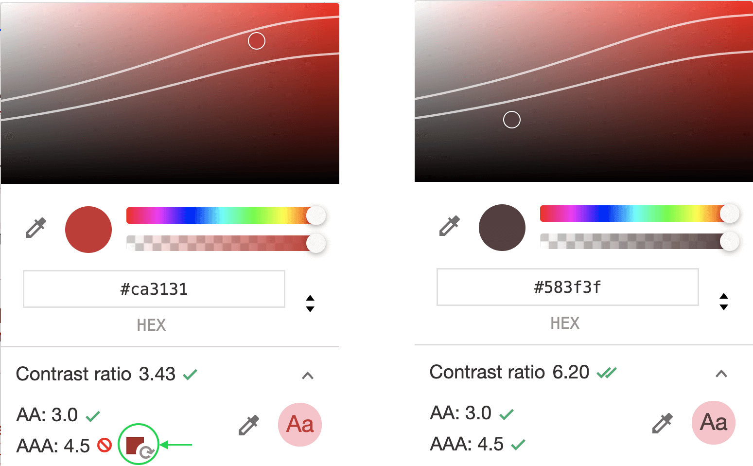
There are already some proven solutions in the industry. For example, Chrome DevTools provides intelligent color recommendations based on contrast standards within the inspector:
Leonardo is an open-source project of Adobe that generates expected colors based on the input theme color, variable primitive colors, and expected contrast.
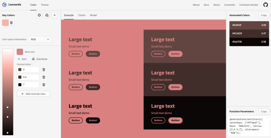
In the following example, if we set the background as the theme color and the foreground as the variable primitive color, we can get new UI color codes that meet the AA and AAA standards through this calculation method.
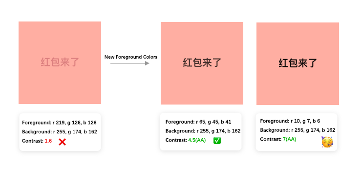
In real-world applications, we only need to determine whether to change the foreground color or the background color (usually the foreground color) according to the results of the contrast check. We can use this calculation method to generate new color codes conforming to AA or AAA standards.
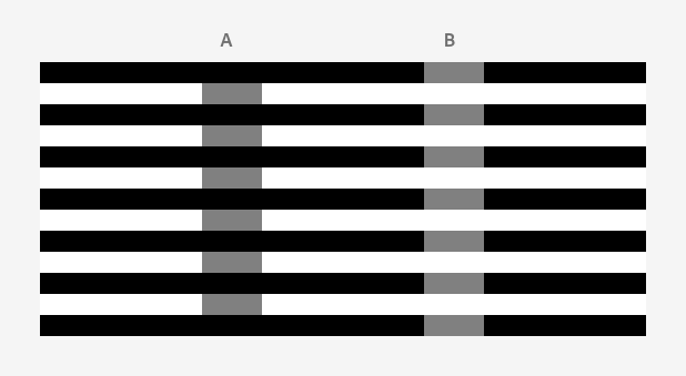
When we switch into night mode, the background will change from bright white or light gray to black or dark gray. However, the colors of most foreground modules and elements do not change with it. This often causes reading difficulties. Look at those small gray blocks in the figure below. The blocks of columns A and B look very different, right? However, the color picker tells us that their color codes are both #808080. We are deceived by our brain because different background colors can twist our perception of the same color.
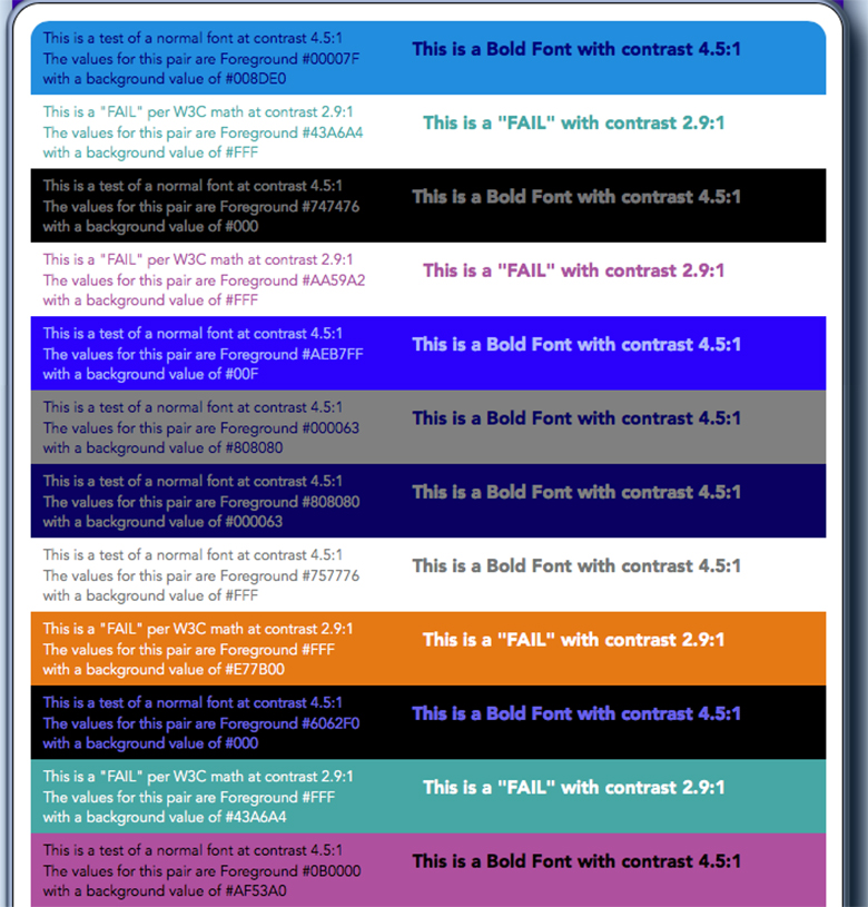
In the following figure, the icons and texts have the same color and quite similar contrast. However, the UI information on the white background is far more legible than the one in night mode. This is a shortcoming of existing contrast check methods.

While contrast calculation methods today help us identify problems in most cases, due to the defects of the algorithm, a satisfactory contrast standard test may not necessarily ensure a comfortable reading experience (or vice versa), as shown in the following figure. This is because the contrast perceived by our brain is different from the result of a fixed mathematical formula; just look at the example above.
To achieve a better experience in night mode, we need to adjust the brightness and saturation of the foreground elements altogether, which requires an adaptive web design system. A Leonardo demo has realized such a global, automatic chromaticity change when switching from the light mode to the night mode.

Emotions are often affected by the surrounding environment. For example, in hot weather, the low saturation, "cold" colors can often cheer people up. When we are nervous, red and orange may make us more anxious, while blue and green can calm us down and make us feel relaxed. Therefore, if we know the current season, lighting, location, or even the real-time intention of the user, we can change the UI color accordingly to offer a more intelligent and considerate user experience.
Having talked so much about knowledge and application scenarios, how can we create a color system that can work efficiently and flexibly for intelligent design and production?
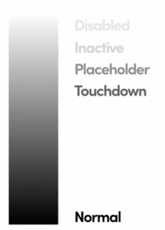
To build a comprehensive brand visual identity, we usually design a two-layered brand color palette that includes primary and secondary colors. Tertiary colors are sometimes added to the UI design with neutral colors (black, white, and gray) for lines, fillings, and texts. In addition, a series of functional colors are used for warnings, prompts, successful actions, errors, help messages, etc. In a product that emphasizes data presentation, visual data colors are added. On the other hand, different colors may imply different statuses. For example, we use different background color intensity for a button to indicate its statuses, such as disabled and touchdown.
TinyColors.js provides a series of methods for generating color codes of the same hue or multiple hues. Adobe Color is a powerful tool to help designers pick and generate colors, create color palettes from images, and simulate colors seamlessly. ColorBox allows Lyft designers to create color palettes based on JSON. Designers can also export the new color palettes as JSON and pack them into an NPM package. For better gradient color palettes, Ant design has explored three methods: generate the palette based on tint or shade and use the Bezier curve to take the primary color value, pick colors from the color wheel of the HSL model to generate the palette, and use HSV model to decrease or increase the values of H, S, and V, respectively. However, there are still some contrast problems and inconsistent effects of different hues in the case of extremely dark and light colors. These are all great independent tools, but we have not seen many applications.
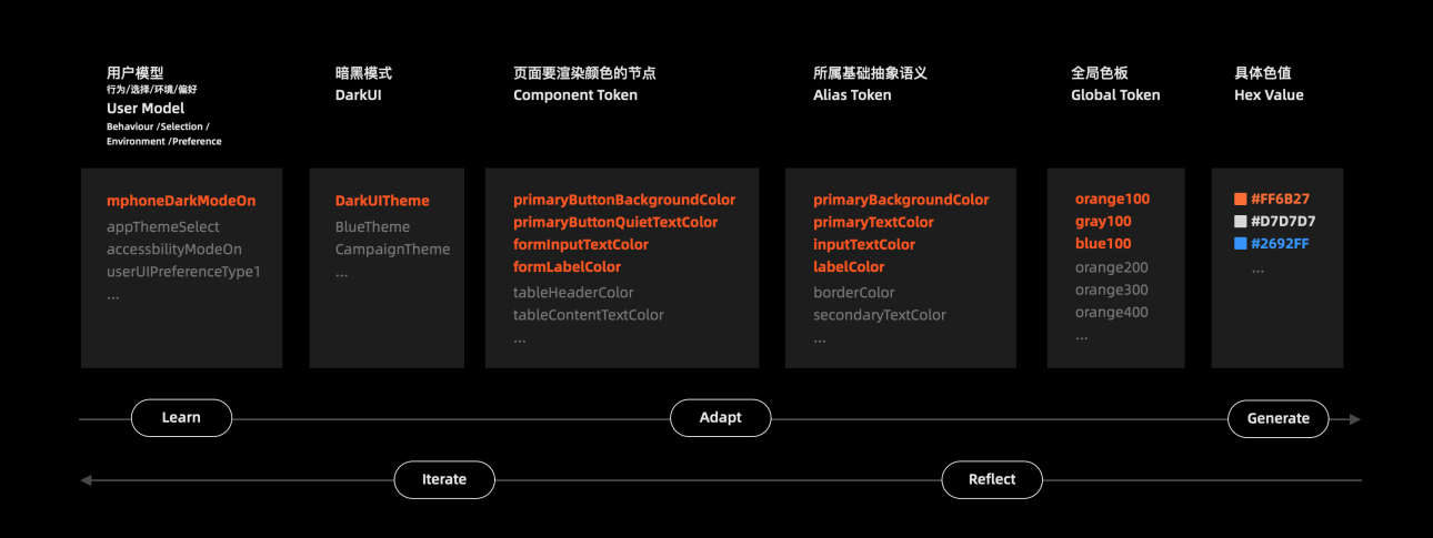
First of all, the Design Token method based on the design system management (DSM) and interfacing the engineering system requires a set of nomenclature and definition specifications that meet different needs and can be applied quickly under the circumstances with different connotations.
One of the scientific methods is to define the color codes of global palettes from extensive scenarios and connotations, narrow them down gradually, and reference and name them level by level until the specific scenario:
//Define a reference palette with no special connotations.
purple100: rgb(184, 121, 240); //Lavender
purple200: rgb(159, 101, 208);
purple300: rgb(130, 80, 170);  //Dark purple

//Some basic connotations
primaryBackgroundColor: $purple200; // Background
primaryTextColor:       $purple300; // Text color

//A specific scenario
primaryButtonBackgroundColor: primaryBackgroundColor; // The background color of the primary button.
primaryButtonQuietTextColor:  primaryTextColor; // The text color of the primary button.
Under this nomenclature specification, we can build an intelligent and adaptive color system by defining a specific scenario as needed and generating a reference color palette or new color codes as per the rules. This way, any changes to the reference color palette can be applied to all relevant components and nodes, making the palette the engineering basis for generating new UI themes on a large scale.
Status Quo and Future Outlook of Frontend Intelligence Development

66 posts | 5 followers
FollowMiSand - February 27, 2020
Alibaba Cloud Native Community - May 8, 2025
Alibaba Cloud Native Community - August 12, 2025
xungie - November 23, 2020
Alibaba Clouder - December 19, 2018
Alibaba F(x) Team - January 24, 2022

66 posts | 5 followers
Follow Platform For AI
A platform that provides enterprise-level data modeling services based on machine learning algorithms to quickly meet your needs for data-driven operations.
Learn More Epidemic Prediction Solution
This technology can be used to predict the spread of COVID-19 and help decision makers evaluate the impact of various prevention and control measures on the development of the epidemic.
Learn More Super App Solution for Telcos
Alibaba Cloud (in partnership with Whale Cloud) helps telcos build an all-in-one telecommunication and digital lifestyle platform based on DingTalk.
Learn More Machine Translation
Relying on Alibaba's leading natural language processing and deep learning technology.
Learn MoreMore Posts by Alibaba F(x) Team