By Chen Qiang, nicknamed Chensha at Alibaba.

In this age where just about everyone needs to put on the hat of a data analyst, almost all Alibaba employees, and employees elsewhere, are involved in the processes of data collection, processing, and consumption. As a part of this, data visualization is an important piece of connecting data processing to consumption, and its quality is crucial. An excellent case of visualization can make for compelling insights, whereas poor visualization content makes all your hard work worthless. Today, Chen Qiang, a senior product manager with Alibaba, will introduces data visualization tools and explain how to select an effective chart.
In my area of enterprise data management, the level that I see data visualization is taken to on a day to day, especially in PowerPoint slides and reports varies greatly. Today, we will provide my general thoughts, and suggestions about how to use data visualization tools effectively.
In particular, we will offer suggestions about the following processes:
First, I would like to talk about the three goals of data visualization: accuracy, clarity, and elegance. Charts that meet these three goals are called efficient data visualization charts:
In addition, these three goals are ranked by importance: accuracy > clarity > elegance. In principle, you should be following all of the underlying principles.
The question is, how can we select convenient tools to help us meet these goals? In fact, efficient data visualization can be roughly divided into two types based on different purposes from Cole Nussbaumer Knaflic's video interview:
The feature information or value of target data are known, and the main purpose is to convey insights and explanations to others. Therefore, the refinement of presentation is your main goal.
The feature information or value of target data are unknown. The main purpose is to analyze and explore data. Therefore, fast and efficient data interaction is your main goal.
Before you begin, think about your intentions. Generally, you cannot do everything at once. Although flexible data transformation and refined data representation are not conflicting, it is difficult to balance them. This leads to a certain bias in the available tools. Simple and easy-to-use BI tools can help us quickly complete visualization, but the content may be unsatisfactory. Theoretically, some professional chart code libraries can be adjusted to fit any details, but this method has obvious disadvantages in efficiency and ease of use that is a threshold.
In principle, tools are not good or bad. "Good" and "bad" are only relative terms. In fact, many tools can help produce attractive and effective visualized content while being easy-to-use. I conducted a qualitative evaluation of the common types of representative tools from a personal perspective. These are my results below.
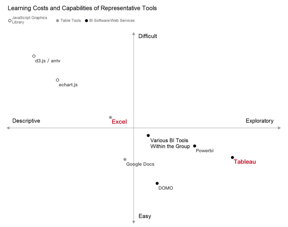
Here I highlighted Excel and Tableau. As the most popular and well-known BI software in the industry, Tableau is easy to use and produces excellent visualization results, helping you analyze and explore data. Microsoft Office Excel is a product that is seriously underestimated by most people. It can easily fine-tune various charts and draw beautiful data charts.
If you do not have any preexisting inclinations, Microsoft Office Excel is very suitable as your first data visualization tool for in-depth research.
Putting aside some professional theories, we cam simply divide the steps for creating charts into three:
For Step 1, you need to consider the information conveyed by the data itself and your own insight, and list such information clearly. This helps you to choose an appropriate visualization method. Next, I will introduce the general methodology. This is not a simple example of choosing a column chart or a pie chart.
First, let's look at two figures:
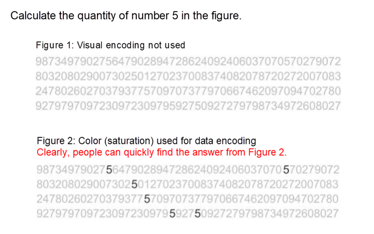
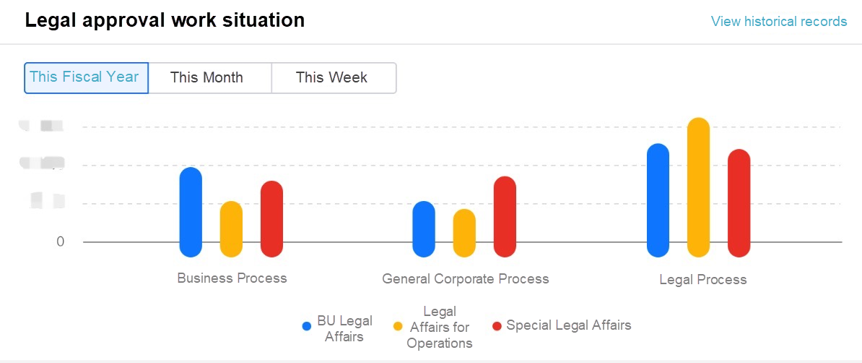
When visual encoding (color) is used to convey information, it is easier for people to understand the features of the original data.
For example, in a common column chart, we use the "height" and "relative position" of columns to convey two sets of data information. Column charts are often easier to understand than spreadsheet data that are not encoded.
We need to get familiar with two important concepts: visual encoding and visual channel. If the human brain is regarded as an information decoding system, visualization is the encoding process of information or data. After the information is visually encoded, the content is transmitted to the brain through the eyes, and the brain decodes the information and obtains knowledge.
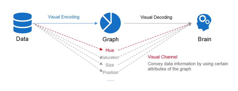
Then, if there are so many visual channels for charts, how can we select appropriate visual channels for mapping data? Data types and the expressive force of visual channels need to be comprehensively considered. I'll explain the basic theory in detail here.
Generally, data is divided into three types: category, order, and number. Apples and bananas belong to a category, dates belong to an order, and 5,000 in profit is a numeric value. In many commercial visualization tools, ordered and categorized data is called dimension data, whereas numeric data is called measurement (metric) data.
The visual channels that are applicable to dimension data and measurement data are very different. For example, color hue applies to dimension data, but not to measurement data. Select the correct visual channel to transmit information more efficiently.
In the book titled Data Visualization by Professor Chen Wei of Zhejiang University, four indicators are used to judge the expressive force of a channel:
A deep understanding of these standards can help us comprehend the reasons behind some suggestions for visualized chart modifications.

This set of measurement data reflects the rationality of some production experience in scientific ways. For example:
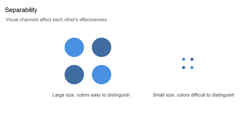
Separability refers to the idea that multiple visual channels cannot be used without restrictions. Every time a channel is added to map data, the impact on existing encoding methods must be considered. In particular, the addition of size can affect the effect of other visual channels.
Let's take a column chart as an example. The column chart in the following figure uses width to map a measurement field, but the width affects the effectiveness of the length. Simultaneous use of the two channels tends to make the area become the visual channel, which will impact the overall effect of the chart.

A colleague asked me why I did not add the "rounded corner" function to the columns in the column chart. In fact, it is also due to this reason. Excessively rounded corners will cause a loss of accuracy in the length, damaging the overall expressiveness of a chart.
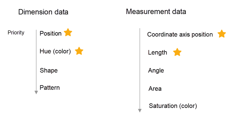
Academically, there is a long list of expressive priorities for visual encoding of data. Here, I'll simplify these concepts and provide only one list of recommended visual channels. Theoretically, these channels can be used together. Of course, you should select the best solution based on your actual situation.
Another effective practice is to not build a visual solution from scratch. Instead, add visual channels to the most basic statistical chart types, and then make continuous attempts to achieve the expected results. Not all charts can use all visual channels. For example, an administrative map does not have the length channel.
For chart design, good visual encoding is the most important point. In addition, data screening is also a challenge. Too much information will make the chart look chaotic, causing cognitive overload. For visualized content built in JavaScript, data interaction is also a focus of attention.
Generally, articles on visualization measure the load by using the data-ink ratio. Unreasonable design will convey excessive, redundant, or meaningless information to the audience.
First, we need to pay attention to whether too much data is presented or visual channels are misused.
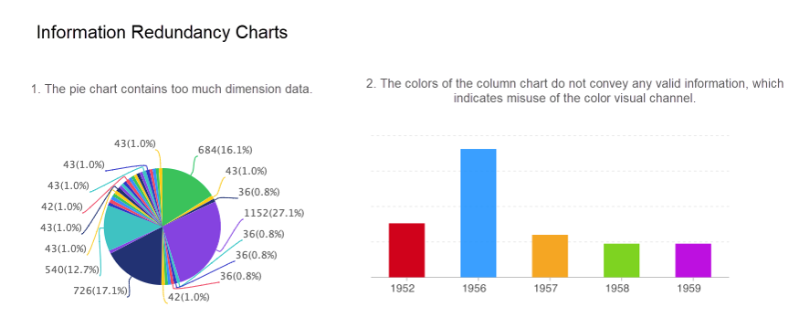
Second, we can use the Gestalt principles to simplify or optimize our chart elements and reduce the cognitive load.
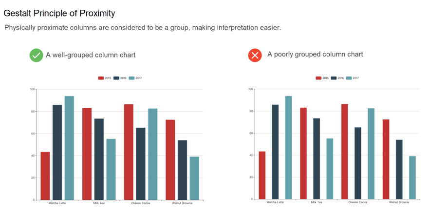
The Gestalt principles consist of eight items. Here, I focus on the most important items among them: the principle of proximity, principle of similarity, and principle of closure.
People tend to perceive physically similar elements to be a whole.
Let me show this simply in a line of dots:
... ........ .......You may naturally think that these are three groups. By using this psychological phenomenon, we have built a typical grouped column chart.
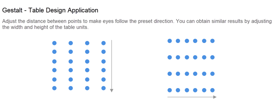
This can also be used to guide users to read the tabular data from Cole Nussbaumer Knaflic's blog:
Objects with similar attributes such as color, size, and shape, tend to be considered to be a whole or be correlated.
This psychological phenomenon, coupled with color hue, can easily promote visual prominence and allow us to quickly notice the processed target data. The preceding example that includes number 5 shows the principle of similarity.
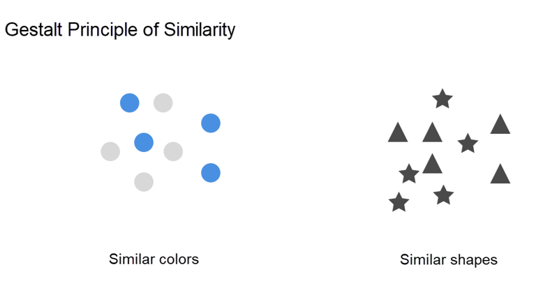
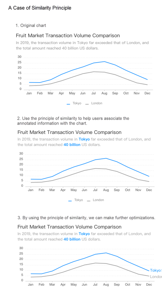
From my personal experience, color is the best visual channel for applying this principle. We can use a legend to map the legend information to the content in the chart area, and simply put, this psychological phenomenon is also in effect here.
We can further use this effect to help users interpret charts.
People tend to consider factors that are enclosed together as a single group.

The principle of closure is often used for annotation. The use of a small amount of "ink" can make the target area more visually prominent. Let's further process the preceding case of the principle of similarity to describe the effect of the principle of closure.
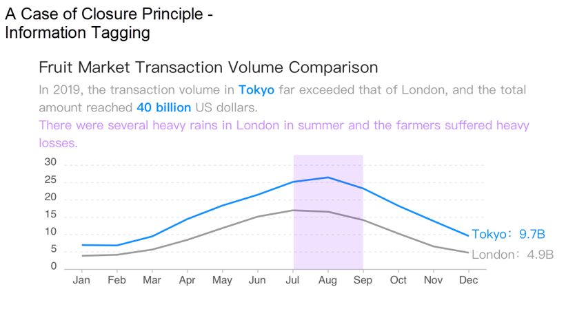
Flexible use of the Gestalt principles and visual encoding of features is an important skill for data visualization in specific charts.
When we see a chart and point out the defects of the chart based on our aesthetic experience, we may as well reflect on which psychological principle this defect violates or whether the data-ink ratio is imbalanced.
I have a lot of practical experience in visualization. Here I want to further emphasize the enormous impact of position and color.
Position is a rich concept. Every element in a chart is placed in a position. You must be careful with the position attribute of elements. You need to think about the positions of axis labels, the position of the description text, the position of the title, the position of the legend, or the relative position of the graph itself. You can adjust the chart structure to make it easier for users to understand the information you want to convey.
Color is the most important and the most easily abused visual encoding method. Color has three variants: hue, saturation, and brightness. Color variation also stimulates people's emotions. Therefore, the use of colors must be carefully considered by chart creators. Here are some practical tips:
There are a lot of online resources. Before selecting a chart, you need to figure out the goal that your data is to convey. Data analysis is varied. To summarize, there are no more than four goals: comparison, focus, induction, and deduction. Based on these initial goals, we will choose to instantiate it.
The following figure shows widely circulated suggestions about charts:
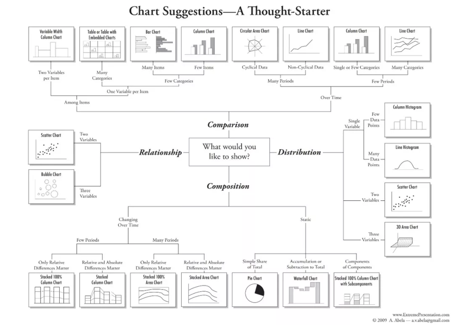
The UK's Financial Times has also published relevant suggestions:
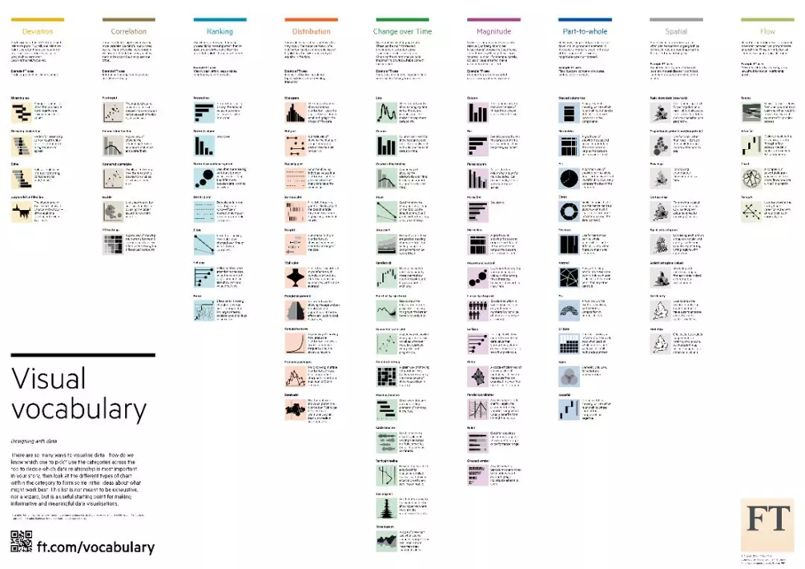
For the visualized data analysis that the technical personnel should never ignore, here is a source image download address for the suggestions from the UK's Financial Times (zoom in out to see the words clearly): https://alitech-public.oss-cn-beijing.aliyuncs.com/1567064473032/shuju%20fenxi.png
Generally, before creating a data chart, you need to work through the processes of data collection and processing. Consider MaxCompute for example, which is familiar to Alibaba developers, as an example. The following figure shows a simple process:

In order to meet certain design specifications, maintenance capabilities, and robustness, most data warehouses do not allow the upper-layer applications of the data warehouse to perform customized intrusion design. However, the data formats required by different types of applications are different. In the field of visualization, for final chart production, making some adjustments to the data is very common, especially by using BI software for mapping. The adjustments include but are not limited to the following:
For a clustered column chart for data comparison and analysis, different tools have different configuration methods for data interaction. The row and column data in the table needs to be flexibly converted to meet the corresponding software requirements.
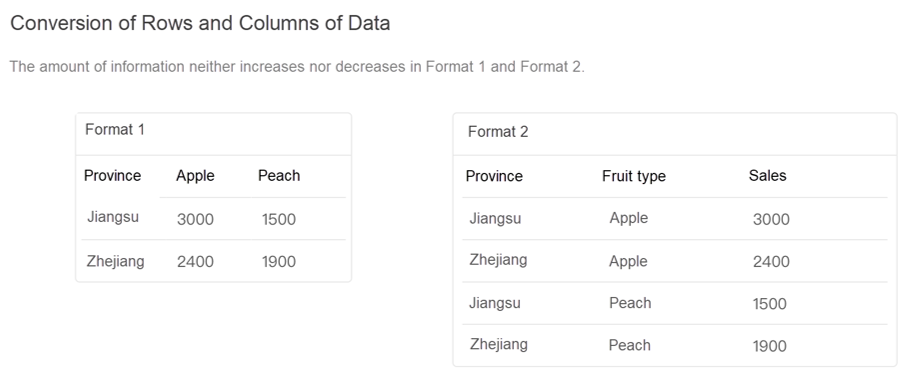
The data in the original table may contain only feature data such as "ID", "XXX code", and English content. To make the final visual processing effective, and make the chart easy to interpret, we need more additional data for association processing. For example:
This type of conversion needs to be combined with certain specific scenarios. Generally, the original table provides only raw data, while specific scenarios provide data conversion rules. The following is a typical example:
Abnormal data is unavoidable in raw data. Erroneous data, or dirty data and test data, and unreasonable data can be collectively referred to as abnormal data. If such data is not removed, the final effect of the visualized presentation is directly affected. Then, the analysis effect and decision-making efficiency are affected. Before you create a chart, make sure that you have completed this step.
Unreasonable data is also relative to specific analysis scenarios. For example, we set a data metric to measure the performance of telemarketers. That is, an average of three successful deals per week means that the telemarketer is excellent. To meet this scenario, we need to remove "interns" from relevant data, or specifically, employees with too few years of work.
For the effect of visualization, we need to focus on ambiguous and "extreme data." The existence of such data can sometimes affect the presentation of our content.
These three data values are typically ambiguous data. In some scenarios, they express the same meaning, whereas in other scenarios they represent quite different information. I use an exam as a case to compare the differences among these three data values:
When visualizing representations, make sure to pay attention to accurately represent data.
Extreme data refers to an extremely uneven distribution of data, such as "Among 100 pieces of data about sales distribution of a product, one piece of data shows 100,000, while the remaining 99 pieces are between 0-1,000." In the graph that genuinely represent the actual data, it will be difficult to see the feature information of most sample data. Corresponding processing steps, such as removing and shortening extreme data, and interpreting the corresponding text, need to be taken for this specific business scenario.
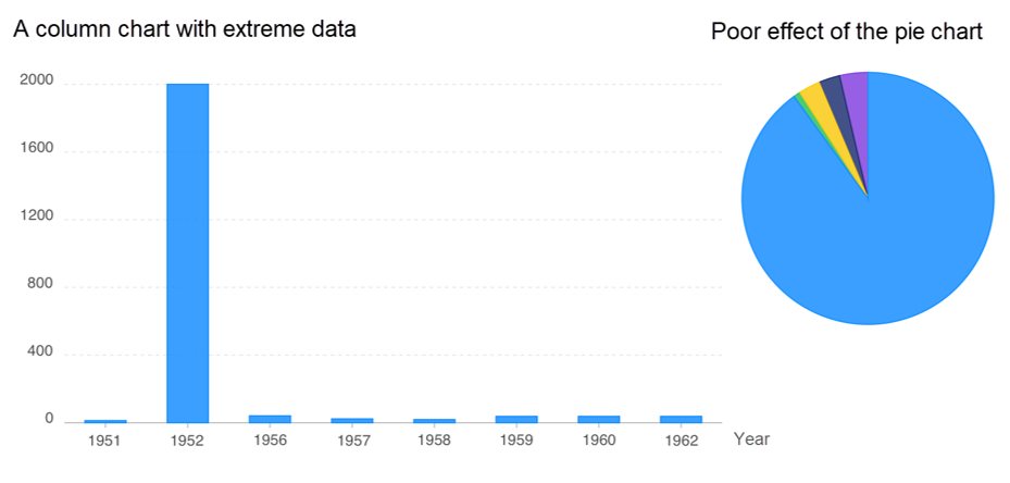
When using BI tools for visual representations, you need to pay attention to the size of raw data. Generally, the performance of the server where software services are located is not unlimited. An appropriate size of data can help you achieve the best performance from interactive presentation.
When the raw data volume is too large, you can remove some fields and aggregate the data according to actual scenarios.
In addition, most tools support "derived fields." As far as possible, solidify such derived data in the "materialized" or "entity table" phase, which can help improve performance. For derived data that needs to be computed by business intelligence (BI) software, the computing process determines its performance:
Computing in the process of storing data as a physical table or a physical data model > Computing through online analytical processing (OLAP) > In-memory computing > Computing that leads to data transfer from internal memory to external memory
This article has briefly introduced some data visualization techniques, but these are far from complete. To achieve the best practices of the data visualization field, you will need to acquire a large amount of knowledge and apply this knowledge flexibly.
Here is an excellent case of optimizing a visualized chart. The original material is from the English blog of Cole Nussbaumer Knaflic. If you are interested, you can check out her blog for more useful information. Mike Bostock, the author of D3, has also produced a large amount of high-quality visualized content, which is worth learning from.
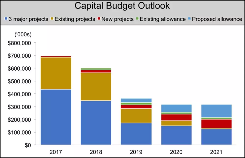
At first glance, there are no mistakes in this chart, but the blog author has identified the following areas for improvement:
In fact, there are other hidden improvements that have not been pointed out:
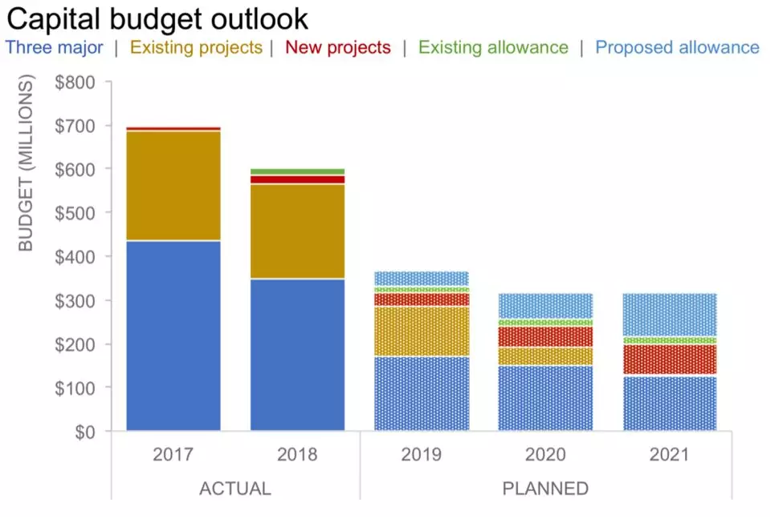
Here, the author removes the square bullets in the legend and colors the text. This solves the problem of legend recognition.
At this moment, the author encounters a difficult situation and does not know how to further improve this legend. However, obviously, the data-ink ratio is too high with many relatively bright colors, and both the color and pattern visual channels are used in the improved version 1. There is too much ink, but no more data information is conveyed obviously.
Therefore, the author made various analyses in the improved version 2. It is worth learning to remove interference by using black and white as shown in the following figure. Some design students may be familiar with this method. Colors can interfere with a designer's judgment. Product directors usually use black and white when drawing a prototype.
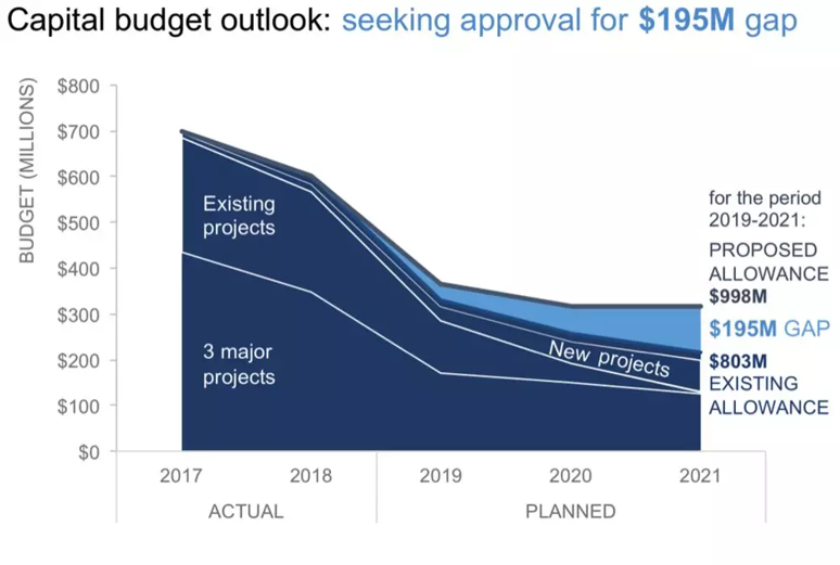
The budgets of the three major projects decreased significantly from 2018 to 2019, and then decreased slowly over time:
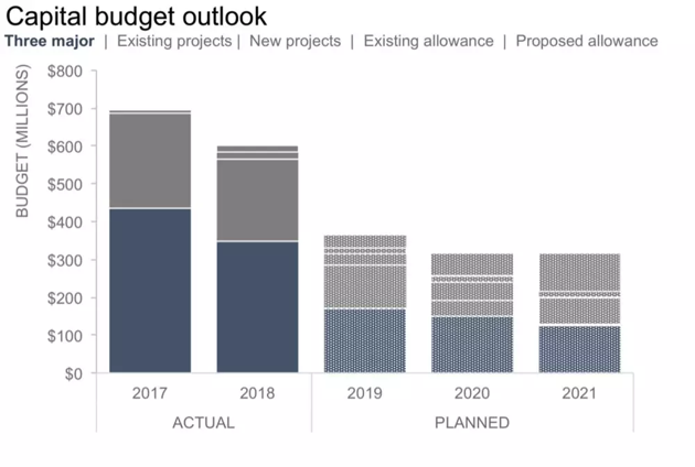
Other projects also show a downward trend:
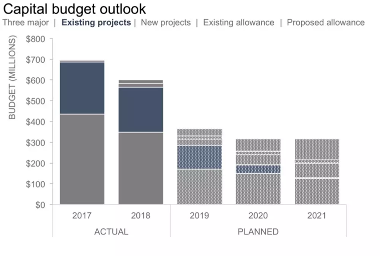
The budget for new projects is increasing significantly:
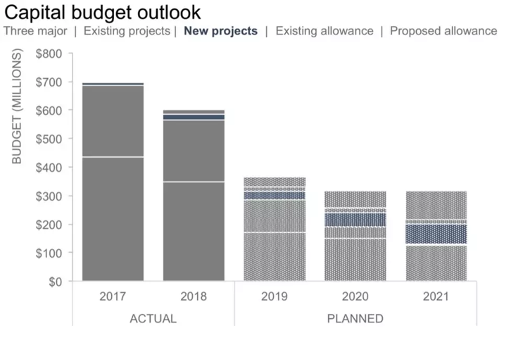
The other two analyses are similar:
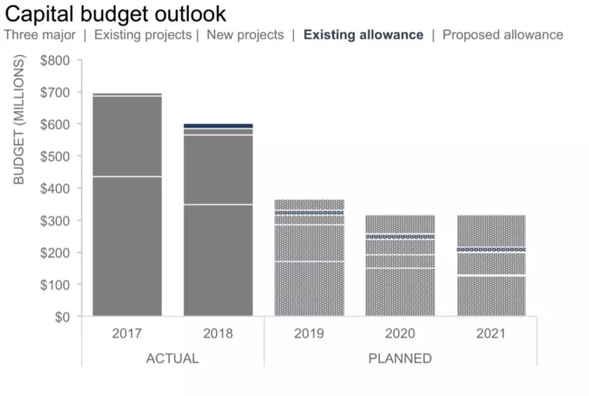
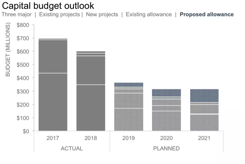
The author analyzes some data features in the improved version 2. Obviously, these features are not represented in visualization, and the chart still has room for improvement.
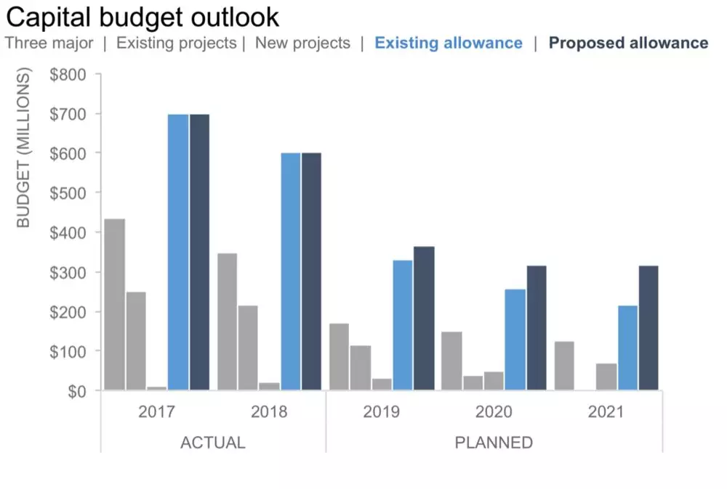
In the three improved versions, the author uses the customer's brand colors. This method is usually very useful, unless the customer's brand colors are too many and too bright.
In addition, the author guides the user perspective to the existing allowance and the proposed allowance.
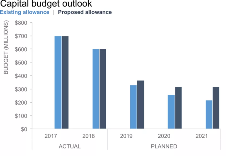
Obviously, we have seen the rule for two groups of data. Then, how can we convey this rule more easily to users and make it more easy-to-understand through visualization? The author improves the chart label format.
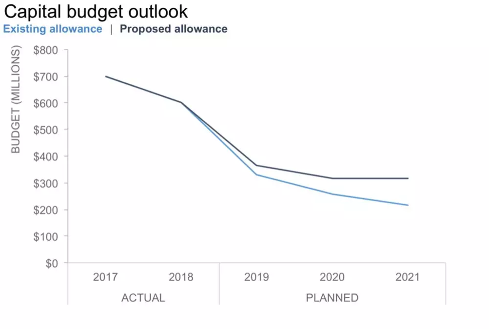
At this step, the improvement is quite successful. It seems like the addition of all the previous information alone is enough, but the author has further insight. Users need to pay attention to the relative difference between the two lines. Therefore, the improved version is also updated as follows:
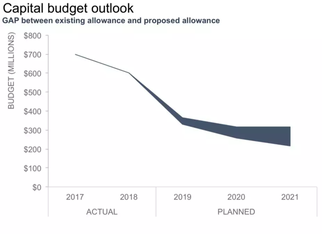
Next is the final process. The author uses a suitable format to add personal insights and interpretation into the chart.
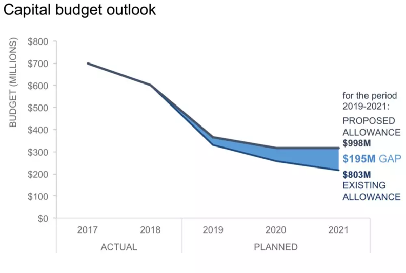
The author inserts the previously ignored data into the chart in an appropriate way, and uses annotations following the principle of similarity to establish associations between the graphics and the text.
Alibaba Clouder - March 20, 2020
Alibaba Clouder - November 30, 2018
Farruh - February 19, 2024
Alibaba Cloud Native Community - January 8, 2026
AliCloud-TechLab - August 25, 2021
Alibaba Clouder - May 24, 2019
 MaxCompute
Conduct large-scale data warehousing with MaxCompute
Learn More Realtime Compute for Apache Flink
Realtime Compute for Apache Flink offers a highly integrated platform for real-time data processing, which optimizes the computing of Apache Flink.
Learn More Hologres
A real-time data warehouse for serving and analytics which is compatible with PostgreSQL.
Learn More Data Lake Analytics
A premium, serverless, and interactive analytics service
Learn More