A button is a type of interactive widget. You can customize the color, size, label content, and jump link of a button in multiple states. You can use this widget to display the link page or prompt information in a visual chart. This topic describes how to add and manage a button widget.
Prerequisites
A data dashboard is created. For more information, see create a Visualization Screen task.
Add Button Control
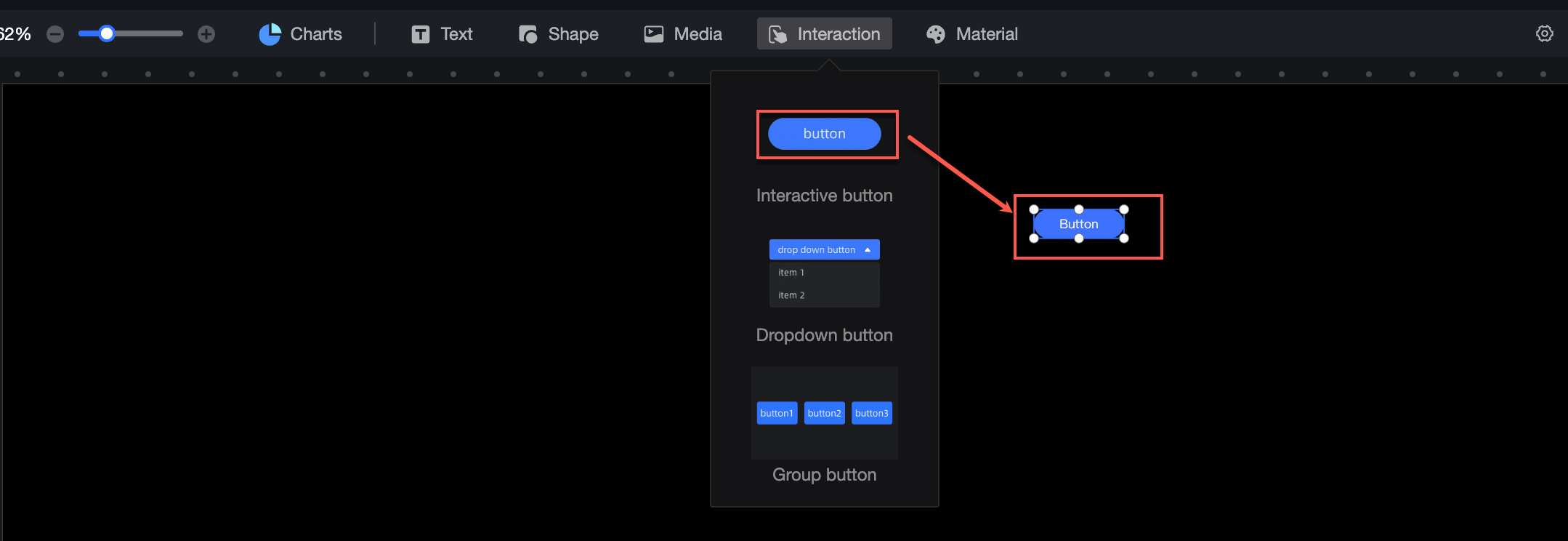
On the dashboard edit page, click Interactive in the top navigation bar to add a button.
Layer Events
You can configure the widget text in the configuration section as follows:
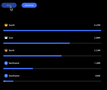
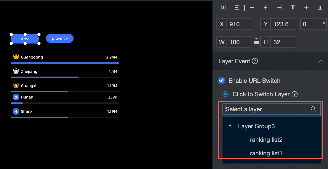
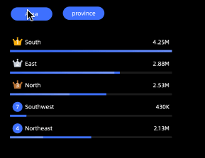
Set Click to Switch Overlay Layer: You can place the button and the switchable object (layer group with layer overlay enabled) in the same layer level. You can associate the button with the layer that you click to switch in the drop-down list.
Effect drawing:
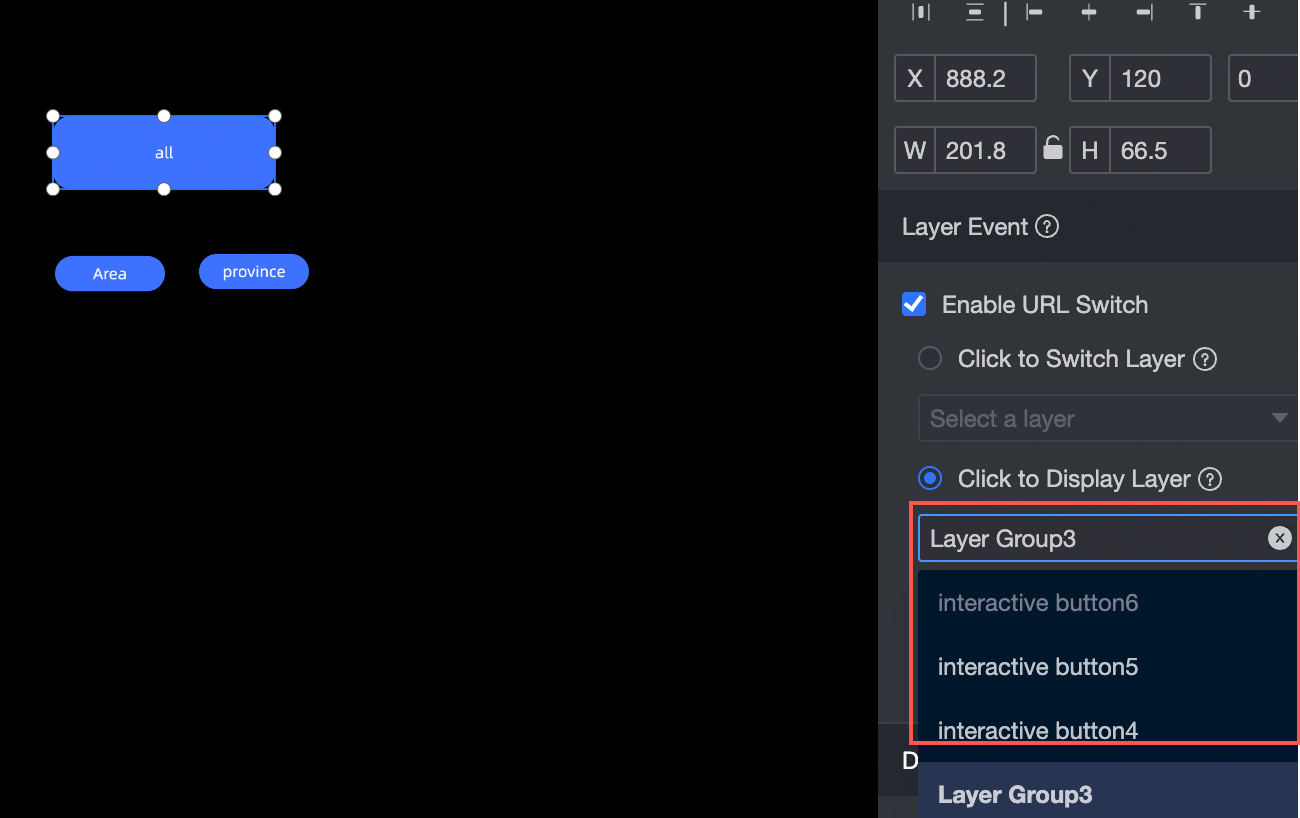
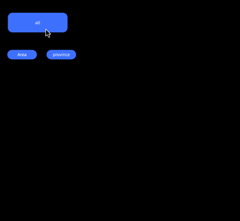
Set Click Pop-up Layer: You can select the object that pops up after you click the button in the drop-down box. The pop-up object must be a layer or layer group on the layer root node.
Effect drawing:
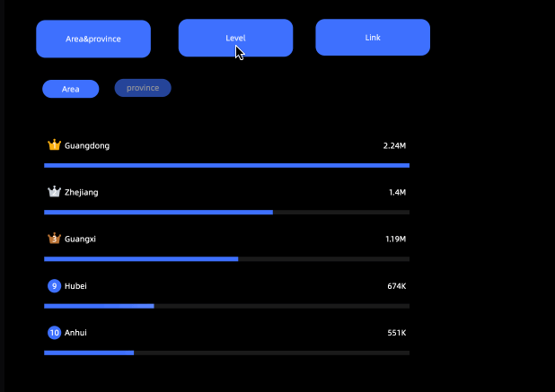
Set the click jump page:
Internal: supports redirection of internal overlay pages.
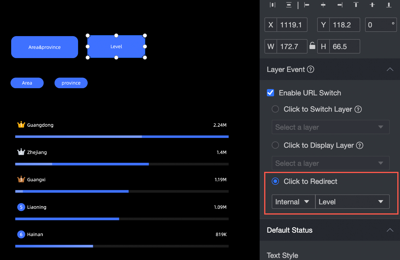
Effect drawing:
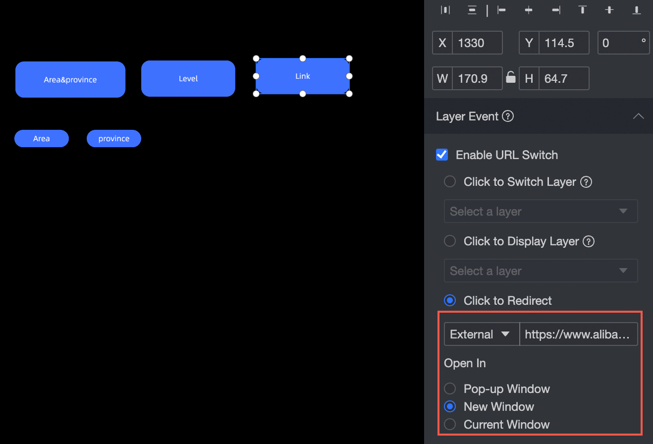
External: You can insert external links. Open in pop-up window, new window, or current window.
Pop window effect drawing
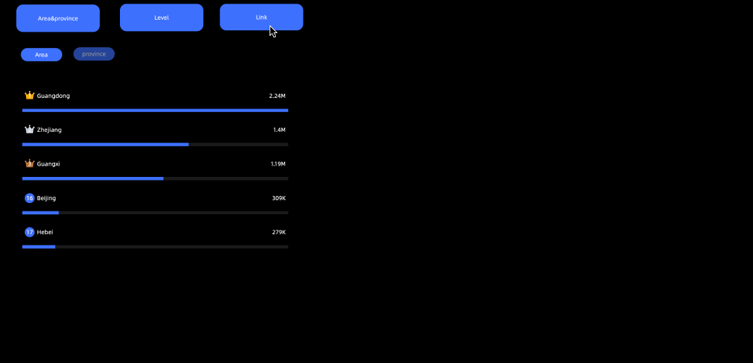
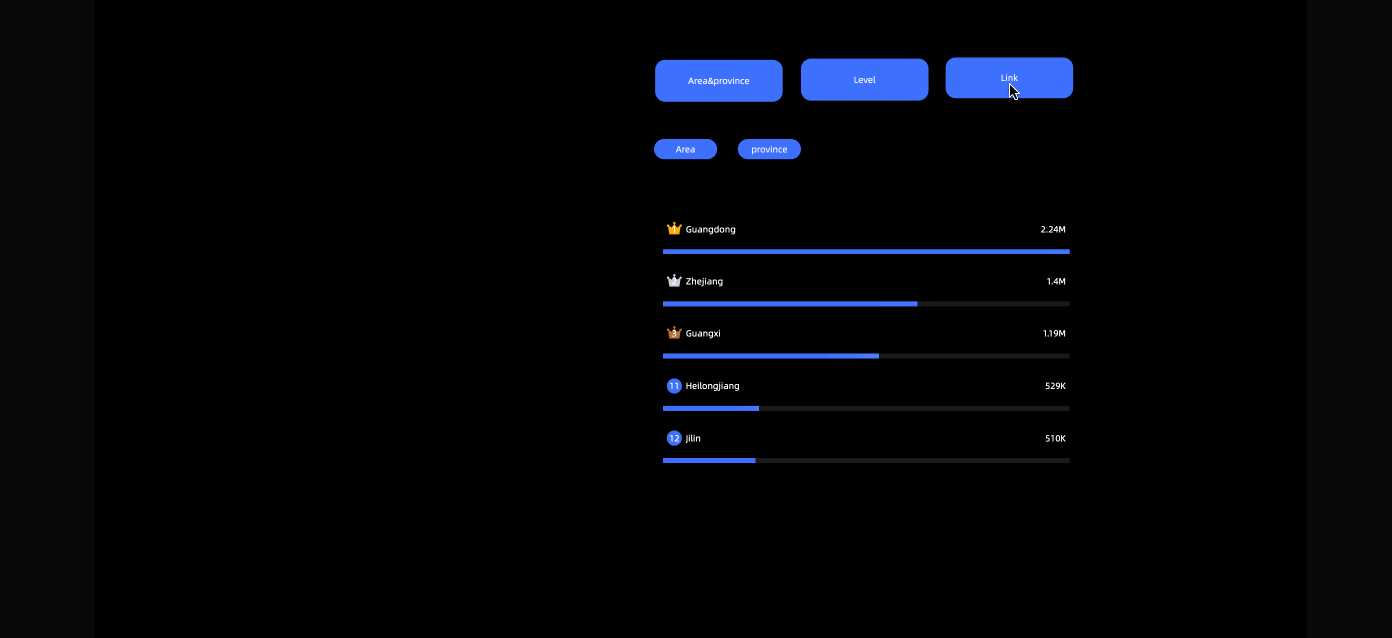
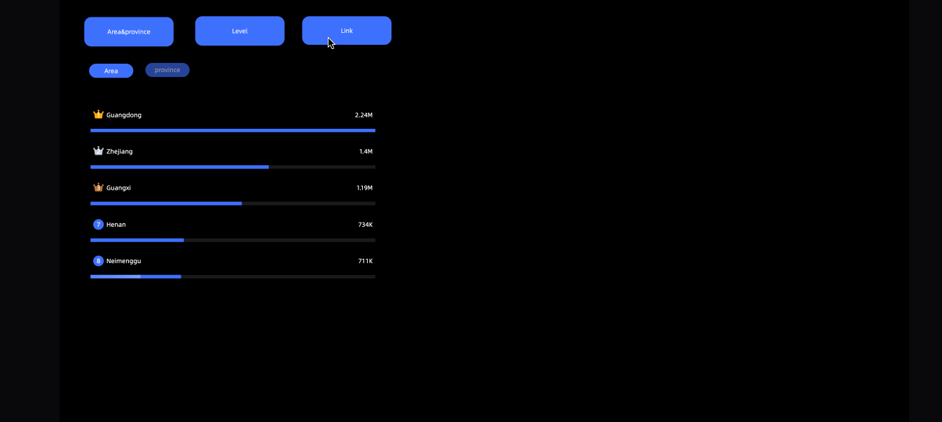
New window renderings
The current window renderings
Button Style Configuration
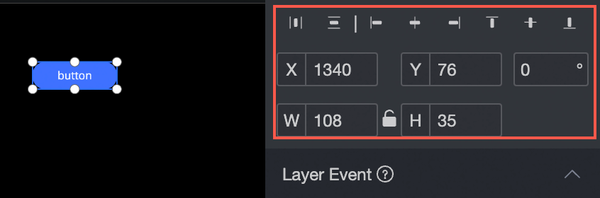
Location and size
You can configure the components in the configuration section as follows:
Adjust the alignment of components: supports left alignment, center alignment, and right alignment.
Adjust the size of the widget: Use the upper-left corner as the origin, set the values of the X and Y axes, and adjust the position.
Adjust the angle of the widget: Set the value of the rotation angle.
Resize the widget: Set the values of W and H to adjust the width and height of the widget.
Lock the component: After locking the component, you will not be able to adjust the size and position of the component.
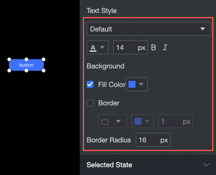
Text Style
You can configure the widget text in the configuration section as follows:
Adjust the font style of the widget text: You can set the font, color, font size, bold, and oblique text.
Adjust the background of a widget: You can set the background fill color of a widget.
Adjust the border of a widget: You can set the style, color, and width of the widget border.
Adjust the corner radius of a widget: You can set the corner radius of the widget border.
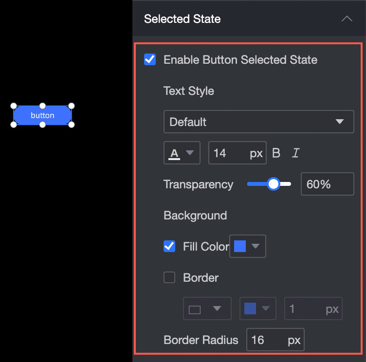
Selected Status
In the configuration section, you can set the selected button as follows:
Adjust the font style of the selected button: You can set the font, color, font size, bold, and tilt of the text.
Adjust the background of the selected button: You can set the background fill color of the widget.
Adjust the border of the selected button: You can set the style, color, and width of the widget border.
Adjust the corner radius of the selected button: You can set the corner radius of the widget border.
Effect diagram