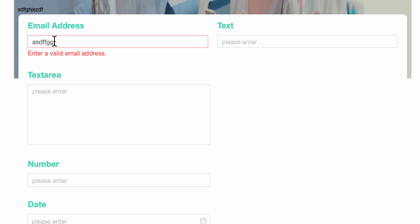
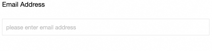
The Email control is an advanced control that is specifically used to fill in the Email field and supports automatic verification of the correct email format.
Scenarios
The mailbox control is an advanced control used to verify the correctness of the mailbox number input in the data form. It is applicable to the scenarios of collecting mailboxes, such as:
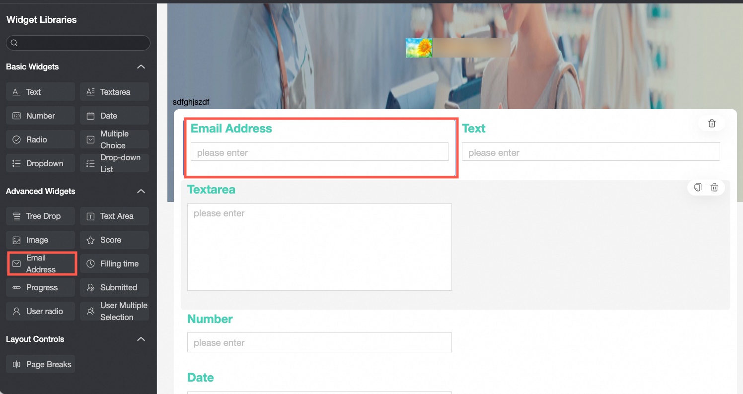
When filling in the satisfaction survey form, enter the email information of the filling person through the email control;
When a new employee is employed, the control is used to enter employee email information.
TensorBoard
Control configuration
Basic parameters
Parameter | Description |
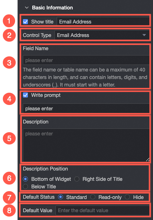
| ① Display Title: Select whether to display the title of the mailbox control. You can customize the display name as the column name of the data form. |
② Control type: After you select a control, you can replace the control type. The drop-down options can be replaced with other basic and advanced control types. | |
③ Table Field Name: the name of the corresponding field in the table created based on the data form. Note The field or table name must start with a letter and can contain letters, digits, and underscores (_). The name can be up to 40 characters in length. | |
④ Prompt: Set Prompt. For example, enter an email number.
| |
⑤ Description: the description of the custom control. | |
⑥ Description Information Location: Specify the location of the description information. Valid values: Bottom, Right, and Below. | |
Default State: the default state of the widget. The valid values are Normal and Hidden. | |
⑧ Default Value: Set the default display value of the control. |
Yes
Parameter | Description |
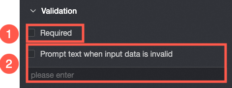
| ① Required: Select whether to set this configuration items. If you select this option, the control is set to Required. |
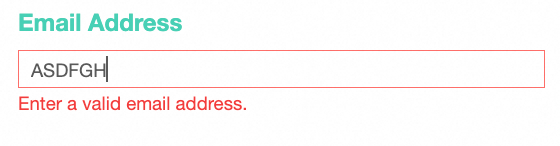
If the input data is invalid, you can edit the prompt text. For example, you can edit the email address that you entered.
|
styles
Parameter | Description |
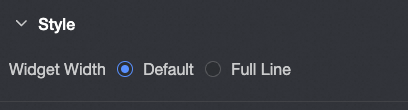
| Widget Width: You can select Default or Whole Line. Note You can also use the Manual Drag Control widget to adjust the border width. |