Single-select drop-down is the basic control. You can select one from the drop-down menus for scenarios with a large number of data options.
Scenarios
Single-select drop-down controls are commonly used in scenarios with a large number of data options, such as province, employee number, product type, and ethnic group.
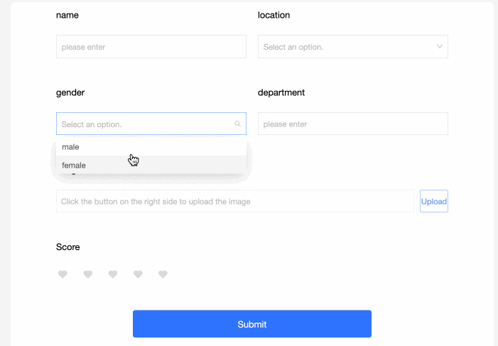
Renderings
Control configuration
Basic parameters
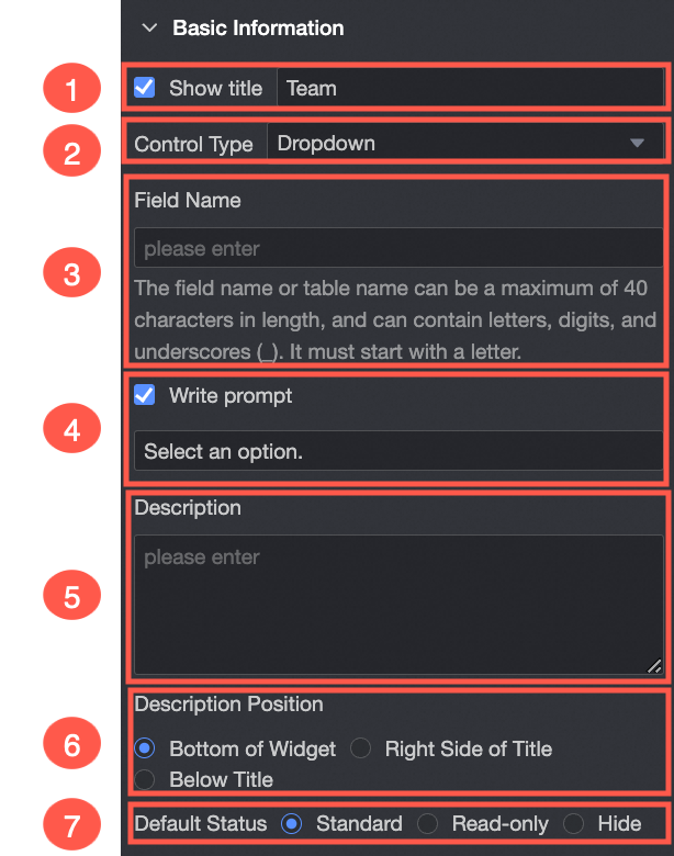
Parameter | Description |
| ① Display Title: Select whether to display the title of the single-line text widget. You can customize the display name as the column name of the widget. |
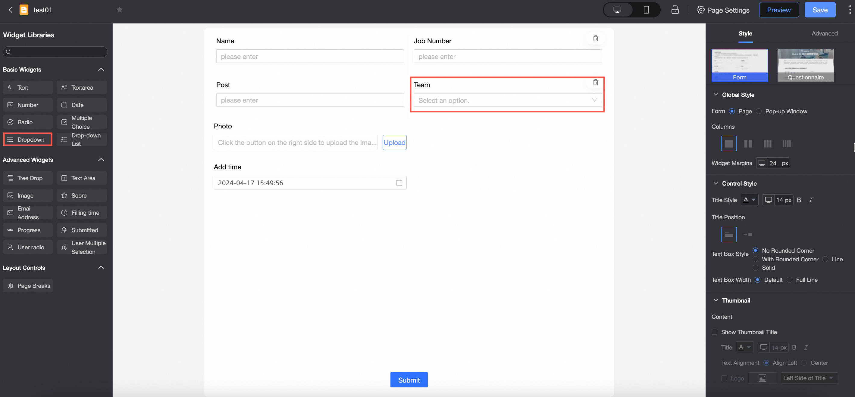
② Control type: After you select a control, you can replace the control type. The drop-down options can be replaced with other basic and advanced control types. | |
③ Table Field Name: the name of the corresponding field in the table created based on the data form. Note The field or table name must start with a letter and can contain letters, digits, and underscores (_). The name can be up to 40 characters in length. | |
④ Prompt: Set Prompt for the widget. For example, Select Customer Type.
| |
⑤ Description: the description of the custom component. | |
⑥ Description Information Location: Specify the location of the description information. The following options are available: Bottom, Right, and Below. | |
Default State: specifies the default state of the widget. The valid values are Normal, Read-only, and Hidden. |

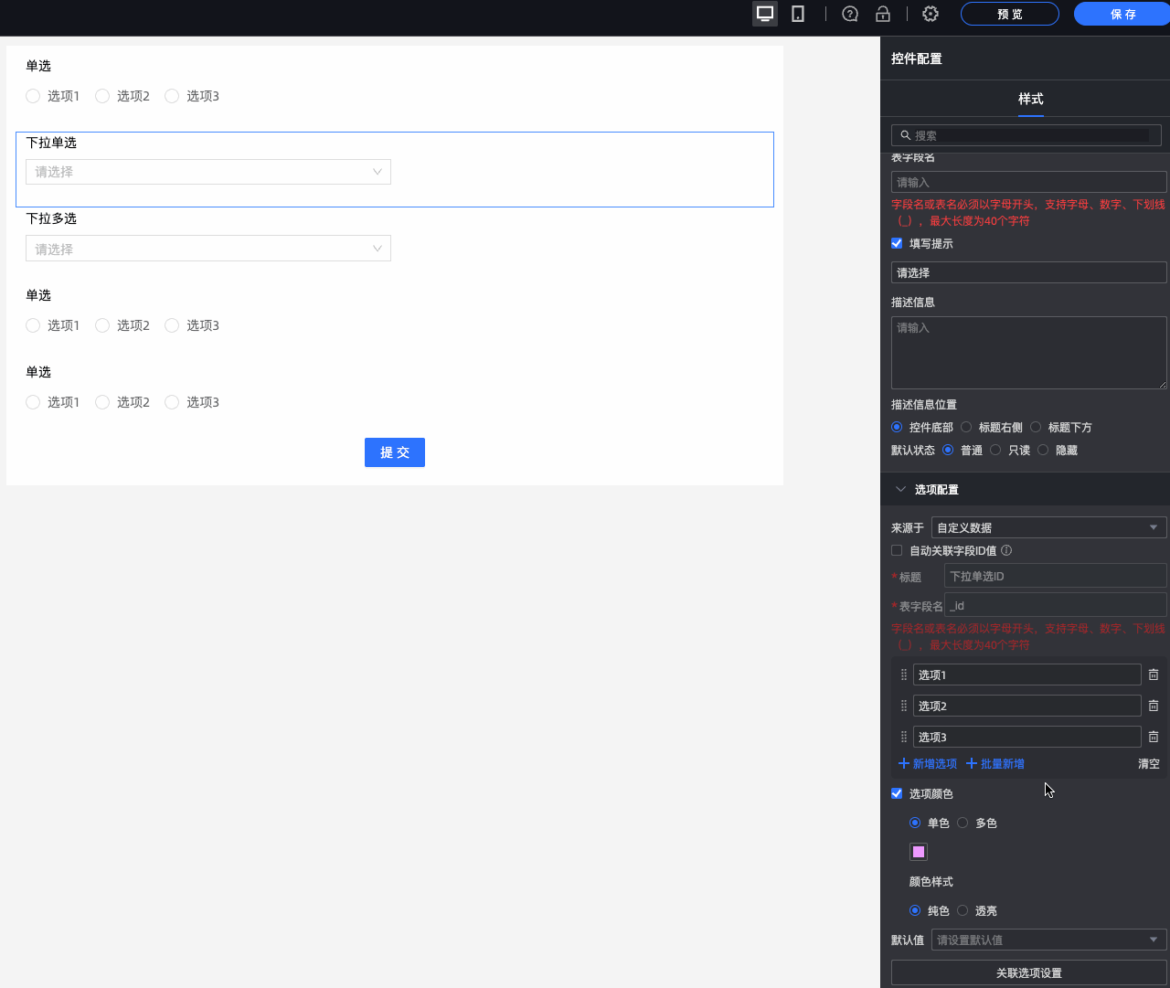
Option
From: You can select Custom Data, Data Source, Dataset, or Organization Member.
Parameter | Description |
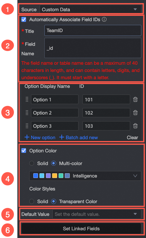
Select Custom Data from the Source drop-down list.
| ① From Custom Data: If you select Custom Data, you can set Display Name and Correlation ID as required. |
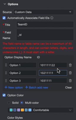
② Automatically Associate Field ID Value: Select whether to automatically associate the field ID value. If you select this option, you can configure Option Display Name to associate the field ID value with the corresponding field ID value. Add, edit, and delete operations are supported.
| |
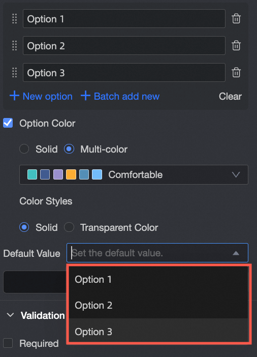
③ Option Name: You can add options, batch add options, edit option names, and delete options. | |
④ Color options: You can select Monochrome or Multicolor from the drop-down list. You can also select Solid or Clear. | |
⑤ Default Value: Select a value from the drop-down list based on your options.
| |
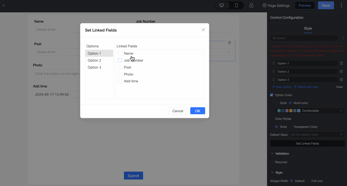
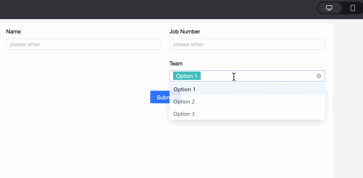
⑥ Associated Option Settings: If the current form has two or more single-selection, single-selection, or multiple-selection controls, you can configure the associated option settings. Note Only fields after the current field can be associated.
| |
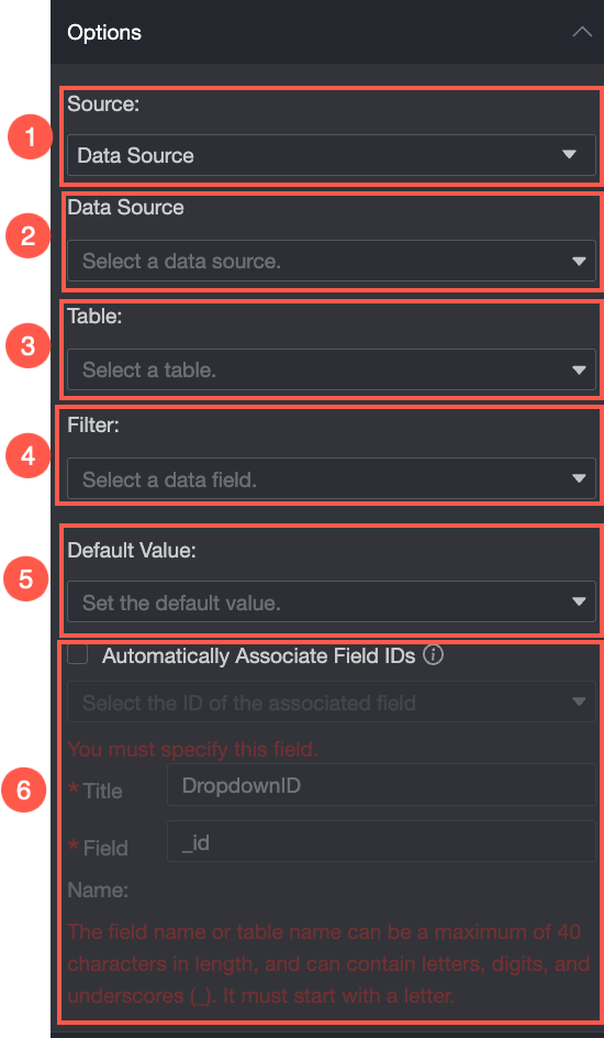
Select Data Source from the Source drop-down list.
| ① From: After you select Data Source, you can select the required options for the data table in the data source. |
② Data Source: Select a data source from the drop-down list. | |
③ Data Table: Select a data table from the drop-down list. | |
④ Data field: Select a data field from the drop-down list. | |
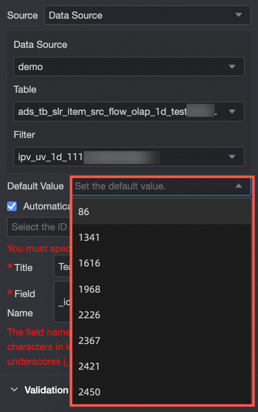
⑤ Default Value: Data Field Content.
| |
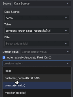
⑥ Automatically Associate Field ID Value: Select whether to automatically associate the field ID value. If you select this check box, you can configure Option Display Name to associate the field ID value with the corresponding field ID value.
| |
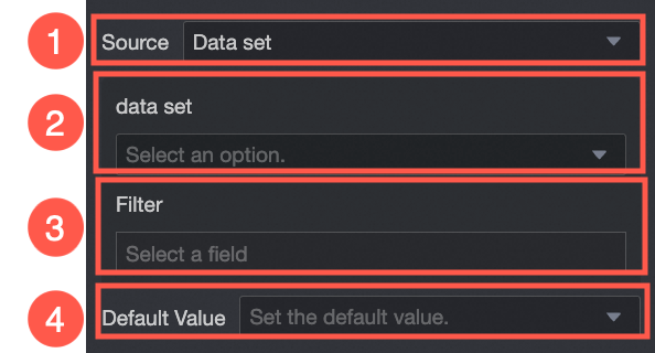
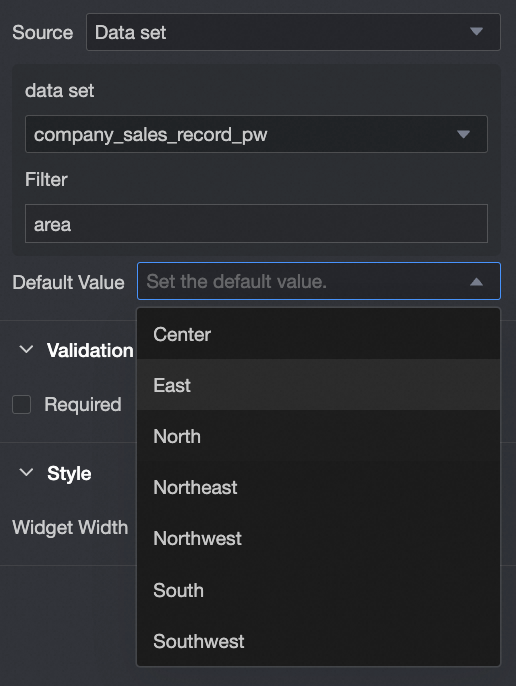
Select Dataset from the Source drop-down list. | ① From Dataset: If you select Dataset, you can select Data Fields in the dataset. |
② Dataset: Select a dataset from the drop-down list. | |
③ Data Field: Select a data field from the drop-down list. | |
④ Default Value: Select a value based on the Data Field Content drop-down list. | |
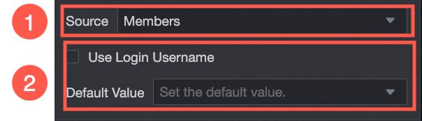
Select Organization Member from the Source drop-down list. | ① From Organization Member: If you select Organization Member, you can add the names of users in the same organization. |
② Default Value: Set the default value of the control. If you select Use Logon Username, the logon username of the current account is automatically entered. |
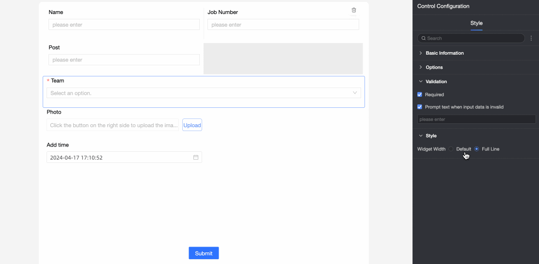
Validation
Parameter | Description |
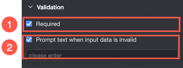
| ① Required: Select whether to set this configuration items. If you select this option, the control is set to Required. |
② Input data invalid prompt text: This configuration items takes effect only when a verification condition takes effect. For example, if Required is selected and no option value is specified, a custom error copy is displayed. |
Section
Parameter | Description |
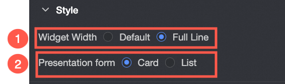
PC side | Widget Width: You can select Default Width or Entire Line. Note You can also manually drag the border of the widget to adjust the width.
|
Mobile terminal | ① Control width: Consistent with PC-side functions. |
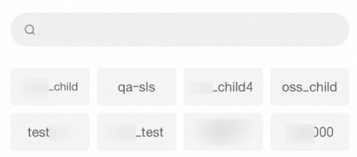
Display form: The list of options can be displayed in two formats: Card and List. Card display effect example: List: |