The mPaaS unified component library (AntUI) translates abstract visual concepts into concrete controls based on standardized visual specifications. This ensures a consistent visual style on the client when you integrate controls.
Unified component library architecture
The AntUI architecture is built from the bottom up, similar to building blocks, to create a unified system of controls.
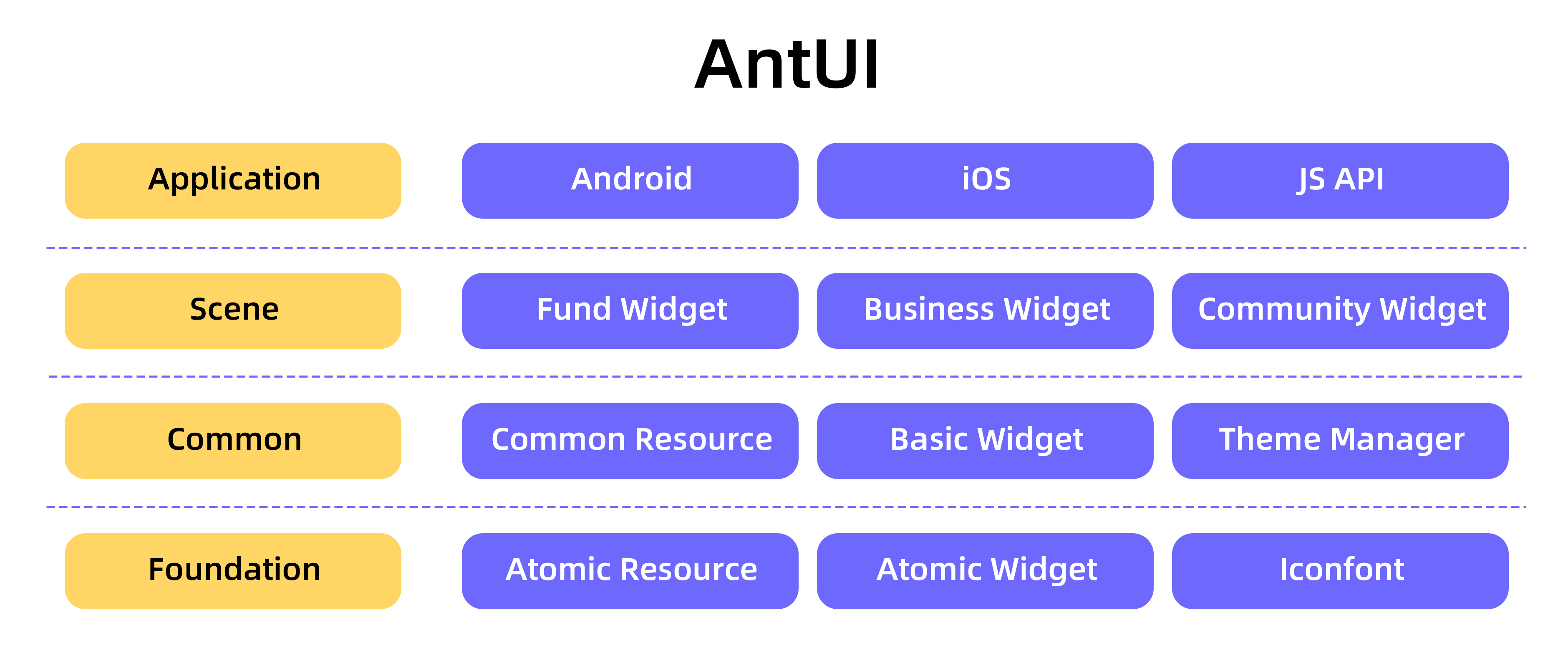
The following table describes the architecture layers from bottom to top.
Architecture layer | Description |
This layer modularizes visual specifications and forms the base of the AntUI system. It includes atomic resources, atomic controls, and Iconfont icons. The foundation layer is built from the smallest units of the visual specifications. | |
This is the core module of AntUI and contains the most frequently used controls. It includes common resources, basic controls, and a style manager. The common layer is built by combining elements from the foundation layer. It can be used in all common client scenarios. | |
This layer builds collections of controls with scenario-specific features, such as controls for funds, merchants, and social networking. Because mPaaS is a super app, its scale means that many services require custom handling. The scene layer builds custom controls for these scenarios on top of the common layer. | |
This layer provides platform-specific handling and H5 container support. It resolves the conflict between unification and platform customization. While atomic, composite, and scene elements form the foundation of AntUI, practical applications must meet the needs of Android, iOS, and H5. The application layer provides interfaces for platform-specific customization to address these differences. |
Foundation layer
The foundation layer modularizes visual specifications and forms the base of the AntUI system. It includes atomic resources, atomic controls, and Iconfont icons.
Atomic resources
Defines atomic resources used by controls, such as colors, sizes, and spacing, to ensure their uniqueness. Examples include colors such as red, yellow, and blue, and font sizes such as 12, 14, and 16.
Atomic controls
Wraps the native controls of the platform framework to build a basic library of atomic controls.
Iconfont icons
Collects icons for common scenarios and provides them in the Iconfont format as a library of usable control icons.
Common layer
The common layer is the core unified module of AntUI. It contains the most frequently used controls and includes common resources, basic controls, and a style manager.
Common resources
Redefines atomic resources according to usage scenarios, such as title color, content color, and link color.
Basic controls
This layer visually reproduces the controls defined in the visual design mockups on a one-to-one basis. It maintains consistent naming and implementation across the Android and iOS platforms to simplify client development.
Style manager
Defines styles abstractly and manages them centrally. This lets you switch a specific control between multiple skins. Style abstraction is implemented using incremental definitions. This means you only need to focus on the styles of the elements that your business requires.
Scene layer
The scene layer builds collections of controls with scenario-specific features, such as controls for funds, merchants, and social networking.
Application layer
The application layer provides capabilities such as platform-specific handling and H5 container support. It resolves the conflict between unification and platform customization.
The Android and iOS platforms have different visual specifications. For example, AntUI handles actionsheets differently on each platform:
On iOS, the actionsheet appears from the bottom.
On Android, it is handled as a pop-up list in the center of the screen.
H5 content often requires different handling for elements such as pop-up dialog boxes and title bars. To ensure H5 content has a native look and feel, the unified component library defines a unified JavaScript Application Programming Interface (JSAPI) for the H5 container. This API makes it easy to call the appropriate platform controls. This allows H5 pages to be handled differently on Android and iOS.
Linkage
To reduce communication costs between designers and developers and to avoid redundant control development and visual design work, the unified component library (AntUI) integrates development and visual design tasks.
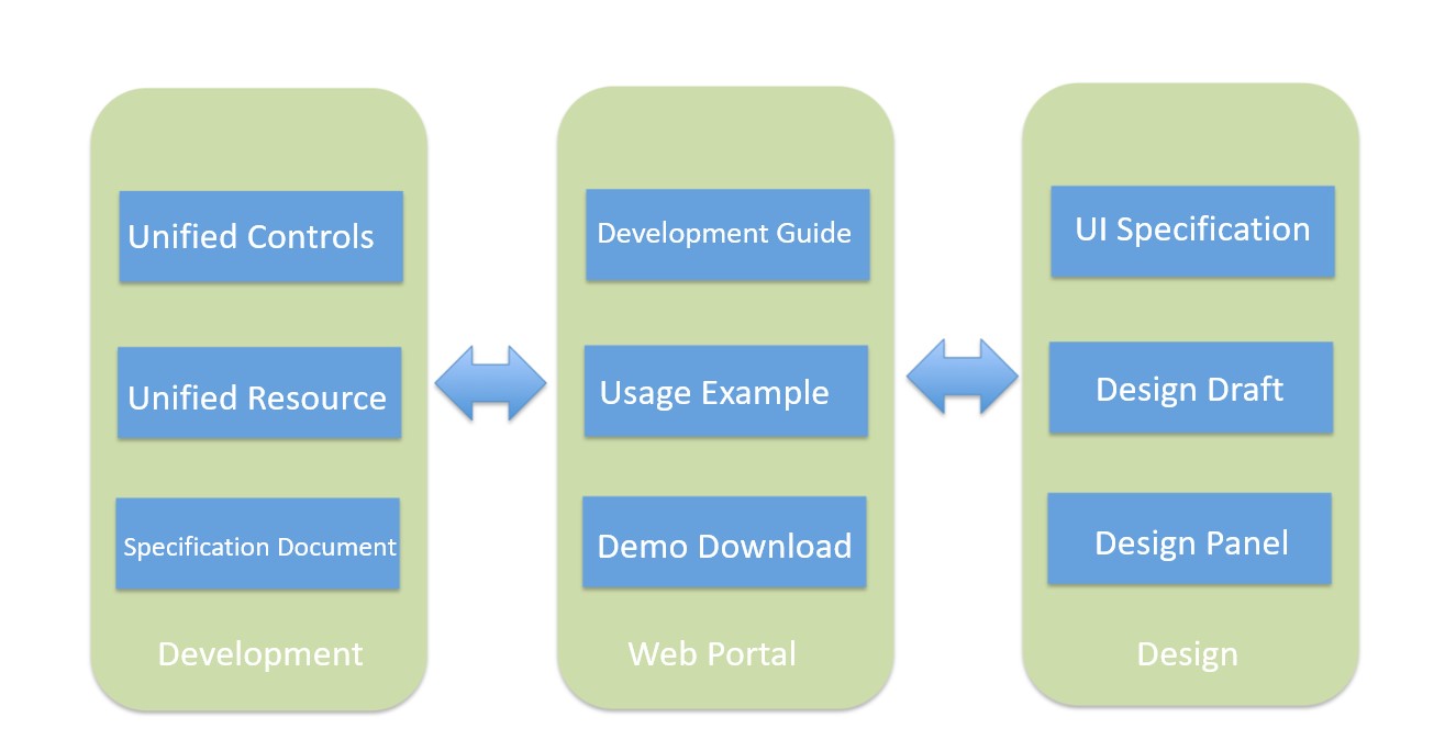
Designers create specifications, and developers interpret these specifications to create controls. A complete development guide simplifies implementation, forming a one-stop control system.
Unified naming creates a shared understanding between developers and designers. For more information about naming conventions, see Component specifications and principles in this topic.
Design boards help designers understand existing controls. They can build the basic structure of a page by simply dragging and dropping elements.
The portal aggregates development documents and visual specifications. It also provides demo downloads so you can observe the visual effects of the controls directly.
Component specifications and principles
Naming style
Controls of the same type must have the same name on both the Android and iOS platforms. Control names are prefixed with AU. All custom control properties use camel case.
ImportantSome components may have platform differences. A component may need to be implemented on one platform but not on another.
Matching basic controls with visual/interaction specifications
Controls not included in the specifications cannot be added to the standard controls.
Controls that are not in the specifications but are already used in multiple places should be placed in the candidate control collection.
A specification does not have to be implemented as a single control. For example, the title bar specification.
Usability
Unlike commonui, do not create simple wrappers for system controls (such as APImageView and APTextView). When you need a system control, use the native control.
Names must be accurate and unambiguous.
Similar features should be consistent across different controls.
Follow user conventions.
Extensibility
Do not use hard coding for control features. For example, support dynamic changes to the number of switchable tabs.
Some controls, such as dialog boxes and navigation bars, must allow their layout to be modified externally.
Novelty
You can use the latest platform features, such as Android's RecyclerView.