This topic describes the three input box components that mPaaS provides: AUInputBox, AUImageInputBox, and AUTextCodeInputBox. AUImageInputBox and AUTextCodeInputBox inherit from AUInputBox.
AUInputBox
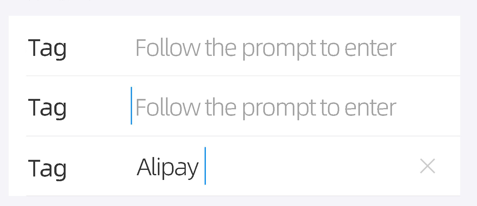
The AUInputBox component contains the following items:
An AUEditText text input box
A tag name that appears to the left of the input box
A delete button that appears when the input box has focus and is not empty
Preview
API reference
/**
 * Gets the UBB-encoded string.
 */
public String getUbbStr()

/***
 * Sets the emoji font size in px.
 */
public void setEmojiSize(int emojiSize)
/***
 * Sets whether to support emojis.
 */
public void setSupportEmoji(boolean isSupport) {
    this.supportEmoji = isSupport;
}

/**
 * Sets a Formatter to format the input.
 * This setting does not take effect on existing text until new text is entered.
 */
public void setTextFormatter(AUFormatter formatter)

/**
 * Sets whether to display the input text in bold.
 *
 * @param isBold Set to true for bold, or false for normal.
 */
public void setApprerance(boolean isBold)

/**
 * Set a special listener to be called when an action is performed on the
 * text view. This will be called when the enter key is pressed, or when an
 * action supplied to the IME is selected by the user. Setting this means
 * that the normal hard key event will not insert a newline into the text
 * view, even if it is multi-line; holding down the ALT modifier will,
 * however, allow the user to insert a newline character.
 */
public void setOnEditorActionListener(OnEditorActionListener l)

/**
 * Adds a TextWatcher to the list of those whose methods are called whenever
 * this TextView's text changes.
 */
public void addTextChangedListener(TextWatcher watcher)


/**
 * After text is entered in the input box, a delete button appears. This method sets the listener object for the delete button's click event.
 */
public void setCleanButtonListener(View.OnClickListener listener)

/**
 * Sets the text content of the input box.
 */
public void setText(CharSequence inputContent)

/**
 * Gets the text content. If the text is formatted, the caller must process it into the required format.
 */
public String getInputedText()

/**
 * Gets the EditText control of the input box.
 */
public AUEditText getInputEdit()

/**
 * Sets the tag text.
 * @param title The tag text to enter.
 */
public void setInputName(String title)


/**
 * Gets the control for the input content name (tag name).
 */
public AUTextView getInputName()

/**
 * Sets the font size of the input content name in px.
 */
public void setInputNameTextSize(float textSize)

/**
 * Sets the font size of the input box in px.
 */
public void setInputTextSize(float textSize)

/**
 * Sets the text color of the input content.
 */
public void setInputTextColor(int textColor)

/**
 * Sets the content type of the input.
 */
public void setInputType(int inputType)
/**
 * Sets the hint message.
 */
public void setHint(String hintString)

/**
 * Sets the icon for the left tag.
 */
public void setInputImage(Drawable drawable)

/**
 * Gets the icon for the left tag.
 */
public AUImageView getInputImage()

/**
 * Sets the color of the hint message.
 */
public void setHintTextColor(int textColor)

/**
 * Sets the maximum input length for the input box.
 *
 * @param maxlength If the parameter is <=0, no length limit is applied.
 */
public void setMaxLength(int maxlength)

/**
 * Gets the clear button control.
 */
public AUIconView getClearButton()

/**
 * Gets whether the clear button needs to be displayed.
 */
public boolean isNeedShowClearButton() {
    return isNeedShowClearButton;
}

/**
 * Sets whether to display the clear button. If set to false, the clear button is never displayed.
 */
public void setNeedShowClearButton(boolean isNeedShowClearButton)

/**
 * Sets the border style of the control, including top, center, bottom, and normal.
 * This method is from the AULineGroupItemInterface interface.
 * When the control is used with LineGroupView, this method is automatically called.
 *
 * @param positionStyle Use the variables defined in AULineGroupItemInterface: AULineGroupItemInterface.TOP, CENTER, BOTTOM, NORMAL, LINE, or NONE.
 */
@Override
public void setItemPositionStyle(int positionStyle)

/**
 * Gets the input content type.
 */
public int getInputType()
Code sample
<com.alipay.mobile.antui.input.AUInputBox
    android:id="@+id/safeInputBox"
    android:layout_width="match_parent"
    android:layout_height="wrap_content"
    app:listItemType="top"
    app:inputName="tag 1"
    app:inputType="textPassword"
    app:inputHint="This input box opens the secure keyboard"/>

<com.alipay.mobile.antui.input.AUInputBox
    android:layout_width="match_parent"
    android:layout_height="wrap_content"
    app:listItemType="center"
    app:inputName="tag 2"
    app:inputHint="Enter text as prompted"/>

<com.alipay.mobile.antui.input.AUInputBox
    android:layout_width="match_parent"
    android:layout_height="wrap_content"
    app:listItemType="bottom"
    app:inputName="Transfer-in amount"
    app:inputHint="Enter text as prompted"/>


<com.alipay.mobile.antui.input.AUInputBox
    android:layout_width="match_parent"
    android:layout_height="wrap_content"
    android:layout_marginTop="20dp"
    app:inputImage="@drawable/image"
    app:inputName="Transfer-in amount"
    app:inputHint="Enter text as prompted"/>

<com.alipay.mobile.antui.input.AUInputBox
    android:layout_width="match_parent"
    android:layout_height="wrap_content"
    android:layout_marginTop="20dp"
    app:inputHint="Enter text as prompted"/>
AUImageInputBox
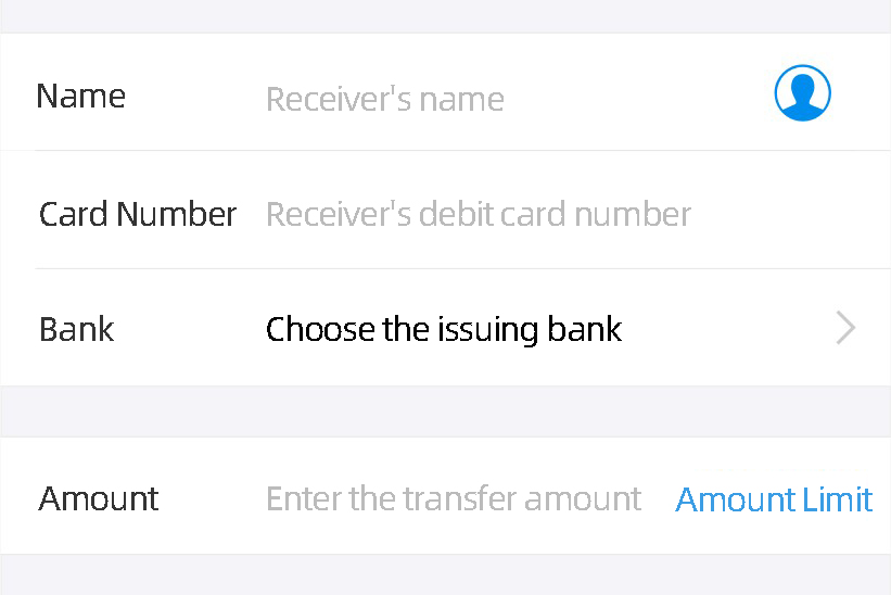
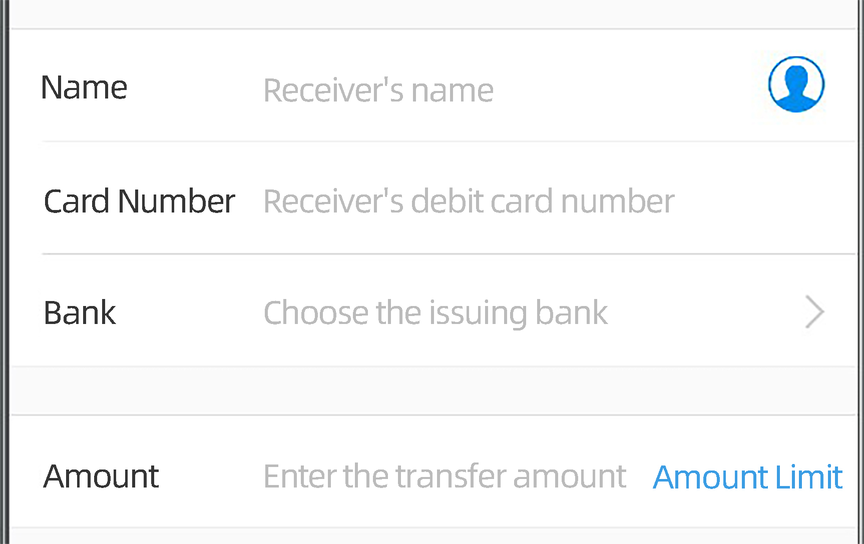
AUImageInputBox inherits from AUInputBox and contains:
An IconView on the right that can display an icon or a Unicode character
A TextView on the right
Preview
Dependencies
For more information, see Getting Started.
API reference
/**
 * Sets the background of the rightmost function button.
 * If the button background is set to empty, the function button is not displayed, which is consistent with the behavior of AUInputBox.
 */
public void setLastImgDrawable(Drawable drawable)

/**
 * Sets the rightmost function icon using a Unicode string.
 * @param unicode
 */
public void setLastImgUnicode(String unicode)

/**
 * Sets the visibility of the rightmost icon.
 * @param visible
 */
public void setLastImgBtnVisible(boolean visible)

/**
 * Sets the listener for the rightmost function button.
 */
public void setLastImgClickListener(View.OnClickListener l)

/**
 * Sets the text on the far right.
 * @param lastText
 */
public void setLastTextView(String lastText)

/**
 * Gets the rightmost TextView.
 *
 * @return The rightmost TextView.
 */
public AUTextView getLastTextView()

/**
 * Gets the rightmost icon View.
 * @return
 */
public AUIconView getLastImgBtn()
Code sample
<com.alipay.mobile.antui.input.AUImageInputBox
    android:layout_width="match_parent"
    android:layout_height="wrap_content"
    android:layout_marginTop="20dp"
    app:listItemType="top"
    app:inputName="Name"
    app:inputHint="Payee name"
    app:input_rightIconUnicode="@string/iconfont_phone_contact" />

<com.alipay.mobile.antui.input.AUImageInputBox
    android:layout_width="match_parent"
    android:layout_height="wrap_content"
    app:listItemType="center"
    app:inputName="Card number"
    app:inputHint="Payee debit card number" />

<com.alipay.mobile.antui.input.AUImageInputBox
    android:layout_width="match_parent"
    android:layout_height="wrap_content"
    app:listItemType="bottom"
    app:inputName="Bank"
    app:inputHint="Select a bank"
    app:input_rightIconDrawable="@drawable/table_arrow" />


<com.alipay.mobile.antui.input.AUImageInputBox
    android:layout_width="match_parent"
    android:layout_height="wrap_content"
    android:layout_marginTop="20dp"
    app:inputName="Amount"
    app:inputHint="Enter transfer amount"
    app:input_rightText="Limit description" />
AUTextCodeInputBox
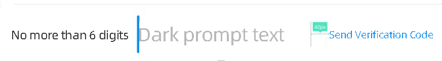
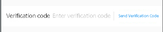
AUTextCodeInputBox inherits from AUInputBox and includes a text button on the right to send a text message verification code.
Preview
Dependencies
For more information, see Quick start.
API reference
/**
 * Sets the callback for the send button's click event.
 * @param callback When a user clicks the send button, the OnSendCallback.onSend() method is called.
 */
public void setOnSendCallback(OnSendCallback callback)

/**
 * Resets the current time to 0.
 */
public void currentSecond2Zero()

/**
 * Sets the current time.
 */
public void setCurrentSecond(int current)

/**
 * Gets the current time.
 */
public int getCurrentSecond()

/**
 * Gets the send button.
 */
public AUButton getSendCodeButton()

/**
 * Allows the service to call this method to release the timer.
 */
public void releaseTimer()


/**
 * Starts the button's countdown timer.
 */
public void scheduleTimer()

public interface SendButtonEnableChecker {
    public boolean checkIsEnabled();
}

/**
 * This method sets a checker to determine if the SendButton is enabled.
 * If this checker finds the button is disabled, the button is grayed out when updateSendButtonEnableStatus is called.
 * Otherwise, the button's enabled state is set according to the countdown logic when updateSendButtonEnableStatus is called.
 * In short, the button is enabled only if all checks pass. Otherwise, it is grayed out.
 */
public void setSendButtonEnableChecker(SendButtonEnableChecker checker)

/**
 * Updates the enabled state of the SendButton based on SendButtonEnableChecker and the internal state of CheckCodeSendBox.
 * The button is enabled only if all checks pass. Otherwise, it is grayed out.
 */
public void updateSendButtonEnableStatus()

/**
 * Gets the SendResultCallback.
 */
public SendResultCallback getSendResultCallback()
Code sample
XML:
<com.alipay.mobile.antui.input.AUTextCodeInputBox android:id="@+id/au_textcode_input" android:layout_width="match_parent" android:layout_height="wrap_content" android:layout_marginTop="20dp"/>Java:
final AUTextCodeInputBox textCodeInputBox = (AUTextCodeInputBox) findViewById(R.id.au_textcode_input);
textCodeInputBox.setOnSendCallback(new OnSendCallback() {
    @Override
    public void onSend(final SendResultCallback callback) {
        // Request a verification code from the server via RPC.
        boolean resendSmsRpcSuccess = true;
        if (resendSmsRpcSuccess) {
            // Verification code sent successfully. Start the countdown.
            callback.onSuccess();
            // Verification code received...
            Toast.makeText(InputActivity.this, "Verification code received: 123456", Toast.LENGTH_SHORT)
                    .show();
            textCodeInputBox.setText("123456");
            Log.d(TAG, "The entered verification code is: " + textCodeInputBox.getInputedText());
        } else {
            // Failed to send the verification code. Re-enable the send button.
            callback.onFail();
        }
    }
});
Custom attributes
The following table lists the custom attribute parameters for the three components.
Attribute name | Description | Type |
inputName | Enter the content name. | string, reference |
inputHint | The hint text in the input box. | string, reference |
maxLength | The maximum length of the input content. | integer |
inputType | The type of the input content. | enum. Valid values: textNormal, textNumber, textDecimal, and textPassword. |
inputImage | The image to the left of the input box. | reference |
listItemType | The background type of the item. | enum. Valid values: top, center, bottom, normal, line, and none. |
input_rightIconUnicode | The icon on the right. | string, reference |
input_rightIconDrawable | The image on the right. | reference |
input_rightText | The hyperlink text on the right. | string, reference |