This article uses the five chart components of vertical stacking column chart, area chart chart, basic scatter chart, ring chart, and general title, and uses the one-click beautification and smart theme functions in the beautification toolbox, combined with the filter configuration function in the toolbar, to quickly adjust the style effect of a visual application.
Procedure
- Log on to the DataV console.
On the My Visualizations page, find a visualization and click Edit in the Actions column.
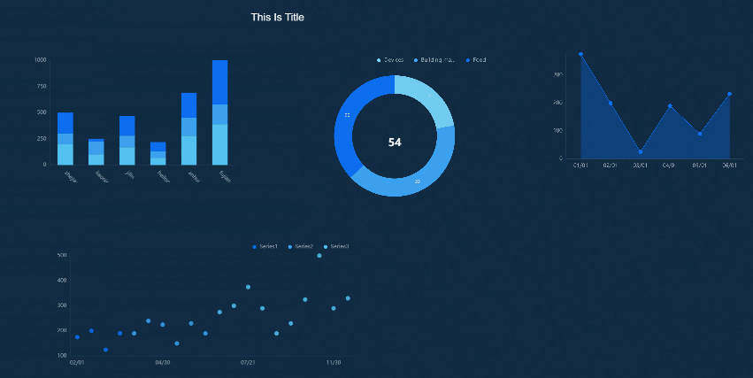
Click the Asset List icon to add the components that you want to configure and arrange them as shown in the figure.
Click the Beautify Toolbox icon to open the Smart Theme feature.
Click My Themes. In the System Themes section, select a system-specific theme. In the canvas editor on the right, preview the effect of the selected theme in real time.
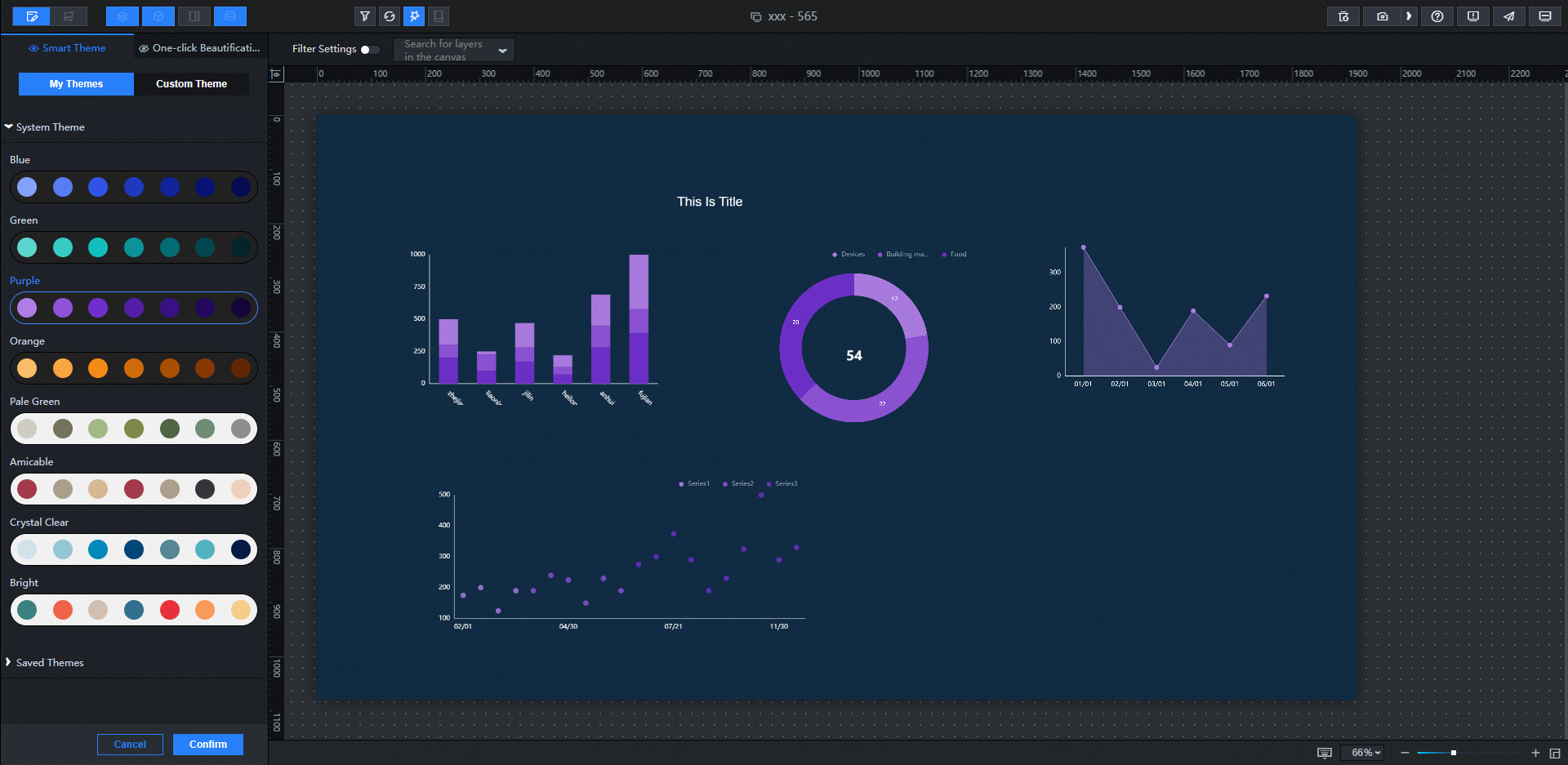
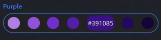
You can move the mouse over the color blocks of different system themes to directly view the color values of the color blocks.
Click Custom Theme to upload a custom image. The system automatically generates multiple themes from the uploaded image.
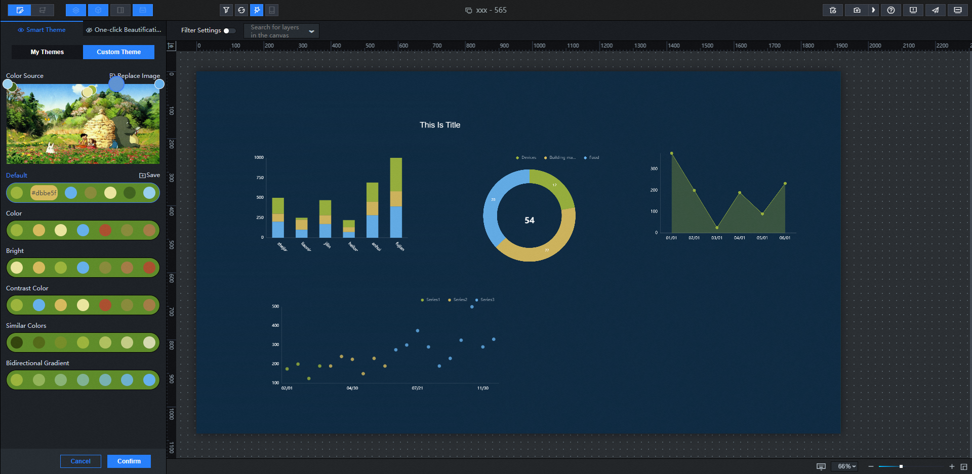
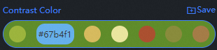
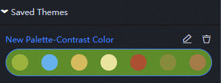
You can also change the automatically generated theme color value below by selecting a different color within the uploaded style image by taking the color circle. Click Save Theme. In the My Themes> Saved Themes dialog box, view the saved theme.
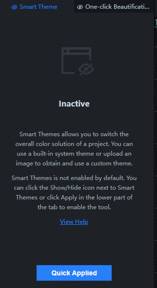
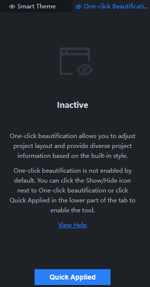
Select One-click Beautification and click Show /Show or Enable to enable the beautification feature.
Click the overall style configuration items. More than 20 overall style effects are displayed. Style 1 is selected by default.
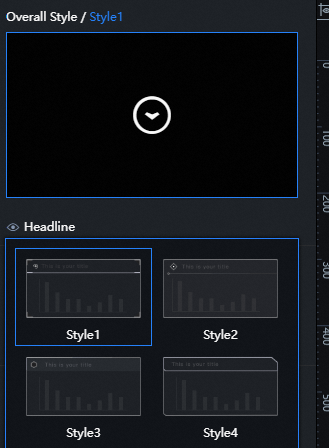
Configure Headline, Level -2 Headline, Level -2 Background, and Layout in the Beautify Style section.
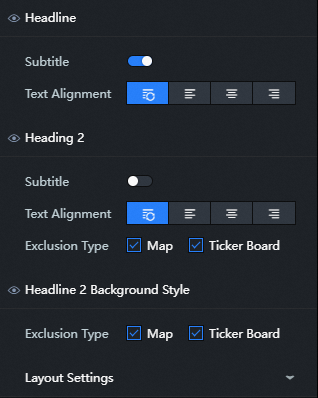
Headline: You can set the display or concealment of the subtitle and the alignment of the text, including the default alignment, left alignment, center alignment, and right alignment.
Level -2 Title: You can set the display mode of the subtitle and the alignment mode of the text, including Default Alignment, Left Alignment, Center Alignment, and Right Alignment. You can also select the Exclude type to display the level -2 title. You can select the Map and Diagrams widgets.
Secondary Background: You can set the exclusion type. If you select this option, the secondary background is displayed. Currently, you can select the Map and ticker board widgets.
Layout Settings: You can customize the overall layout of the visual group.
Parameter
Description
Margin
Pin: adjusts the margin between the visual group and the canvas.
Group Margins: The margins between visual groups.
Inline Margins: the margin between the widget and the border.
Alignment Threshold
Area Range-X: adjusts the horizontal reference line of the visual group.
Area Range-Y: adjusts the vertical reference line of the visual group.
Adsorption Range-X: Adjust the horizontal alignment of each component.
Adsorption Range-X: Adjust the vertical alignment of each component.
Maintain original group
When you use one-click beautification, the layout of the components in the original visual group is disrupted. If you turn on Maintain Original Group, the layout of the components in the original visual group is maintained.
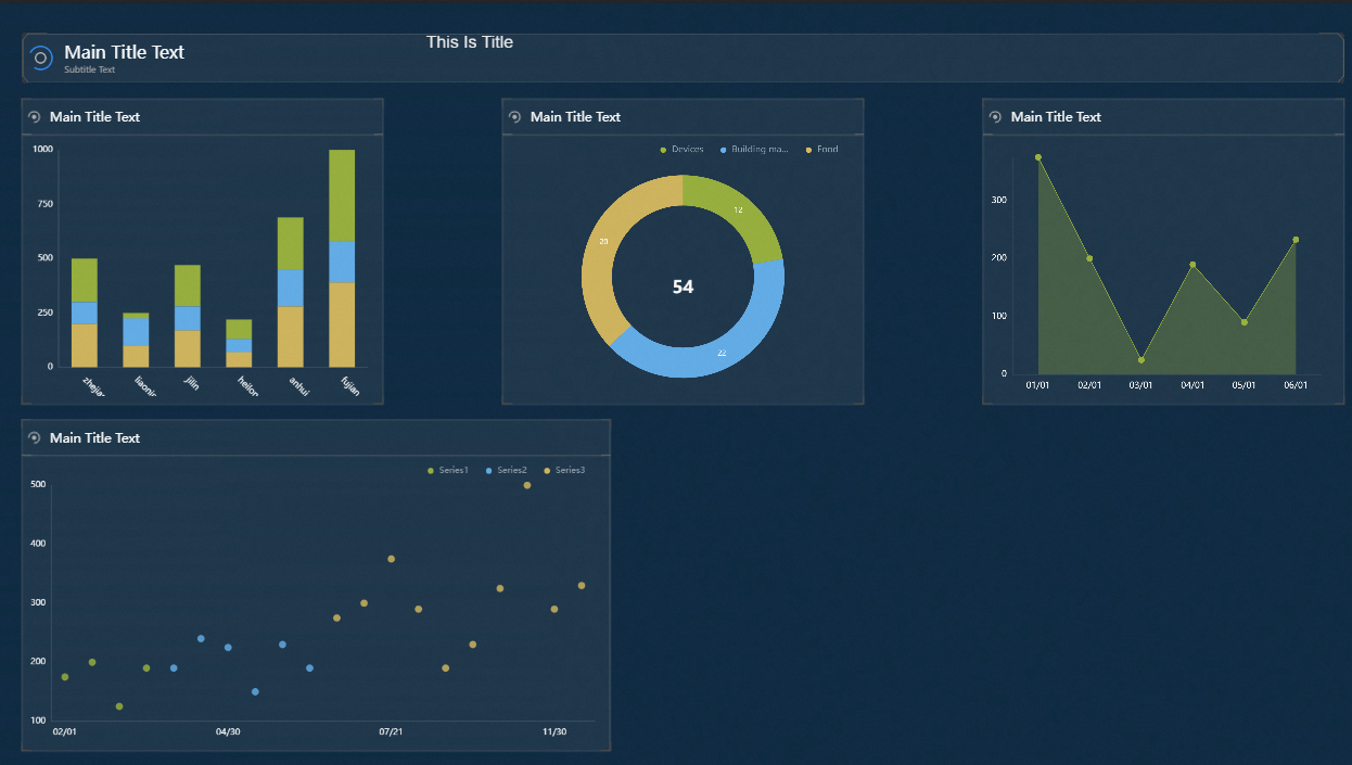
The adjustment results are shown in Fig.
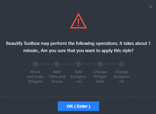
After the configuration is complete, click Confirm Application. In the dialog box that appears, click Confirm again to apply the widget layout style. This way, the widget color and layout style on the canvas are beautified.
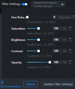
Turn on filter Configuration at the top of Canvas Editor to enable filter configuration.
Drag the sliders to adjust the hue, saturation, brightness, and opacity of the canvas editor based on your business requirements.
After the configuration items is adjusted, click Update filter Configuration in the lower-right corner.
 Note
Notefilter effects can be customized at any time with the option to turn off or on.
Preview and publish the edited visual application to show the beautification effect of the visual application online.