This topic describes the types of pie charts and their examples.
Pie chart
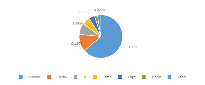
A pie chart can be used to graphically display data that is arranged in columns or rows in a workbook.
We recommend that you use a pie chart to show the ratios of different data categories to the total amount. For example, you can use a pie chart to show expected sales of products. You may find that the expected sales volume of product A accounts for the largest share of all product sales.
To maximize the effect of a pie chart, do not add over seven categories to a pie chart. For easy observation, we recommend that you place the categories in the clockwise direction and place the most important category near 12 o'clock in the pie chart. If all categories are equally important, you can sort the data categories in a descending order.
- Sample data
Chrome Firefox IE Safari Edge Opera Other 2017 0.636 0.1304 0.0834 0.0589 0.0443 0.0223 0.0246 - Sample chart

Doughnut chart
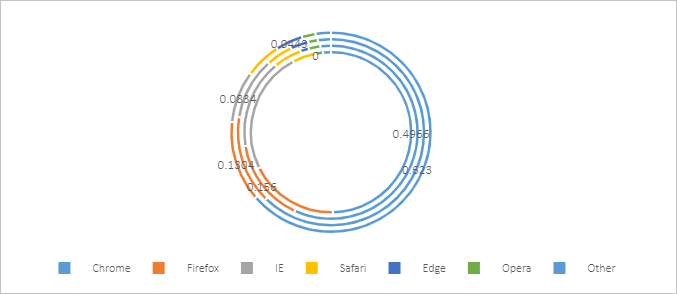
If each category has an almost equal share in a pie chart, it is difficult to compare these categories based on the area size. To show data comparisons more clearly, you can use a doughnut chart.
- A pie chart can only display one data series.
- A doughnut chart displays data distribution in rings. A doughnut chart can display multiple data series. Each ring represents a data series.
- Sample data
Chrome Firefox IE Safari Edge Opera Other 2014 0.4966 0.1801 0.2455 0.047 0 0.015 0.0158 2015 0.5689 0.156 0.1652 0.0529 0.0158 0.022 0.0192 2016 0.623 0.1531 0.1073 0.0464 0.0311 0.0166 0.0225 2017 0.636 0.1304 0.0834 0.0589 0.0443 0.0223 0.0246 - Sample chart


