This topic describes the types of column charts and their examples.
A column chart is one of the most commonly used chart types in data analysis. It can be used to graphically display data that is arranged in columns or rows in a workbook.
A column chart is used to show data comparisons among categories. For example, you can use a column chart to display the distribution of employees of different ages in a company. Then, you can check the number of the employees under 25 and the number of employees between 25 and 35 to analyze the ageing situation. In addition, you can use a column chart to show the change trend of data comparisons among several categories.
Clustered column chart
- Sample data
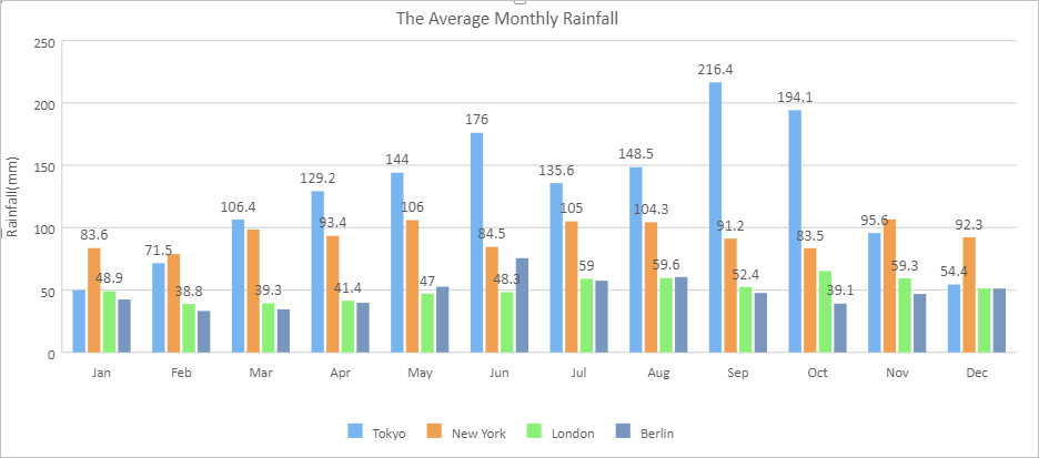
Jan Feb Mar Apr May Jun Jul Aug Sep Oct Nov Dec Tokyo 49.9 71.5 106.4 129.2 144 176 135.6 148.5 216.4 194.1 95.6 54.4 New York 83.6 78.8 98.5 93.4 106 84.5 105 104.3 91.2 83.5 106.6 92.3 London 48.9 38.8 39.3 41.4 47 48.3 59 59.6 52.4 65.2 59.3 51.2 Berlin 42.4 33.2 34.5 39.7 52.6 75.5 57.4 60.4 47.6 39.1 46.8 51.1 - Sample chart

Stacked column chart
- Sample data
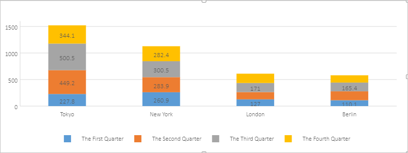
Tokyo New York London Berlin The First Quarter 227.8 260.9 127 110.1 The Second Quarter 449.2 283.9 136.7 167.8 The Third Quarter 500.5 300.5 171 165.4 The Fourth Quarter 344.1 282.4 175.7 137 - Sample chart

100% stacked column chart
- Sample data
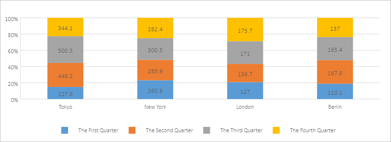
Tokyo New York London Berlin The First Quarter 227.8 260.9 127 110.1 The Second Quarter 449.2 283.9 136.7 167.8 The Third Quarter 500.5 300.5 171 165.4 The Fourth Quarter 344.1 282.4 175.7 137 - Sample chart
