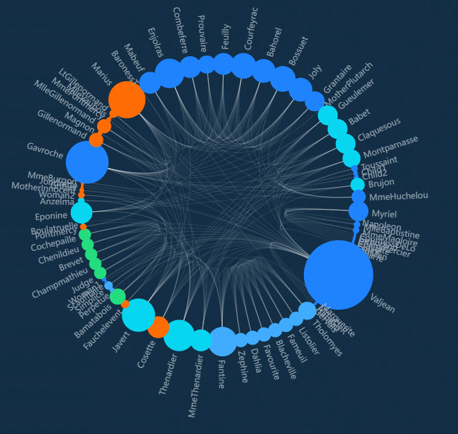
This topic describes the chart style and configuration panel of the Echarts chordal graph.
Chart Style
Configuration Panel 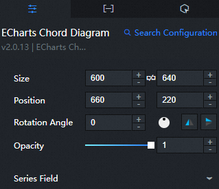
Search Configuration: Click Search Configuration in the upper-right corner of the Configuration panel. In the Search Configuration panel, enter the name of the configuration items that you want to search for to quickly locate the configuration items. Fuzzy match is supported. For more information, see Search for asset configurations.
Size: indicates the size of a widget, including its pixel width and height. You can click the
 icon to lock the aspect ratio of the widget and modify the width and height of the widget in equal proportion. After you click this icon again, you can adjust the width and height as needed.
 Position: the position of a widget, which is indicated by pixel X and Y coordinates. X-coordinate indicates the pixel distance between the upper-left corner of the widget and the left border of the canvas. Y-coordinate indicates the pixel distance between the upper-left corner of the widget and the upper border of the canvas.
Rotation Angle: the angle of a rotation that uses the center point of a widget as the rotation point. The unit is degrees (°). You can use one of the following methods to control the rotation angle of a widget:
Directly enter the degrees in the Rotation Angle spin box or click the plus sign (+) or minus sign (-) to increase or decrease the value in the Rotation Angle spin box.
Drag the
 black dot in the icon to control the rotation angle of the widget.
 Click the
 icon to flip the widget style.
 Click the
 icon to flip the widget style.
Opacity: Valid values: 0 to 1. If this parameter is set to 0, the widget is hidden. If this parameter is set to 1, the widget is completely displayed. Default value: 1.
Chart Elements
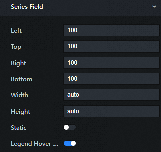
Left: the distance between the element and the left border of the widget. The following types of input are supported:
The specific pixel value, for example, 20.
Percentage relative to the height and width of the container, for example, 20%.
left, center or right, the components are automatically aligned according to the corresponding position.
Top: the distance between the element and the upper border of the component. The following types of input are supported:
The specific pixel value, for example, 20.
Percentage relative to the height and width of the container, for example, 20%.
left, center or right, the components are automatically aligned according to the corresponding position.
Right: the distance between the element and the right border of the widget. The following types of input are supported:
The specific pixel value, for example, 20.
Percentage relative to the height and width of the container, such as 20%.
left, center or right, the components are automatically aligned according to the corresponding position.
Bottom: the distance between the element and the lower border of the component. The following types of input are supported:
The specific pixel value, for example, 20.
Percentage relative to the height and width of the container, such as 20%.
left, center or right, the components are automatically aligned according to the corresponding position.
Width: Enter a value to adjust the width of the element. The default value is auto, which adapts to the width of the element.
Height: Enter a value to adjust the height of the element. Default value: auto.
Static: If you select this check box, static tags cannot be used.
Legend Linkage: If you select this check box, the hover link is enabled.
Hover Animation: If you select this option, the animation effect is displayed when the hover switch is enabled.
Circular Layout
Rotate Label: If you select this check box, the text is located outside the chart element. After you clear the check box, the text is suspended above the chart.
Zoom&Pan Roaming: If you select this check box, the Zoom&Pan Roaming feature is enabled.
Hover Node: Select this check box to enable the node hover feature.
Marker Graphic: optional. Default value: circle. Tag types include circle, rect, roundRect, triangle, diamond, pin, arrow, none, and can also be configured as URL or path of pictures.
Rotation Angle: Click the + or-sign or enter a value to modify the rotation angle of the marker.
Element Style
Ordinary Item
Border Color: Modify the border color of common item elements. For more information, see color picker description.
Border Width: Click the + or-sign or enter a value to modify the border thickness of the normal element.
Border Style: the type of the stroke that you want to use for the border. Valuable values include Solid and Dotted. Default value: Solid.
Transparency: Click the + or-sign or enter a value to modify the transparency of normal elements. The value ranges from 0 to 1.
Selected Items
Border Color: Modify the border color of the selected item. For more information, see color picker description.
Border Width: Click the + or-sign or enter a value to change the border thickness of the selected element.
Border Style: the type of the stroke that you want to use for the border. Valuable values include Solid and Dotted. Default value: Solid.
Transparency: Click the + or-sign or enter a value to modify the transparency of the selected element. The value ranges from 0 to 1.
Axis Style
Show Direction Arrow: If you select this check box, a direction arrow is displayed on the line between charts.
Ordinary Item
Color: Modify the color of common elements by referring to the color picker description.
Width: Click the + or-sign or enter a value to modify the width of the normal element.
Transparency: Click the + or-sign or enter a value to modify the transparency of normal elements. Valid values: 0 to 1.
Curvature: Click the + or-sign or enter a value to modify the curvature of the normal element.
Selected Items
Color: Modify the color of the selected element. For more information, see color picker description.
Width: Click the + or-sign or enter a value to change the width of the selected element.
Transparency: Click the + or-sign or enter a value to modify the transparency of the selected element. The value ranges from 0 to 1.
Labels
Normal Items: Click the Eye icon on the right to display the label text of normal items (columns that do not respond to mouse events).
Text Style
Color: Modify the color of the common item label text. For more information, see color picker description.
Font Style: the font style of the label text.
Font weight: the font weight of the label text.
Font: the font family of the label text.
Font Size: the font size of the label text.
Selected Items: Click the Eye icon on the right to display the label text of the selected item (the column that responds to the mouse event).
Text Style
Color: Modify the color of the selected item label text. For more information, see color picker description.
Font Style: the font style of the label text.
Font weight: the font weight of the label text.
Font: the font family of the label text.
Font Size: the font size of the label text.
Edge Label
Normal Items: Click the Eye icon on the right side to display the label text on the edges of normal items (columns that do not respond to mouse events).
Text Style
Color: Modify the color of the label text along the edge of the common item. For more information, see color picker description.
Font Style: the font style of the label text.
Font weight: the font weight of the label text along the edge of the regular item.
Font: the font family of the label text.
Font Size: the font size of the label text along the edge of the regular item.
Selected Items: Click the Eye icon on the right to display the text of the label on the edge of the selected item (the column that responds to mouse events).
Text Style
Color: Modify the color of the label text along the edges of the selected item. For more information, see color picker description.
Font Style: the font style of the label text.
Font weight: the font weight of the label text.
Font: the font family of the label text.
Font Size: the font size of the label text near the selected item.
Legend: Click the Eye icon on the right to display the legend style.

Top: the distance between the legend and the upper border of the widget. Default value: auto. The following types of input are supported:
The specific pixel value, for example, 20.
Percentage relative to the height and width of the container, such as 20%.
left, center or right, the components are automatically aligned according to the corresponding position.
Right: the distance between the legend and the right border of the widget. Default value: auto. The following types of input are supported:
The specific pixel value, for example, 20.
Percentage relative to the height and width of the container, such as 20%.
left, center or right, the components are automatically aligned according to the corresponding position.
Bottom: the distance between the legend and the lower border of the widget. Default value: auto. The following types of input are supported:
The specific pixel value, for example, 20.
Percentage relative to the height and width of the container, such as 20%.
left, center or right, the components are automatically aligned according to the corresponding position.
Width: Enter a value to adjust the width of the legend. The default value is auto, which adapts to the width of the legend.
Height: Enter a value to adjust the height of the legend. Default value: auto.
Orientation: Select the orientation of the legend from the drop-down list.
Horizontal: the horizontal distribution of the legend.
Vertical: The legend is distributed vertically.
Alignment: Click the drop-down list and select an alignment method for the legend and text.
Auto: By default, Auto is determined based on the position and orientation of the widget.
Left Align: If the graphic is on the left side of the text, it is left-aligned.
Align to Center: Align to Center if the legend graphic overlaps the text.
Right Align: If the graphic is on the right side of the text, it is right-aligned.
Pin: Click the + or-sign or enter a number to adjust the inner margin of the legend. Unit: pixels. The default inner margin is 5.
Element Spacing: Click the + or-sign or enter a number to adjust the distance between each item in the legend. Horizontal spacing for horizontal layout, vertical spacing for vertical layout.
Graph Width: Click the + or-sign or enter a number to adjust the width of the legend.
Graphic Height: Click the + or-sign or enter a value to adjust the height of the legend.
Off Color: Modify the color of the legend when the legend is off. For more information, see color picker description. You can see the effect only when you click the legend element on the Preview or Publish page.
Text Style
Color: Modify the color of the legend text. For more information, see color picker description.
Font Style: the font style of the legend text.
Font weight: the font weight of the legend text.
Font: the font family of the legend text.
Font Size: Click + or-, or enter a value to change the font size of the legend.
Background Color: Modify the background color of the legend. For more information, see color picker description.
Border Color: Modify the border color of the legend. For more information, see color picker description.
Border Size: Click + or-, or enter a value to adjust the border thickness of the legend.
Alignment: Click the drop-down list and select an alignment method for the legend and widget. The value of this parameter is Align Left, Align Center, and Align Right. The default value is Align Center.
dialog box: Click the eye icon on the right to display the dialog box.
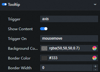
Trigger Condition: the type of the trigger. This parameter is optional. You can select Mouse Move Trigger, Mouse Click Trigger, and Mouse Move and Click Trigger.
Background Color: Change the background color of the dialog box. For more information, see color picker description.
Border Color: Modify the border color of the dialog box. For more information, see color picker description.
Border Size: Click + or-, or enter a value to modify the border thickness of the background frame.
Pin: Click the + or-sign, or enter a number manually to modify the inner margin of the background frame. Unit: pixels. The default inner margin is 5.
Text Style
Color: Modify the color of the dialog box text. For more information, see color picker description.
Font Style: dialog box the font style of the text.
Font weight: dialog box the font weight of the text.
Font: dialog box the font family of the text.
Font Size: dialog box the font size of the text.
Series: Click the
 or
or  icon to add or delete a conditional style. Click the
  or
or  icon to configure the arrangement style of multiple conditional styles. Click the
  icon to copy the selected conditional style configuration and add a conditional style with the same configuration.
 Series Name: Enter a name for the series.
Series Color: Modify the series color by referring to the color picker description.
Data tab
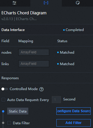
Configuration field description
Column | Description |
| Used to configure the node information in the chordal graph. |
| Used to configure the association line information in the chordal graph. |
Interaction tab
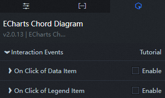
Description
Interaction | Description |
When a data item is clicked | Select Enable to enable the widget interaction feature. The chordal graph component has an interactive configuration. When a data item is selected by clicking, a callback value is thrown. By default, fields such as type and id in the data are thrown. For more information, see Configure the callback ID of a ticker board. |
When the legend is clicked | Select Enable to enable the widget interaction feature. The chordal graph component has interactive configuration. When a legend is clicked, the callback value is returned. By default, the selected field in the data is returned. For more information, see How do I configure the callback ID of a token flip widget? |
Configure interactions in Blueprint Editor
In Canvas Editor, right-click a widget and select Export to Blueprint Editor.
Click the
 icon in the upper-left corner.
 In Blueprint Editor, click chordal graph in the Imported Nodes pane. You can view the chordal graph parameters in the canvas, as shown in the following figure.
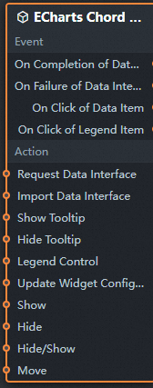
Events
Events
Description
When the data interface request is completed
The event is triggered with the processed JSON data after a data interface request is responded and processed by a filter. For more information about specific data examples, see the Data Response Result section of the Data tab in the right-side configuration panel of the canvas editor.
When a data interface request fails
The event that is returned when a data interface request fails (such as network problems or interface errors) and is processed by the filter. The event also throws the processed JSON data. For more information about specific data examples, see the Data Response Result section of the Data tab in the right-side configuration panel of the canvas editor.
When a data item is clicked
The event that is raised when a chordal graph data item is clicked, along with the corresponding data item.
When the legend is clicked
The event that is raised when the chordal graph legend is clicked, along with the corresponding data item.
action
Action
Description
Request Data Interface
This action is performed to request the server data again. The data sent by an upstream data processing node or layer node is used as a parameter. For example, chordal graph the API data source is
https://api.testand the data transferred to the request data interface is{ id: '1'}, the final request interface ishttps://api.test?id=1.Import data
After data of a widget is processed in accordance with its drawing format, the widget is imported for redrawing. You do not need to request server data again. For more information about specific data examples, see the Data Response Result section of the Data tab in the right-side configuration panel of the canvas editor.
Display dialog box
The input data of the action is of the object type. The parameters include
dataindex(data index),name(data name),x(x-axis position), andy(y-axis position). Sample data:{ "dataIndex": 1, "name": "", "x": 1, "y": 1 }Hide dialog box
Hide dialog box, no parameters required.
Legend control
The input data of the action is of the object type. The parameters include
type(legend action type) andname(legend name). Sample data:{ "type": "legendToggleSelect", "name": "" }Update component configurations
Style configurations of widgets are dynamically updated. In the Configuration panel, click Copy Configuration to Clipboard to obtain the configuration data of the component. After that, change the style field for the data processing node in Blueprint Editor.
Display
The following example shows the widget.
return{
  "animationType": "",
  "animationDuration": 1000,
  "animationEasing": "linear"
}
Hide
The following example shows how to hide a widget:
return{
  "animationType": "",
  "animationDuration": 1000,
  "animationEasing": "linear"
}
Switch to the implicit state
The following example shows whether to show or hide a widget.
return {
  "animationIn": {
    "animationType": "",
    "animationDuration": 1000,
    "animationEasing": "linear"
  },
  "animationOut": {
    "animationType": "",
    "animationDuration": 1000,
    "animationEasing": "linear"
  }
}
Move
Move a widget to a specified location. The following example shows the reference data.
    return{
      // The positioning type. to indicates absolute positioning, whereas by indicates relative positioning. The default value is to.
        "positionType": "to",
      // The location, which is indicated by the x and y coordinates.
      "attr": {
        "x": 0,
        "y": 0
      },
      // The animation type.
      "animation": {
        "enable": false,
        // The duration in which animation is displayed.
        "animationDuration": 1000,
        // The animation curve, which can be set to linear|easeInOutQuad|easeInOutExpo.
        "animationEasing": "linear"
      }
    }