By Wu Chong (Yunxie)
Flink features powerful API abstraction capabilities. It provides three layers of API: Process Function, DataStream API, and SQL and Table API from the bottom to the top. Three layers attract different user groups. The lower the layer, the higher the flexibility and the higher the threshold. The highest layer has a lower threshold with certain inflexibility.
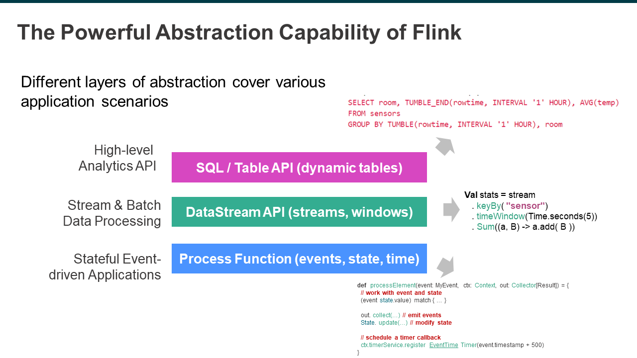
DataStream API is helpful for its powerful expressiveness that allows users to maintain and update application status. It can also control time flexibly. However, it is relatively complex and challenging to use, so that it is not suitable for all, especially for those who want to focus on business logic. Therefore, SQL is the best choice for easier-to-understand APIs.
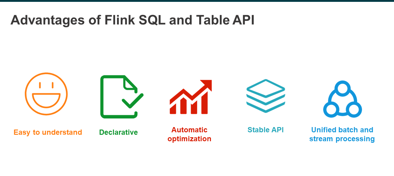
Flink SQL and Table API have many advantages. First of all, they are very easy for many people in different industries and fields to understand and have become the standard language in the big data processing ecosystem. Secondly, SQL is a declarative language. Users only need to express what they want without worrying about computing. Thirdly, SQL can automatically generate an optimal execution plan. In addition, SQL is a stable language with a history of more than 30 years. Last but not least, SQL can more easily unify stream and batch processing simultaneously in the same system, allowing users to focus only on the core business logic.
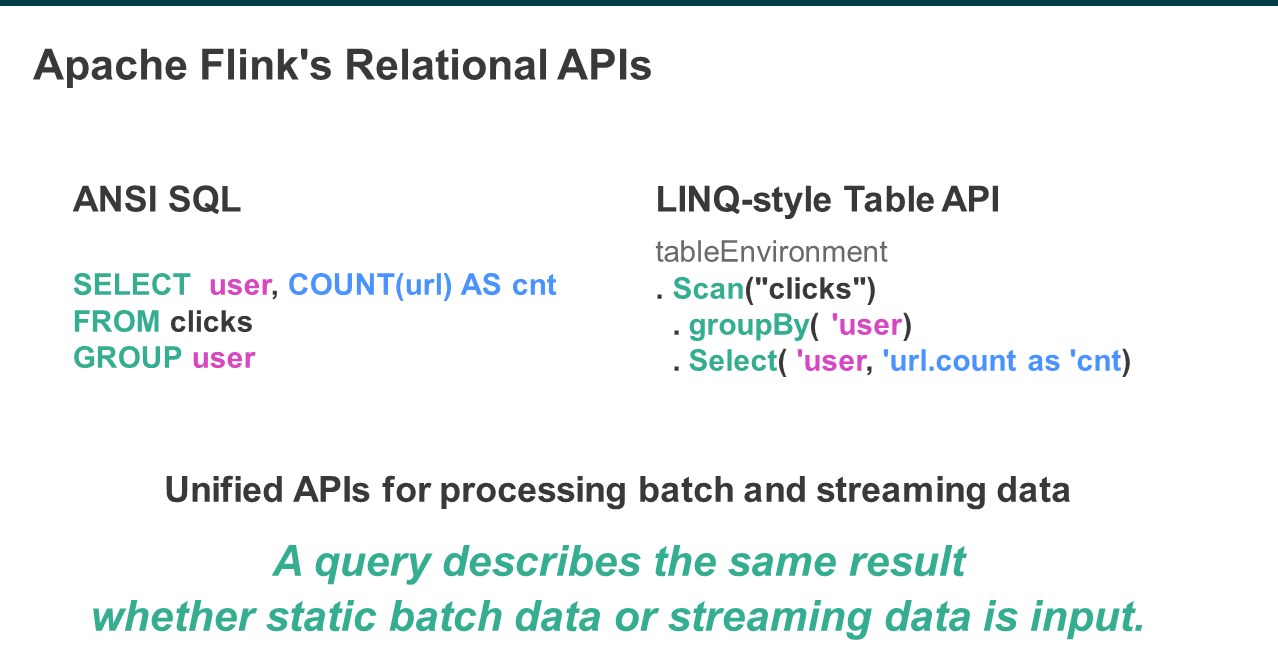
Flink mainly has two types of relational APIs: SQL API and Table API. The SQL API fully complies with ANSI SQL standards. Therefore, it is relatively easy to learn SQL API with a basic knowledge of SQL. The Table API can be considered a SQL-like programming API. They are both unified APIs for batch processing and stream processing. Whether static batch data or unlimited stream data is input, it will generate the same query results. In summary, the principle is one result for one piece of code, which is also the most important evaluation indicator for stream and batch unification.
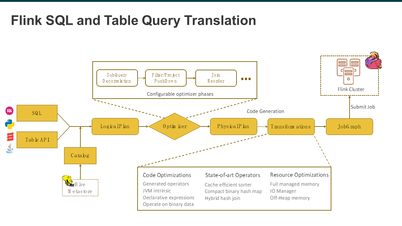
The following provides an advanced overview of the SQL and Table converted to a unified data structure after entering Flink, namely Logical Plan. The catalog provides some metadata information for subsequent optimization. A logical Plan is an optimization point. Flink optimizes the initial Logical Plan into a Physical Plan with a series of optimization rules, then translates it into Transformation through the Code Generation mechanism. Lastly, it converts it into a JobGraph to submit to the Flink cluster for distributed execution. As can be seen, there is no separate path for stream processing and batch processing in the whole process because these optimization processes and extensions are shared.
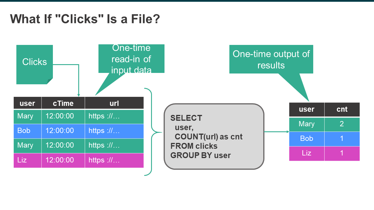
For example, if "Clicks" is a file, there are users, click time, and URL. To count the number of clicks under the circumstance that users are selected for unified batch processing, it is characterized by one-time read-in and one-time output.
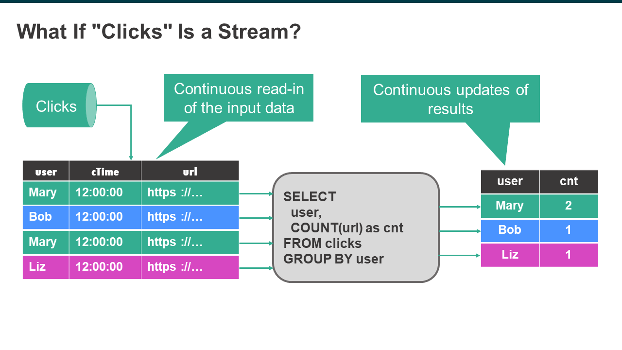
If "Clicks" is a data stream, there will be one result output for one piece of data input. For example, the first click by Mary will be recorded once. And incremental computation will be performed starting from the second click. Therefore, the results are continuously updated with the input data continuously read in.
It can be seen that the batch and stream processing results are the same. Therefore, the SQL statements used in batch processing can be migrated to Flink for stream processing. Its results and semantics should be the same as those of the previous batch processing.
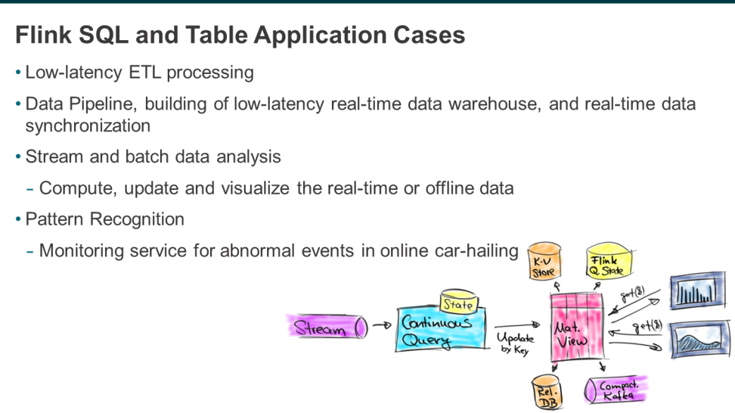
Typical examples include low-latency ETL processing, such as data preprocessing, data cleaning, and data filtering. In addition, Flink can construct real-time and offline data pipelines and low-latency real-time data warehouses. It also supports real-time data synchronization from one data system to another.
The third is batch and stream data analysis used to compute, update, and visualize offline or real-time data, such as the Alibaba Double 11 big screen.
The last type is pattern recognition, which identifies event streams that match a certain pattern in a data stream in real-time and provides corresponding monitoring or alarm services, such as the monitoring service for some abnormal events in online car-hailing.
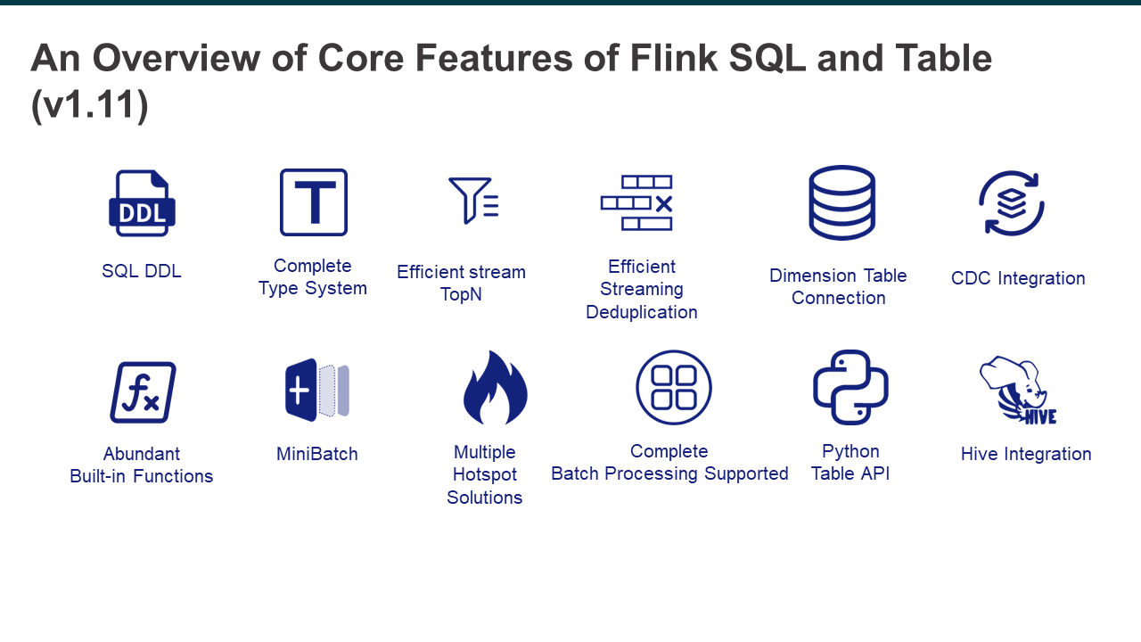
The following figure shows some core features of Flink. The first one is the DDL of SQL, which is directly connected to external systems. It determines the connectivity between Flink and external systems, which is very important for Flink as a computer engine. The second one is a complete data type system supporting multiple data types, which is also necessary for the SQL engine. The third one is the efficient stream TopN with powerful stream processing capabilities for calculating the rankings in real-time, such as the sales rankings during Double 11. It also features efficient stream deduplication to filter data since sometimes duplicated data is involved during data collection. Other features include dimension table connection and integration with CDC services, and so on.
In addition, Flink also provides many built-in functions, supportive of MiniBatch and many other ways to solve the hotspot problem. It also supports complete batch processing, together with languages such as Python. What's more, Hive integration is also supported so that not only can Hive data be directly accessed, Hive syntax is also compatible with Flink. Therefore, frequent switches are not needed.
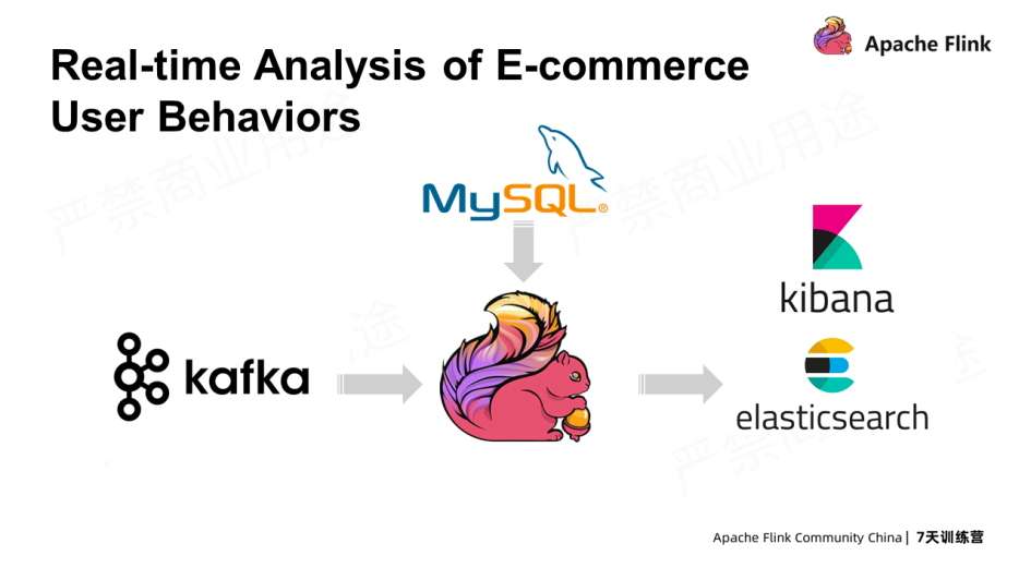
The following example shows the behavior analysis of e-commerce users in real-time. The user behavior data is consumed from Kafka in real-time, associated with data in MySQL, written to an Elasticsearch index, and lastly visualized through Kibana. This is the building of a real-time application from end to end.
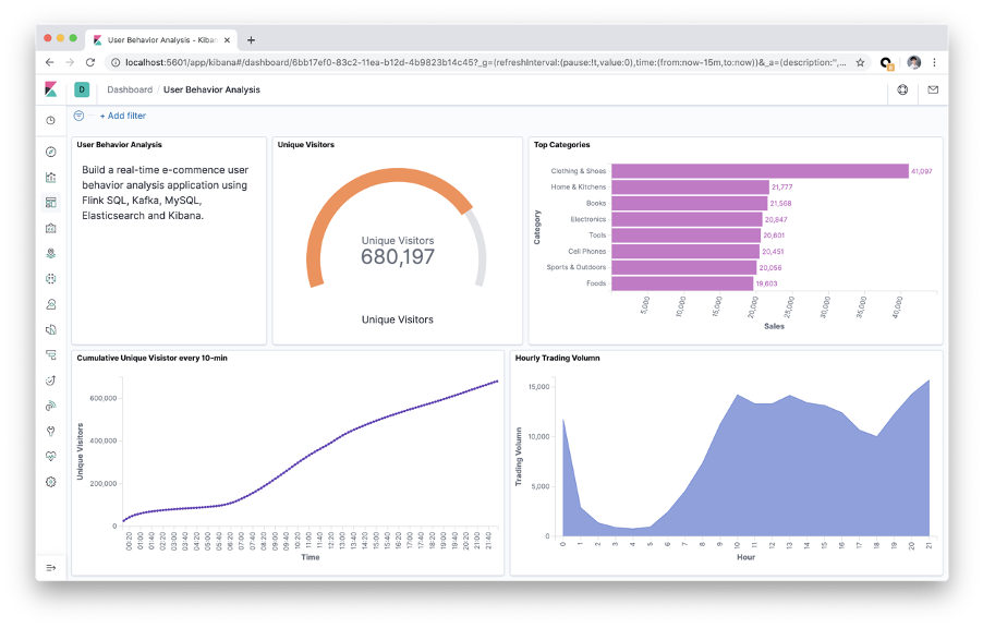
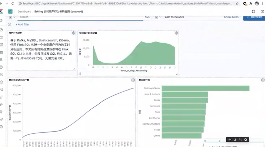
The following figure shows the final results displayed on Kibana. A panel is provided for real-time monitoring, which shows the current number of unique visitors, the rankings of different categories, and the purchases in different periods.
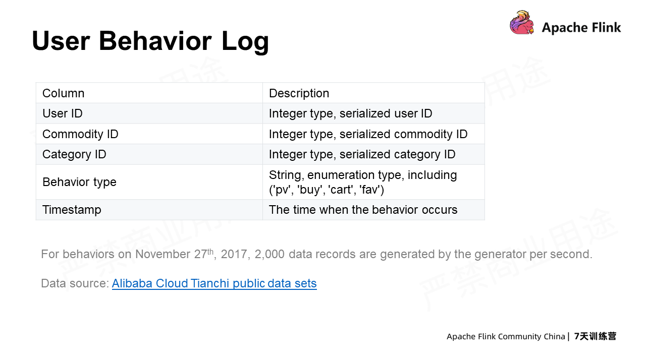
The following is a Taobao user behavior log on November 27. It contains a user ID, commodity ID, commodity category ID, behavior type, and timestamp. In the behavior type, PV means clicking, buy means purchasing, cart means adding to the shopping cart, fav means adding to favorites, and the timestamp indicates when the event occurs.
The sample code for the practice has been uploaded to Github. Those who are interested can also follow this document step by step. Please prepare a Linux or MacOS computer with Docker. No additional packages are needed.
First, create a directory, such as flink-sql-demo, and then download the demo file of docker-compose. Click to view this file.
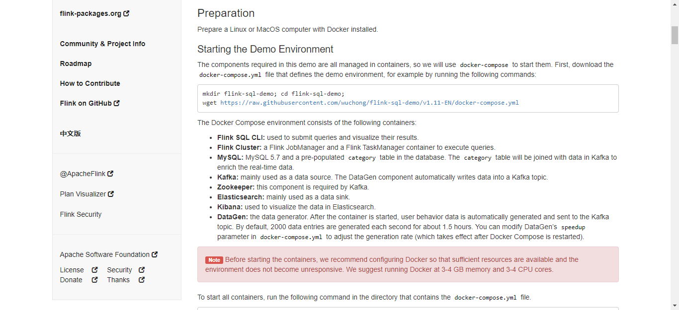
There is a dategen data source whose production speed can be changed, for example, from 2000 to 3000.
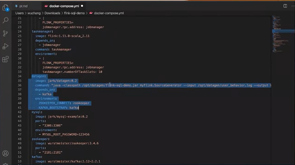
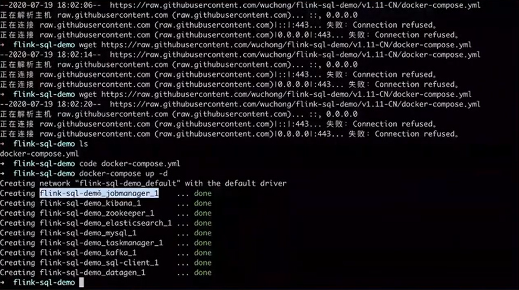
Use the docker-compose up-d to start all containers in the docker. Containers include two clusters in Flink, which are Jobmanager and Taskmanager, as well as Kibana, Elasticsearch, Zookeeper, MySQL, and Kafka etc.
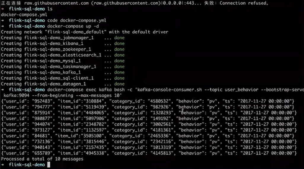
Use the Docker-compose command to view the latest 10 pieces of data in Kafka. They are the user ID, commodity ID, category ID, and user behavior. There is also a timestamp indicating the time when the behavior occurs.
Then, start the SQL-Client container through Docker-compose. When the squirrel in this figure appears, SQL Client is successfully started on which the SQL commands can be run.

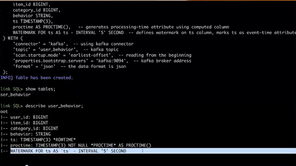
The first step is to use DDL to create data sources of user log. Use the DDL syntax "Create Table" to create a user behavior table containing five fields, including user ID, commodity ID, category ID, user behavior, and timestamp (TS). The With clause displays the attributes to connect to external systems. For example, use Kafka to connect to the external topic.
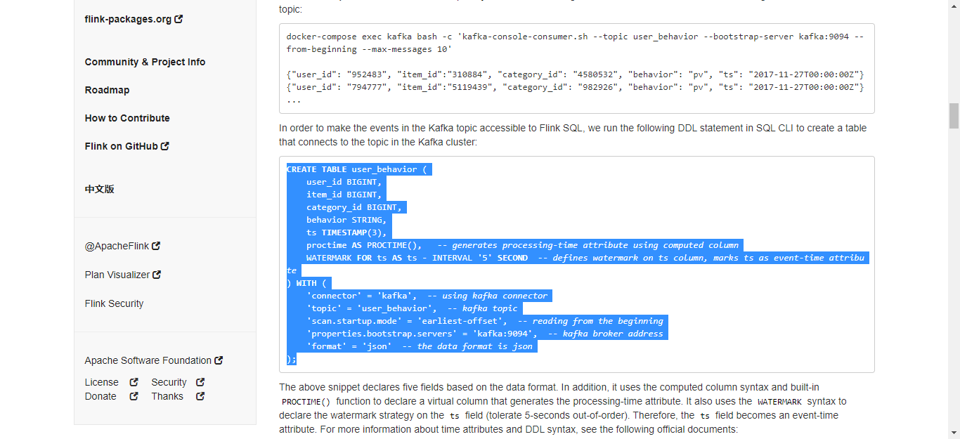
In addition, users can view the user behavior through the show table and view the table structure, fields, computed columns, and watermark policies through the described table.
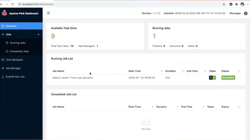
Users can also access Port 8081, a Web UI interface of the Flink cluster under Docker compose. All panels in this interface are available to be checked.
Next, let's learn some functions of Flink further through the practice of drawing three charts.
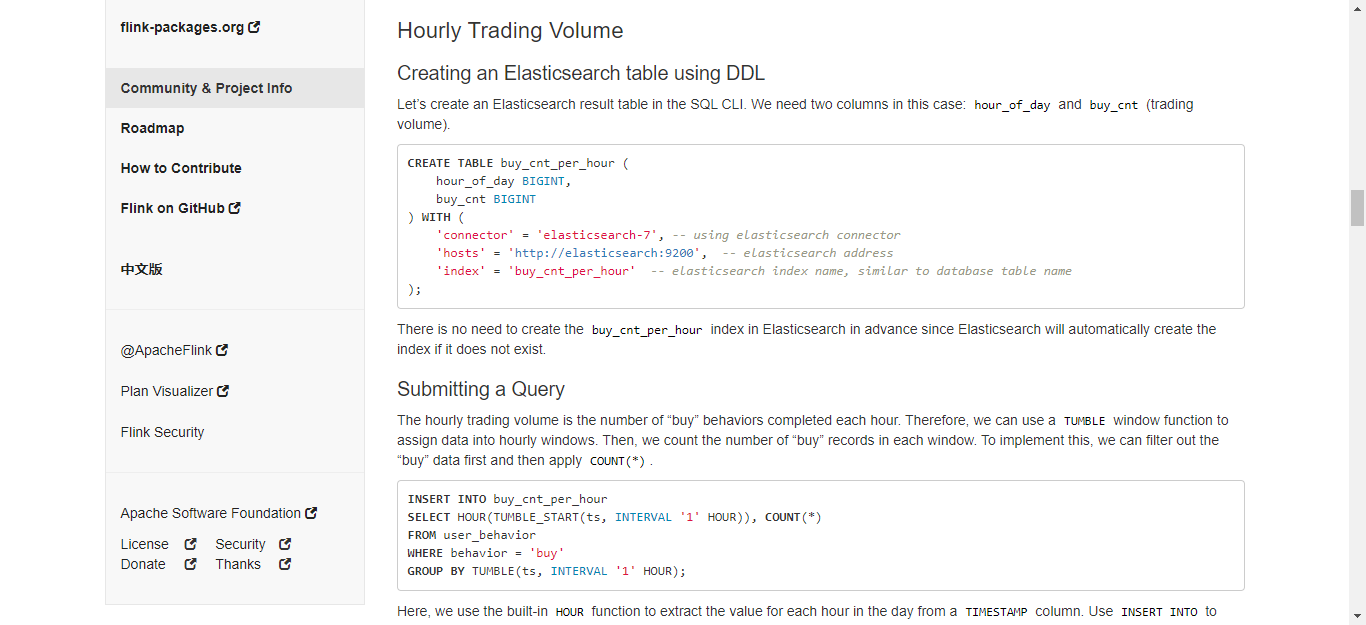
The first is to count the turnover per hour. Use DDL to create an Elasticsearch table first. Define the hourly turnover, and then submit a Query statement to perform a statistical analysis of the hourly turnover.
An hourly sliding window needs to be created with the Tumble Window syntax. The first field of Tumble defines the time attribute, that is, the event time indicated by TS. The window is open for an hour. Users slide one window every one hour and then perform statistical analysis on the data in the window.
Submit this Query. Then, access Kibana through Port 5601 for the visualization of this query. It is empty initially without data in it. Therefore, the create index pattern needs to be created first: enter through the Index Pattern in the Management of the page, find the index, and click to create.
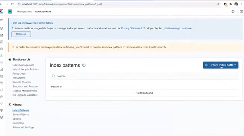
Only after the Index Pattern is created can the operations of discovery or visualization be done. You can see the corresponding values with these fields are defined in the DDL.
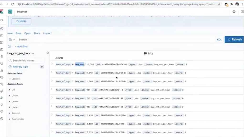
As visualization is the final goal, a Dashboard needs to be created. Click Dashboard in the upper-left corner of the page, and click Create New to create a new view. Then, the value of the hourly turnover can be set.
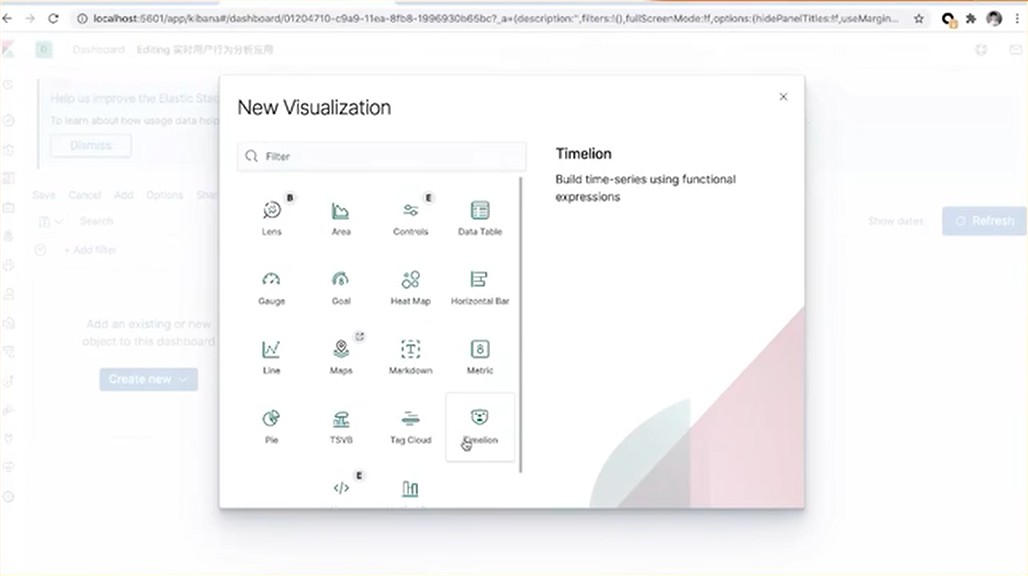
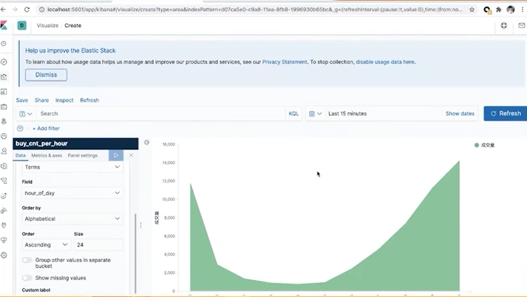
Draw an area chart, select purchase max on the y-axis, and change the label name to "turnover." As the x-axis displays the time, select the "hour-of-day," ordered by alphabet and adjusted to 24. Click Play to see the drawn area chart. Click Save to save the area chart to the Dashboard.
Then, draw another chart to count the accumulative number of unique visitors every 10 minutes in a day. Similarly, create an Elasticsearch table in the SQL CLI to store the results and collect data. The character fields include the date, time, and the cumulative number of unique visitors.
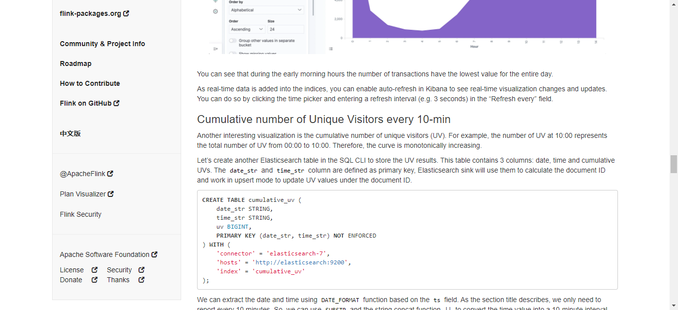
After that, execute the Table in SQL CLI.
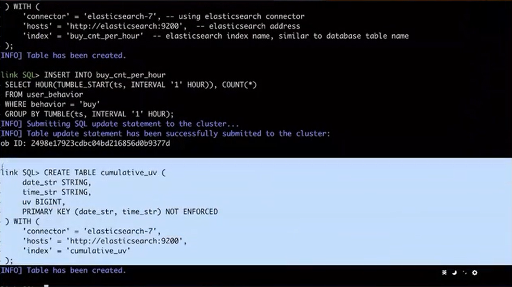
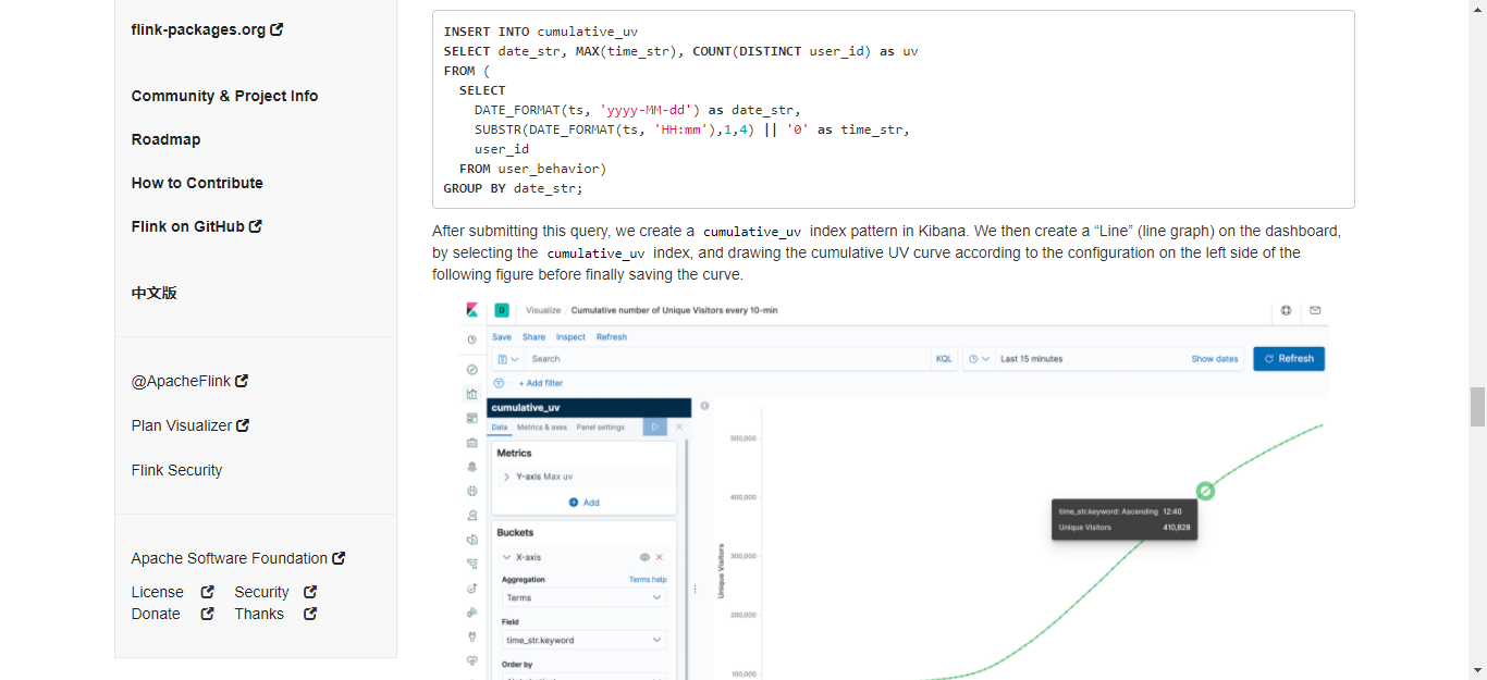
Here, what the Query does is to pick out the date and time. The only thing special here is that since dotting is needed every 10 minutes, the function of Substr with two vertical lines for connection is used. Then, submit the Query to SQL CLI for execution.
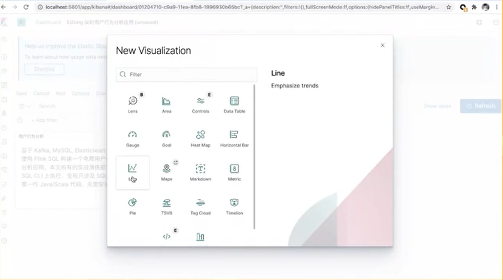
Create a new view, as mentioned before. Here a line chart is created.
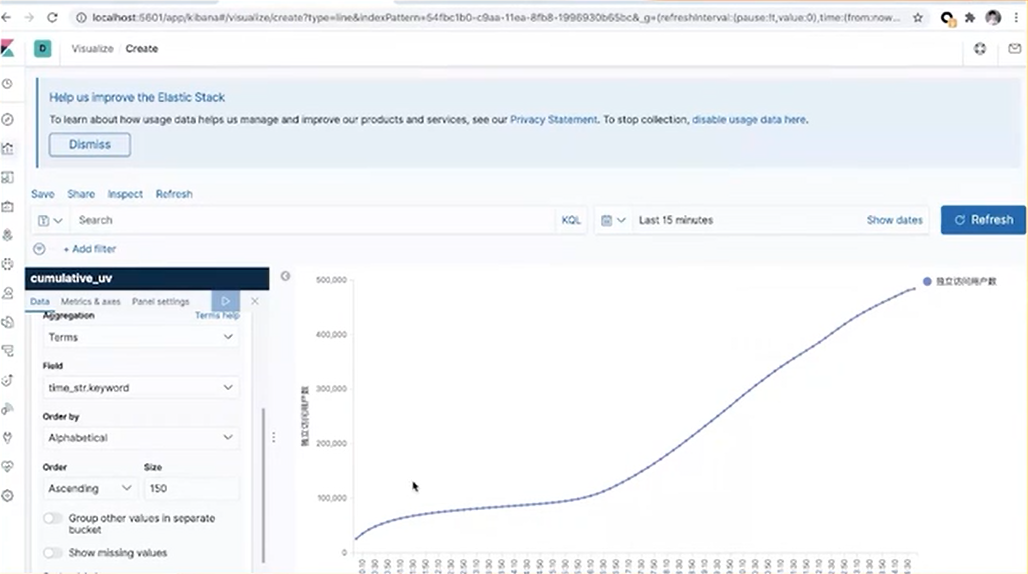
Select the value of unique visitors for the y-axis, and name it "the number of unique visitors." Select the time-str for the x-axis, ordered by alphabet. Change the dotting number to 150 a day. Click Play to view the curve chart of the number of unique visitors. Likewise, click Save to add the chart to the Dashboard.
Finally, let's draw the third chart. The third one is the top category rankings. If a commodity is classified in a very detailed way, such as with two or three sub-categories, it may not be significant enough for the rankings. However, users may want to merge these sub-categories into a top-level category for statistical analysis. Therefore, a MySQL container is prepared, in which the mapping relationships between sub-categories and their corresponding top-level category are included.
First, create a MySQL table in SQL CLI for the subsequent dimension table query. At the same time, create an Elasticsearch table to store category statistics. In the Query, the Create View syntax is used to register a temporary View. This simplifies the writing because writing two queries together can be complex.
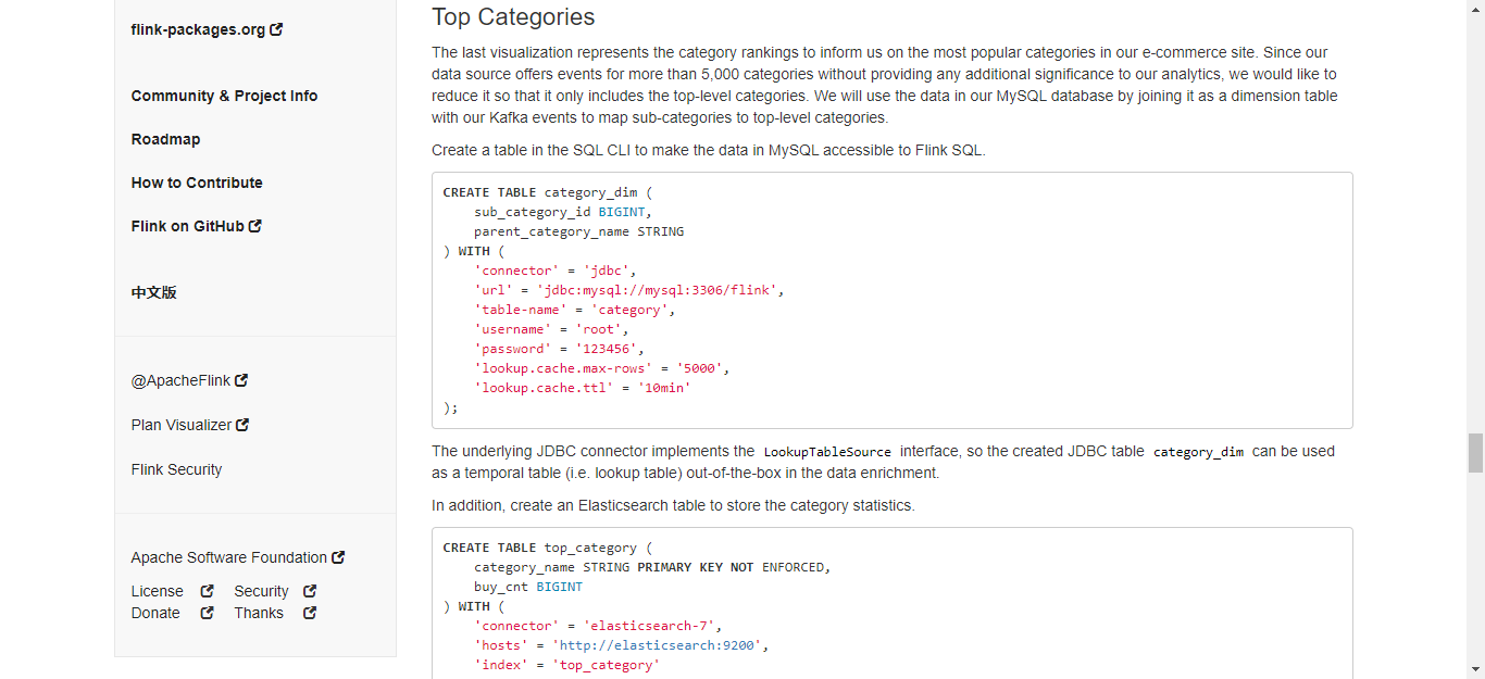
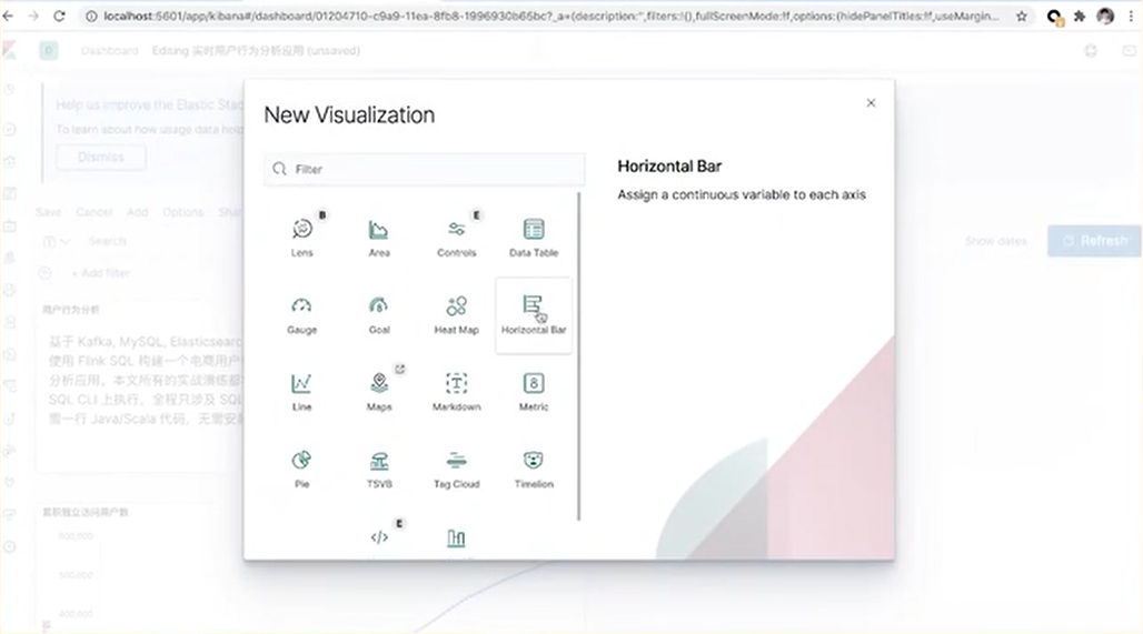
Likewise, run the code in SQL CLI and then go to the Kibana page to create indexes and add visualization charts. Here, a Horizontal Bar is used to draw a bar chart.
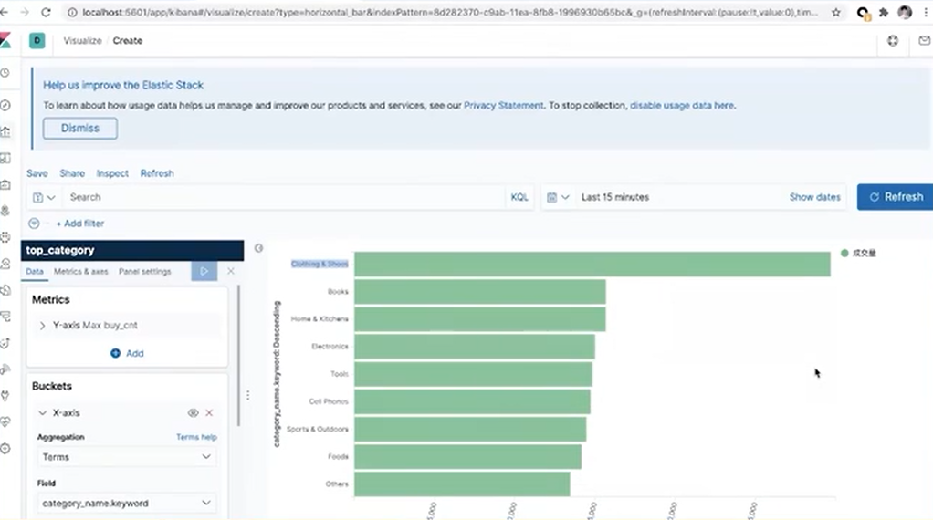
The y-axis indicates the turnover of category items. The x-axis shows the name of the category. Sort the results in descending order and then click Play.
Finally, click Save to add the category rankings to the Dashboard. Altogether with the previous two charts, there are three charts on the Dashboard. Users can modify the composition of the charts.
That's all for today's course. For extra learning and practice, please go for the documents on Github.

206 posts | 56 followers
FollowApache Flink Community - August 4, 2021
Apache Flink Community China - August 11, 2021
Apache Flink Community China - August 19, 2021
Apache Flink Community China - May 18, 2022
Apache Flink Community China - August 4, 2021
Apache Flink Community China - December 25, 2019

206 posts | 56 followers
Follow Realtime Compute for Apache Flink
Realtime Compute for Apache Flink offers a highly integrated platform for real-time data processing, which optimizes the computing of Apache Flink.
Learn More Big Data Consulting for Data Technology Solution
Alibaba Cloud provides big data consulting services to help enterprises leverage advanced data technology.
Learn More Big Data Consulting Services for Retail Solution
Alibaba Cloud experts provide retailers with a lightweight and customized big data consulting service to help you assess your big data maturity and plan your big data journey.
Learn More ApsaraDB for HBase
ApsaraDB for HBase is a NoSQL database engine that is highly optimized and 100% compatible with the community edition of HBase.
Learn MoreMore Posts by Apache Flink Community